


项目说明:
开发环境:
Python 3.7 、PyCharm
框架:flask、bootstrap
数据库:Mysql 8.0
需要代码:看作者主页联系QQ
web效果:

登录成功后的跳转页面效果:

全部页面长截图:


SQL数据库脚本:需要源代码的可以在以下截图中找到:

sql .py文件:

项目源码访问地址如下:
腾讯文档腾讯文档-在线文档 https://docs.qq.com/doc/p/71239d69a76f56cf1521717ae6b22c27cf876f10
import pymysql


def DB(user,password):
    db = pymysql.connect(host='localhost',
                         user='root',
                         password='123456',
                         database='book')

    cursor = db.cursor()

    sql = 'select * from user where username = "{}" and password = {}'.format(user, password)

    try:
        cursor.execute(sql)
        results = cursor.fetchall()
        if not results:
            return 0
        else:
            return 1
    except:
        return 0
    db.close()
app.py: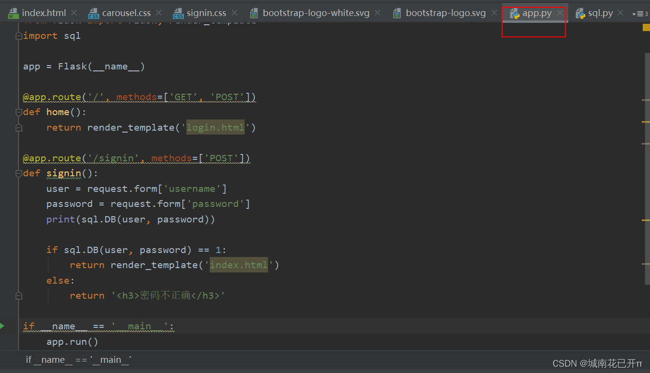
index.html页面代码:
<!doctype html>
<html lang="en">
<head>
<meta charset="utf-8">
<meta name="viewport" content="width=device-width, initial-scale=1">
<meta name="description" content="">
<meta name="author" content="Mark Otto, Jacob Thornton, and Bootstrap contributors">
<meta name="generator" content="Hugo 0.88.1">
<title>Carousel Template · Bootstrap v5.1</title>
<!-- Bootstrap core CSS -->
<link href="../static/assets/dist/css/bootstrap.min.css" rel="stylesheet">
<link href="../static/css/carousel.css" rel="stylesheet">
</head>
<body>
<!-- 头部栏-->
<header>
<nav class="navbar navbar-expand-md navbar-dark fixed-top bg-dark">
<div class="container-fluid">
<a class="navbar-brand" href="#">Logo</a>
<button class="navbar-toggler" type="button" data-bs-toggle="collapse" data-bs-target="#navbarCollapse"
aria-controls="navbarCollapse" aria-expanded="false" aria-label="Toggle navigation">
<span class="navbar-toggler-icon"></span>
</button>
<div class="collapse navbar-collapse" id="navbarCollapse">
<!-- 标题栏-->
<ul class="navbar-nav me-auto mb-2 mb-md-0">
<li class="nav-item">
<a class="nav-link active" aria-current="page" href="#">主页</a>
</li>
<li class="nav-item">
<a class="nav-link" href="#">数据</a>
</li>
<li class="nav-item">
<a class="nav-link disabled">视图</a>
</li>
</ul>
<form class="d-flex">
<!--搜索-->
<input class="form-control me-2" type="search" placeholder="Search" aria-label="Search">
<!--按钮-->
<button class="btn btn-outline-success" type="submit">Search</button>
</form>
</div>
</div>
</nav>
</header>
<main>
<!-- 轮播图-->
<div id="myCarousel" class="carousel slide" data-bs-ride="carousel">
<div class="carousel-indicators">
<button type="button" data-bs-target="#myCarousel" data-bs-slide-to="0" class="active" aria-current="true"
aria-label="Slide 1"></button>
<button type="button" data-bs-target="#myCarousel" data-bs-slide-to="1" aria-label="Slide 2"></button>
<button type="button" data-bs-target="#myCarousel" data-bs-slide-to="2" aria-label="Slide 3"></button>
</div>
<!-- 图片-->
<div class="carousel-inner">
<div class="carousel-item active">
<img src="../static/img/笑容超治愈的美女写真.jpg" alt="" class="bd-placeholder-img" width="100%" height="100%">
<div class="container">
<div class="carousel-caption text-start">
<h1>Example headline.</h1>
<p>Some representative placeholder content for the first slide of the carousel.</p>
<p><a class="btn btn-lg btn-primary" href="#">Sign up today</a></p>
</div>
</div>
</div>
<div class="carousel-item">
<img src="../static/img/灵动率性的漂亮美女.jpg" alt="" class="bd-placeholder-img" width="100%" height="100%">
<div class="container">
<div class="carousel-caption">
<h1>Another example headline.</h1>
<p>Some representative placeholder content for the second slide of the carousel.</p>
<p><a class="btn btn-lg btn-primary" href="#">Learn more</a></p>
</div>
</div>
</div>
<div class="carousel-item">
<img src="../static/img/日落下的美女写真.jpg" alt="" class="bd-placeholder-img" width="100%" height="100%">
<div class="container">
<div class="carousel-caption text-end">
<h1>One more for good measure.</h1>
<p>Some representative placeholder content for the third slide of this carousel.</p>
<p><a class="btn btn-lg btn-primary" href="#">Browse gallery</a></p>
</div>
</div>
</div>
</div>
<button class="carousel-control-prev" type="button" data-bs-target="#myCarousel" data-bs-slide="prev">
<span class="carousel-control-prev-icon" aria-hidden="true"></span>
<span class="visually-hidden">Previous</span>
</button>
<button class="carousel-control-next" type="button" data-bs-target="#myCarousel" data-bs-slide="next">
<span class="carousel-control-next-icon" aria-hidden="true"></span>
<span class="visually-hidden">Next</span>
</button>
</div>
<!-- Marketing messaging and featurettes
================================================== -->
<!-- Wrap the rest of the page in another container to center all the content. -->
<div class="container marketing">
<!-- 图标-->
<!-- Three columns of text below the carousel -->
<div class="row">
<div class="col-lg-4">
<img src="../static/img/1.jpg" alt="" class="bd-placeholder-img rounded-circle" width="140" height="140">
<h2>Heading</h2>
<p>Some representative placeholder content for the three columns of text below the carousel. This is the
first column.</p>
<p><a class="btn btn-secondary" href="#">View details »</a></p>
</div><!-- /.col-lg-4 -->
<div class="col-lg-4">
<img src="../static/img/img_2.png" alt="" class="bd-placeholder-img rounded-circle" width="140" height="140">
</svg>
<h2>Heading</h2>
<p>Another exciting bit of representative placeholder content. This time, we've moved on to the second
column.</p>
<p><a class="btn btn-secondary" href="#">View details »</a></p>
</div><!-- /.col-lg-4 -->
<div class="col-lg-4">
<img src="../static/img/img_3.png" alt="" class="bd-placeholder-img rounded-circle" width="140" height="140">
</svg>
<h2>Heading</h2>
<p>And lastly this, the third column of representative placeholder content.</p>
<p><a class="btn btn-secondary" href="#">View details »</a></p>
</div><!-- /.col-lg-4 -->
</div><!-- /.row -->
<!-- START THE FEATURETTES -->
<hr class="featurette-divider">
<div class="row featurette">
<div class="col-md-7">
<h2 class="featurette-heading">First featurette heading. <span
class="text-muted">It’ll blow your mind.</span></h2>
<p class="lead">Some great placeholder content for the first featurette here. Imagine some exciting
prose here.</p>
</div>
<div class="col-md-5">
<img src="../static/img/img_4.png" alt="" class="bd-placeholder-img bd-placeholder-img-lg featurette-image img-fluid mx-auto" width="500"
height="500">
</div>
</div>
<hr class="featurette-divider">
<div class="row featurette">
<div class="col-md-7 order-md-2">
<h2 class="featurette-heading">Oh yeah, it’s that good. <span
class="text-muted">See for yourself.</span></h2>
<p class="lead">Another featurette? Of course. More placeholder content here to give you an idea of how
this layout would work with some actual real-world content in place.</p>
</div>
<div class="col-md-5 order-md-1">
<img src="../static/img/img.png" alt="" class="bd-placeholder-img bd-placeholder-img-lg featurette-image img-fluid mx-auto" width="500"
height="500">
</div>
</div>
<hr class="featurette-divider">
<div class="row featurette">
<div class="col-md-7">
<h2 class="featurette-heading">And lastly, this one. <span class="text-muted">Checkmate.</span></h2>
<p class="lead">And yes, this is the last block of representative placeholder content. Again, not really
intended to be actually read, simply here to give you a better view of what this would look like
with some actual content. Your content.</p>
</div>
<div class="col-md-5">
<img src="../static/img/img_1.png" alt="" class="bd-placeholder-img bd-placeholder-img-lg featurette-image img-fluid mx-auto" width="500"
height="500">
</div>
</div>
<hr class="featurette-divider">
<!-- /END THE FEATURETTES -->
</div><!-- /.container -->
<!-- FOOTER -->
<footer class="container">
<p class="float-end"><a href="#">Back to top</a></p>
<p>© 2022–至今 Company XXX, Inc. · <a href="#">Privacy</a> · <a href="#">Terms</a></p>
</footer>
</main>
<script src="../static/assets/dist/js/bootstrap.bundle.min.js"></script>
</body>
</html>
登录的页面:
<!doctype html>
<html lang="en">
<head>
<meta charset="utf-8">
<meta name="viewport" content="width=device-width, initial-scale=1">
<meta name="description" content="">
<meta name="author" content="Mark Otto, Jacob Thornton, and Bootstrap contributors">
<meta name="generator" content="Hugo 0.88.1">
<title>Signin Template · Bootstrap v5.1</title>
<link rel="canonical" href="https://getbootstrap.com/docs/5.1/examples/sign-in/">
<!-- Bootstrap core CSS -->
<link href="../static/assets/dist/css/bootstrap.min.css" rel="stylesheet">
<style>
.bd-placeholder-img {
font-size: 1.125rem;
text-anchor: middle;
-webkit-user-select: none;
-moz-user-select: none;
user-select: none;
}
@media (min-width: 768px) {
.bd-placeholder-img-lg {
font-size: 3.5rem;
}
}
</style>
<!-- Custom styles for this template -->
<link href="../static/css/signin.css" rel="stylesheet">
</head>
<body class="text-center">
<main class="form-signin">
<form action="http://127.0.0.1:5000/signin" method="post">
<img class="mb-4" src="../static/assets/brand/bootstrap-logo.svg" alt="" width="72" height="57">
<h1 class="h3 mb-3 fw-normal">欢迎登录</h1>
<div class="form-floating">
<input type="text" class="form-control" name="username">
<label for="floatingInput">用户名</label>
</div>
<div class="form-floating">
<input type="password" class="form-control" name="password">
<label for="floatingPassword">密码</label>
</div>
<br>
<button class="w-100 btn btn-lg btn-primary" type="submit">登录</button>
<p class="mt-5 mb-3 text-muted">© 2022–至今 </p>
</form>
</main>
</body>
</html>


 297
297


 被折叠的 条评论
为什么被折叠?
被折叠的 条评论
为什么被折叠?
 到【灌水乐园】发言


