


在我们的项目的有的地方需要用弹框的拖拽,以及弹窗自定义全屏显示的需求,所以再次将二次合一,同时弹框里面内容自适应屏幕高度
在ant-design-vue中,已经实现了拖拽,全屏的功能,下面是ant官网的示例
下面是对ant原有的功能进行二次封装,由于组件拆解了,子组件分为三部分:为如下代码:
一:子级的根目录modal下新建index.vue,弹框涉及到的参数可参考ant官网
<template>
<!--  v-bind处理a-table 传递过来的参数,你们开发的时候不用再子组件中接收这么ant原有的参数-->
    <a-modal class="Kld-dfs-modal" :open="isOpen" :body-style="computeBodyStyle" :width="width" :centered="centered"
        @cancel="closeModal" :afterClose="handleAfterClose" :destroyOnClose="destroyOnClose" :keyboard="keyboardOpen"
        :style="topStyle" :maskClosable="maskClosable" :mask="mask" :wrap-class-name="fullModal" v-bind="attrs">
        <template #title>

            <div class="modalHeader">
<!-- 标题的ref用于控制是否可以拖拽-->
                <div :ref="modalTitleRefS" class="draggableTitle">{{ title }}</div>
<!-- 弹框头部的标题,以及全屏的按钮-->
                <ModalHeader :width="width" @fullScreen="handleFullScreen" @reduction="handleReduction" />
            </div>
        </template>
        <template #closeIcon>
<!-- 弹框头部的关闭按钮区域-->
            <ModalClose />
        </template>
        <div ref="bodySlot">
<!-- 弹框内容区域-->
            <slot name="body"></slot>
        </div>
        <template #footer>
<!-- 弹框底部按钮区域-->
            <div ref="footerSlot">
                <slot name="footer" v-if="haveFooter"></slot>
            </div>
        </template>
<!-- 实现是否拖拽弹框计算的核心代码-->
        <template #modalRender="{ originVNode }">
            <div :style="transformStyle">
                <component :is="originVNode" />
            </div>
        </template>
    </a-modal>
</template>

<script  lang="ts">
import { defineComponent, ref, computed, watch, CSSProperties, watchEffect } from 'vue';
import { useDraggable } from '@vueuse/core';
import { FullscreenExitOutlined, FullscreenOutlined, CloseOutlined } from '@ant-design/icons-vue';

import ModalClose from './components/ModalClose.vue';
import ModalHeader from './components/ModalHeader.vue';
import { Modal } from 'ant-design-vue';

export default defineComponent({
    name: 'KldDfsModal',
    props: {
        centered: {
            type: Boolean,
            default: true
        },
        maskClosable: {
            type: Boolean,
            default: true,
        },
        mask: {
            type: Boolean,
            default: true
        },
        topStyle: {
            type: String,
            default: ''
        },
        closable: {
            type: Boolean,
            default: true,
        },
        destroyOnClose: {
            type: Boolean,
            default: false,
        },
        keyboardOpen: {
            type: Boolean,
            default: false,
        },
        title: {
            type: String,
            default: ''
        },
        open: {
            type: Boolean,
            default: false
        },
        haveFooter: {
            type: Boolean,
            default: true
        },
        width: {
            type: [String, Number],
            default: '60vw'
        },
        boxHeight: {
            type: [String, Number],
            default: 60
        },
        bodyStyle: {
            type: Object,
            default: {
                overflowX: 'hidden',
                overflowY: 'auto'
            }
        }
    },
    setup(props, { attrs, emit }) {
        /*****拖拽相关*****/
        const modalTitleRefS = ref('modalTitleRef')
        const modalTitleRef = ref<HTMLElement>();
        const { x, y, isDragging } = useDraggable(modalTitleRef);
        const startX = ref<number>(0);
        const startY = ref<number>(0);
        const startedDrag = ref(false);
        const transformX = ref(0);
        const transformY = ref(0);
        const preTransformX = ref(0);
        const preTransformY = ref(0);
        const dragRect = ref({ left: 0, right: 0, top: 0, bottom: 0 });
        const transformStyle = computed<CSSProperties>(() => {
            return {
                transform: `translate(${transformX.value}px, ${transformY.value}px)`,
            };
        });
        watch([x, y], () => {
            if (!startedDrag.value) {
                startX.value = x.value;
                startY.value = y.value;
                const bodyRect = document.body.getBoundingClientRect();
                const titleRect = modalTitleRef.value?.getBoundingClientRect() ?? { width: 0, height: 0 };
                dragRect.value.right = bodyRect.width - titleRect.width;
                dragRect.value.bottom = bodyRect.height - titleRect.height;
                preTransformX.value = transformX.value;
                preTransformY.value = transformY.value;
            }
            startedDrag.value = true;
        });
        watch(isDragging, () => {
            if (!isDragging) {
                startedDrag.value = false;
            }
        });
        watchEffect(() => {
            if (startedDrag.value) {
                transformX.value =
                    preTransformX.value +
                    Math.min(Math.max(dragRect.value.left, x.value), dragRect.value.right) -
                    startX.value;
                transformY.value =
                    preTransformY.value +
                    Math.min(Math.max(dragRect.value.top, y.value), dragRect.value.bottom) -
                    startY.value;
            }
        });
        /*****************/
        const bodySlot = ref(null);
        const footerSlot = ref(null);

        const isOpen = ref<boolean>(false);
        //const centered = ref<boolean>(true);
        const computeBodyStyle = ref<CSSProperties>();
        //动态计算内容高度,生成弹窗
        const computeWindowStyle = (bodyRealHeight: number = 0, headerRealHeight: number = 0, footerRealHeight: number = 0) => {
            let windowHeight = document.body.offsetHeight;
            let realHeight: number = 0;
            //后面增加数值的构成 model padding 上下20 + 20 header和body之间 25 footer和body之间 20
            if (bodyRealHeight + headerRealHeight + footerRealHeight + 85 >= windowHeight) {
                realHeight = windowHeight - headerRealHeight - footerRealHeight - 82;
            } else {
                realHeight = bodyRealHeight + 25;
            }
            computeBodyStyle.value = Object.assign({
                height: `${realHeight}px`
            }, props.bodyStyle);


        };
        const width = ref<string | number>(props.width);
        const fullModal = ref<string>();
        // 全屏
        const handleFullScreen = () => {
            width.value = '100%'
            modalTitleRefS.value = ''
            fullModal.value = 'kld-full-modal'
            transformX.value = 0;
            transformY.value = 0;
        }
        // 还原
        const handleReduction = () => {
            width.value = props.width
            modalTitleRefS.value = 'modalTitleRef'
            fullModal.value = ''
        }
        const closeModal = (e: Event) => {
            emit('cancel', e);
        };
        /**
         * @description: Modal 完全关闭后的回调
         */
        const handleAfterClose = () => {
            console.log('Modal 完全关闭后的回调');
            fullModal.value = ''
            modalTitleRefS.value = 'modalTitleRef'
            width.value = props.width
            emit('afterClose')
        };
        watch(
            () => props.open,
            (newVal) => {
                if (newVal) {
                    isOpen.value = true;
                } else {
                    isOpen.value = false;
                }
            },
            { deep: true }
        );
        watch(() => bodySlot.value, (newVal) => {
            if (newVal) {
                const bodyDom: any = newVal, footerDom: any = footerSlot.value, headerDom: any = modalTitleRef.value;
                x.value = startX.value;
                y.value = startY.value;
                computeWindowStyle(bodyDom.clientHeight, headerDom.clientHeight, footerDom.clientHeight);
            }
        }, { deep: true });
        return {
            modalTitleRefS,
            isOpen,
            modalTitleRef,
            computeBodyStyle,
            width,
            fullModal,
            transformStyle,
            handleFullScreen,
            handleReduction,
            closeModal,
            handleAfterClose,
            bodySlot,
            footerSlot,
            transformX,
            transformY,
            dragRect,
            startedDrag,
            isDragging,
            computeWindowStyle,
            startX,
            startY,
            preTransformX,
            preTransformY,
            x,
            y,
            attrs,
            listeners: emit,
        };
    },
    components: {
        CloseOutlined,
        FullscreenOutlined,
        FullscreenExitOutlined,
        AModal: Modal,
        ModalClose,
        ModalHeader
    }

});


</script>

<style scoped lang="less">
.draggableTitle {
    width: 100%;
    cursor: move
}
<!-- 用于弹框滚动条-->
:global(.ant-modal-root .ant-modal-wrap) {
    overflow: hidden;
}

:deep(.ant-modal-body)::-webkit-scrollbar {
    width: 0px;
    height: 0px;
    padding: 0px;
}

:deep(.ant-modal-body)::-webkit-scrollbar-thumb {
    background: #c1c1c1;
    border-radius: 3px;
}

:deep(.ant-modal-body)::-webkit-scrollbar-track {
    border-radius: 3px;
    background: #f1f1f1;
}
</style>
<style lang="less">
<!-- 用于弹框全屏的样式-->
@import url('./common.less');
</style>
子级的根目录modal下新建common.less,全屏的cs样式
// modal 全屏
.modalHeader {
  display: flex;
  justify-content: space-between;
}
.kld-full-modal{
  .ant-modal {
    max-width: 100% !important;
    top: 0 !important;
    padding-bottom: 0 !important;
    margin: 0 !important;
  }
  .ant-modal-content {
    display: flex;
    flex-direction: column;
    height: calc(100vh);
  }
  .ant-modal-body {
    flex: 1;
    max-height: calc(100vh);
  }
}
二:子级的根目录modal下新建components文件然后新建存放头部关闭按钮的组件以及全屏按钮的组件,
ModalClose组件
<template>
    <a-tooltip ref="KldTooltip" color="#ffffff" placement="bottom">
        <template #title>
            <span style="color: black;">关闭</span>
        </template>
        <CloseOutlined />
    </a-tooltip>
</template>

<script lang="ts">
import { ref } from 'vue';
import { Tooltip } from 'ant-design-vue';
import { CloseOutlined } from '@ant-design/icons-vue';

export default {
    name: "KldTooltip",
    setup(_, { attrs, emit }) {
        return {
            attrs,
            listeners: emit,
            KldTooltip: ref()
        };
    },
    components: {
        ATooltip: Tooltip,
        CloseOutlined
    }
};
</script>
ModalHeader组件
<template>
    <div>
        <a-tooltip color="#ffffff" v-if="width != '100%'" placement="bottom">
            <template #title>
                <span style="color: black;">全屏</span>
            </template>
            <a-button type="text" class="ant-modal-close" style="margin-right: 30px;" @click="handleFullScreen">
                <FullscreenOutlined />
            </a-button>
        </a-tooltip>
        <a-tooltip color="#ffffff" v-else placement="bottom">
            <template #title>
                <span style="color: black;">还原</span>
            </template>
            <a-button type="text" class="ant-modal-close" style="margin-right: 30px;" @click="handleReduction">
                <FullscreenExitOutlined />
            </a-button>
        </a-tooltip>
    </div>
</template>

<script lang="ts">
import { ref } from 'vue';
import { Tooltip } from 'ant-design-vue';
import { FullscreenExitOutlined, FullscreenOutlined } from '@ant-design/icons-vue';

export default {
    name: "KldTooltip",
    props: {
        width: {
            type: [String, Number],
            default: '40%'
        },
    },
    setup(props, { attrs, emit }) {
        const handleFullScreen = () => {
            emit('fullScreen');
        };
        const handleReduction = () => {
            emit('reduction');
        };
        return {
            props,
            attrs,
            listeners: emit,
            KldTooltip: ref(),
            handleFullScreen,
            handleReduction
        };
    },
    components: {
        ATooltip: Tooltip,
        FullscreenExitOutlined,
        FullscreenOutlined
    }
};
</script>
三、然后在main.js里面引入,也可以直接在父组件引入,此处就不讲解引入了,直接父组件使用弹框
父组件
<template>
      <kld-dfs-modal :open="createVisible" :title="createTitle" :width="'40%'" :destroyOnClose="true" :haveFooter="true"
            :boxHeight="85" @cancel="createVisible = false" :maskClosable="false">
            <template #body>
                <ApplicationCreate @close="handleClose" :editFormRef="editFormRef" :editId="editId"
                    :createTitle="createTitle" />
                <p class="h-20" v-for="index in 20" :key="index">根据屏幕高度自适应</p>
            </template>
            <template #footer>
                <a-button>
                    测试底部按钮插槽
                </a-button>
            </template>
        </kld-dfs-modal>
</template>

<script lang="ts" setup>
const createVisible = ref<boolean>(false); //创建
const createTitle = ref<string>(""); //创建弹窗标题

const showModalA = () => {
    createVisible.value = true;
    createTitle.value = "创建应用";
    editFormRef.value = {}
    editId.value = ''
};
// 关闭创建弹窗
const handleClose = (type: string) => {
    if (type === "提交") {

    }
    createVisible.value = false;
};
</script>
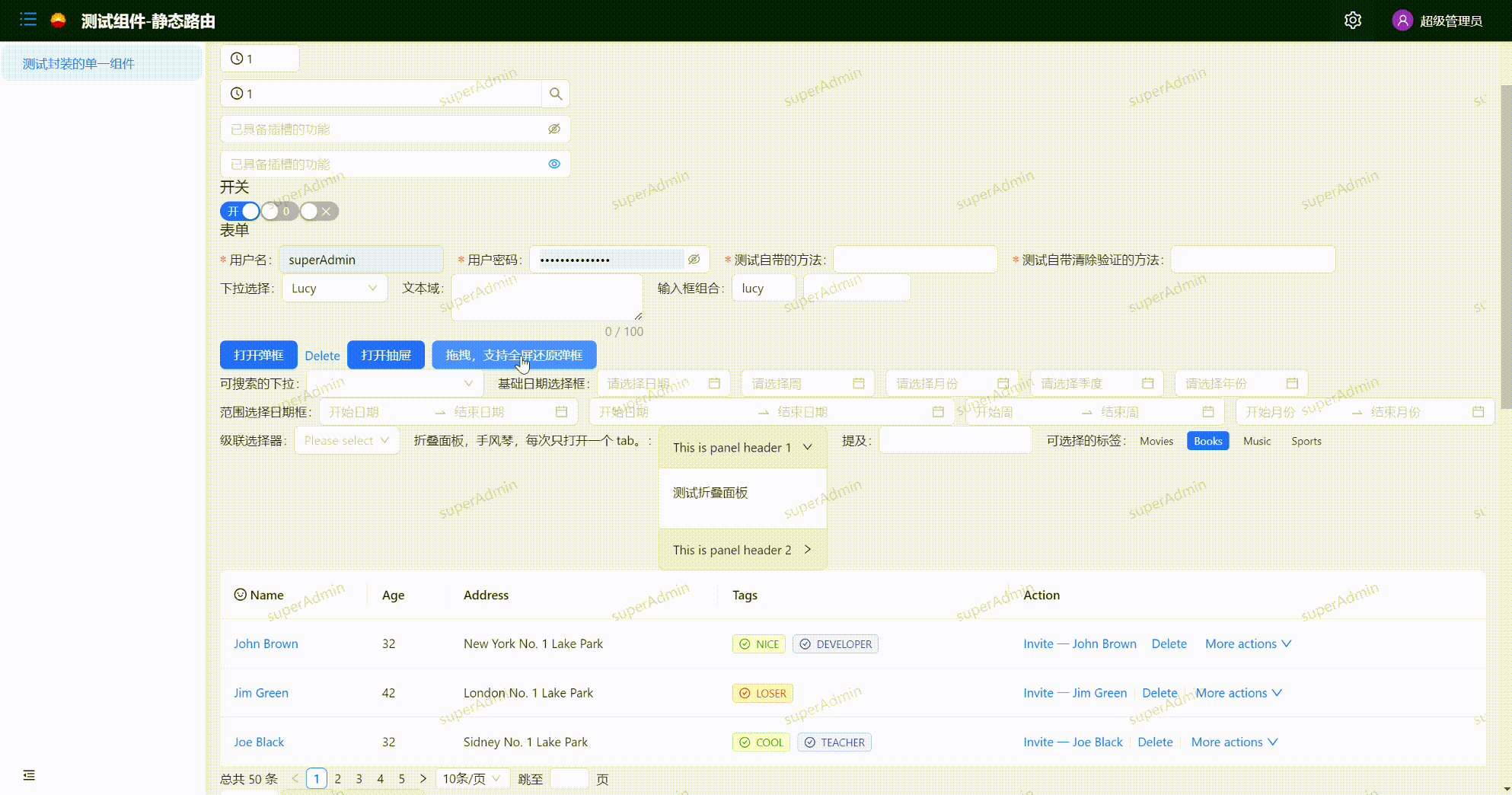
效果图如下:内容可自适应屏幕高度,如果不需要可通过弹框标题的ref控制


 1891
1891


 被折叠的 条评论
为什么被折叠?
被折叠的 条评论
为什么被折叠?
 到【灌水乐园】发言


