


<template>
	<view class="tabs-box">
		<view class="tabs-main" :style="{paddingBottom:comPaddingBottom}">
			<view @click="changeIndex(index)" class="content-item" v-for="(item,index) in dataList" :key="index">
				<view class="top-text">
					<text :class="{'_font-bold':currIndex==index}">{{item.name}}</text>
					<image v-show="currIndex==index" class="icon-image" src="/static/global_image/active_icon.png">
					</image>
				</view>
			</view>
			<view class="active" :style="{'left':comLeft,'width':comWidth,height:comHeight}"></view>
		</view>
	</view>
</template>

<!-- @该组件传入一个事件用于改变tabs下标 @changeIndex-->
<!-- @传入一个data数组对象 必须为 value name 的键值对 -->
<script>
	export default {
		data() {
			return {
				itemWidth: '', //每个tabs-item 元素的宽

			}
		},
		props: {
			dataList: Array, //组件要求传入一个和data 格式相同的列表 用于展示数据
			currIndex: Number, //组件需要一个index值来控制tabs 下标
			LineOffset:0,//下方线条与上方item的距离 单位rpx
			LineHeight: {
				type: Number,
				default: 6
			}, //下方滑块line高度 默认6rpx高度
			lineWidth: {
				type: Number,
				default: 1
			}, //下方滑块的宽度 默认为每个item的宽度 请传入百分比值 例如 1 = 100%
		},
		mounted() {
			this.getWidth(); //获取组件宽度
		},
		computed: {
			comPaddingBottom(){
				return this.LineOffset+'rpx'
			},
			comHeight() {
				return this.LineHeight + 'rpx'
			},
			comWidth() {
				let width = this.itemWidth.width * this
				.lineWidth; //组件支持传入相对于每个item 来计算的  滑块的宽  例如 每个item宽度100 *0.8 意味着line将是80
				return width + 'px'
			},
			comLeft() {
				// 规定左偏移数值 10 px
				let py = 0;
				//获取当前坐标 curr
				py = (this.itemWidth.width - this.itemWidth.width * this.lineWidth) / 2;
				let index = this.currIndex;
				// 最终移动位置 =(index * 93.75 )+ py
				let numSum = (index * this.itemWidth.right) + py;
				//左移
				return numSum + 'px'
			}
		},
		methods: {
			changeIndex( index) {
				//告知父组件当前选中项 并回传item
				this.$emit('changeIndex',  index);
			},
			getWidth() {
				this.$nextTick(async () => {
					//使用uni带的方法获取 元素的 宽度 为了适配各机型
					let that = this;
					that.itemWidth = await that.$uGetRect('.' + 'content-item');
					console.log(that.itemWidth.right, '获取每个元素的宽度');
				})
			},
		}
	}
</script>

<style lang="scss">
	.tabs-box {
		.tabs-main {
			display: flex;
			justify-content: space-between;
			background-color: #FFF;
			padding: 10rpx 0;
			transition: left 2s;
			position: relative;

			.content-item {
				width: 100%;
				display: flex;
				flex-direction: column;
				align-items: center;
				border-right: 1rpx solid #EEEEEE;

				.top-text {
					position: relative;
					font-size: 30rpx;
					font-weight: 500;
					color: #666666;

					.icon-image {
						position: absolute;
						width: 28rpx;
						height: 28rpx;
						right: -10rpx;
						top: 0;
					}
				}

				.bottom-card {
					padding: 8rpx 40rpx;
					margin-top: 10rpx;
					border-radius: 20rpx;
					text-align: center;
					font-size: 24rpx;
					font-weight: 400;
					color: #666666;
					position: relative;
					z-index: 10;
				}
			}
		}

		.active {
			position: absolute;
			background: #FFDD00;
			color: #333333;
			transition: all .5s;
			bottom: 0rpx;
			padding: 4rpx 20rpx;
			border-radius: 20rpx;
			z-index: 1;
		}
	}
</style>
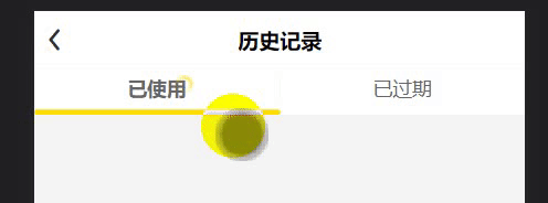
组件会自动计算好一些参数 ,带动画的 效果如图


 1198
1198


 被折叠的 条评论
为什么被折叠?
被折叠的 条评论
为什么被折叠?
 到【灌水乐园】发言


