


🚀一、Text/Span
在HarmonyOS中,Text/Span组件是文本控件中的一个关键部分。Text控件可以用来显示文本内容,而Span只能作为Text组件的子组件显示文本内容。
Text/Span组件的用法非常简单和直观。我们可以通过Text组件来显示普通文本,也可以通过Span组件来实现。
🔎1.创建文本
语法说明:
Text(content?: string | Resource)
文本内容。包含子组件Span时不生效,显示Span内容,并且此时text组件的样式不生效。
使用:
@Entry
@Component
struct Index {
build() {
Column() {
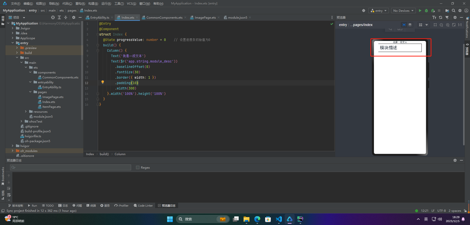
Text('我是一段文本')
Text($r('app.string.module_desc'))
.baselineOffset(0)
.fontSize(30)
.border({ width: 1 })
.padding(10)
.width(300)
}.width('100%').height('100%')
}
}
🔎2.添加子组件
🦋2.1 Span
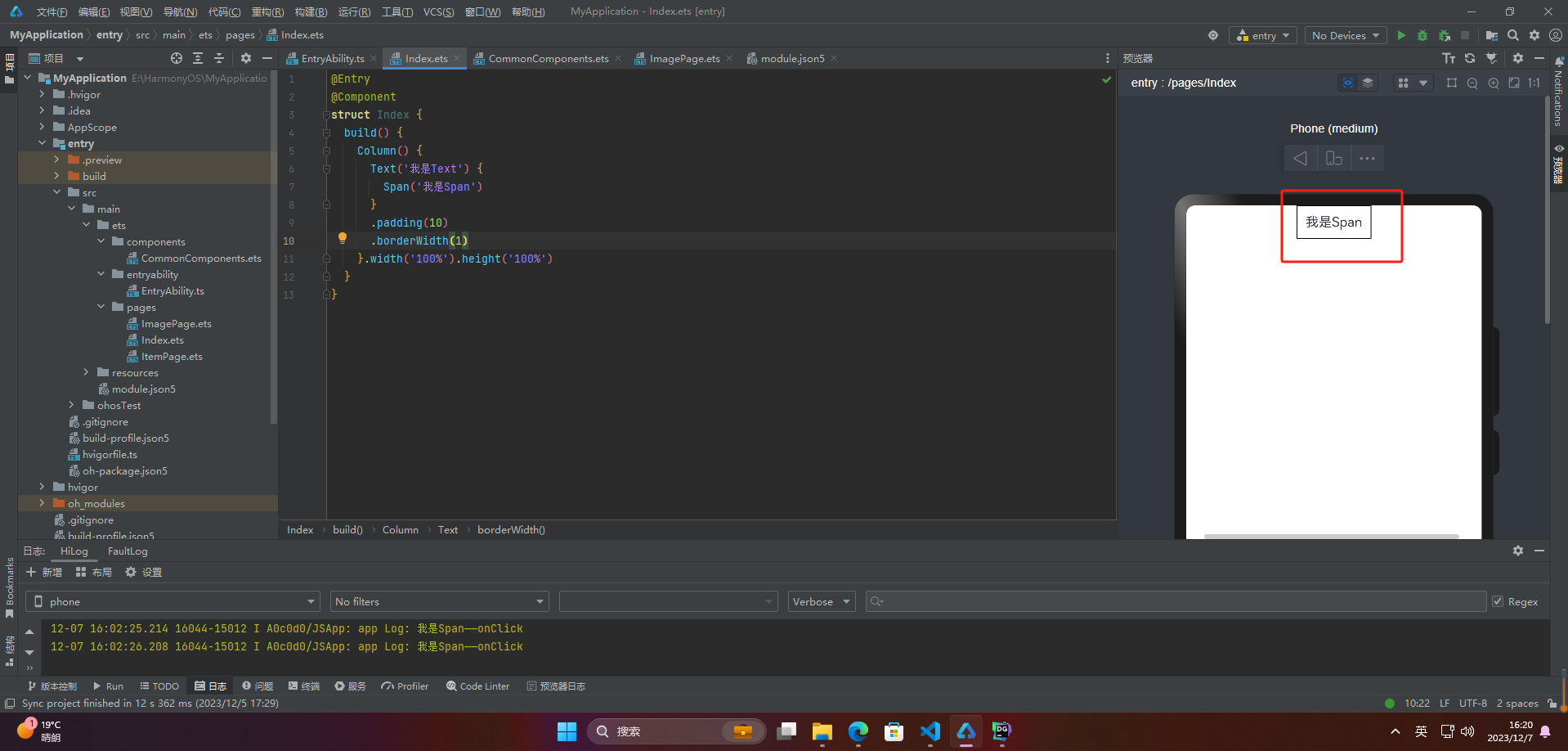
在文本处理中,Span通常用于表示文本中的一部分。例如,在一个字符串中找到一个单词,可以使用Span表示这个单词在字符串中的位置和大小。Span还可以用于对文本进行修改,例如替换一个单词或插入新的文本。
HarmonyOS中的Span也表示文本不过是嵌入Text中的
@Entry
@Component
struct Index {
  build() {
    Column() {
      Text('我是Text') {
        Span('我是Span')
      }
      .padding(10)
      .borderWidth(1)
    }.width('100%').height('100%')
  }
}
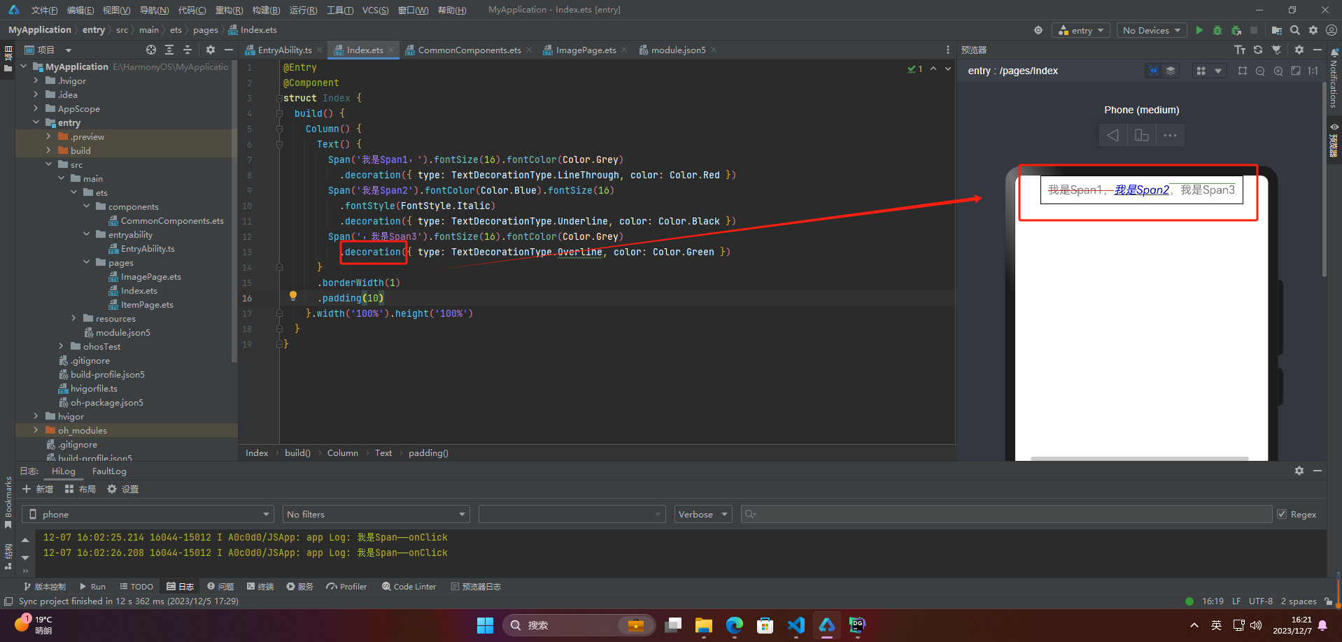
🦋2.2 decoration
Span的decoration属性用于设置文字的装饰效果,可以取以下值:
- Underline:下划线
- LineThrough:删除线
- Overline:上划线
@Entry
@Component
struct Index {
  build() {
    Column() {
      Text() {
        Span('我是Span1,').fontSize(16).fontColor(Color.Grey)
          .decoration({ type: TextDecorationType.LineThrough, color: Color.Red })
        Span('我是Span2').fontColor(Color.Blue).fontSize(16)
          .fontStyle(FontStyle.Italic)
          .decoration({ type: TextDecorationType.Underline, color: Color.Black })
        Span(',我是Span3').fontSize(16).fontColor(Color.Grey)
          .decoration({ type: TextDecorationType.Overline, color: Color.Green })
      }
      .borderWidth(1)
      .padding(10)
    }.width('100%').height('100%')
  }
}
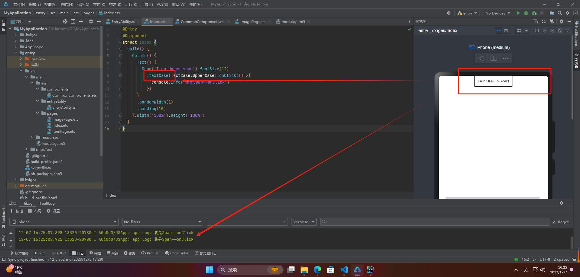
🦋2.3 textCase
textCase设置文字一直保持大写或者小写状态
@Entry
@Component
struct Index {
  build() {
    Column() {
      Text() {
        Span('I am Upper-span').fontSize(12)
          .textCase(TextCase.UpperCase).onClick(()=>{
            console.info('我是Span——onClick')
          })
      }
      .borderWidth(1)
      .padding(10)
    }.width('100%').height('100%')
  }
}
🔎3.自定义文本样式
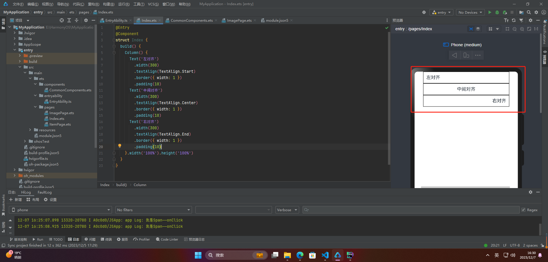
🦋3.1 textAlign
textAlign属性用于设置文本在其容器中的水平对齐方式。
@Entry
@Component
struct Index {
  build() {
    Column() {
      Text('左对齐')
        .width(300)
        .textAlign(TextAlign.Start)
        .border({ width: 1 })
        .padding(10)
      Text('中间对齐')
        .width(300)
        .textAlign(TextAlign.Center)
        .border({ width: 1 })
        .padding(10)
      Text('右对齐')
        .width(300)
        .textAlign(TextAlign.End)
        .border({ width: 1 })
        .padding(10)
    }.width('100%').height('100%')
  }
}
🦋3.2 textOverflow
textOverflow属性是添加的一个文本溢出属性,用于标识当元素的文本溢出其指定大小的容器时如何处理。textOverflow需配合maxLines一起使用(默认情况下文本自动折行)
@Entry
@Component
struct Index {
  build() {
    Column() {
      Text('This is the setting of textOverflow to Clip text content This is the setting of textOverflow to None text content. This is the setting of textOverflow to Clip text content This is the setting of textOverflow to None text content.')
        .width(250)
        .textOverflow({ overflow: TextOverflow.None })
        .maxLines(1)
        .fontSize(12)
        .border({ width: 1 }).padding(10)
      Text('我是超长文本,超出的部分显示省略号。I am an extra long text, with ellipses displayed for any excess。')
        .width(250)
        .textOverflow({ overflow: TextOverflow.Ellipsis })
        .maxLines(1)
        .fontSize(12)
        .border({ width: 1 }).padding(10)
    }.width('100%').height('100%')
  }
}

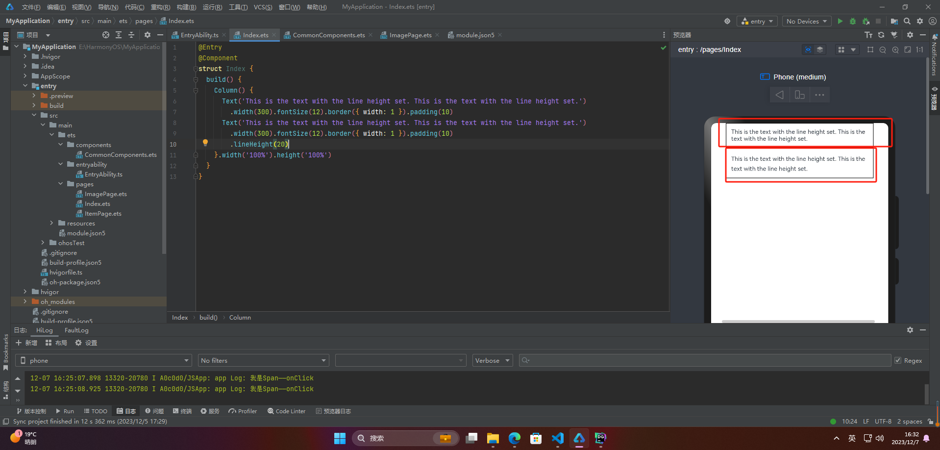
🦋3.3 lineHeight
lineHeight属性用于设置行高,即每行文本的高度。它可以用于任何元素,包括块级元素、行内元素和表格单元
@Entry
@Component
struct Index {
  build() {
    Column() {
      Text('This is the text with the line height set. This is the text with the line height set.')
        .width(300).fontSize(12).border({ width: 1 }).padding(10)
      Text('This is the text with the line height set. This is the text with the line height set.')
        .width(300).fontSize(12).border({ width: 1 }).padding(10)
        .lineHeight(20)
    }.width('100%').height('100%')
  }
}
🦋3.4 decoration
decoration属性设置文本装饰线样式及其颜色,前面span介绍过就不介绍了
@Entry
@Component
struct Index {
  build() {
    Column() {
      Text('This is the text')
        .decoration({
          type: TextDecorationType.LineThrough,
          color: Color.Red
        })
        .borderWidth(1).padding(10).margin(5)
      Text('This is the text')
        .decoration({
          type: TextDecorationType.Overline,
          color: Color.Red
        })
        .borderWidth(1).padding(10).margin(5)
      Text('This is the text')
        .decoration({
          type: TextDecorationType.Underline,
          color: Color.Red
        })
        .borderWidth(1).padding(10).margin(5)
    }.width('100%').height('100%')
  }
}

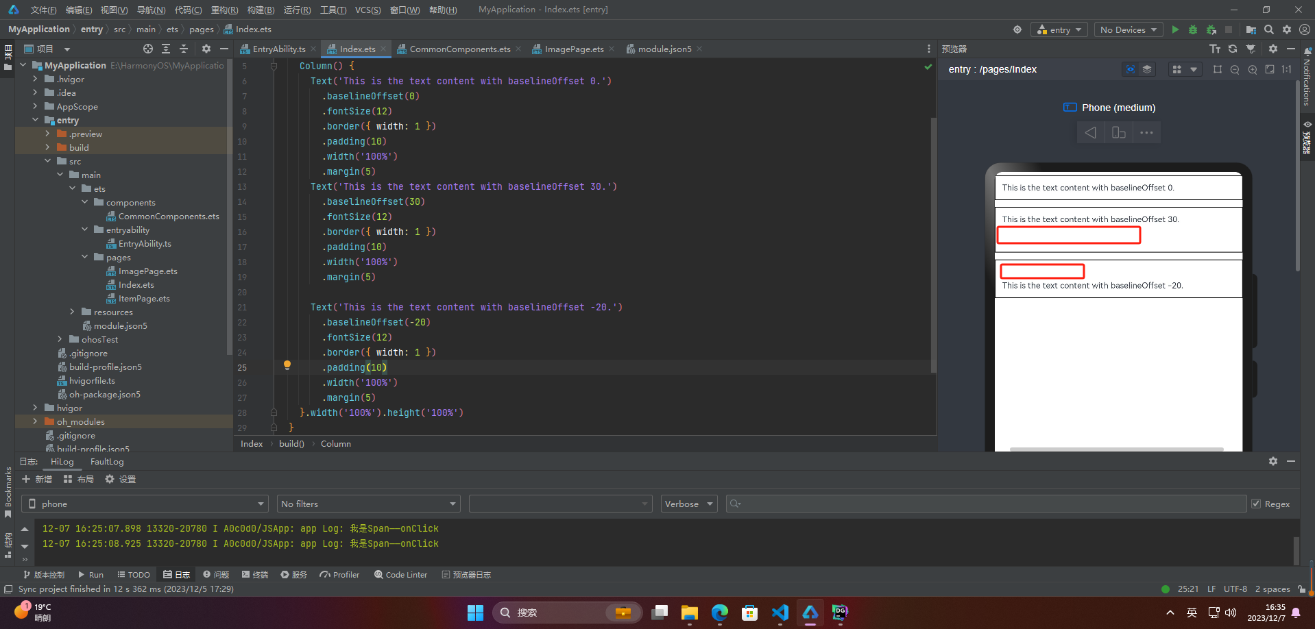
🦋3.5 baselineOffset
baselineOffset属性是用于控制行内元素基线位置的属性。它可以将元素相对于其父元素的基线位置向上或向下移动指定的距离,以满足垂直对齐的需求。该属性接受长度或百分比值作为参数。正值会将元素向上移动,负值会将元素向下移动。当使用百分比值时,该值会相对于元素自身的 fontSize 计算。
@Entry
@Component
struct Index {
  build() {
    Column() {
      Text('This is the text content with baselineOffset 0.')
        .baselineOffset(0)
        .fontSize(12)
        .border({ width: 1 })
        .padding(10)
        .width('100%')
        .margin(5)
      Text('This is the text content with baselineOffset 30.')
        .baselineOffset(30)
        .fontSize(12)
        .border({ width: 1 })
        .padding(10)
        .width('100%')
        .margin(5)

      Text('This is the text content with baselineOffset -20.')
        .baselineOffset(-20)
        .fontSize(12)
        .border({ width: 1 })
        .padding(10)
        .width('100%')
        .margin(5)
    }.width('100%').height('100%')
  }
}
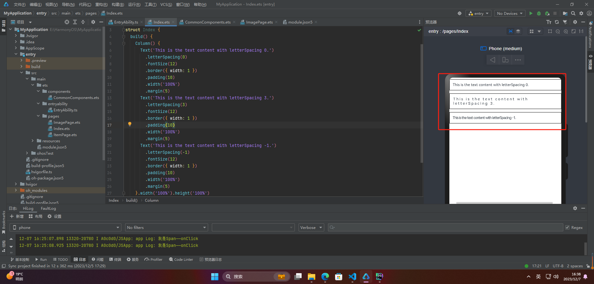
🦋3.6 letterSpacing
letterSpacing属性用于设置文本中字母之间的间距。它可以接受一个值,这个值可以是小于或大于0的数字,也可以是正负百分比数值。正值会增加字符之间的距离,而负值则会减小它们之间的距离。如果没有使用该属性,字母之间的默认间距将由系统决定。
@Entry
@Component
struct Index {
  build() {
    Column() {
      Text('This is the text content with letterSpacing 0.')
        .letterSpacing(0)
        .fontSize(12)
        .border({ width: 1 })
        .padding(10)
        .width('100%')
        .margin(5)
      Text('This is the text content with letterSpacing 3.')
        .letterSpacing(3)
        .fontSize(12)
        .border({ width: 1 })
        .padding(10)
        .width('100%')
        .margin(5)
      Text('This is the text content with letterSpacing -1.')
        .letterSpacing(-1)
        .fontSize(12)
        .border({ width: 1 })
        .padding(10)
        .width('100%')
        .margin(5)
    }.width('100%').height('100%')
  }
}
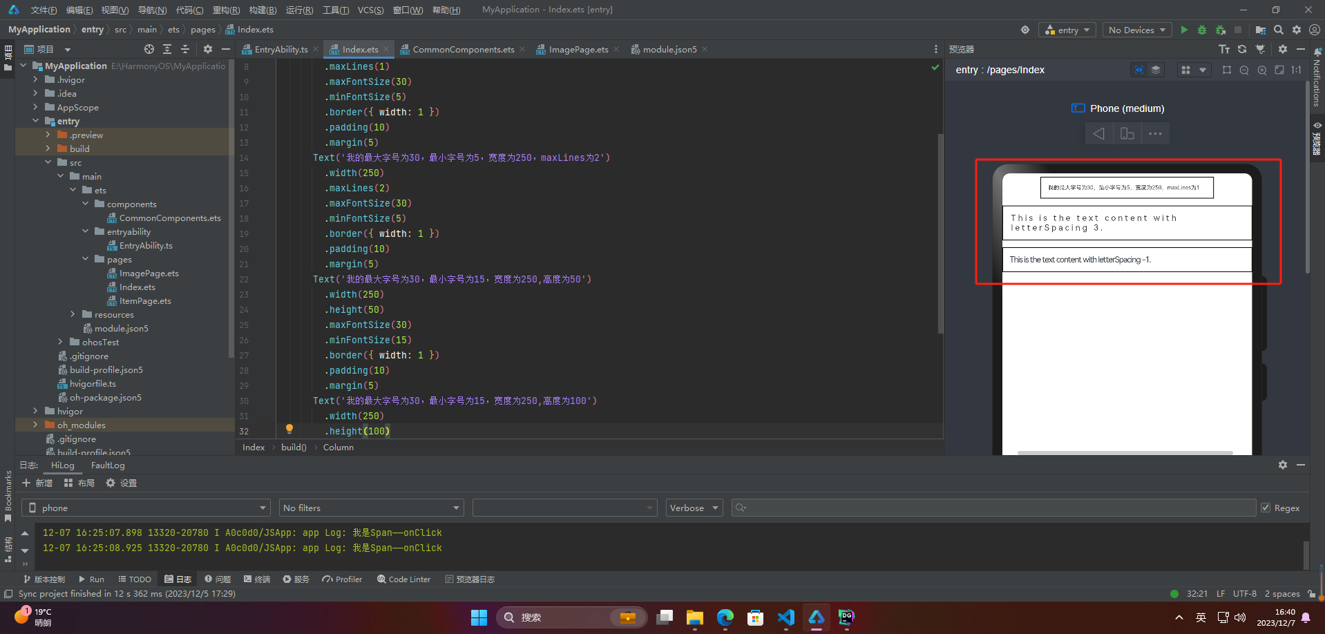
🦋3.7 minFontSize与maxFontSize
minFontSize和maxFontSize是用于设置文本字体大小的属性。这两个属性指定了一个范围,使得当文本的尺寸调整时,字体大小的最小值不会小于minFontSize,最大值不会大于maxFontSize。这些属性通常与viewport相关,因为文本大小可能需要在不同的屏幕尺寸和分辨率下进行调整。
@Entry
@Component
struct Index {
  build() {
    Column() {
      Text('我的最大字号为30,最小字号为5,宽度为250,maxLines为1')
        .width(250)
        .maxLines(1)
        .maxFontSize(30)
        .minFontSize(5)
        .border({ width: 1 })
        .padding(10)
        .margin(5)
      Text('我的最大字号为30,最小字号为5,宽度为250,maxLines为2')
        .width(250)
        .maxLines(2)
        .maxFontSize(30)
        .minFontSize(5)
        .border({ width: 1 })
        .padding(10)
        .margin(5)
      Text('我的最大字号为30,最小字号为15,宽度为250,高度为50')
        .width(250)
        .height(50)
        .maxFontSize(30)
        .minFontSize(15)
        .border({ width: 1 })
        .padding(10)
        .margin(5)
      Text('我的最大字号为30,最小字号为15,宽度为250,高度为100')
        .width(250)
        .height(100)
        .maxFontSize(30)
        .minFontSize(15)
        .border({ width: 1 })
        .padding(10)
        .margin(5)
    }.width('100%').height('100%')
  }
}
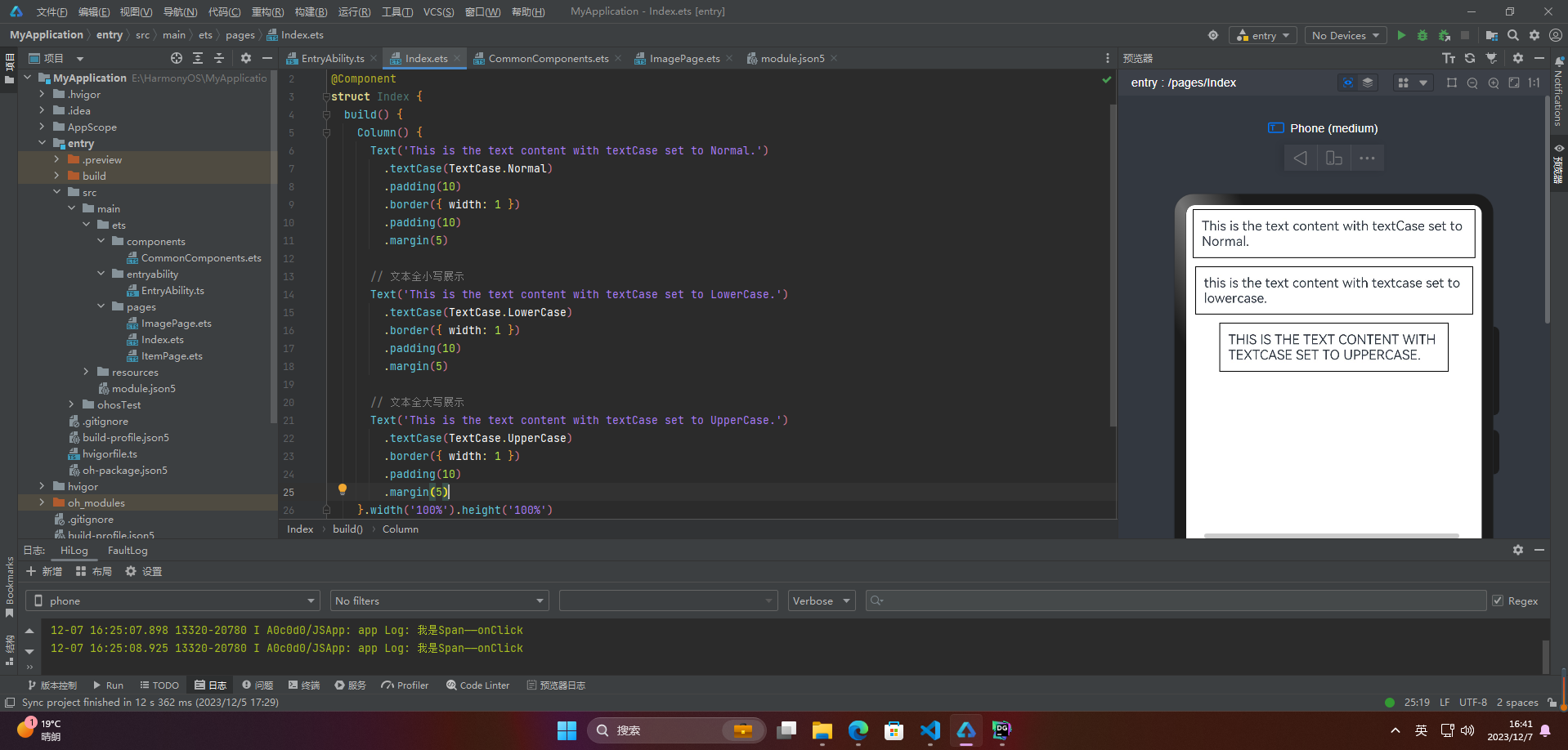
🦋3.8 textCase
同span
@Entry
@Component
struct Index {
  build() {
    Column() {
      Text('This is the text content with textCase set to Normal.')
        .textCase(TextCase.Normal)
        .padding(10)
        .border({ width: 1 })
        .padding(10)
        .margin(5)

      // 文本全小写展示
      Text('This is the text content with textCase set to LowerCase.')
        .textCase(TextCase.LowerCase)
        .border({ width: 1 })
        .padding(10)
        .margin(5)

      // 文本全大写展示
      Text('This is the text content with textCase set to UpperCase.')
        .textCase(TextCase.UpperCase)
        .border({ width: 1 })
        .padding(10)
        .margin(5)
    }.width('100%').height('100%')
  }
}
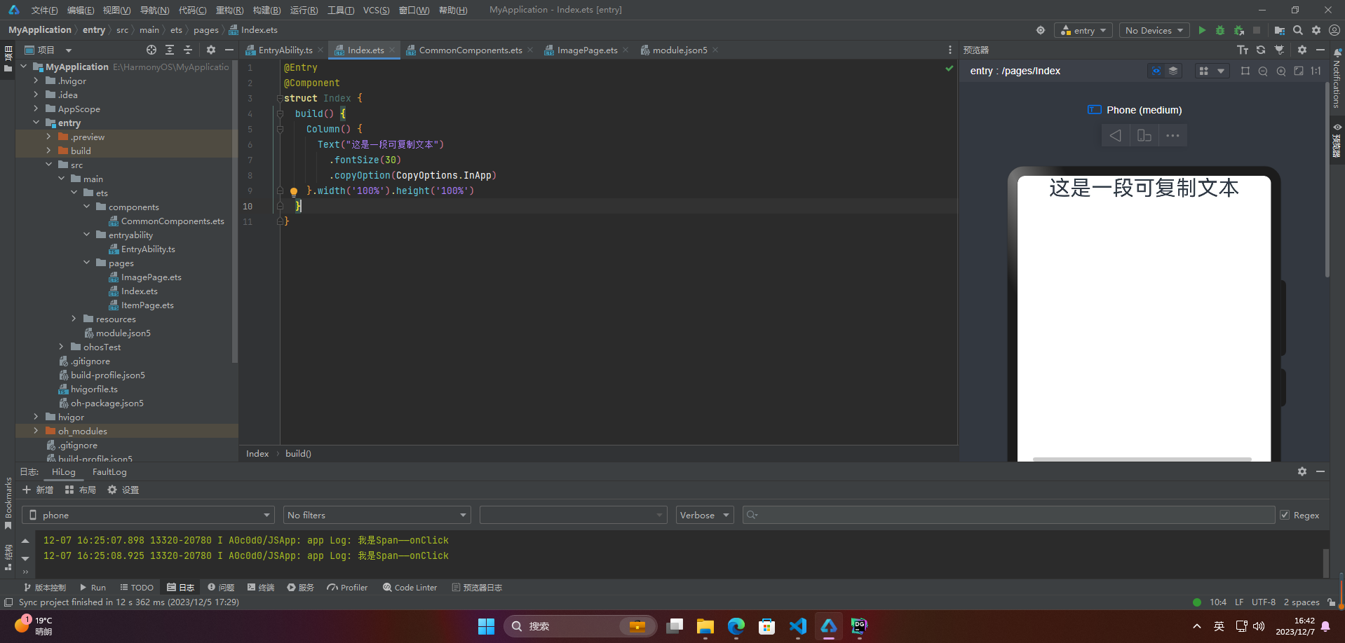
🦋3.9 copyOption
copyOption属性设置文本是否可复制粘贴
@Entry
@Component
struct Index {
  build() {
    Column() {
      Text("这是一段可复制文本")
        .fontSize(30)
        .copyOption(CopyOptions.InApp)
    }.width('100%').height('100%')
  }
}
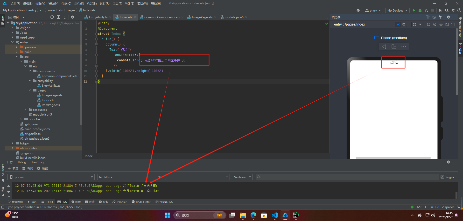
🔎4.添加事件
@Entry
@Component
struct Index {
  build() {
    Column() {
      Text('点我')
        .onClick(()=>{
          console.info('我是Text的点击响应事件');
        })
    }.width('100%').height('100%')
  }
}
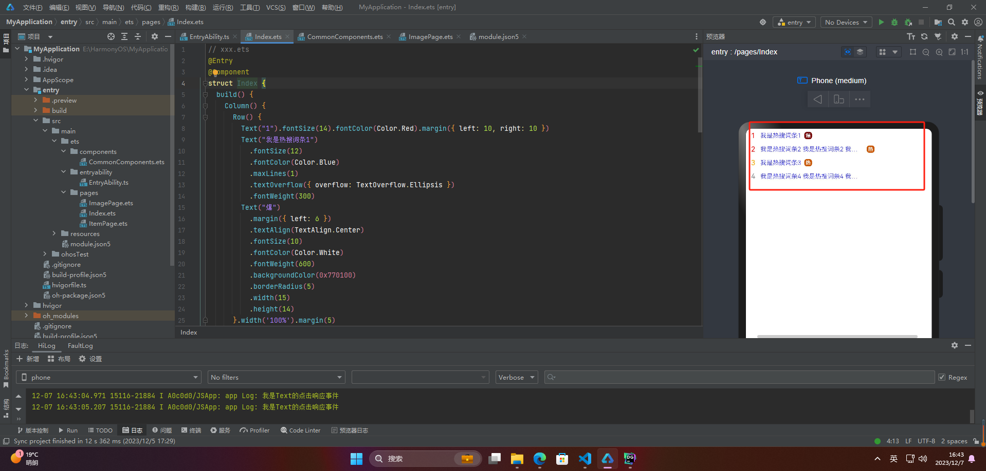
🔎5.案例
热搜词条是指在某一特定时间内,搜索引擎或网站等平台上,被用户频繁搜索的关键词。通常这些关键词涵盖当下流行的话题、热门事件、名人八卦、产品销售等各方面,反映了当前社会热点和大众关注度的变化。热搜词条可以帮助我们了解当前社会舆论的走向、人们关注的焦点以及市场需求等。
案例:
// xxx.ets
@Entry
@Component
struct Index {
  build() {
    Column() {
      Row() {
        Text("1").fontSize(14).fontColor(Color.Red).margin({ left: 10, right: 10 })
        Text("我是热搜词条1")
          .fontSize(12)
          .fontColor(Color.Blue)
          .maxLines(1)
          .textOverflow({ overflow: TextOverflow.Ellipsis })
          .fontWeight(300)
        Text("爆")
          .margin({ left: 6 })
          .textAlign(TextAlign.Center)
          .fontSize(10)
          .fontColor(Color.White)
          .fontWeight(600)
          .backgroundColor(0x770100)
          .borderRadius(5)
          .width(15)
          .height(14)
      }.width('100%').margin(5)

      Row() {
        Text("2").fontSize(14).fontColor(Color.Red).margin({ left: 10, right: 10 })
        Text("我是热搜词条2 我是热搜词条2 我是热搜词条2 我是热搜词条2 我是热搜词条2")
          .fontSize(12)
          .fontColor(Color.Blue)
          .fontWeight(300)
          .constraintSize({ maxWidth: 200 })
          .maxLines(1)
          .textOverflow({ overflow: TextOverflow.Ellipsis })
        Text("热")
          .margin({ left: 6 })
          .textAlign(TextAlign.Center)
          .fontSize(10)
          .fontColor(Color.White)
          .fontWeight(600)
          .backgroundColor(0xCC5500)
          .borderRadius(5)
          .width(15)
          .height(14)
      }.width('100%').margin(5)

      Row() {
        Text("3").fontSize(14).fontColor(Color.Orange).margin({ left: 10, right: 10 })
        Text("我是热搜词条3")
          .fontSize(12)
          .fontColor(Color.Blue)
          .fontWeight(300)
          .maxLines(1)
          .constraintSize({ maxWidth: 200 })
          .textOverflow({ overflow: TextOverflow.Ellipsis })
        Text("热")
          .margin({ left: 6 })
          .textAlign(TextAlign.Center)
          .fontSize(10)
          .fontColor(Color.White)
          .fontWeight(600)
          .backgroundColor(0xCC5500)
          .borderRadius(5)
          .width(15)
          .height(14)
      }.width('100%').margin(5)

      Row() {
        Text("4").fontSize(14).fontColor(Color.Grey).margin({ left: 10, right: 10 })
        Text("我是热搜词条4 我是热搜词条4 我是热搜词条4 我是热搜词条4 我是热搜词条4")
          .fontSize(12)
          .fontColor(Color.Blue)
          .fontWeight(300)
          .constraintSize({ maxWidth: 200 })
          .maxLines(1)
          .textOverflow({ overflow: TextOverflow.Ellipsis })
      }.width('100%').margin(5)
    }.width('100%')
  }
}
最后
有很多小伙伴不知道学习哪些鸿蒙开发技术?不知道需要重点掌握哪些鸿蒙应用开发知识点?而且学习时频繁踩坑,最终浪费大量时间。所以有一份实用的鸿蒙(HarmonyOS NEXT)资料用来跟着学习是非常有必要的。
这份鸿蒙(HarmonyOS NEXT)资料包含了鸿蒙开发必掌握的核心知识要点,
内容包含了:(ArkTS、ArkUI开发组件、Stage模型、多端部署、分布式应用开发、音频、视频、WebGL、OpenHarmony多媒体技术、Napi组件、OpenHarmony内核、OpenHarmony南向开发、鸿蒙项目实战等等)鸿蒙(HarmonyOS NEXT)技术知识点。
希望这一份鸿蒙学习资料能够给大家带来帮助,有需要的小伙伴自行领取,限时开源,先到先得~无套路领取!!
如果你是一名有经验的资深Android移动开发、Java开发、前端开发、对鸿蒙感兴趣以及转行人员,可以直接领取这份资料
获取这份完整版高清学习路线,请点击关注 → 公众皓 :【蜀道衫】即可领取
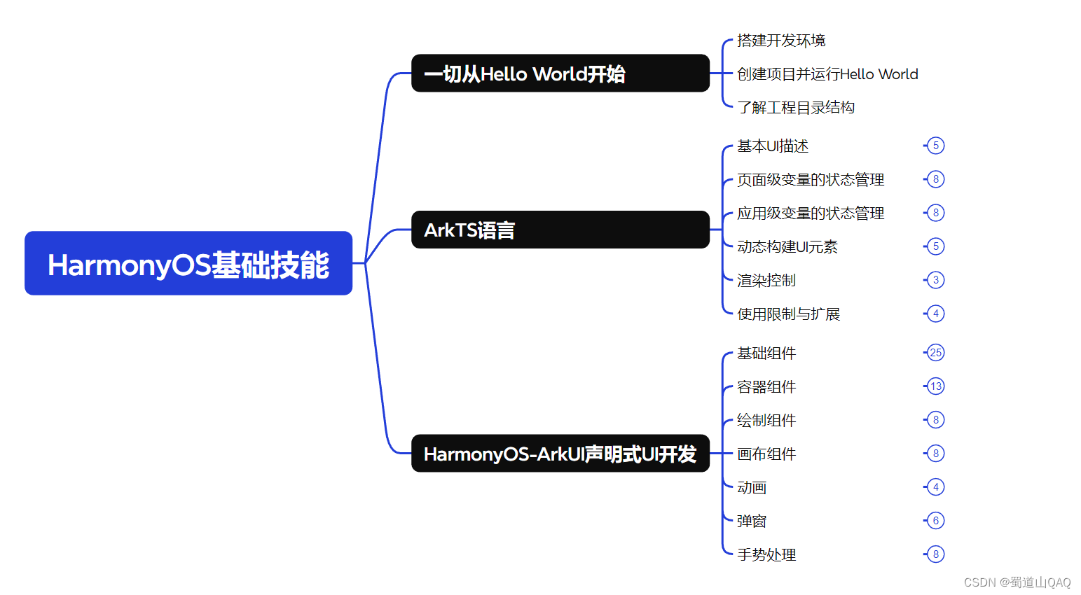
鸿蒙(HarmonyOS NEXT)最新学习路线

-
HarmonOS基础技能
- HarmonOS就业必备技能
- HarmonOS多媒体技术
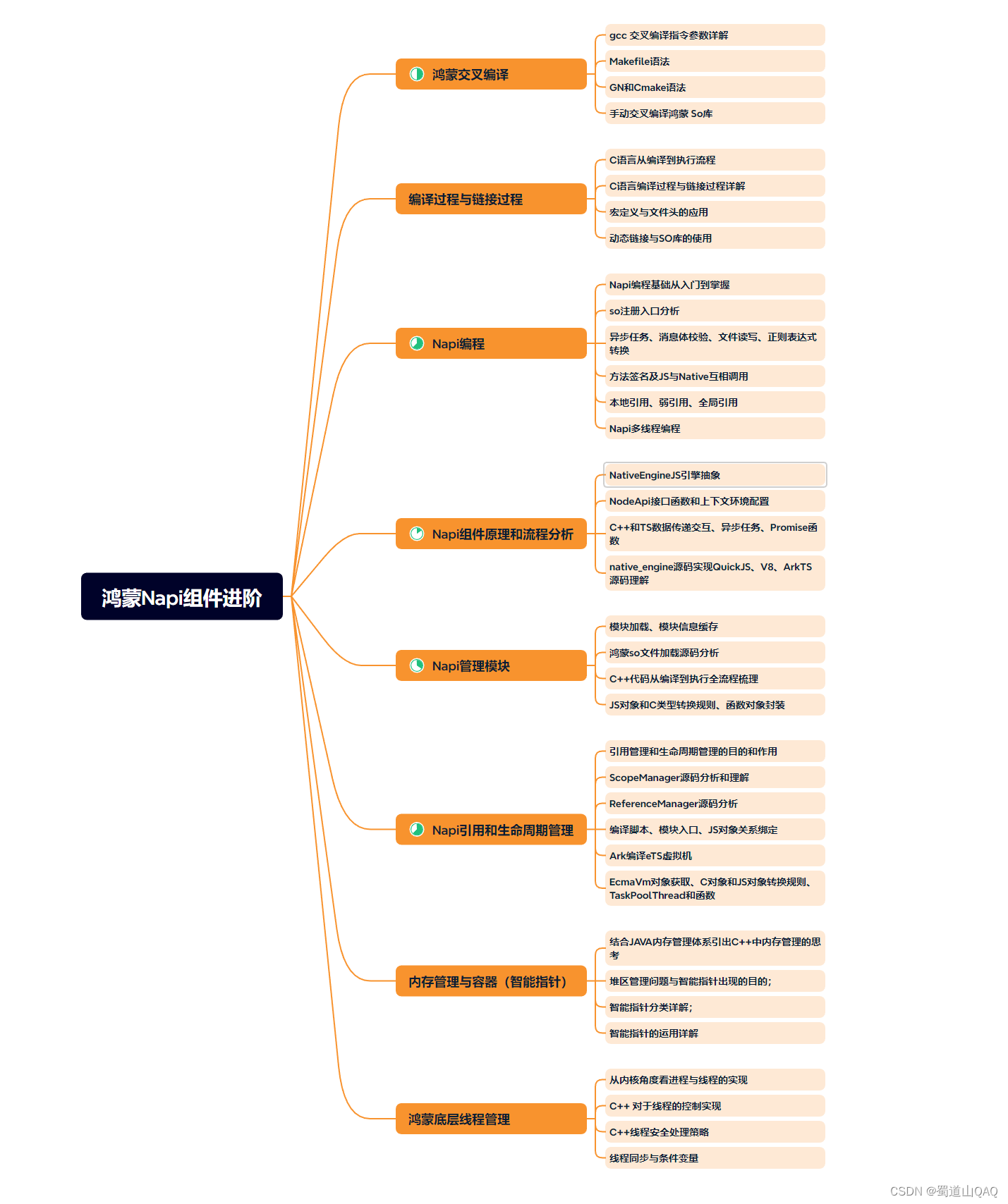
- 鸿蒙NaPi组件进阶
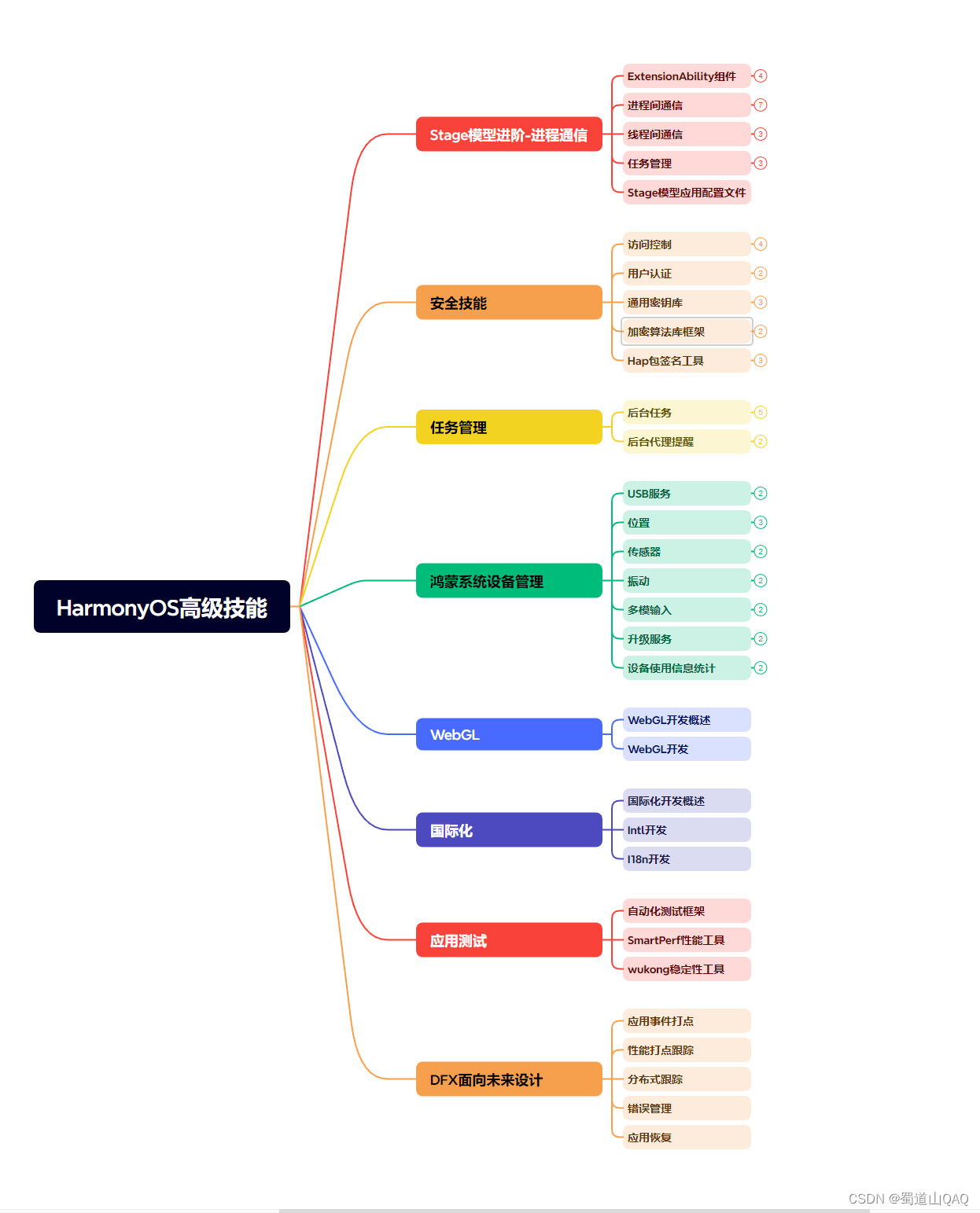
- HarmonOS高级技能
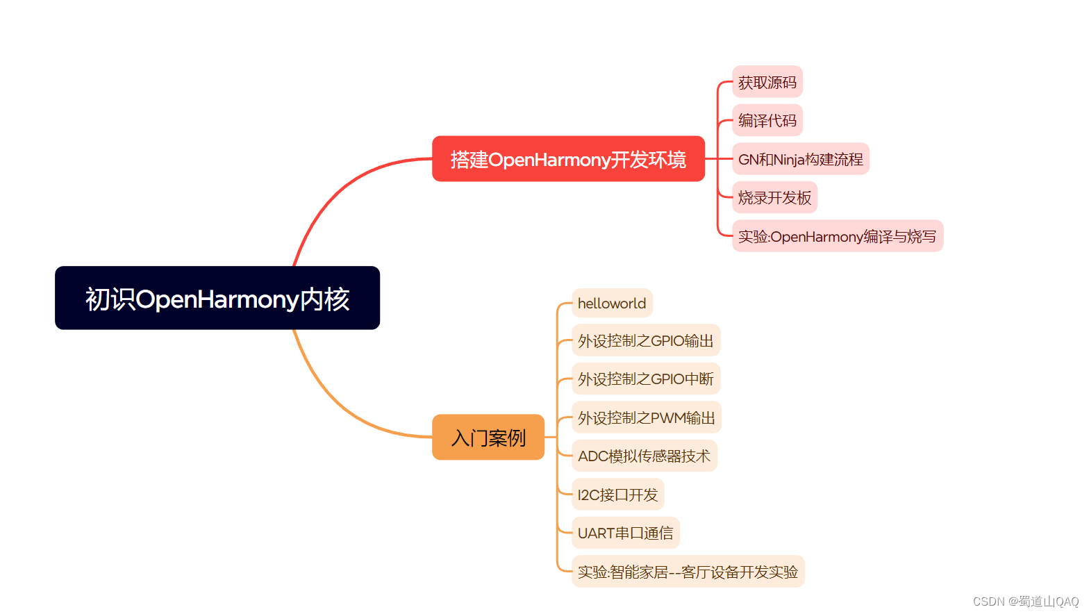
- 初识HarmonOS内核
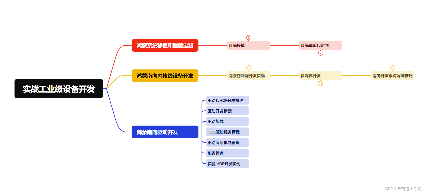
- 实战就业级设备开发
有了路线图,怎么能没有学习资料呢,小编也准备了一份联合鸿蒙官方发布笔记整理收纳的一套系统性的鸿蒙(OpenHarmony )学习手册(共计1236页)与鸿蒙(OpenHarmony )开发入门教学视频,内容包含:ArkTS、ArkUI、Web开发、应用模型、资源分类…等知识点。
获取以上完整版高清学习路线, 请点击关注 → 公众皓 :【蜀道衫】即可领取
《鸿蒙 (OpenHarmony)开发入门教学视频》
《鸿蒙生态应用开发V2.0白皮书》
《鸿蒙 (OpenHarmony)开发基础到实战手册》
OpenHarmony北向、南向开发环境搭建
《鸿蒙开发基础》
- ArkTS语言
- 安装DevEco Studio
- 运用你的第一个ArkTS应用
- ArkUI声明式UI开发
- .……
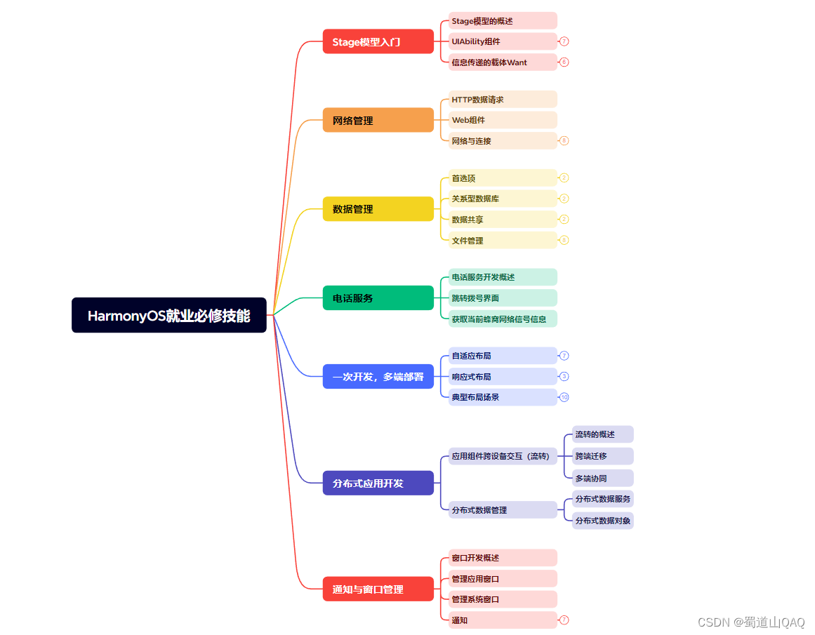
《鸿蒙开发进阶》
- Stage模型入门
- 网络管理
- 数据管理
- 电话服务
- 分布式应用开发
- 通知与窗口管理
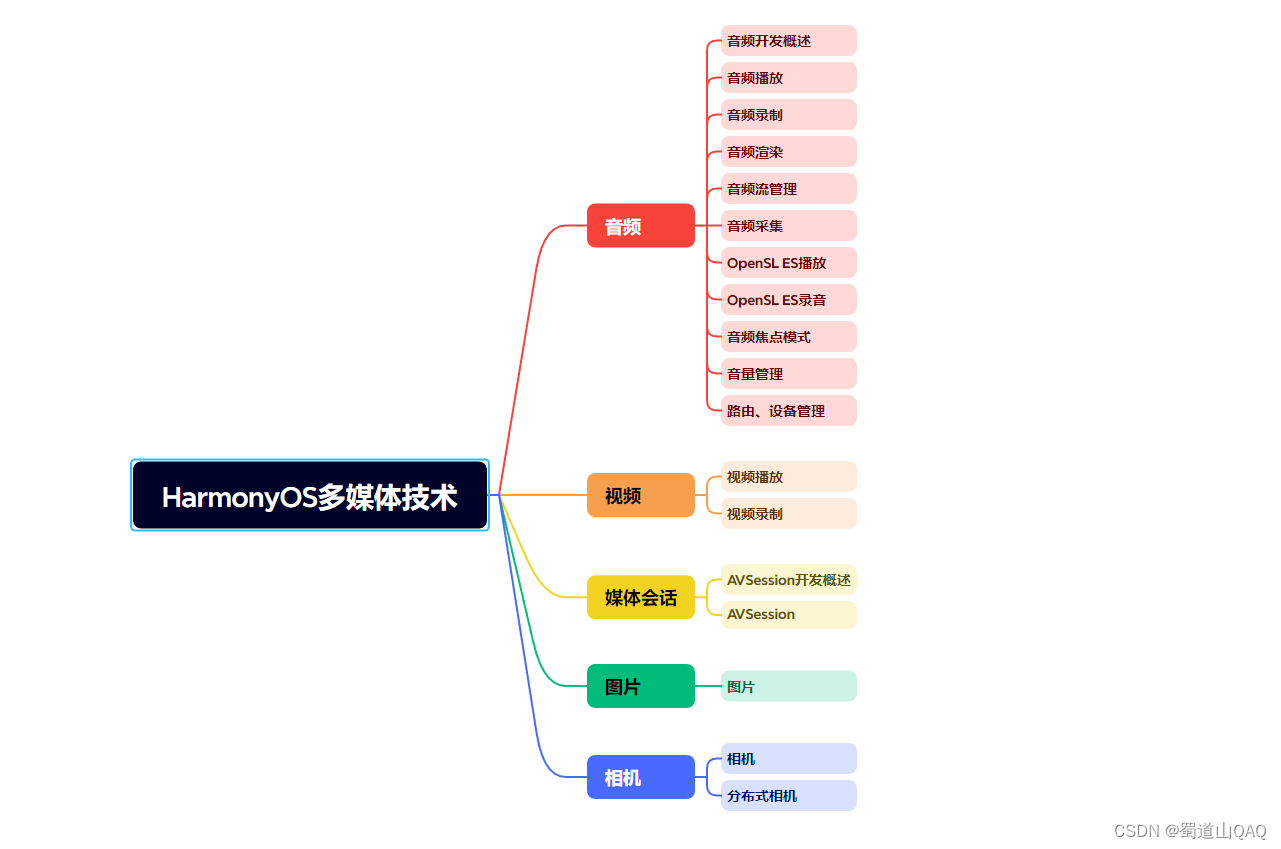
- 多媒体技术
- 安全技能
- 任务管理
- WebGL
- 国际化开发
- 应用测试
- DFX面向未来设计
- 鸿蒙系统移植和裁剪定制
- ……
《鸿蒙进阶实战》
- ArkTS实践
- UIAbility应用
- 网络案例
- ……
总结
总的来说,华为鸿蒙不再兼容安卓,对中年程序员来说是一个挑战,也是一个机会。只有积极应对变化,不断学习和提升自己,他们才能在这个变革的时代中立于不败之地。
看完三件事❤️
- 如果你觉得这篇内容对你还蛮有帮助,我想邀请你帮我三个小忙:
- 点赞,转发,有你们的 『点赞和评论』,才是我创造的动力。
- 关注作者公众号 『 蜀道衫 』,不定期分享原创知识。
- 关注后回复【666】扫码即可获取学习资料包。
- 同时可以期待后续文章ing🚀。


 被折叠的 条评论
为什么被折叠?
被折叠的 条评论
为什么被折叠?
 到【灌水乐园】发言


