


CSS是啥
- CSS 指的是层叠样式表* (Cascading Style Sheets)
- CSS 描述了如何在屏幕、纸张或其他媒体上显示 HTML 元素
- CSS 节省了大量工作。它可以同时控制多张网页的布局
- 外部样式表存储在 CSS 文件中
*:也称级联样式表。
3种CSS导入方式
行内样式表(结构与样式不分离)
<!DOCTYPE html>
<html lang="en">
<head>
<meta charset="UTF-8">
<meta http-equiv="X-UA-Compatible" content="IE=edge">
<meta name="viewport" content="width=device-width, initial-scale=1.0">
<title>Document</title>
</head>
<body>
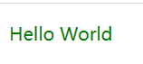
<p style="color: red;">Hello World</p>
</body>
</html>内部样式表(结构与样式不完全分离)
<!DOCTYPE html>
<html lang="en">
<head>
    <meta charset="UTF-8">
    <title>Title</title>
    <!--规范,<style>可以编写css的代码,每一个声明,最好使用分号结尾
    语法:
        选择器 {
            声明1;
            声明2;
            声明3;
        }
    -->
    <style>
        p {
            color: red;
        }
    </style>
</head>
<body>
<p>Hello World</p>
</body>
</html>
外部样式表(结构与样式完全分离)
index.html
<!DOCTYPE html>
<html lang="en">
<head>
    <meta charset="UTF-8">
    <title>Title</title>

    <link rel="stylesheet" href="css/style.css">
</head>
<body>
<p>Hello World</p>
</body>
</html>
style.css
p {
    color: red;
}
就近原则
当标签存在多种样式表时,最终呈现出来的样式取决于离标签最近的那个样式表。
index.html
<!DOCTYPE html>
<html lang="en">

<head>
    <meta charset="UTF-8">
    <meta http-equiv="X-UA-Compatible" content="IE=edge">
    <meta name="viewport" content="width=device-width, initial-scale=1.0">
    <title>Document</title>

    <!-- 外部样式表 -->
    <link rel="stylesheet" href="css/style.css">

    <!-- 内部样式表 -->
    <style>
        p {
            color: blue;
        }
    </style>

</head>

<body>
    <!-- 行内样式表 -->
    <p style="color: green;">Hello World</p>
</body>

</html>
style.css
p {
    color: red;
}
CSS优势
- 内容和样式分离,so建议使用独立于html的css文件
- 网页结构表现统一
- 可以实现复用
- 样式十分的丰富
- 利用SEO,容易被搜索引擎收录!
SEO(Search Engine Optimization):汉译为搜索引擎优化。是一种方式:利用搜索引擎的规则提高网站在有关搜索引擎内的自然排名。目的是让其在行业内占据领先地位,获得品牌收益。很大程度上是网站经营者的一种商业行为,将自己或自己公司的排名前移。
3种基本选择器
标签选择器
选择到页面上所有的这个标签的元素。
类选择器
<!DOCTYPE html>
<html lang="en">
<head>
    <meta charset="UTF-8">
    <meta http-equiv="X-UA-Compatible" content="IE=edge">
    <meta name="viewport" content="width=device-width, initial-scale=1.0">
    <title>Document</title>
    <style>
        /* 类选择器
        格式:.class的名称{...}
        好处:实现标签归类,复用性高
        */
        .title {
            color: red;
        }
        .par {
            color: green;
        }
    </style>
</head>
<body>
    <h1 class="title">我是标题1</h1>
    <h2 class="title">我是标题2</h2>
    <p class="par">我是段落</p>
</body>
</html>
id选择器
<!DOCTYPE html>
<html lang="en">
<head>
    <meta charset="UTF-8">
    <meta http-equiv="X-UA-Compatible" content="IE=edge">
    <meta name="viewport" content="width=device-width, initial-scale=1.0">
    <title>Document</title>
    <style>
        /* id选择器:
        格式:#id名称{...}
        特点:只能选择一个标签
        */
        #title {
            color: red;
        }
    </style>
</head>
<body>
    <h1 id="title">标题1</h1>
</body>
</html>
优先级
<!DOCTYPE html>
<html lang="en">

<head>
    <meta charset="UTF-8">
    <meta http-equiv="X-UA-Compatible" content="IE=edge">
    <meta name="viewport" content="width=device-width, initial-scale=1.0">
    <title>Document</title>
    <style>
        /* 不遵循就近原则
        优先级:id选择器>类选择器>标签选择器
        */
        #title {
            color: red;
        }

        .title {
            color: green;
        }

        h1 {
            color: blue;
        }
    </style>
</head>

<body>
    <h1 id="title" class="title">标题1</h1>
</body>

</html>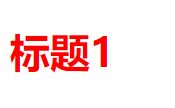
并集选择器
<style>
        div,
        p {
            font-size: 20px;
            color: red;
        }
</style>
<div>我是div</div>
<p>我是p</p>层次选择器
- 后代选择器:选择所有后代
- 子选择器:选择后代中的第一代
- 相邻兄弟选择器:选择一个弟弟
- 通用选择器:选择所有弟弟
<body>
    <p>p1</p>
    <p>p2</p>
    <ul>
        <li>
            <p>p3</p>
        </li>

        <li>
            <p>p4</p>
        </li>
    </ul>
    <p>p5</p>

</body>
后代选择器
<style>
        /* 后代选择器:选择某个元素后面所有的元素。选择p1-p5 */
        body p {
            background-color: red;
        }
</style>
子选择器
<style>
        /* 子选择器:选择某个元素后面一代的元素。选择p1、p2、p5*/
        body>p {
            background-color: red;
        }
</style>
相邻兄弟选择器
<style>
        /* 相邻兄弟选择器:选择当前选中元素的同辈中的一个弟弟元素。选择p2*/
        .active {
            background-color: green;
        }

        .active+p {
            background-color: red;
        }
</style>
<p class="active">p1</p>
<p>p2</p>
<ul>
<li>
<p>p3</p>
</li>
<li>
<p>p4</p>
</li>
</ul>
<p>p5</p>通用选择器
<style>
        /* 通用选择器:选择当前选中元素的同辈中的所有弟弟元素。选中p2、p5*/
        .active {
            background-color: green;
        }

        .active~p {
            background-color: red;
        }
</style>
<p class="active">p1</p>
<p>p2</p>
<ul>
<li>
<p>p3</p>
</li>
<li>
<p>p4</p>
</li>
</ul>
<p>p5</p>结构伪类选择器
<style>
        /* 选中ul后代的第一个元素li1 */
        ul li:first-child {
            color: blue;
        }

        /* 选中li3后代的最后一个元素li3 */
        ul li:last-child {
            color: green;
        }
</style>
<ul>
<li>li1</li>
<li>li2</li>
<li>li3</li>
</ul>属性选择器
<style>
        /* 属性选择器:根据元素的属性及属性值来选择元素 */
        /* 选择包含title属性的所有元素。选择a2、h1、h2 */
        *[title] {
            color: red;
        }

        /* 选择包含title属性且属性值为"h2标签"的所有元素。选择h2 */
        *[title="h2标签"] {
            font-weight: 400;
        }

        /*选择同时有 href 和 title 属性的a标签。选择a2*/
        a[href][title] {
            display: block;
        }
</style>
<body>
<a href="#">a1</a>
<a href="#" title="a标签">a2</a>
<h1 title="h1标签">h1</h1>
<h2 title="h2标签">h2</h2>
</body>Emmet语法
HTML:
- 生成标签直接输入标签名按tab键即可比如div 然后tab键,就可以生成<div> </div>
- 如果想要生成多个相同标签加上*就可以了比如div*3 就可以快速生成3个div
- 如果有父子级关系的标签,可以用>比如ul> li就可以了
- 如果有兄弟关系的标签,用+就可以了比如div+p
- 如果生成带有类名或者id名字的div标签,直接写.demo 或者#two tab 键就可以了
- 如果生成的div类名是有顺序的,可以用自增符号$
CSS:
- 比如w200按tab可以生成width: 200px;
- 比如Ih26按tab 可以生成line-height: 26px。
字体样式
<style>
        /*
        font-family:字体
        font-style:字体样式(normal,italic斜体,oblique倾斜)
        font-size:字体大小
        font-weight:字体粗细(nomal,bold/bolder) */
        body {
            font-family: 楷体;
            font-style: italic;
        }

        h1 {
            font-size: 50px;
        }

        .p1 {
            font-weight: bolder;
        }
</style>
<body>
<h1>微妙时刻</h1>
<p class="p1">12211221221121212212</p>
<p>23232332323223233232323</p>
<p>5565666565665566556565</p>
</body>简体字体属性
font 属性是以下属性的简写属性:
- font-style
- font-weight
- font-size/line-height
- font-family
注意:font-size 和 font-family 的值是必需的。如果缺少其他值之一,则会使用其默认值。
  body {
            font: italic bold 12px/30px 楷体;
        }
文本样式
<style>
        /* color:颜色(颜色名,十六进制,rgb,rgba)
           text-indent:首行缩进
           text-align:文本对齐(center,left,right)
           line-height:行高(盒子高度=行高,单行文字上下居中)
           text-decoration:装饰(none,underline,line-through,overline)
           vertical-align:文本图片水平对齐
        */
        p {
            color: red;
            text-indent: 2em;
        }

        h1 {
            text-align: center;
        }

        p {
            background-color: blue;
            height: 30px;
            line-height: 30px;
        }

        img,
        span {
            text-decoration: underline;
            vertical-align: middle;
        }

        a {
            text-decoration: none;
        }
</style>
<h1>微妙时刻</h1>
<p>12121212121212121212</p>
<img src="images/1.jpg" alt="图片一">
<span>12345,上山打老虎</span>
<a href="#">123</a>文本阴影和超链接伪类
<style>
        /* 去掉a标签的下划线 */
        a {
            text-decoration: none;
        }

        /* 鼠标悬浮的状态 */
        a:hover {
            color: orange;
            font-size: 20px;
        }

        /* 鼠标按住未释放的状态 */
        a:active {
            color: #00FF00;
        }

        /* 已访问的链接 */
        a:visited {
            color: rgb(48, 144, 134);
        }

        /* text-shadow: x y blur color */
        #price {
            text-shadow: 10px 10px 1px #FF0000;
        }
</style>
<a href="#">
<img src="images/a.jpg" alt="">
</a>
<p>
<a href="#">沧浪之水</a>
</p>
<p>
<a href="#">作者:阎真</a>
</p>
<p id="price">¥30</p>列表和背景
商品栏
<body>
    <div id="nav">
        <h2 class="title">全部商品分类</h2>

        <ul>
            <li>
                <a href="#">图书</a>
                <a href="#">音像</a>
                <a href="#">数字商品</a>
            </li>
            <li>
                <a href="#">家用电器</a>
                <a href="#">手机</a>
                <a href="#">数码</a>
            </li>
            <li>
                <a href="#">电脑</a>
                <a href="#">办公</a>
            </li>
            <li>
                <a href="#">家居</a>
                <a href="#">家装</a>
                <a href="#">厨具</a>
            </li>
            <li>
                <a href="#">服饰鞋帽</a>
                <a href="#">个性化妆</a>
            </li>
            <li>
                <a href="#">礼品箱包</a>
                <a href="#">钟表</a>
                <a href="#">珠宝</a>
            </li>
            <li>
                <a href="#">食品饮料</a>
                <a href="#">保健食品</a>
            </li>
            <li>
                <a href="#">彩票</a>
                <a href="#">旅行</a>
                <a href="#">充值</a>
                <a href="#">票务</a>
            </li>
        </ul>
    </div>
</body>
#nav {
width: 300px;
background-color: #a0a0a0;
}
.title {
font-size: 20px;
font-weight: bold;
line-height: 35px;
text-indent: 2em;
/*background:背景颜色 背景图片 背景位置 背景平铺 */
background: red url("../images/down.png") 274px 10px no-repeat;
}
/* list-style:
none:去掉圆点
circle:空心圆
decimal:数字
square:正方形
*/
ul li {
/* 背景图片:background-image: url("") */
background-image: url("../images/right.png");
/* 背景平铺:background-position: x y */
background-position: 228px 1px;
/* 背景平铺:background-repeat: repeat或no-repeat或repeat-x或repeat-y
默认是平铺repeat */
background-repeat: no-repeat;
line-height: 30px;
text-indent: 1em;
list-style: none;
}
a {
text-decoration: none;
color: #000;
}
a:hover {
color: orange;
text-decoration: underline;
}盒子模型
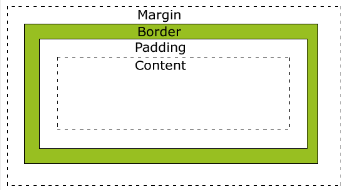
边框、外边距、内边距
<style>
        /* 清除所有标签的内外边距 */
        * {
            margin: 0;
            padding: 0;
        }

        #box {
            width: 500px;
            /* 边框:border: 粗细 样式 颜色 */
            border: 1px solid red;
            /* 外边距:
            margin-top:上外边距
            margin-bottom:下外边距
            margin-left:左外边距
            margin-right:右外边距


            简便写法:
            margin: 10px 上下左右
            margin: 10px 5px 上下 左右
            margin: 10px 5px 3px 2px 上 右 下 左
            */
            /* 居中 */
            margin: 0 auto;
        }

        h2 {
            /* 外边距:padding
            写法与margin相同
            */
            padding: 10px;
            font-size: 16px;
            background-color: #3cbda6;
            line-height: 30px;
            color: white;

        }

        form {
            background-color: rgb(31, 211, 205);
        }
</style>
<body>
<div id="box">
<h2>会员登录</h2>
<form action="">
<div>
<span>用户名:</span>
<input type="text">
</div>
<div>
<span>密码:</span>
<input type="text">
</div>
<div>
<span>邮箱:</span>
<input type="text">
</div>
</form>
</div>
</body>圆角边框及盒子阴影
<style>
        #demo1 {
            /* 画圆:
            1.给定盒子相同的高度和宽度(边长记为a)
            2.给出边框三要素(边长记为b)
            3.给出圆角边框(长度=(a+2*b)/2)
            */
            width: 100px;
            height: 100px;
            border: 10px solid red;
            /*
            简便写法与margin、padding相同
             */
            border-radius: 60px;
        }

        /*方形图片变为圆形图片,发光,居中*/
        #demo2 {
            width: 100px;
            height: 100px;
            background-image: url("images/yi.png");
            border-radius: 50%;
            background-size: cover;
            /* 盒子阴影:box-shadow: x y blur color */
            box-shadow: 100px 100px 500px yellow;
            margin: 0 auto;
        }
</style>
<body>
<div id="demo1"></div>
<div id="demo2"></div>
</body>块级元素、行内元素和行内块元素
块级元素
- 独占一行
- 宽度默认与父级相同
- 可设置宽高,margin,padding
- 注:p标签、h、dt等文字类标签内最好不要放块级元素
行内元素
- 一行内显示
- 不能设置宽高
- 默认宽度是内容宽度
- padding值只左右下有效,margin值只左右有效
行内块元素
- 一行内显示
- 可设置宽高
- 默认为本身内容宽度(高度),排列有缝隙,会因挤压而换行
display
<style>
        .nav {
            background-color: yellow;
            list-style: none;
            text-align: center;
            margin: 0;
            padding: 0;
        }

        .nav li {
            /* block: 块级元素
            inline: 行内元素
            inline-block:行内块元素
            display: none:清除元素
            */
            display: inline-block;
            font-size: 20px;
            padding: 20px;
        }
</style>
<body>
<h1>水平导航链接</h1>
<!-- 默认地,列表项是垂直显示的。在本例中,我们使用 display: inline-block 来水平地显示它们(并排)。
注意:如果您调整浏览器的大小,链接会在变得拥挤时自动换行。 -->
<ul class="nav">
<li>
<a href="#home">Home</a>
</li>
<li>
<a href="#about">About Us</a>
</li>
<li>
<a href="#clients">Our Clients</a>
</li>
<li>
<a href="#contact">Contact Us</a>
</li>
</body>浮动
网页布局的本质--用CSS来摆放盒子。把盒子摆放到相应位置。
CSS提供了三种传统布局方式:
- 普通流(标准流)
- 浮动
- 定位
网页布局第一准则:多个块级元素纵向排列找标准流,多个块级元素横向排列找浮动。
浮动特性:
- 脱标(脱离标准流)
- 浮动元素一行显示
- 浮动元素具有行内块特性
- 浮动元素经常和标准流父级搭配使用

浮动布局1
<style>
        .box {
            width: 450px;
            height: 200px;
            background-color: pink;
            margin: 0 auto;
        }

        .left {
            /* float:
            left 左浮
            right:右浮
            none:不浮动(默认)*/
            float: left;
            width: 230px;
            height: 200px;
            background-color: purple;
        }

        .right {
            float: right;
            width: 220px;
            height: 200px;
            background-color: skyblue;
        }
</style>
<div class="box">
<div class="left">左青龙</div>
<div class="right">右白虎</div>
</div>
浮动布局2
<style>
        /* ul自带margin和padding,需清除 */
        * {
            margin: 0;
            padding: 0;
        }

        .box {
            width: 1000px;
            height: 300px;
            background-color: pink;
            margin: 0 auto;
        }

        .box li {
            list-style: none;
            width: 220px;
            height: 300px;
            background-color: red;
            margin-right: 40px;
            float: left;
        }

        /* 要注意权重的问题,这里必须写.box .last(权重为20),才能层叠.box li(权重为10)的样式margin-right */
        .box .last {
            margin-right: 0;
        }
</style>
<ul class="box">
<li>1</li>
<li>2</li>
<li>3</li>
<li class="last">4</li>
</ul>
清除浮动
为什么
由于父级盒子很多情况下,不方便给高度,但是子盒子浮动又不占有位置,最后父级盒子高度为0时,就会影响下面的标准流盒子。

由于浮动元素不再占用原文档流的位置,所以它会对后面的元素排版产生影响。
清除浮动
| 属性值 | 说明 |
| left | 不允许左侧有浮动元素(清除左侧浮动的影响) |
| right | 不允许右侧有浮动元素(清除右侧浮动的影响) |
| both | 同时清除左右两侧浮动的影响 |
常用clear: both;
清除浮动的策略是:闭合浮动。
方法:
- 额外标签法
- 父元素overflow
- after伪元素
- 双伪元素
额外标签法
<style>
        .box {
            width: 800px;
            border: 1px solid blue;
            margin: 0 auto;
        }

        .damao {
            float: left;
            width: 300px;
            height: 200px;
            background-color: purple;
        }

        .ermao {
            float: left;
            width: 200px;
            height: 200px;
            background-color: pink;
        }

        #clear {
            clear: both;
        }
</style>
<div class="box">
<div class="damao">大毛</div>
<div class="ermao">二毛</div>
<div id="clear"></div>
</div>清除浮动之父元素overflow
<style>
        .box {
            /* 清除浮动 */
            overflow: hidden;
            width: 800px;
            border: 1px solid blue;
            margin: 0 auto;
        }

        .damao {
            float: left;
            width: 300px;
            height: 200px;
            background-color: purple;
        }

        .ermao {
            float: left;
            width: 200px;
            height: 200px;
            background-color: pink;
        }
</style>
<body>
<div class="box">
<div class="damao">大毛</div>
<div class="ermao">二毛</div>
</div>
</body>after伪元素
:after方式是额外标签法的升级版。也是给父元素添加

双伪元素
也是给父元素添加

定位
定位=定位模式+边偏移
定位模式
一个元素在文档中的定位方式
| 值 | 语义 |
| static | 静态定位(默认,无定位的意思) |
| relative | 相对定位 |
| absolute | 绝对定位 |
| fixed | 固定定位 |
边偏移
| 属性 | 描述 |
| top | 顶端偏移量 |
| bottom | 底部偏移量 |
| left | 左侧偏移量 |
| right | 右侧偏移量 |
相对定位
<style>
        .box1 {
            /* 相对定位:元素在移动位置的时候,是相对它原来的位置
            不脱标,继续保留原来的位置
            */
            position: relative;
            left: 100px;
            top: 100px;
            width: 200px;
            height: 200px;
            background-color: red;
        }

        .box2 {
            width: 200px;
            height: 200px;
            background-color: pink;
        }
</style>
<div class="box1"></div>
<div class="box2"></div>绝对定位
 <style>
        /* 如果没有祖先元素或者祖先元素没有定位,则以浏览器为准定位( Document文档)。
           而且绝对定位不再占有原先的位置。( 脱标)*/
        .father {
            width: 500px;
            height: 500px;
            background-color: skyblue;
        }

        .son {
            position: absolute;
            top: 100px;
            right: 100px;
            width: 200px;
            height: 200px;
            background-color: red;
        }
</style>
<style>
/* 如果祖先元素有定位(相对、绝对、固定定位),
则以最近一级的有定位祖先元素为参考点移动位置。
*/
.father {
position: relative;
width: 500px;
height: 500px;
background-color: skyblue;
}
.son {
position: absolute;
top: 100px;
right: 100px;
width: 200px;
height: 200px;
background-color: red;
}
</style><div class="father">
<div class="son"></div>
</div>固定定位
 <style>
        /* 1.以浏览器的可视窗口为参照点移动元素。
            ●跟父元素没有任何关系
            ●不随滚动条滚动。
            2.固定定位不在占有原先的位置。
            固定定位也是脱标的,其实固定定位也可以看做是-种特殊的绝对定位。
        */
        .pic {
            position: fixed;
            top: 100px;
            left: 100px;
        }
</style>
<div class="pic">
        <img src="images/yi.png" alt="">
</div>
<p>我是yi</p>
<p>我是yi</p>
<p>我是yi</p>
<p>我是yi</p>
<p>我是yi</p>
z-index
<style>
img {
  position: absolute;
  left: 0px;
  top: 0px;
  z-index: -1;
}
</style>
<h1>这是标题</h1>
<img src="/i/logo/w3logo-1.png" width="188" height="267">
<p>由于图像的 z-index 为 -1,它将被置于文本之后。</p>


 568
568


 被折叠的 条评论
为什么被折叠?
被折叠的 条评论
为什么被折叠?
 到【灌水乐园】发言


