


1.Bootstrap简介
Bootstrap 是全球最受欢迎的前端组件库,用于开发响应式布局、移动设备优先的 WEB 项目。
Bootstrap4 目前是 Bootstrap 的最新版本,是一套用于 HTML、CSS 和 JS 开发的开源工具集。利用我们提供的 Sass 变量和大量 mixin、响应式栅格系统、可扩展的预制组件、基于 jQuery 的强大的插件系统,能够快速为你的想法开发出原型或者构建整个 app 。
Sass–CSS扩展语言
Mixin–包含一段合法Sass代码,类似于C语言的宏定义。调用Mixin时,解释器会将Mixin扩展成它所包含的完整的Sass代码,因此可以有效地减少代码重复,从而写出更加干净的代码。CSS不支持Mixin,因此重复和类似的代码必须挨个书写。
例如:
<!DOCTYPE html>
<html>
<head>
  <title>Bootstrap 实例</title>
  <meta charset="utf-8">
  <meta name="viewport" content="width=device-width, initial-scale=1">
  <link rel="stylesheet" href="https://cdn.staticfile.org/twitter-bootstrap/4.3.1/css/bootstrap.min.css">
  <script src="https://cdn.staticfile.org/jquery/3.2.1/jquery.min.js"></script>
  <script src="https://cdn.staticfile.org/popper.js/1.15.0/umd/popper.min.js"></script>
  <script src="https://cdn.staticfile.org/twitter-bootstrap/4.3.1/js/bootstrap.min.js"></script>
</head>
<body>
<div class="jumbotron text-center">
  <h1>我的第一个 Bootstrap 页面</h1>
  <p>重置浏览器大小查看效果!</p>
</div>
<div class="container">
  <div class="row">
    <div class="col-sm-4">
      <h3>第一列</h3>
      <p>网星软件</p>
      <p>学的不仅是技术,更是梦想!!!</p>
    </div>
    <div class="col-sm-4">
      <h3>第二列</h3>
      <p>网星软件..</p>
      <p>学的不仅是技术,更是梦想!!!</p>
    </div>
    <div class="col-sm-4">
      <h3>第三列</h3>
      <p>网星软件..</p>
      <p>学的不仅是技术,更是梦想!!!</p>
    </div>
  </div>
</div>
</body>
</html>
Bootstrap4 是 Bootstrap 的最新版本,与 Bootstrap3 相比拥有了更多的具体的类以及把一些有关的部分变成了相关的组件。同时 Bootstrap.min.css 的体积减少了40%以上。
Bootstrap4 放弃了对 IE8 以及 iOS 6 的支持,现在仅仅支持 IE9 以上 以及 iOS 7 以上版本的浏览器。如果对于其中需要用到以前的浏览器,那么请使用 Bootstrap3。
2.Bootstrap4 安装使用
我们可以通过以下两种方式来安装 Bootstrap4。
1、使用 Bootstrap 4 CDN。
CDN的全称是Content Delivery Network,即内容分发网络.
国内推荐使用 Staticfile CDN 上的库:
<!-- 新 Bootstrap4 核心 CSS 文件 -->
<link rel="stylesheet" href="https://cdn.staticfile.org/twitter-bootstrap/4.3.1/css/bootstrap.min.css">
<!-- jQuery文件。务必在bootstrap.min.js 之前引入 -->
<script src="https://cdn.staticfile.org/jquery/3.2.1/jquery.min.js"></script>
<!-- bootstrap.bundle.min.js 用于弹窗、提示、下拉菜单,包含了 popper.min.js -->
 <script src="https://cdn.staticfile.org/popper.js/1.15.0/umd/popper.min.js"></script>
 <!-- 最新的 Bootstrap4 核心 JavaScript 文件 -->
<script src="https://cdn.staticfile.org/twitter-bootstrap/4.3.1/js/bootstrap.min.js"></script>
注意:popper.min.js 用于设置弹窗、提示、下拉菜单,目前 bootstrap.bundle.min.js 已经包含了 popper.min.js。
此外,你还可以使用以下的 CDN 服务:
国内推荐使用 : https://www.staticfile.org/
国际推荐使用:https://cdnjs.com/
2、从官网 getbootstrap.com 下载 Bootstrap 4。
你可以去官网 https://getbootstrap.com/ 下载 Bootstrap4 资源库。
此外你还可以通过包的管理工具 npm、 gem、 composer 等来安装:
npm install bootstrap@4.0.0-beta.2
gem ‘bootstrap’, ‘~> 4.0.0.beta2’
composer require twbs/bootstrap:4.0.0-beta.2
3.创建第一个 Bootstrap 4 页面
1.添加 HTML5 doctype
Bootstrap 要求使用 HTML5 文件类型,所以需要添加 HTML5 doctype 声明。
HTML5 doctype 在文档头部声明,并设置对应编码:
<!DOCTYPE html>
<html>
<head>
 <meta charset="utf-8">
 </head>
</html>
2.移动设备优先
为了让 Bootstrap 开发的网站对移动设备友好,确保适当的绘制和触屏缩放,需要在网页的 head 之中添加 viewport meta 标签,如下所示:
<meta name="viewport" content="width=device-width, initial-scale=1, shrink-to-fit=no">
width=device-width 表示宽度是设备屏幕的宽度。
initial-scale=1 表示初始的缩放比例。
shrink-to-fit=no 自动适应手机屏幕的宽度。
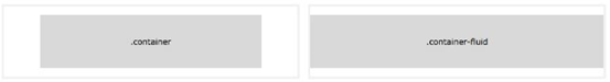
3.容器类
Bootstrap 4 需要一个容器元素来包裹网站的内容。
我们可以使用以下两个容器类:
.container 类用于固定宽度并支持响应式布局的容器。
.container-fluid 类用于 100% 宽度,占据全部视口(viewport)的容器。
4.Bootstrap4 网格系统
Bootstrap 提供了一套响应式、移动设备优先的流式网格系统,随着屏幕或视口(viewport)尺寸的增加,系统会自动分为最多 12 列。
我们也可以根据自己的需要,定义列数:
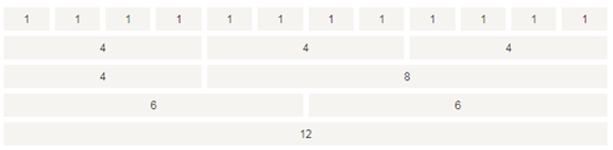
Bootstrap 4 的网格系统是响应式的,列会根据屏幕大小自动重新排列。
网格类
Bootstrap 4 网格系统有以下 5 个类:
1、.col- 针对所有设备
2、.col-sm- 平板 - 屏幕宽度等于或大于 576px
3、.col-md- 桌面显示器 - 屏幕宽度等于或大于 768px
4、.col-lg- 大桌面显示器 - 屏幕宽度等于或大于 992px
5、.col-xl- 超大桌面显示器 - 屏幕宽度等于或大于 1200px
网格系统规则
Bootstrap4 网格系统规则:
1、网格每一行需要放在设置了 .container (固定宽度) 或 .container-fluid (全屏宽度) 类的容器中,这样就可以自动设置一些外边距与内边距。
2、使用行来创建水平的列组。
3、内容需要放置在列中,并且只有列可以是行的直接子节点。
4、预定义的类如 .row 和 .col-sm-4 可用于快速制作网格布局。
5、列通过填充创建列内容之间的间隙。 这个间隙是通过 .rows 类上的负边距设置第一行和最后一列的偏移。
6、网格列是通过跨越指定的 12 个列来创建。 例如,设置三个相等的列,需要使用三个 .col-sm-4 来设置。
7、Bootstrap 3 和 Bootstrap 4 最大的区别在于 Bootstrap 4 现在使用 flexbox(弹性盒子) 而不是浮动。 Flexbox 的一大优势是,没有指定宽度的网格列将自动设置为等宽与等高列 。
下表总结了 Bootstrap 网格系统如何在不同设备上工作的:

5. Bootstrap 4 网格的基本结构
以下代码为 Bootstrap 4 网格的基本结构:
<!-- 第一个例子:控制列的宽度及在不同的设备上如何显示 -->
<div class="row">
 <div class="col-*-*"></div>
 </div>
 <div class="row">
 <div class="col-*-*"></div>
 <div class="col-*-*"></div>
 <div class="col-*-*"></div>
</div>
 <!-- 第二个例子:或让 Bootstrap 者自动处理布局 -->
<div class="row">
<div class="col"></div>
<div class="col"></div>
<div class="col"></div>
 </div>
第一个例子:创建一行(<div class="row">)。然后, 添加需要的列( .col-- 类中设置)。 第一个星号 () 表示响应的设备: sm, md, lg 或 xl, 第二个星号 () 表示一个数字, 同一行的数字相加为 12。
第二个例子: 不在每个 col 上添加数字,让 bootstrap 自动处理布局,同一行的每个列宽度相等: 两个 “col” ,每个就为 50% 的宽度。三个 "col"每个就为 33.33% 的宽度,四个 "col"每个就为 25% 的宽度,以此类推。同样,你可以使用 .col-sm|md|lg|xl 来设置列的响应规则。
创建相等宽度的列,Bootstrap 自动布局
例如:
<!DOCTYPE html>
<html>
<head>
  <title>Bootstrap 实例</title>
  <meta charset="utf-8">
  <meta name="viewport" content="width=device-width, initial-scale=1">
  <link rel="stylesheet" href="https://cdn.staticfile.org/twitter-bootstrap/4.3.1/css/bootstrap.min.css">
  <script src="https://cdn.staticfile.org/jquery/3.2.1/jquery.min.js"></script>
  <script src="https://cdn.staticfile.org/popper.js/1.15.0/umd/popper.min.js"></script>
  <script src="https://cdn.staticfile.org/twitter-bootstrap/4.3.1/js/bootstrap.min.js"></script>
</head>
<body>
<div class="container-fluid">
  <h1>Hello World!</h1>
  <p>创建三个相等宽度的列! 尝试在 class="row" 的 div 中添加新的 class="col"  div,会显示四个等宽的列。</p>
  <div class="row">
    <div class="col" style="background-color:lavender;">.col</div>
    <div class="col" style="background-color:orange;">.col</div>
    <div class="col" style="background-color:lavender;">.col</div>
  </div>
</div>
</body>
</html>
等宽响应式列
以下实例是如何在平板及更大屏幕上创建等宽度的响应式列。 在移动设备上,即屏幕宽度小于 576px 时,四个列将会上下堆叠排版:
<!DOCTYPE html>
<html>
<head>
  <title>Bootstrap 实例</title>
  <meta charset="utf-8">
  <meta name="viewport" content="width=device-width, initial-scale=1">
  <link rel="stylesheet" href="https://cdn.staticfile.org/twitter-bootstrap/4.3.1/css/bootstrap.min.css">
  <script src="https://cdn.staticfile.org/jquery/3.2.1/jquery.min.js"></script>
  <script src="https://cdn.staticfile.org/popper.js/1.15.0/umd/popper.min.js"></script>
  <script src="https://cdn.staticfile.org/twitter-bootstrap/4.3.1/js/bootstrap.min.js"></script>
</head>
<body>
<div class="container-fluid">
  <h1>Hello World!</h1>
  <p>重置浏览器大小查效果。</p>
  <p> 在移动设备上,即屏幕宽度小于 576px 时,四个列将会上下堆叠排版。</p>
  <div class="row">
    <div class="col-sm-3" style="background-color:lavender;">.col-sm-3</div>
    <div class="col-sm-3" style="background-color:lavenderblush;">.col-sm-3</div>
    <div class="col-sm-3" style="background-color:lavender;">.col-sm-3</div>
    <div class="col-sm-3" style="background-color:lavenderblush;">.col-sm-3</div>
  </div>
</div>
</body>
</html>
不等宽响应式列
在移动设备上,即屏幕宽度小于 576px 时,两个列将会上下堆叠排版:
<!DOCTYPE html>
<html>
<head>
  <title>Bootstrap 实例</title>
  <meta charset="utf-8">
  <meta name="viewport" content="width=device-width, initial-scale=1">
  <link rel="stylesheet" href="https://cdn.staticfile.org/twitter-bootstrap/4.3.1/css/bootstrap.min.css">
  <script src="https://cdn.staticfile.org/jquery/3.2.1/jquery.min.js"></script>
  <script src="https://cdn.staticfile.org/popper.js/1.15.0/umd/popper.min.js"></script>
  <script src="https://cdn.staticfile.org/twitter-bootstrap/4.3.1/js/bootstrap.min.js"></script>
</head>
<body>

<div class="container-fluid">
  <h1>Hello World!</h1>
  <p>重置浏览器大小查效果。</p>
  <p>在移动设备上,即屏幕宽度小于 576px 时,四个列将会上下堆叠排版。</p>
  <div class="row">
    <div class="col-sm-4" style="background-color:lavender;">.col-sm-4</div>
    <div class="col-sm-8" style="background-color:lavenderblush;">.col-sm-8</div>
  </div>
</div>
</body>
</html>
平板和桌面端
在桌面设备的显示器上两个列的宽度各占 50%,如果在平板端则左边的宽度为 25%,右边的宽度为 75%, 在移动手机等小型设备上会堆叠显示。
<!DOCTYPE html>
<html>
<head>
  <title>Bootstrap 实例</title>
  <meta charset="utf-8">
  <meta name="viewport" content="width=device-width, initial-scale=1">
  <link rel="stylesheet" href="https://cdn.staticfile.org/twitter-bootstrap/4.3.1/css/bootstrap.min.css">
  <script src="https://cdn.staticfile.org/jquery/3.2.1/jquery.min.js"></script>
  <script src="https://cdn.staticfile.org/popper.js/1.15.0/umd/popper.min.js"></script>
  <script src="https://cdn.staticfile.org/twitter-bootstrap/4.3.1/js/bootstrap.min.js"></script>
</head>
<body>
<div class="container-fluid">
  <h1>平板与桌面的网格布局</h1>
  <p>以下实例演示了在桌面设备的显示器上两个列的宽度各占 50%,如果在平板端则左边的宽度为 25%,右边的宽度为 75%, 在移动手机等小型设备上会堆叠显示。
</p>
  <p>重置浏览器窗口大小,查看效果。</p>
  <div class="container-fluid">
    <div class="row">
      <div class="col-sm-3 col-md-6 bg-success">
        wangxingruanjian
      </div>
      <div class="col-sm-9 col-md-6 bg-warning">
      </div>
    </div>
  </div>
</div>
</body>
</html>
平板、桌面、大桌面显示器、超大桌面显示器
在平板、桌面、大桌面显示器、超大桌面显示器的宽度比例为分别为:25%/75%、50%/50%、33.33%/66.67%、16.67/83.33%, 在移动手机等小型设备上会堆叠显示。
<!DOCTYPE html>
<html>
<head>
  <title>Bootstrap 实例</title>
  <meta charset="utf-8">
  <meta name="viewport" content="width=device-width, initial-scale=1">
  <link rel="stylesheet" href="https://cdn.staticfile.org/twitter-bootstrap/4.3.1/css/bootstrap.min.css">
  <script src="https://cdn.staticfile.org/jquery/3.2.1/jquery.min.js"></script>
  <script src="https://cdn.staticfile.org/popper.js/1.15.0/umd/popper.min.js"></script>
  <script src="https://cdn.staticfile.org/twitter-bootstrap/4.3.1/js/bootstrap.min.js"></script>
</head>
<body>

<div class="container-fluid">
  <h1>平板、桌面、大桌面显示器、超大桌面显示器</h1>
  <p>以下实例在平板、桌面、大桌面显示器、超大桌面显示器的宽度比例为分别为:25%/75%、50%/50%、33.33%/66.67%、16.67/83.33%, 在移动手机等小型设备上会堆叠显示。</p>
  <p>重置浏览器窗口大小,查看效果。</p>
  <div class="container-fluid">
    <div class="row">
      <div class="col-sm-3 col-md-6 col-lg-4 col-xl-2 bg-success">
        wangxingruanjian
      </div>
      <div class="col-sm-9 col-md-6 col-lg-8 col-xl-10 bg-warning">
        网星软件
      </div>
    </div>
  </div>
</div>
</body>
</html>
Bootstrap4 颜色
Bootstrap 4 提供了一些有代表意义的颜色类:
.text-muted, .text-primary, .text-success, .text-info, .text-warning, .text-danger, .text-secondary, .text-white, .text-dark and .text-light
例如:
<!DOCTYPE html>
<html>
<head>
  <title>Bootstrap 实例</title>
  <meta charset="utf-8">
  <meta name="viewport" content="width=device-width, initial-scale=1">
  <link rel="stylesheet" href="https://cdn.staticfile.org/twitter-bootstrap/4.3.1/css/bootstrap.min.css">
  <script src="https://cdn.staticfile.org/jquery/3.2.1/jquery.min.js"></script>
  <script src="https://cdn.staticfile.org/popper.js/1.15.0/umd/popper.min.js"></script>
  <script src="https://cdn.staticfile.org/twitter-bootstrap/4.3.1/js/bootstrap.min.js"></script>
</head>
<body>
<div class="container">
  <h2>代表指定意义的文本颜色</h2>
  <p class="text-muted">柔和的文本。</p>
  <p class="text-primary">重要的文本。</p>
  <p class="text-success">执行成功的文本。</p>
  <p class="text-info">代表一些提示信息的文本。</p>
  <p class="text-warning">警告文本。</p>
  <p class="text-danger">危险操作文本。</p>
  <p class="text-secondary">副标题。</p>
  <p class="text-dark">深灰色文字。</p>
  <p class="text-light">浅灰色文本(白色背景上看不清楚)。</p>
  <p class="text-white">白色文本(白色背景上看不清楚)。</p>
</div>
</body>
</html>
在链接中使用
<!DOCTYPE html>
<html>
<head>
  <title>Bootstrap 实例</title>
  <meta charset="utf-8">
  <meta name="viewport" content="width=device-width, initial-scale=1">
  <link rel="stylesheet" href="https://cdn.staticfile.org/twitter-bootstrap/4.3.1/css/bootstrap.min.css">
  <script src="https://cdn.staticfile.org/jquery/3.2.1/jquery.min.js"></script>
  <script src="https://cdn.staticfile.org/popper.js/1.15.0/umd/popper.min.js"></script>
  <script src="https://cdn.staticfile.org/twitter-bootstrap/4.3.1/js/bootstrap.min.js"></script>
</head>
<body>

<div class="container">
  <h2>文本颜色</h2>
  <p>鼠标移动到链接。</p>
  <a href="#" class="text-muted">柔和的链接。</a>
  <a href="#" class="text-primary">主要链接。</a>
  <a href="#" class="text-success">成功链接。</a>
  <a href="#" class="text-info">信息文本链接。</a>
  <a href="#" class="text-warning">警告链接。</a>
  <a href="#" class="text-danger">危险链接。</a>
  <a href="#" class="text-secondary">副标题链接。</a>
  <a href="#" class="text-dark">深灰色链接。</a>
  <a href="#" class="text-light">浅灰色链接。</a>
</div>
</body>
</html>
背景颜色
提供背景颜色的类有:
.bg-primary, .bg-success, .bg-info, .bg-warning, .bg-danger, .bg-secondary, .bg-dark 和 .bg-light。
注意背景颜色不会设置文本的颜色,在一些实例中你需要与 .text-* 类一起使用。
例如:
<!DOCTYPE html>
<html>
<head>
  <title>Bootstrap 实例</title>
  <meta charset="utf-8">
  <meta name="viewport" content="width=device-width, initial-scale=1">
  <link rel="stylesheet" href="https://cdn.staticfile.org/twitter-bootstrap/4.3.1/css/bootstrap.min.css">
  <script src="https://cdn.staticfile.org/jquery/3.2.1/jquery.min.js"></script>
  <script src="https://cdn.staticfile.org/popper.js/1.15.0/umd/popper.min.js"></script>
  <script src="https://cdn.staticfile.org/twitter-bootstrap/4.3.1/js/bootstrap.min.js"></script>
</head>
<body>

<div class="container">
  <h2>背景颜色</h2>
  <p class="bg-primary text-white">重要的背景颜色。</p>
  <p class="bg-success text-white">执行成功背景颜色。</p>
  <p class="bg-info text-white">信息提示背景颜色。</p>
  <p class="bg-warning text-white">警告背景颜色</p>
  <p class="bg-danger text-white">危险背景颜色。</p>
  <p class="bg-secondary text-white">副标题背景颜色。</p>
  <p class="bg-dark text-white">深灰背景颜色。</p>
  <p class="bg-light text-dark">浅灰背景颜色。</p>
</div>
</body>
</html>
10.Bootstrap4 信息提示框
提示框可以使用 .alert 类, 后面加上 .alert-success, .alert-info, .alert-warning, .alert-danger, .alert-primary, .alert-secondary, .alert-light 或 .alert-dark 类来实现
<div class="container">
<h2>提示框</h2>
<p>提示框可以使用 .alert 类, 后面加上指定特定意义的颜色类来实现:</p>
<div class="alert alert-success">
<strong>成功!</strong> 指定操作成功提示信息。
</div>
<div class="alert alert-info">
<strong>信息!</strong> 请注意这个信息。
</div>
<div class="alert alert-warning">
<strong>警告!</strong> 设置警告信息。
</div>
<div class="alert alert-danger">
<strong>错误!</strong> 失败的操作
</div>
<div class="alert alert-primary">
<strong>首选!</strong> 这是一个重要的操作信息。
</div>
<div class="alert alert-secondary">
<strong>次要的!</strong> 显示一些不重要的信息。
</div>
<div class="alert alert-dark">
<strong>深灰色!</strong> 深灰色提示框。
</div>
<div class="alert alert-light">
<strong>浅灰色!</strong>浅灰色提示框。
</div>
</div>
提示框中在链接的标签上添加 alert-link 类来设置匹配提示框颜色的链接
<div class="alert alert-success">
<strong>成功!</strong> 你应该认真阅读 <a href="#" class="alert-link">这条信息</a>。
</div>
关闭提示框
我们可以在提示框中的 div 中添加 .alert-dismissible 类,然后在关闭按钮的链接上添加 class="close" 和 data-dismiss="alert" 类来设置提示框的关闭操作。
<div class="alert alert-success alert-dismissible">
<button type="button" class="close" data-dismiss="alert">×</button>
<strong>成功!</strong> 指定操作成功提示信息。
</div>
提示框动画
.fade 和 .show 类用于设置提示框在关闭时的淡出和淡入效果
<div class="alert alert-success alert-dismissible fade show">
<button type="button" class="close" data-dismiss="alert">×</button>
<strong>成功!</strong> 指定操作成功提示信息。
</div>
11.Bootstrap4 按钮
<div class="container">
  <h2>按钮样式</h2>
  <button type="button" class="btn">基本按钮</button>
  <button type="button" class="btn btn-primary">主要按钮</button>
  <button type="button" class="btn btn-secondary">次要按钮</button>
  <button type="button" class="btn btn-success">成功</button>
  <button type="button" class="btn btn-info">信息</button>
  <button type="button" class="btn btn-warning">警告</button>
  <button type="button" class="btn btn-danger">危险</button>
  <button type="button" class="btn btn-dark">黑色</button>
  <button type="button" class="btn btn-light">浅色</button>
  <button type="button" class="btn btn-link">链接</button>
</div>
按钮类可用于 <a>, <button>, 或 <input> 元素上
<div class="container">
  <h2>按钮元素</h2>
  <a href="#" class="btn btn-info" role="button">链接按钮</a>
  <button type="button" class="btn btn-info">按钮</button>
  <input type="button" class="btn btn-info" value="输入框按钮">
  <input type="submit" class="btn btn-info" value="提交按钮">
</div>
按钮设置边框
<div class="container">
  <h2>按钮设置边框</h2>
  <button type="button" class="btn btn-outline-primary">主要按钮</button>
  <button type="button" class="btn btn-outline-secondary">次要按钮</button>
  <button type="button" class="btn btn-outline-success">成功</button>
  <button type="button" class="btn btn-outline-info">信息</button>
  <button type="button" class="btn btn-outline-warning">警告</button>
  <button type="button" class="btn btn-outline-danger">危险</button>
  <button type="button" class="btn btn-outline-dark">黑色</button>
  <button type="button" class="btn btn-outline-light text-dark">浅色</button>
</div>
不同大小的按钮
<div class="container">
  <h2>不同大小的按钮</h2>
  <button type="button" class="btn btn-primary btn-lg">大号按钮</button>
  <button type="button" class="btn btn-primary">默认按钮</button>
  <button type="button" class="btn btn-primary btn-sm">小号按钮</button>
</div>
通过添加 .btn-block 类可以设置块级按钮
<div class="container">
  <h2>块级按钮</h2>
  <button type="button" class="btn btn-primary btn-block">按钮 1</button>
  <button type="button" class="btn btn-default btn-block">按钮 2</button>

  <h2>大的块级按钮</h2>
  <button type="button" class="btn btn-primary btn-lg btn-block">按钮 1</button>
  <button type="button" class="btn btn-default btn-lg btn-block">按钮 2</button>

  <h2>小的块级按钮</h2>
  <button type="button" class="btn btn-primary btn-sm btn-block">按钮 1</button>
  <button type="button" class="btn btn-default btn-sm btn-block">按钮 2</button>
</div>
激活和禁用的按钮
按钮可设置为激活或者禁止点击的状态。
.active 类可以设置按钮是可用的, disabled 属性可以设置按钮是不可点击的。 注意 <a> 元素不支持 disabled 属性,你可以通过添加 .disabled 类来禁止链接的点击。
<div class="container">
  <h2>按钮状态</h2>
  <button type="button" class="btn btn-primary">主要按钮</button>
  <button type="button" class="btn btn-primary active">点击后的按钮</button>
  <button type="button" class="btn btn-primary" disabled>禁止点击的按钮</button>
  <a href="#" class="btn btn-primary disabled">禁止点击的链接</a>
</div>
12.Bootstrap4 按钮组
Bootstrap 4 中允许我们将按钮放在同一行上。
可以在
<div class="container">
  <h2>按钮组</h2>
  <p> .btn-group 类用于创建按钮组:</p>
  <div class="btn-group">
    <button type="button" class="btn btn-primary">Apple</button>
    <button type="button" class="btn btn-primary">Samsung</button>
    <button type="button" class="btn btn-primary">Sony</button>
  </div>
</div>
我们可以使用 .btn-group-lg|sm 类来设置按钮组的大小。
<div class="container">
  <h2>按钮组大小</h2>
  <p>我们可以使用 .btn-group-lg|sm|xs 类来设置按钮组的大小。</p>
  <h3>大按钮:</h3>
  <div class="btn-group btn-group-lg">
    <button type="button" class="btn btn-primary">Apple</button>
    <button type="button" class="btn btn-primary">Samsung</button>
    <button type="button" class="btn btn-primary">Sony</button>
  </div>
  <h3>默认按钮:</h3>
  <div class="btn-group">
    <button type="button" class="btn btn-primary">Apple</button>
    <button type="button" class="btn btn-primary">Samsung</button>
    <button type="button" class="btn btn-primary">Sony</button>
  </div>
  <h3>小按钮:</h3>
  <div class="btn-group btn-group-sm">
    <button type="button" class="btn btn-primary">Apple</button>
    <button type="button" class="btn btn-primary">Samsung</button>
    <button type="button" class="btn btn-primary">Sony</button>
  </div>
</div>
可以使用 .btn-group-vertical 类来创建垂直的按钮组:
<div class="container">
  <h2>垂直按钮组</h2>
  <p>U可以使用 .btn-group-vertical 类来创建垂直的按钮组:</p>
  <div class="btn-group-vertical">
    <button type="button" class="btn btn-primary">Apple</button>
    <button type="button" class="btn btn-primary">Samsung</button>
    <button type="button" class="btn btn-primary">Sony</button>
  </div>
</div>
内嵌按钮组及下拉菜单
<div class="container">
  <h2>内嵌按钮组</h2>
  <p>按钮组设置下拉菜单:</p>
  <div class="btn-group">
    <button type="button" class="btn btn-primary">Apple</button>
    <button type="button" class="btn btn-primary">Samsung</button>
    <div class="btn-group">
      <button type="button" class="btn btn-primary dropdown-toggle" data-toggle="dropdown">
      Sony
      </button>
      <div class="dropdown-menu">
        <a class="dropdown-item" href="#">Tablet</a>
        <a class="dropdown-item" href="#">Smartphone</a>
      </div>
    </div>
  </div>
</div>
垂直按钮组及下拉菜单
<div class="container">
  <h2>垂直按钮组及下拉菜单</h2>
  <div class="btn-group-vertical">
    <button type="button" class="btn btn-primary">Apple</button>
    <button type="button" class="btn btn-primary">Samsung</button>
    <div class="btn-group">
      <button type="button" class="btn btn-primary dropdown-toggle" data-toggle="dropdown">
        Sony
      </button>
      <div class="dropdown-menu">
        <a class="dropdown-item" href="#">Tablet</a>
        <a class="dropdown-item" href="#">Smartphone</a>
      </div>
    </div>
  </div>
</div>
- Bootstrap4 徽章(Badges)
徽章(Badges)主要用于突出显示新的或未读的项。如需使用徽章,只需要将 .badge 类加上带有指定意义的颜色类 (如 .badge-secondary) 添加到 元素上即可。 徽章可以根据父元素的大小的变化而变化
<div class="container">
  <h2>徽章</h2>
  <h1>测试标题 <span class="badge badge-secondary">New</span></h1>
  <h2>测试标题 <span class="badge badge-secondary">New</span></h2>
  <h3>测试标题 <span class="badge badge-secondary">New</span></h3>
  <h4>测试标题 <span class="badge badge-secondary">New</span></h4>
  <h5>测试标题 <span class="badge badge-secondary">New</span></h5>
  <h6>测试标题 <span class="badge badge-secondary">New</span></h6>
</div>
各种颜色类型的徽章
<div class="container">
  <h2>各种颜色类型的徽章</h2>
  <span class="badge badge-primary">主要</span>
  <span class="badge badge-secondary">次要</span>
  <span class="badge badge-success">成功</span>
  <span class="badge badge-danger">危险</span>
  <span class="badge badge-warning">警告</span>
  <span class="badge badge-info">信息</span>
  <span class="badge badge-light">浅色</span>
  <span class="badge badge-dark">深色</span>
</div>
使用 .badge-pill 类来设置药丸形状徽章:
<div class="container">
  <h2>药丸形状徽章</h2>
  <span class="badge badge-pill badge-default">默认</span>
  <span class="badge badge-pill badge-primary">主要</span>
  <span class="badge badge-pill badge-success">成功</span>
  <span class="badge badge-pill badge-info">信息</span>
  <span class="badge badge-pill badge-warning">警告</span>
  <span class="badge badge-pill badge-danger">危险</span>
</div>
徽章插入到元素内
<div class="container">
  <h2>徽章嵌入到按钮内</h2>
  <button type="button" class="btn btn-primary">
    Messages <span class="badge badge-light">4</span>
  </button>
  <button type="button" class="btn btn-danger">
    Notifications <span class="badge badge-light">7</span>
  </button>
</div>


 1430
1430


 被折叠的 条评论
为什么被折叠?
被折叠的 条评论
为什么被折叠?
 到【灌水乐园】发言


