


     decoration: TextDecoration.lineThrough,
    decorationColor: Colors.black,
//solid:实线,double:双线,dotted:点虚线,dashed:横虚线,wavy:波浪线
decorationStyle:
TextDecorationStyle.wavy),
);
}
class TextApp extends StatelessWidget {
@override
Widget
build(BuildContext context)
{
return MaterialApp(
title: “Text演示”,
home: Scaffold(
appBar: AppBar(title: Text(“Text”)),
body: _TextBody(),
),
);
}
}

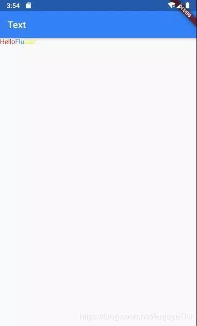
**RichText**
如果需要显示更为丰富样式的文本(比如一段文本中文字不同颜色),可以使用 RichText或者 Text.rich
```java
Widget _RichTextBody() {
var textSpan = TextSpan(
text: "Hello",
style: TextStyle(color: Colors.red),
children: [
TextSpan(text: "Flu", style: TextStyle(color: Colors.blue)),
TextSpan(text: "uter", style: TextStyle(color: Colors.yellow)),
],
);
//Text.rich(textSpan);
return RichText(text: textSpan);
}
DefaultTextStyle
在widget树中,文本的样式默认是可以被继承的,因此,如果在widget树的某一个节点处设置一个默认的文本样式,那么该节点的子树中所有文本都会默认使用这个样式。相当于在Android中定义 Theme
Widget _DefaultStyle(){
  DefaultTextStyle(
//设置文本默认样式
 style: TextStyle(
   color:Colors.red,
   fontSize: 20.0,
),
    textAlign: TextAlign.start,
    child: Column(
      crossAxisAlignment:
      CrossAxisAlignment.start,
      children: <Widget>[
        Text("Hello Flutter!"),
        Text("Hello Flutter!"),
        Text("Hello Flutter!",
             style: TextStyle(
               inherit: false,
//不继承默认样式
               color: Colors.grey
          ),
        ),
      ],
    ),
  );
}
FlutterLogo
这个Widget用于显示Flutter的logo…
Widget flutterLogo() {
  return FlutterLogo(
//大小
    size: 100,
//logo颜色 默认为 Colors.blue
    colors: Colors.red,
//markOnly:只显示logo,horizontal:logo右边显示flutter文字,stacked:logo下面显示文字
    style: FlutterLogoStyle.stacked,
//logo上文字颜色
    textColor: Colors.blue,
  );
}
Icon
主要用于显示内置图标的 Widget
Widget icon() {
  return Icon(
//使用预定义Material icons
// https://docs.flutter.io/flutter/material/Icons-class.html

Icons.add,
    size: 100,
    color: Colors.red);
}

Image
显示图片的 Widget。图片常用的格式主要有bmp,jpg,png,gif,webp等,Android中并不是天生支持gif和webp动图,但是这一特性在flutter中被很好的支持了。
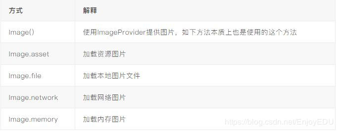
Iamge.asset
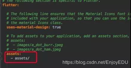
在工程目录下创建目录,如:assets,将图片放入此目录。打开项目根目录:pubspec.yaml
return MaterialApp(
  title: "Image演示",
  home: Scaffold(
    appBar: AppBar(title: Text("Image")),
    body: Image.asset("assets/banner.jpeg"),
  ),
);
Image.file
在sd卡中放入一张图片。然后利用path_provider库获取sd卡根目录(Dart库版本可以在:https://pub.dartlang.org/packages查询)。
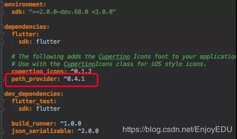
注意权限
class ImageState extends State<ImageApp> {
  Image image;

@override
  void initState() {
   super.initState();
    getExternalStorageDirectory().then((path) {
      setState(() {
        image = Image.file(File("${path.path}${Platform.pathSeparator}banner.jpeg"
      ));
    });
  });
}

@override
Widget build(BuildContext context) {
return MaterialApp(
  title: "Image演示",
  home: Scaffold(
    appBar: AppBar(title: Text("Image")),
    body: image,
    ),
  );
 }
}
Image.network
直接给网络地址即可。
Flutter 1.0,加载https时候经常出现证书错误。必须断开AS打开app
Image.memory
Future<List<int>> _imageByte() async {
  String path = (await getExternalStorageDirectory()).path;
  return await File("$path${Platform.pathSeparator}banner.jpeg").readAsBytes();
}
class ImageState extends State<ImageApp> {
  Image image;

@override
  void initState() {
    super.initState();
    _imageByte().then((bytes) {
      setState(() {
        image = Image.memory(bytes);
      });
    });
}

@override
Widget build(BuildContext context) {
  return MaterialApp(
    title: "Image演示",
    home: Scaffold(
      appBar: AppBar(title: Text("Image")),
      body: image,
    ),
   );
  }
}
CircleAvatar
CircleAvatar(
    //图片提供者 ImageProvider
      backgroundImage: AssetImage("assets/banner.jpeg"),
    //半径,控制大小
      radius: 50.0,
  );
FadeInImage
当使用默认 Image widget显示图片时,您可能会注意到它们在加载完成后会直接显示到屏幕上。这可能会让用户产生视觉突兀。如果最初显示一个占位符,然后在图像加载完显示时淡入,我们可以使用 FadeInImage来达到这个目的!
 image =  FadeInImage.memoryNetwork(
   placeholder: kTransparentImage,
   image: 'https://flutter.io/images/homepage/header-illustration.png',
);
按钮
Material widget库中提供了多种按钮Widget如RaisedButton、FlatButton、OutlineButton等,它们都是直接或间接对RawMaterialButton的包装定制,所以他们大多数属性都和 RawMaterialButton一样。所有Material 库中的按钮都有如下相同点:
- 按下时都会有“水波动画”。
- 有一个onPressed属性来设置点击回调,当按钮按下时会执行该回调,如果不提供该回调则按钮会处于禁用状态,禁用状态不响应用户点击。
RaisedButton
"漂浮"按钮,它默认带有阴影和灰色背景
RaisedButton(
  child: Text("normal"),
  onPressed: () => {},
)
FlatButton
扁平按钮,默认背景透明并不带阴影
FlatButton(
  child: Text("normal"),
  onPressed: () => {},
)
OutlineButton
默认有一个边框,不带阴影且背景透明。
OutlineButton(
  child: Text("normal"),
  onPressed: () => {},
)
IconButton
可点击的Icon
IconButton(
  child: Text("normal"),
  onPressed: () => {},
)
按钮外观可以通过其属性来定义,不同按钮属性大同小异
const FlatButton({
  ...
@required this.onPressed,
//按钮点击回调
this.textColor,
//按钮文字颜色
this.disabledTextColor,
//按钮禁用时的文字颜色
this.color,
//按钮背景颜色
this.disabledColor,
//按钮禁用时的背景颜色
this.highlightColor,
//按钮按下时的背景颜色
this.splashColor,
//点击时,水波动画中水波的颜色
this.colorBrightness,
//按钮主题,默认是浅色主题
this.padding,
//按钮的填充
this.shape,
//外形
@required this.child,
//按钮的内容
})
  FlatButton( onPressed: () => {},
  child: Text("Raised"),
//蓝色
  color: Colors.blue,
//水波
  splashColor: Colors.yellow,
//深色主题,这样文字颜色会变成白色
  colorBrightness: Brightness.dark,
//圆角按钮
  shape: RoundedRectangleBorder(
    borderRadius: BorderRadius.circular(50)
  ),
)
而 RaisedButton,默认配置有阴影,因此在配置 RaisedButton 时,拥有一系列 elevation 属性的配置
const RaisedButton({
  ...
  this.elevation = 2.0,
//正常状态下的阴影
  this.highlightElevation = 8.0,
//按下时的阴影
  this.disabledElevation = 0.0,
// 禁用时的阴影
  ...
}
输入框
import 'package:flutter/material.dart';
void main() => runApp(Demo1());
class Demo1 extends StatelessWidget {
@override
Widget build(BuildContext context) {
return MaterialApp(
title: "Demo1",
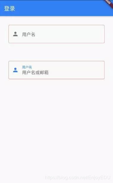
home: Scaffold(
appBar: AppBar(
title: Text("登录"),
),
//线性布局,垂直方向
body: Column(
children: <Widget>[
TextField(
//自动获得焦点
autofocus: true,
decoration: InputDecoration(
labelText: "用户名",
hintText: "用户名或邮箱",
prefixIcon: Icon(Icons.person)),
),
TextField(
//隐藏正在编辑的文本
obscureText: true,
decoration: InputDecoration(
labelText: "密码",
hintText: "您的登录密码",
prefixIcon: Icon(Icons.lock)),
),
],
),
),
);
}
}

这个效果非常的“系统”,我们可能大多数情况下需要将下划线更换为矩形边框,这时候可能就需要组合widget来完成:
//容器 设置一个控件的尺寸、背景、margin
Container(
  margin: EdgeInsets.all(32),
    child: TextField(
      keyboardType: TextInputType.emailAddress,
      decoration: InputDecoration(
        labelText: "用户名",
        hintText: "用户名或邮箱",
        prefixIcon: Icon(Icons.person),
            border: InputBorder.none
//隐藏下划线
)),
//装饰
    decoration: BoxDecoration(
// 边框浅灰色,宽度1像素
      border: Border.all(color: Colors.red[200], width: 1.0),
//圆角
      borderRadius: BorderRadius.circular(5.0),
    ),
  )
焦点控制
FocusNode: 与Widget绑定,代表了这个Widget的焦点
FocusScope: 焦点控制范围
FocusScopeNode:控制焦点
class _TextFocusState extends State<TextFocusWidget> {
  FocusNode focusNode1 = new
  FocusNode();  FocusNode focusNode2 = new FocusNode();
void _listener() {
  debugPrint("用户名输入框焦点:${focusNode1.hasFocus}");
}

@override
  void initState() {
    super.initState();
//监听焦点状态改变事件
    focusNode1.addListener(_listener);
}

@override
  void dispose() {
    super.dispose();
    focusNode1.dispose();
    focusNode2.dispose();
}

@override
  Widget build(BuildContext context) {
    return Column(
      children: <Widget>[
        TextField(
          autofocus: true,
//关联焦点
          focusNode: focusNode1,
//设置键盘动作为: 下一步
          textInputAction: TextInputAction.next,
//点击下一步执行回调
          onEditingComplete: () {
//获得 context对应UI树的焦点范围 的焦点控制器
          FocusScopeNode focusScopeNode = FocusScope.of(context);
//将焦点交给focusNode2
          focusScopeNode.requestFocus(focusNode2);
         },
          decoration: InputDecoration(
          labelText: "用户名",
           hintText: "用户名或邮箱",
         prefixIcon: Icon(Icons.person)),
        ),
        TextField(
//隐藏正在编辑的文本
        obscureText: true,
          focusNode: focusNode2,
         decoration: InputDecoration(
          labelText: "密码",
           hintText: "您的登录密码",
          refixIcon: Icon(Icons.lock)),
        ),
        custom(),
      ],
    );
  }
}
获取输入内容
获取输入内容有两种方式:
- 定义两个变量,用于保存用户名和密码,然后在onChange触发时,各自保存一下输入内容。
- 通过controller直接获取。
onChange获得输入内容:
TextField(
  onChanged: (s) => debugPrint("ssss:$s"),
controller获取:
定义一个controller:
//定义一个controller
TextEditingController _unameController=new TextEditingController();
然后设置输入框controller:
TextField(
  controller: _unameController,
//设置controller
    ...
)
通过controller获取输入框内容
debugPrint(_unameController.text)
TextFormField
TextFormField比 TextField多了一些属性,其中 validator用于设置验证回调。在单独使用时与 TextField没有太大的区别。当结合 From,利用 From可以对输入框进行分组,然后进行一些统一操作(验证)
class _TextFocusState extends State<TextFocusWidget> {
//全局key
GlobalKey<FormState> _key = GlobalKey<FormState>();
# Ending
**Tip:由于文章篇幅有限制,下面还有20个关于MySQL的问题,我都复盘整理成一份pdf文档了,后面的内容我就把剩下的问题的目录展示给大家看一下,[点击这里即可解锁全部内容!](https://gitee.com/vip204888/java-p7)**
**如果觉得有帮助不妨【转发+点赞+关注】支持我,后续会为大家带来更多的技术类文章以及学习类文章!**(阿里对MySQL底层实现以及索引实现问的很多)
TextField没有太大的区别。当结合 From,利用 From可以对输入框进行分组,然后进行一些统一操作(验证)
```java
class _TextFocusState extends State<TextFocusWidget> {
//全局key
GlobalKey<FormState> _key = GlobalKey<FormState>();
# Ending
**Tip:由于文章篇幅有限制,下面还有20个关于MySQL的问题,我都复盘整理成一份pdf文档了,后面的内容我就把剩下的问题的目录展示给大家看一下,[点击这里即可解锁全部内容!](https://gitee.com/vip204888/java-p7)**
**如果觉得有帮助不妨【转发+点赞+关注】支持我,后续会为大家带来更多的技术类文章以及学习类文章!**(阿里对MySQL底层实现以及索引实现问的很多)
[外链图片转存中...(img-UbKAETfZ-1628089418433)]
[外链图片转存中...(img-AC56uJ77-1628089418434)]
吃透后这份pdf,你同样可以跟面试官侃侃而谈MySQL。其实像阿里p7岗位的需求也没那么难(但也不简单),扎实的Java基础+无短板知识面+对某几个开源技术有深度学习+阅读过源码+算法刷题,这一套下来p7岗差不多没什么问题,还是希望大家都能拿到高薪offer吧。


 223
223


 被折叠的 条评论
为什么被折叠?
被折叠的 条评论
为什么被折叠?
 到【灌水乐园】发言


