


-
- Remove the padding so developers are not caught out when they zero out
fieldsetelements in all browsers.
- Remove the padding so developers are not caught out when they zero out
去掉填充,这样当开发者在所有浏览器中归零“fieldset”元素时就不会被发现。
*/
legend {
box-sizing: border-box; /* 1 */
color: inherit; /* 2 */
display: table; /* 1 */
max-width: 100%; /* 1 */
padding: 0; /* 3 */
white-space: normal; /* 1 */
}
/**
- Add the correct vertical alignment in Chrome, Firefox, and Opera.在Chrome、Firefox和Opera中添加正确的垂直对齐
*/
progress {
vertical-align: baseline;
}
/**
- Remove the default vertical scrollbar in IE 10+.:删除IE 10+中默认的垂直滚动条。
*/
textarea {
overflow: auto;
}
/**
-
- Add the correct box sizing in IE 10.1. 在IE 10中添加正确的框大小。
-
- Remove the padding in IE 10.2. 移除IE 10中的填充。
*/
[type=“checkbox”],
[type=“radio”] {
box-sizing: border-box; /* 1 */
padding: 0; /* 2 */
}
/**
- Correct the cursor style of increment and decrement buttons in Chrome.修正了Chrome中递增和递减按钮的光标样式。
*/
type=“number”::-webkit-outer-spin-button {
height: auto;
}
/**
-
- Correct the odd appearance in Chrome and Safari.修正Chrome和Safari中奇怪的外观。
-
- Correct the outline style in Safari.修正Safari中的轮廓样式
*/
[type=“search”] {
-webkit-appearance: textfield; /* 1 */
outline-offset: -2px; /* 2 */
}
/**
- Remove the inner padding in Chrome and Safari on macOS.在macOS上移除Chrome和Safari的内填充。
*/
[type=“search”]::-webkit-search-decoration {
-webkit-appearance: none;
}
/**
-
- Correct the inability to style clickable types in iOS and Safari.修正了在iOS和Safari中无法样式化可点击类型的问题。
-
- Change font properties to
inheritin Safari.在Safari中更改字体属性为“inherit”。
- Change font properties to
*/
::-webkit-file-upload-button {
-webkit-appearance: button; /* 1 */
font: inherit; /* 2 */
}
/* Interactive
========================================================================== */
/*
- Add the correct display in Edge, IE 10+, and Firefox.在Edge、IE 10+和Firefox中添加正确的显示。
*/
details {
display: block;
}
/*
- Add the correct display in all browsers.在所有浏览器中添加正确的显示。
*/
summary {
display: list-item;
}
/* Misc
========================================================================== */
/**
- Add the correct display in IE 10+.在ie10 +中添加正确的显示。
*/
template {
display: none;
}
/**
- Add the correct display in IE 10.在ie10中添加正确的显示。
*/
[hidden] {
display: none;
}
3 CSS3 盒子模型box-sizing
-
传统模式宽度计算:盒子的宽度 = CSS中设置的width + border + padding
-
`CSS3盒子模型: 盒子的宽度 = CSS中设置的宽度width 里面包含了 border 和 padding
也就是说,我们的CSS3中的盒子模型, padding 和 border 不会撑大盒子了
4.特殊样式
/CSS3盒子模型/
box-sizing: border-box;
-webkit-box-sizing: border-box;
/点击高亮我们需要清除清除 设置为transparent 完成透明/
-webkit-tap-highlight-color: transparent;
/在移动端浏览器默认的外观在iOS上加上这个属性才能给按钮和输入框自定义样式/
-webkit-appearance: none;
/禁用长按页面时的弹出菜单//ios上独有/
img,a { -webkit-touch-callout: none; }
移动端技术选型
1. 单独制作移动端页面(主流)
-
流式布局(百分比布局)
-
flex 弹性布局(强烈推荐)
-
less+rem+媒体查询布局
-
混合布局
2.响应式页面兼容移动端(其次)
-
媒体查询
-
bootstarp
-
流式布局,就是百分比布局,也称非固定像素布局。
-
通过盒子的宽度设置成百分比来根据屏幕的宽度来进行伸缩,不受固定像素的限制,内容向两侧填充。
-
流式布局方式是移动web开发使用的比较常见的布局方式
-
max-width 最大宽度 (max-height 最大高度)
-
min-width 最小宽度 (min-height 最小高度)
1.技术选型
-
方案:我们采取单独制作移动页面方案
-
技术:布局采取流式布局
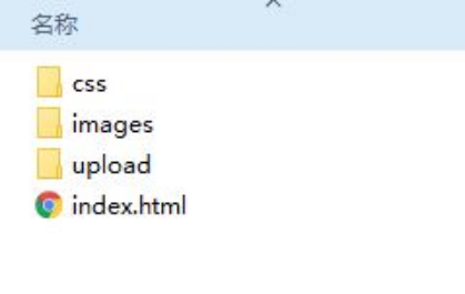
2. 搭建相关文件夹结构
3.设置视口标签以及引入初始化样式
<meta name=“viewport” content="width=device-width, user-scalable=no,
initial-scale=1.0, maximum-scale=1.0, minimum-scale=1.0">
4. 常用初始化样式
body {
margin: 0 auto;
min-width: 320px;
max-width: 640px;
background: #fff;
font-size: 14px;
font-family: -apple-system, Helvetica, sans-serif;
line-height: 1.5;
color: #666;
}
/点击高亮我们需要清除清除 设置为transparent 完成透明/
- {
-webkit-tap-highlight-color: transparent;
}
/在移动端浏览器默认的外观在iOS上加上这个属性才能给按钮和输入框自定义样式/
input {
-webkit-appearance: none;
}
/禁用长按页面时的弹出菜单/
img,
a {
-webkit-touch-callout: none;
}
a {
color: #666;
text-decoration: none;
}
ul {
margin: 0;
padding: 0;
list-style: none;
}
img {
vertical-align: middle;
}
div {
/* css3 盒子模型 */
box-sizing: border-box;
-webkit-box-sizing: border-box;
}
.clearfix:after {
content: “”;
display: block;
line-height: 0;
visibility: hidden;
height: 0;
clear: both;
}
1.flex布局体验
1.1 传统布局与flex布局
传统布局
-
兼容性好
-
布局繁琐
-
局限性,不能再移动端很好的布局
flex 弹性布局
-
操作方便,布局极为简单,移动端应用很广泛
-
PC 端浏览器支持情况较差
-
IE 11或更低版本,不支持或仅部分支持
建议:
-
如果是PC端页面布局,我们还是传统布局。
-
如果是移动端或者不考虑兼容性问题的PC端页面布局,我们还是使用flex弹性布局
1.2 初体验
1
2
3
2. flex布局原理
1 布局原理
flex 是 flexible Box 的缩写,意为"弹性布局",用来为盒状模型提供最大的灵活性,任何一个容器都可以指定为 flex 布局
-
当我们为父盒子设为 flex 布局以后,子元素的 float、clear 和 vertical-align 属性将失效。
-
伸缩布局 = 弹性布局 = 伸缩盒布局 = 弹性盒布局 =flex布局
采用 Flex 布局的元素,称为 Flex 容器(flex container),简称"容器"。它的所有子元素自动成为容器成员,称为 Flex 项目(flex item),简称"项目"。
-
体验中 div 就是 flex父容器。
-
体验中 span 就是 子容器 flex项目
-
子容器可以横向排列也可以纵向排列
总结flex布局原理:
就是通过给父盒子添加flex属性,来控制子盒子的位置和排列方式
[外链图片转存失败,源站可能有防盗链机制,建议将图片保存下来直接上传(img-85Ph4D1E-1647853059074)(C:/Users/lightofd/AppData/Roaming/Typora/typora-user-images/image-20220319090424025.png)]
3.常见父项属性
-
flex-direction:设置主轴的方向
-
justify-content:设置主轴上的子元素排列方式
-
flex-rap:设置子元素是否换行
-
align-content:设置侧轴上的子元素的排列方式(多行)
-
align-items:设置侧轴上的子元素排列方式(单行)
-
flex-flow:复合属性,相当于同时设置了 flex-direction 和 flex-wrap
-
flex布局中,默认的子元素是不换行的, 如果装不开,会缩小子元素的宽度,放到父元素里面
1).flex-direction 属性决定主轴的方向(即项目的排列方向)
注意: 主轴和侧轴是会变化的,就看 flex-direction 设置谁为主轴,剩下的就是侧轴。而我们的子元素是跟着主轴来排列的
| 属性值 | 说明 |
| — | — |
| row | 默认值从左到右 |
| row-reverse | 从右到左 |
| column | 从上到下 |
| column-reverse | 从下到上 |
2)justify-content 设置主轴上的子元素排列方式
- justify-content 属性定义了项目在主轴上的对齐方式
注意: 使用这个属性之前一定要确定好主轴是哪个
| 属性值 | 说明 |
| — | — |
| flex-start | 默认值 从头部开始 如果主轴是x轴,则从左到右 |
| flex-end | 从尾部开始排列 |
|
 最低0.47元/天 解锁文章


 1278
1278


 被折叠的 条评论
为什么被折叠?
被折叠的 条评论
为什么被折叠?
 到【灌水乐园】发言


