


组件树结构
1.父组件  House
  子组件
  1.form表单组件   2.table数据组件
开发需要使用sass
<style scoped lang="scss">

cnpm i --save-dev sass
<style scoped lang="scss">
.house {
  height: 100%;
  background-color: #ccc;
  padding: 10px;
  .house-form {
    min-height: 80px;
    background-color: #fff;
  }
}
</style>
//默认解析之后  空格选择

.house {
  height: 100%;
  background-color: #ccc;
  padding: 10px;
  > .house-form {
    min-height: 80px;
    background-color: #fff;
  }
}
//添加>  解析之后是 > 子集选择器
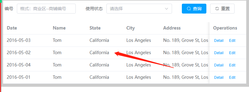
封装了form基础组件
<script lang="ts" setup>
//引入puls 图标
import { Search, Refresh } from "@element-plus/icons-vue";
import { reactive } from "vue";

//定义props
interface propType {
  options: any[];
}
const props = defineProps<propType>();
//定义emit事件
const emitter = defineEmits(["search"]);
const formInline = reactive({
  name: "",
  state: "",
});

//表单提交方法
const onSubmit = () => {
  console.log("submit!");
  //触发组件自定义事件
  emitter("search", formInline);
};
</script>
<template>
  <el-form :inline="true" :model="formInline" class="demo-form-inline">
    <el-form-item label="编号">
      <el-input v-model="formInline.name" placeholder="格式:商业区--商铺编号" />
    </el-form-item>
    <el-form-item label="使用状态">
      <el-select v-model="formInline.state" placeholder="请选择">
        <!-- 循环编译产生 -->
        <template v-for="(item, index) in options">
          <el-option :label="item.name" :value="item.value" />
        </template>
      </el-select>
    </el-form-item>
    <el-form-item>
      <el-button type="primary" @click="onSubmit" :icon="Search">查询</el-button>
      <el-button type="default" :icon="Refresh">重置</el-button>
    </el-form-item>
  </el-form>
</template>

<style scoped></style>

完善表格table
常规版  table组件使用
<el-table :data="tableData" style="width: 100%">
    <el-table-column type="index" prop="index" label="序号" width="150" />
    <el-table-column prop="block" label="商业区-商户编号">
      <template #default="scope"> {{ scope.row.block }}-{{ scope.row.code }} </template>
    </el-table-column>
    <el-table-column prop="floor" label="楼层" />
    <el-table-column prop="buildingsquare" label="占地面积" />
    <el-table-column prop="usesquare" label="使用面积" />
    <el-table-column prop="rentFee" label="租金" />
    <el-table-column prop="state" label="使用状态">
      <!-- 使用插槽 -->
      <template #default="scope">
        <span>{{
          scope.row.state == "empty"
            ? "空置"
            : scope.row.state == "rented"
            ? "已出租"
            : "已出售"
        }}</span>
      </template>
    </el-table-column>
    <el-table-column fixed="right" label="操作">
      <template #default>
        <el-button link type="primary" size="small" @click="handleClick">
          <el-text class="mx-1" type="success">编辑</el-text>
        </el-button>
        <el-button link type="primary" size="small">
          <el-text class="mx-1" type="danger">删除</el-text>
        </el-button>
      </template>
    </el-table-column>
  </el-table>
table组件封装公共组件
技术点: props 自定义事件 插槽
table中存在表格数据不同---1.纯数据展示 2.数据中带标签操作。
思想:在table组件中使用循环遍历产生列字段
需要额外 配置列的字段。
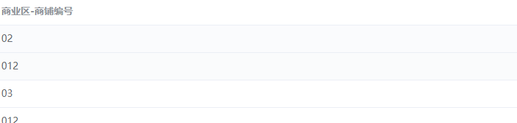
1.定义table  列配置
//table显示列配置
let tableColumn = ref([
  {
    prop: "block",
    label: "商业区-商铺编号",
  },
]);
2.在封装组件中 定义props接收列的配置
//定义props
interface propType {
  tableData?: any[];
  column?: any[];
}
const props = defineProps<propType>();
3.在table组件中动态编译产生
<el-table :data="tableData" style="width: 100%">
    <!-- 循环编译产生 -->
    <template v-for="(item, index) in column">
      <el-table-column :prop="item.prop" :label="item.label" />
    </template>
  </el-table>
展示效果
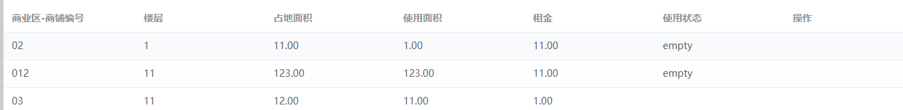
4.完善列的配置
let tableColumn = ref([
  {
    prop: "block",
    label: "商业区-商铺编号",
  },
  {
    prop: "floor",
    label: "楼层",
  },
  {
    prop: "buildingsquare",
    label: "占地面积",
  },
  {
    prop: "usesquare",
    label: "使用面积",
  },
  {
    prop: "rentFee",
    label: "租金",
  },
  {
    prop: "state",
    label: "使用状态",
  },
  {
    prop: "caozuo",
    label: "操作",
  },
]);
5.配置插槽

列的配置添加 插槽
 {
    prop: "block",
    label: "商业区-商铺编号",
    slot: true,
  },
 <template v-if="item.slot">
        <el-table-column :prop="item.prop" :label="item.label">
          <template #default>
            <!-- 配置定义插槽 -->
            <slot></slot>
          </template>
        </el-table-column>
      </template>
组件使用写入插槽
<myTable :tableData="tableList" :column="tableColumn">
        <template #default>
          <span>测试</span>
        </template>
      </myTable>
table表格中的数据字段使用插槽不止一个,插槽修改为具名插槽
 <template v-if="item.slot">
        <el-table-column :prop="item.prop" :label="item.label">
          <template #default>
            <!-- 配置定义插槽 -->
            <slot name="xx"></slot>
          </template>
        </el-table-column>
 使用修改为具名插槽使用
  <myTable :tableData="tableList" :column="tableColumn">
        <template #xx>
          <span>测试</span>
        </template>
      </myTable>
修改为动态具名插槽
 <template v-if="item.slot">
        <el-table-column :prop="item.prop" :label="item.label">
          <template #default>
            <!-- 配置定义插槽 -->
            <slot :name="item.prop"></slot>
          </template>
        </el-table-column>
      </template>
 //根据列字段直接使用
  <myTable :tableData="tableList" :column="tableColumn">
        <template #blockCode>
          <span>测试</span>
        </template>
      </myTable>
为了达到在插槽中使用table表格行数据 需要使用局部作用域插槽,将组件内部数据对外暴漏
 <el-table-column :prop="item.prop" :label="item.label">
          <template #default="scope">
            <!-- 配置定义插槽 -->
            <slot :name="item.prop" :items="scope"></slot>
          </template>
        </el-table-column>
 插槽itmes 属性绑定到插槽 关联行数据 scope
 在插槽中获取行数据
  <myTable :tableData="tableList" :column="tableColumn">
        <template #blockCode="{ items }">
          <span>{{ items.row.code }}</span>
        </template>
      </myTable>
实现效果

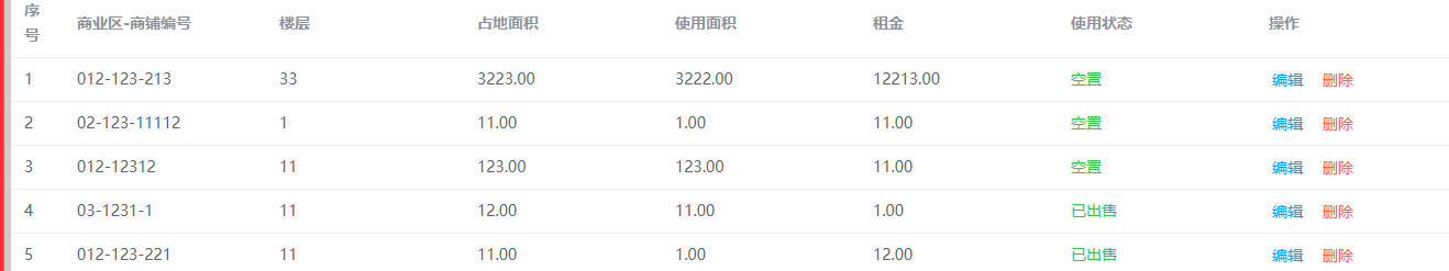
最终实现所有的插槽
<myTable :tableData="tableList" :column="tableColumn">
        <template #blockCode="{ items }">
          {{ items.row.block }}-{{ items.row.code }}
        </template>
        <template #state="{ items }">
          <el-text class="mx-1" type="success">{{
            items.row.state == "empty"
              ? "空置"
              : items.row.state == "rented"
              ? "已出租"
              : "已出售"
          }}</el-text>
        </template>
        <template #caozuo="{ items }">
          <el-button link type="primary">编辑</el-button>
          <el-button link type="danger">删除</el-button>
        </template>
      </myTable>
项目中模态框
基本用法
<el-dialog v-model="dialogVisible" title="Tips" width="30%">
        <span>This is a message</span>
        <template #footer>
          <span class="dialog-footer">
            <el-button @click="dialogVisible = false">Cancel</el-button>
            <el-button type="primary" @click="dialogVisible = false"> Confirm </el-button>
          </span>
        </template>
      </el-dialog>
应为项目中模态框的内容不定,需要将模态框进行二次封装。
二次封装使用插槽做的模态框
<script lang="ts" setup>
import { toRefs } from "vue";
//定义
interface propType {
  dialogVisible: boolean;
}
let props = defineProps<propType>();
let { dialogVisible } = toRefs(props);
</script>
<template>
  <el-dialog v-model="dialogVisible" title="Tips" width="30%">
    <slot></slot>
    <template #footer>
      <slot name="footer"></slot>
    </template>
  </el-dialog>
</template>
<style scoped></style>
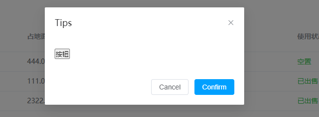
组件中直接使用模态框
 <!-- 模态框 -->
      <myDialog :dialog-visible="dialogVisible">
        <!-- 默认插槽 -->
        <button>按钮</button>
        <!-- 底部插槽 -->
        <template #footer>
          <span class="dialog-footer">
            <el-button @click="confirm">Cancel</el-button>
            <el-button type="primary" @click="confirm"> Confirm </el-button>
          </span>
        </template>
      </myDialog>
form表单封装
复制出一个简单的基本格式
<script setup lang="ts"></script>
<template>
  <el-form :inline="true" class="demo-form-inline">
    <el-form-item label="Approved by">
      <el-input v-model="formInline.user" placeholder="Approved by" />
    </el-form-item>
  </el-form>
</template>

封装不同种类的表单
分析表单的配置
{
  name:"input",
  type:"text"
}


 2019
2019


 被折叠的 条评论
为什么被折叠?
被折叠的 条评论
为什么被折叠?
 到【灌水乐园】发言


