


在做一些网页布局的时候,经常会遇到各种方向的三角形,常常令人头疼,今天给大家介绍一些利用CSS伪元素写各个方向三角形的方法
目录
一、CSS伪元素写三角形
1、向右的三角形
<!DOCTYPE html>
<html>
<!--根标签-->
<head>
<!--不可视区域-->
<meta charset='UTF-8'>
<!--国际编码-->
<meta name='Keyword' content='关键字'>
<meta name='Description' content='描述'>
<title>demo</title>
<style>
#triangle {
margin: 100px;
width: 100px;
height: 100px;
background-color: black;
position: relative;
}
#triangle:before {
position: absolute;
content: "";
width: 0;
height: 0;
top: 0px;
left: 100px;
border-top: solid 50px transparent;
border-left: solid 50px black;
border-bottom: solid 50px transparent;
}
</style>
</head>
<body>
<div id="triangle">
</div>
</body>
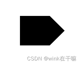
</html>定位后这里的 top:0px;
left:100px
效果图
2、向上的三角形
<!DOCTYPE html>
<html>
<!--根标签-->
<head>
<!--不可视区域-->
<meta charset='UTF-8'>
<!--国际编码-->
<meta name='Keyword' content='关键字'>
<meta name='Description' content='描述'>
<title>demo</title>
<style>
#triangle {
position: relative;
margin: 100px;
width: 100px;
height: 100px;
background-color: black;
}
#triangle:before {
position: absolute;
content: "";
width: 0;
height: 0;
top: -50px;
left: 0px;
border-right: solid 50px transparent;
border-left: solid 50px transparent;
border-bottom: solid 50px black;
}
</style>
</head>
<body>
<div id="triangle">
</div>
</body>
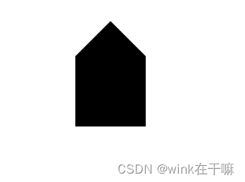
</html>定位后这里的 top:-50px;
left: 0px
效果图
3、向下的三角形
<!DOCTYPE html>
<html>
<!--根标签-->
<head>
<!--不可视区域-->
<meta charset='UTF-8'>
<!--国际编码-->
<meta name='Keyword' content='关键字'>
<meta name='Description' content='描述'>
<title>demo</title>
<style>
#triangle {
position: relative;
margin: 100px;
width: 100px;
height: 100px;
background-color: black;
}
#triangle:before {
position: absolute;
content: "";
width: 0;
height: 0;
top: 100px;
left: 0px;
border-top: solid 50px black;
border-right: solid 50px transparent;
border-left: solid 50px transparent;
}
</style>
</head>
<body>
<div id="triangle">
</div>
</body>
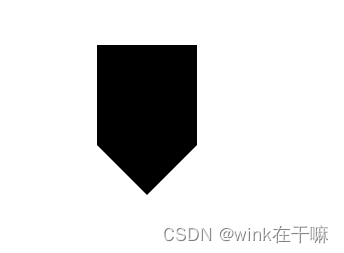
</html>定位后这里的 top:100px;
left: 0px
效果图
4、向左的三角形
<!DOCTYPE html>
<html>
<!--根标签-->
<head>
<!--不可视区域-->
<meta charset='UTF-8'>
<!--国际编码-->
<meta name='Keyword' content='关键字'>
<meta name='Description' content='描述'>
<title>demo</title>
<style>
#triangle {
position: relative;
margin: 100px;
width: 100px;
height: 100px;
background-color: black;
}
#triangle:before {
position: absolute;
content: "";
width: 0;
height: 0;
top: 0px;
left: -50px;
border-top: solid 50px transparent;
border-right: solid 50px black;
border-bottom: solid 50px transparent;
}
</style>
</head>
<body>
<div id="triangle">
</div>
</body>
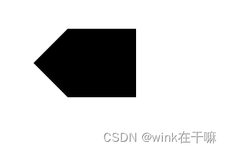
</html>定位后这里的 top:0px;
left:-50px
效果图


 379
379


 被折叠的 条评论
为什么被折叠?
被折叠的 条评论
为什么被折叠?
 到【灌水乐园】发言


