


绘制折线图
x = [1, 2, 3, 4, 5]
y = [10, 20, 15, 25, 30]
plt.plot(x, y)
绘制散点图
plt.scatter(x, y)
绘制柱状图
plt.bar(x, y)
添加标题和标签
plt.title(‘Title’)
plt.xlabel(‘X Label’)
plt.ylabel(‘Y Label’)
显示图表
plt.show()
4. Seaborn:
import seaborn as sns
import matplotlib.pyplot as plt
绘制带有趋势线的散点图
sns.regplot(x=‘x’, y=‘y’, data=df)
绘制箱线图
sns.boxplot(x=‘group’, y=‘value’, data=df)
绘制直方图和核密度估计
sns.distplot(df[‘column’], bins=10, kde=True)
设置样式和调整图表布局
sns.set(style=‘darkgrid’)
plt.tight_layout()
显示图表
plt.show()
5. Scikit-learn:
from sklearn.linear_model import LinearRegression
from sklearn.model_selection import train_test_split
from sklearn.metrics import mean_squared_error
划分训练集和测试集
X_train, X_test, y_train, y_test = train_test_split(X, y, test_size=0.2)
创建线性回归模型
model = LinearRegression()
在训练集上拟合模型
model.fit(X_train, y_train)
在测试集上进行预测
y_pred = model.predict(X_test)
计算均方误差
mse = mean_squared_error(y_test, y_pred)
6. SciPy:
from scipy.optimize import minimize
from scipy.interpolate import interp1d
from scipy.integrate import quad
最小化函数
result = minimize(f, x0)
插值函数
f_interp = interp1d(x, y, kind=‘linear’)
y_interp = f_interp(x_new)
数值积分
result, error = quad(f, a, b)
7. Statsmodels:
import statsmodels.api as sm
创建线性回归模型
model = sm.OLS(y, X)
在训练集上拟合模型
results = model.fit()
打印模型摘要
print(results.summary())
进行假设检验
hypothesis = ‘x = 0’
t_test = results.t_test(hypothesis)
进行预测
y_pred = results.predict(X_new)
8. NetworkX:
import networkx as nx
import matplotlib.pyplot as plt
创建图对象
G = nx.Graph()
添加节点和边
G.add_nodes_from([1, 2, 3, 4])
G.add_edges_from([(1, 2), (2, 3), (3, 4), (4, 1)])
绘制图形
nx.draw(G, with_labels=True)
计算图的中心性指标
centrality = nx.betweenness_centrality(G)
计算最短路径
shortest_path = nx.shortest_path(G, source=1, target=4)
显示图形
plt.show()
9. BeautifulSoup:
from bs4 import BeautifulSoup
import requests
发送HTTP请求,获取网页内容
response = requests.get(‘https://www.example.com’)
使用BeautifulSoup解析网页内容
soup = BeautifulSoup(response.content, ‘html.parser’)
提取网页中的文本内容
text = soup.get_text()
提取指定标签的内容
links = soup.find_all(‘a’)
for link in links:
print(link.get(‘href’))
10. TensorFlow:
import tensorflow as tf
创建图和会话
graph = tf.Graph()
session = tf.Session(graph=graph)
定义变量和操作
x = tf.constant(2)
y = tf.constant(3)
z = tf.add(x, y)
运行操作
result = session.run(z)
print(result)
定义神经网络模型
model = tf.keras.Sequential()
model.add(tf.keras.layers.Dense(10, activation=‘relu’))
model.add(tf.keras.layers.Dense(1, activation=‘sigmoid’))
编译模型
model.compile(loss=‘binary_crossentropy’, optimizer=‘adam’, metrics=[‘accuracy’])
训练模型
model.fit(X_train, y_train, epochs=10, validation_data=(X_val, y_val))
这些使用事例展示了以上每个库的基本用法和功能,可以根据具体需求进行相应的调用和使用。


### 实际案例:


假设我们有一个电商网站的销售数据,想要对销售情况进行分析和预测。


首先,我们可以使用pandas读取销售数据的CSV文件为一个DataFrame,并进行数据清洗和整理,以便后续分析。
import pandas as pd
读取销售数据
df = pd.read_csv(‘sales_data.csv’)
查看数据前几行
print(df.head())
对数据进行清洗和整理
…
接下来,我们可以使用NumPy计算销售数据的一些统计指标,比如平均值、标准差等。
import numpy as np
计算销售额的平均值和标准差
sales = df[‘sales’].values
mean_sales = np.mean(sales)
std_sales = np.std(sales)
计算销售额的累积和
cumulative_sales = np.cumsum(sales)
然后,我们可以使用Matplotlib和Seaborn绘制销售数据的可视化图表,比如折线图、柱状图等。
import matplotlib.pyplot as plt
import seaborn as sns
绘制销售额的折线图
dates = df[‘date’].values
plt.plot(dates, sales)
plt.xlabel(‘Date’)
plt.ylabel(‘Sales’)
plt.title(‘Sales Trend’)
plt.show()
绘制销售额的柱状图
categories = df[‘category’].values
sns.barplot(x=categories, y=sales)
plt.xlabel(‘Category’)
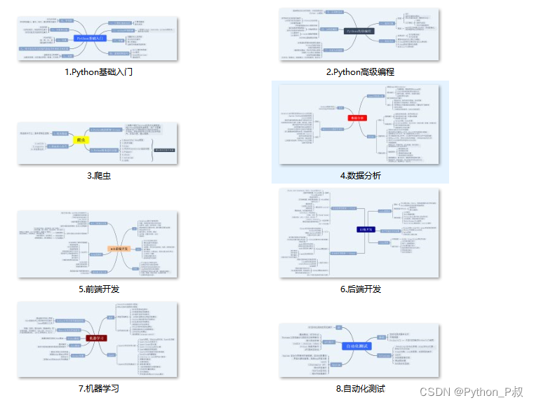
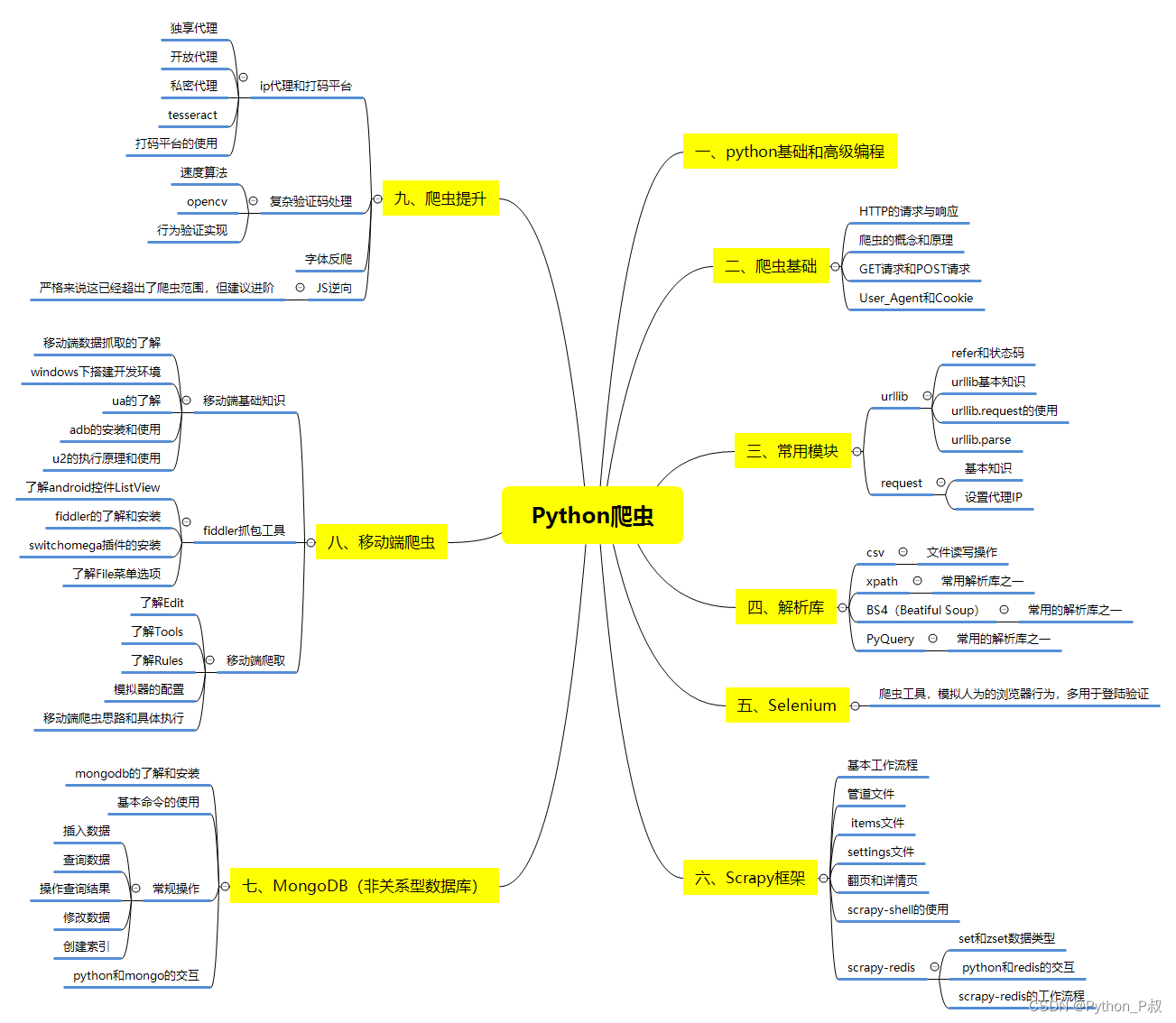
一、Python所有方向的学习路线
Python所有方向的技术点做的整理,形成各个领域的知识点汇总,它的用处就在于,你可以按照下面的知识点去找对应的学习资源,保证自己学得较为全面。
二、Python必备开发工具
工具都帮大家整理好了,安装就可直接上手!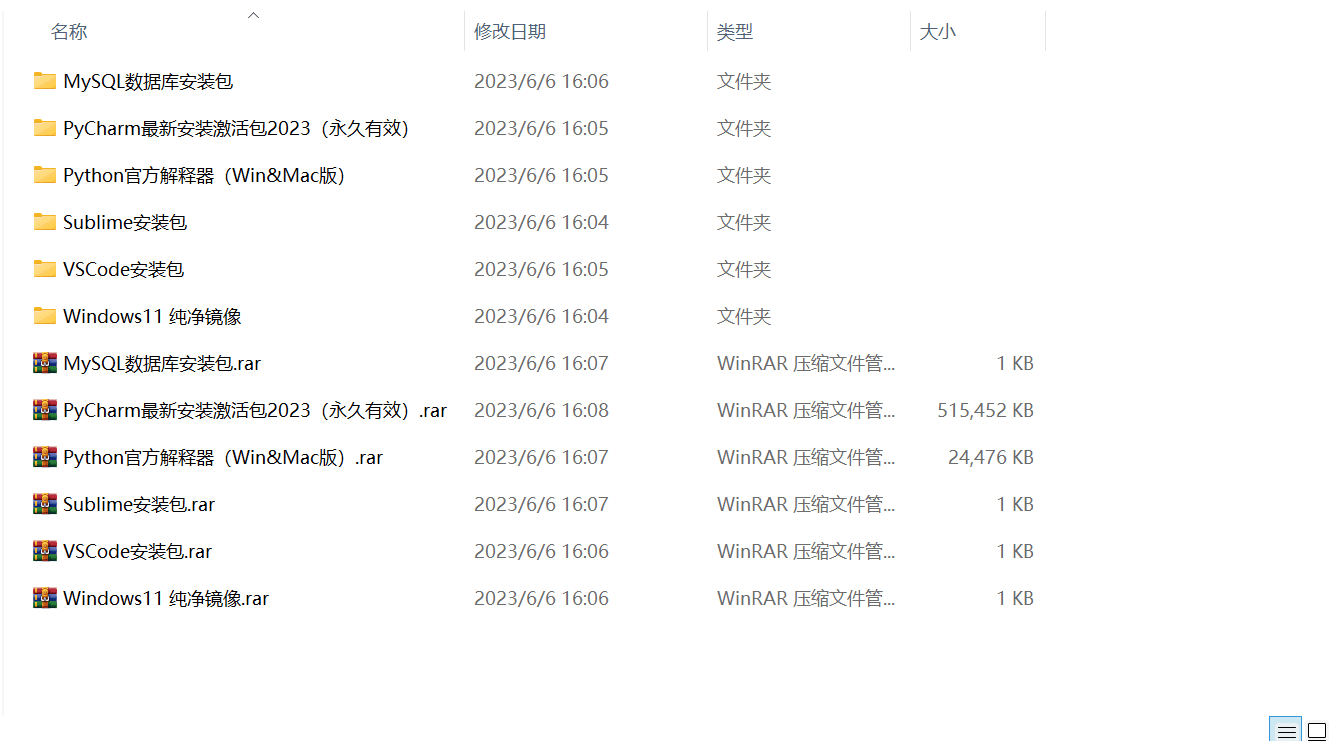
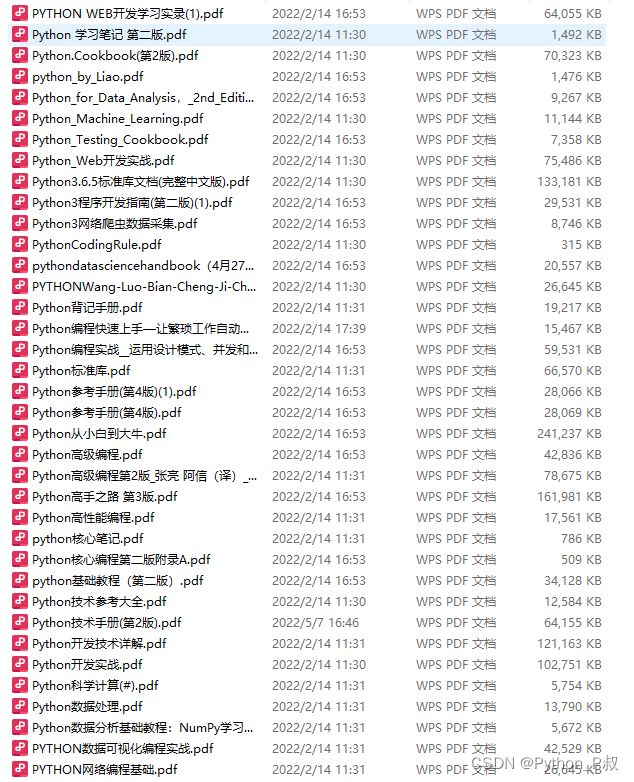
三、最新Python学习笔记
当我学到一定基础,有自己的理解能力的时候,会去阅读一些前辈整理的书籍或者手写的笔记资料,这些笔记详细记载了他们对一些技术点的理解,这些理解是比较独到,可以学到不一样的思路。
四、Python视频合集
观看全面零基础学习视频,看视频学习是最快捷也是最有效果的方式,跟着视频中老师的思路,从基础到深入,还是很容易入门的。

五、实战案例
纸上得来终觉浅,要学会跟着视频一起敲,要动手实操,才能将自己的所学运用到实际当中去,这时候可以搞点实战案例来学习。
六、面试宝典

简历模板
网上学习资料一大堆,但如果学到的知识不成体系,遇到问题时只是浅尝辄止,不再深入研究,那么很难做到真正的技术提升。
一个人可以走的很快,但一群人才能走的更远!不论你是正从事IT行业的老鸟或是对IT行业感兴趣的新人,都欢迎加入我们的的圈子(技术交流、学习资源、职场吐槽、大厂内推、面试辅导),让我们一起学习成长!


 2万+
2万+


 被折叠的 条评论
为什么被折叠?
被折叠的 条评论
为什么被折叠?
 到【灌水乐园】发言


