


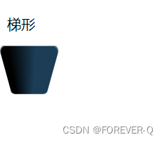
1.css画
说明:css画出倒梯形
  <div class="outer-box">
  <div class="gradient_bg"></div>
  </div>
.outer-box{
width: 50px;
height: 50px;
position: relative;
//overflow: hidden;
}
/*使用transform属性后,梯形样式会溢出父容器*/
.gradient_bg {
position: absolute;
//left: 50%;
top: 50%;
width: 100%;
height: 100%;
background: linear-gradient(90deg, #010101 13.46%, #1B3D55 59.95%);
transform: perspective(0.1em) rotateX(179deg);
border-radius: 5px;
} 
2.canvas
说明:画出正梯形
<canvas id="trapezoidCanvas" width="200" height="100"></canvas><script>
export default {
name: "index",
mounted() {
this.ininShape()
},
methods:{
ininShape(){
// 获取画布元素
const canvas = document.querySelector('#trapezoidCanvas');
const ctx = canvas.getContext('2d');
// 设置梯形的参数
const topWidth = 30;
const bottomWidth = 100;
const height = 50;
const trapezoidColor = '#008000'; // 绿色
// 计算梯形的顶点坐标
const xTopLeft = (canvas.width - topWidth) / 2;
const xTopRight = xTopLeft + topWidth;
const xBottomLeft = (canvas.width - bottomWidth) / 2;
const xBottomRight = xBottomLeft + bottomWidth;
const yTop = (canvas.height - height) / 2;
const yBottom = yTop + height;
// 绘制梯形
ctx.fillStyle = trapezoidColor;
ctx.beginPath();
ctx.moveTo(xTopLeft, yTop);
ctx.lineTo(xTopRight, yTop);
ctx.lineTo(xBottomRight, yBottom);
ctx.lineTo(xBottomLeft, yBottom);
ctx.closePath();
ctx.fill();
}
}
}
</script> 
如何想让它倒过来;直接沿着X旋转180度。
transform: rotateX(180deg)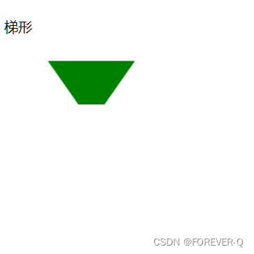


 扫一扫
扫一扫


 被折叠的 条评论
为什么被折叠?
被折叠的 条评论
为什么被折叠?
 到【灌水乐园】发言


