


常用属性
1.从右往左对齐 justify-content:flex-end;
2.水平居中 justify-content:center;
3.将主轴设置垂直方向{侧轴变成水平方向} flex-direction: column;
4.两边贴边,中间均分 justify-content:space-between;
4主轴反方向 flex-direction:row-reverse;
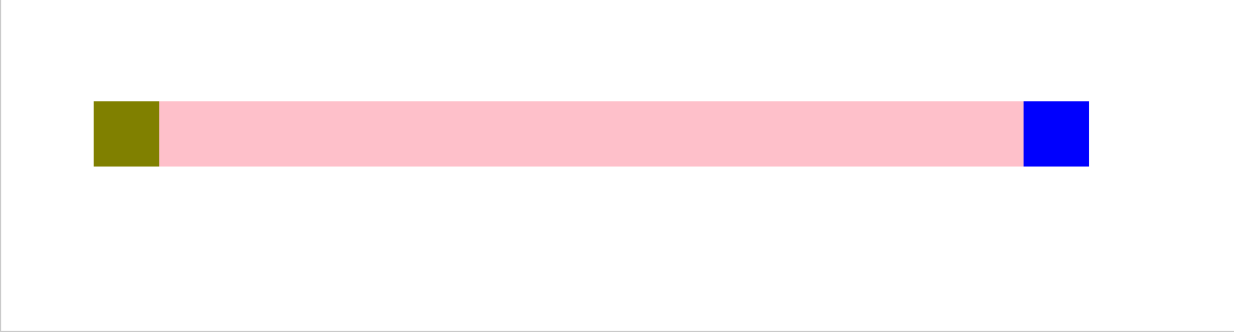
圣杯布局
(移动网页,旁边两个小盒子不动,中间盒子自动缩放)
方法:
1.设置一个父盒子box 给父盒子使用displya:flex;布局
2.设置三个子盒子(注意只有左右两边的子盒子设置宽度和高度),
3.中间的和子给css属性设置flex:1;
4:然后对父盒子使用justify-content:space-between;)让盒子分别能位于左.中.右。
5.此时拉动网页,旁边两个小盒子不动,中间盒子会自动缩放。
<!DOCTYPE html>
<html lang="en">
<head>
  <meta charset="UTF-8">
  <meta http-equiv="X-UA-Compatible" content="IE=edge">
  <meta name="viewport" content="width=device-width, initial-scale=1.0">
  <title>Document</title>
  <style>

    /* flex:1; 写在子盒子上*/
    .box{
      display: flex;
      margin:100px auto;
      /* 给父盒子设置长宽 */
      width: 60%;
      height: 40px;
      background-color: aqua;
    }
    .box div:nth-child(1){
      /* 给左边的子盒子设置边长 */
      width: 40px;
      height: 40px;
      background-color: olive;
    }
    .box div:nth-child(3){
      /* 给右边的盒子设置边长 */
      width: 40px;
      height: 40px;
      background-color: blue;
    }
    .box div:nth-child(2){
      /* 中间的盒子设置 flex: 1;*/
      flex: 1;
      background-color: pink;
    }
  </style>
</head>
<body>
  <div class="box">
    <div></div>
    <div></div>
    <div></div>
  </div>
</body>


 2万+
2万+


 被折叠的 条评论
为什么被折叠?
被折叠的 条评论
为什么被折叠?
 到【灌水乐园】发言


