


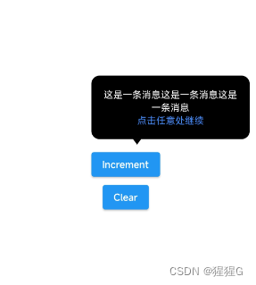
一、 效果
二 、 创建PopRoute类继承自PopupRoute,用于创建一个弹出层路由。
class PopRoute extends PopupRoute {
  final Duration _duration = Duration(milliseconds: 300);
  Widget child;

  PopRoute({required this.child});

  @override
  Color? get barrierColor => null;

  @override
  bool get barrierDismissible => true;

  @override
  String? get barrierLabel => null;

  @override
  Widget buildPage(BuildContext context, Animation<double> animation,
      Animation<double> secondaryAnimation) {
    return child;
  }

  @override
  Duration get transitionDuration => _duration;
}- _duration:弹出层动画持续时间。
- child:弹出层显示的子Widget。
- barrierColor:弹出层遮罩颜色,该属性返回null,即不设置遮罩颜色。
- barrierDismissible:是否允许点击遮罩关闭弹出层,该属性返回true,即允许关闭。
- barrierLabel:遮罩上显示的文本,该属性返回null,即不显示文本。
- buildPage:构建弹出层页面的方法,返回child子Widget。
- transitionDuration:动画持续时间,返回_duration属性。
三 、 创建BasePopup弹出层Widget。
class BasePopup extends StatelessWidget {
  final Widget child;
  final double right;
  final double top;

  BasePopup({
    required this.child,
    required this.right,
    required this.top,
  });

  @override
  Widget build(BuildContext context) {
    return Material(
      color: Colors.transparent,
      child: GestureDetector(
        child: Stack(
          children: [
            Container(
              width: MediaQuery.of(context).size.width,
              height: MediaQuery.of(context).size.height,
              color: Colors.transparent,
            ),
            Positioned(
              child: GestureDetector(
                  child: child,
                  onTap: () {
                    MyPopup.closePop(context);
                  }),
              right: right,
              top: top,
            ),
          ],
        ),
        onTap: () {
          MyPopup.closePop(context);
        },
        onHorizontalDragStart: (detalis) {
          MyPopup.closePop(context);
        },
        onVerticalDragStart: (detalis) {
          MyPopup.closePop(context);
        },
      ),
    );
  }
}
此组件接受三个参数:child(弹出层的内容)、right(弹出层距离屏幕右侧的距离)和top(弹出层距离屏幕顶部的距离)。
在build方法中,返回一个Material widget,设置其颜色为透明,并在其内部使用GestureDetector来捕捉用户的点击和拖拽事件,以便关闭弹出层。GestureDetector的子 widget 是一个Stack,包含两个子 widget:一个透明的Container和一个Positioned widget。Positioned widget 内部又包含一个GestureDetector,它的 child 是传入的child参数,当用户点击child时,会调用MyPopup.closePop方法关闭弹出层。Positioned widget 通过right和top参数将弹出层定位在屏幕的指定位置。
四 、 创建MyPopup类用于计算位置和控制Popup的显示。
enum ArrowDirection { top, bottom }
class MyPopup {
  static Offset calculateElementOffset(GlobalKey key) {
    final renderBox = key.currentContext?.findRenderObject();

    if (renderBox is! RenderBox) {
      return Offset(0, 0);
    }
    final position = renderBox.localToGlobal(Offset.zero);
    final width = renderBox.size.width > 0 ? renderBox.size.width : 0;
    final height = renderBox.size.height > 0 ? renderBox.size.height : 0;

    return Offset(
      width.toDouble(),
      position.dy + height,
    );
  }

  static void closePop(BuildContext context) {
    Navigator.of(context).pop();
  }

  static void showPop({
    required GlobalKey key,
    required Widget child,
    required BuildContext context,
    double right = -12,
    double top = 12,
    double? arrowRight,
    double? arrowBottom,
    double? arrowTop,
    double? arrowLeft,
    double radius = 5,
    double opacity = 0.7,
    double padding = 12,
    Color color = Colors.black,
    ArrowDirection direction = ArrowDirection.top,
  }) {
    final Offset offset = calculateElementOffset(key);
    Navigator.push(
      context,
      PopRoute(
        child: BasePopup(
          child: Container(
            decoration: BoxDecoration(
                color: color.withOpacity(opacity),
                borderRadius: BorderRadius.circular(radius)),
            child: Padding(
              padding: EdgeInsets.all(padding),
              child: Stack(
                clipBehavior: Clip.none,
                children: <Widget>[
                  child,
                  Positioned(
                    child: Container(
                      width: 12,
                      height: 8,
                      child: CustomPaint(
                        painter: direction == ArrowDirection.top
                            ? TrianglePainter(color: color, opacity: opacity)
                            : InvertedTrianglePainter(
                                color: color, opacity: opacity),
                      ),
                    ),
                    top: arrowBottom != null
                        ? null
                        : (arrowTop == null ? 0 : arrowTop - padding),
                    right: arrowLeft != null ? null : arrowRight,
                    left: arrowRight != null ? null : arrowLeft,
                    bottom: arrowTop != null
                        ? null
                        : arrowBottom == null
                            ? 0
                            : arrowBottom - padding,
                  )
                ],
              ),
            ),
          ),
          right: offset.dx / 2 + right,
          top: offset.dy + top,
        ),
      ),
    );
  }
}


class TrianglePainter extends CustomPainter {
  final Color color;
  final double opacity;

  TrianglePainter({this.color = Colors.black, this.opacity = 0.7});
  @override
  void paint(Canvas canvas, Size size) {
    final path = Path();
    path.moveTo(size.width / 2, 0);
    path.lineTo(0, size.height);
    path.lineTo(size.width, size.height);
    path.close();

    final paint = Paint()
      ..color = color.withOpacity(opacity)
      ..style = PaintingStyle.fill; // 填充颜色

    canvas.drawPath(path, paint);
  }

  @override
  bool shouldRepaint(TrianglePainter oldDelegate) => false;
}

class InvertedTrianglePainter extends CustomPainter {
  final Color color;
  final double opacity;

  InvertedTrianglePainter({this.color = Colors.black, this.opacity = 0.7});

  @override
  void paint(Canvas canvas, Size size) {
    final path = Path();
    path.moveTo(size.width / 2, size.height);
    path.lineTo(size.width, 0);
    path.lineTo(0, 0);
    path.close();

    final paint = Paint()
      ..color = color.withOpacity(opacity)
      ..style = PaintingStyle.fill; // 填充颜色

    canvas.drawPath(path, paint);
  }

  @override
  bool shouldRepaint(TrianglePainter oldDelegate) => false;
}
1. calculateElementOffset方法:通过传入的GlobalKey获取目标元素的偏移量。
- 通过key.currentContext?.findRenderObject()获取目标元素的RenderBox对象。
- 判断renderBox是否为RenderBox类型,如果不是则返回(0, 0)。
- 使用localToGlobal(Offset.zero)获取元素相对于屏幕的全局偏移量position。
- 计算元素的宽度和高度,如果小于等于0,则默认为0。
- 返回一个新的Offset对象,其x值为元素宽度,y值为元素高度加上position.dy。
2. closePop方法:通过传入的BuildContext关闭当前弹出层。
3. showPop方法:显示一个自定义的弹出层
- key: 必需,用于标识弹出框的全局键。
- child: 必需,弹出框内显示的子部件。
- context: 必需,构建上下文,用于显示弹出框。
- right: 弹出框相对于父元素的右侧偏移量,默认为-12。
- top: 弹出框相对于父元素的顶部偏移量,默认为12。
- arrowRight、arrowBottom、arrowTop、arrowLeft: 弹出框箭头相对于弹出框的偏移量,可为空,默认为null。
- radius: 弹出框的圆角半径,默认为5。
- opacity: 弹出框的透明度,默认为0.7。
- padding: 弹出框内部的填充,默认为12。
- color: 弹出框的颜色,默认为黑色。
- direction: 箭头的方向,默认为朝上。
函数首先计算弹出框的位置,然后使用Navigator.push将弹出框压入导航栈中。弹出框的外观由BasePopup组件和其子部件Container、Padding和Stack共同决定。Stack中包含两个子组件,一个是用户传入的child,另一个是小箭头,箭头的方向和颜色由direction和color参数决定。
五 、 使用方法
1. 先定义一个Globalkey
GlobalKey key = GlobalKey();2. 将这个key给需要的组件
 ElevatedButton(
                  key: key,
                  onPressed: () {

                  },
                  child: const Text('Increment'),
                )
3. 通过show方法弹出
当然可以点击按钮弹出,也可以在initState里面自动弹出(前提是异步弹出,否则会造成按钮还没渲染出来就通过key计算它的位置信息,导致报错 )。
 ElevatedButton(
                  key: key,
                  onPressed: () {
                    MyPopup.showPop(
                        key: key,
                        child: PopUpContent(),
                        context: context,
                        right: -36,
                        top: -154,
                        arrowRight:
                            (MediaQuery.of(context).size.width * 0.75) * 0.5 -
                                6,
                        arrowBottom: -7.9,
                        radius: 12,
                        opacity: 1,
                        padding: 18,
                        direction: ArrowDirection.bottom);
                  },
                  child: const Text('Increment'),
                )


class PopUpContent extends StatelessWidget {
  @override
  Widget build(BuildContext context) {
    return Column(
      children: [
        Row(
          children: [
            SizedBox(
              width: MediaQuery.of(context).size.width * 0.5,
              child: Text(
                "这是一条消息这是一条消息这是一条消息",
                style: TextStyle(
                  color: Colors.white,
                  fontSize: 14,
                ),
                maxLines: 2,
                overflow: TextOverflow.ellipsis,
                textAlign: TextAlign.center,
              ),
            ),
          ],
        ),
        Row(
          mainAxisAlignment: MainAxisAlignment.center,
          children: [
            Text(
              "点击任意处继续",
              style: TextStyle(
                color: Color(0xFF408CFF),
                fontSize: 14,
              ),
              maxLines: 1,
              overflow: TextOverflow.ellipsis,
            ),
          ],
        )
      ],
    );
  }
}
六 、全部代码
这个组件需要自己手动控制箭头和矩形框的位置。
如果觉得自定义程度还不够还能继续自定义,例如绘制左箭头和右箭头,然后加两个枚举值就可以了。
import 'package:flutter/material.dart';

class PopRoute extends PopupRoute {
  final Duration _duration = Duration(milliseconds: 300);
  Widget child;

  PopRoute({required this.child});

  @override
  Color? get barrierColor => null;

  @override
  bool get barrierDismissible => true;

  @override
  String? get barrierLabel => null;

  @override
  Widget buildPage(BuildContext context, Animation<double> animation,
      Animation<double> secondaryAnimation) {
    return child;
  }

  @override
  Duration get transitionDuration => _duration;
}

class BasePopup extends StatelessWidget {
  final Widget child;
  final double right;
  final double top;

  BasePopup({
    required this.child,
    required this.right,
    required this.top,
  });

  @override
  Widget build(BuildContext context) {
    return Material(
      color: Colors.transparent,
      child: GestureDetector(
        child: Stack(
          children: [
            Container(
              width: MediaQuery.of(context).size.width,
              height: MediaQuery.of(context).size.height,
              color: Colors.transparent,
            ),
            Positioned(
              child: GestureDetector(
                  child: child,
                  onTap: () {
                    MyPopup.closePop(context);
                  }),
              right: right,
              top: top,
            ),
          ],
        ),
        onTap: () {
          MyPopup.closePop(context);
        },
        onHorizontalDragStart: (detalis) {
          MyPopup.closePop(context);
        },
        onVerticalDragStart: (detalis) {
          MyPopup.closePop(context);
        },
      ),
    );
  }
}

enum ArrowDirection { top, bottom }

class MyPopup {
  static Offset calculateElementOffset(GlobalKey key) {
    final renderBox = key.currentContext?.findRenderObject();

    if (renderBox is! RenderBox) {
      return Offset(0, 0);
    }
    final position = renderBox.localToGlobal(Offset.zero);
    final width = renderBox.size.width > 0 ? renderBox.size.width : 0;
    final height = renderBox.size.height > 0 ? renderBox.size.height : 0;

    return Offset(
      width.toDouble(),
      position.dy + height,
    );
  }

  static void closePop(BuildContext context) {
    Navigator.of(context).pop();
  }

  static void showPop({
    required GlobalKey key,
    required Widget child,
    required BuildContext context,
    double right = -12,
    double top = 12,
    double? arrowRight,
    double? arrowBottom,
    double? arrowTop,
    double? arrowLeft,
    double radius = 5,
    double opacity = 0.7,
    double padding = 12,
    Color color = Colors.black,
    ArrowDirection direction = ArrowDirection.top,
  }) {
    final Offset offset = calculateElementOffset(key);
    Navigator.push(
      context,
      PopRoute(
        child: BasePopup(
          child: Container(
            decoration: BoxDecoration(
                color: color.withOpacity(opacity),
                borderRadius: BorderRadius.circular(radius)),
            child: Padding(
              padding: EdgeInsets.all(padding),
              child: Stack(
                clipBehavior: Clip.none,
                children: <Widget>[
                  child,
                  Positioned(
                    child: Container(
                      width: 12,
                      height: 8,
                      child: CustomPaint(
                        painter: direction == ArrowDirection.top
                            ? TrianglePainter(color: color, opacity: opacity)
                            : InvertedTrianglePainter(
                                color: color, opacity: opacity),
                      ),
                    ),
                    top: arrowBottom != null
                        ? null
                        : (arrowTop == null ? 0 : arrowTop - padding),
                    right: arrowLeft != null ? null : arrowRight,
                    left: arrowRight != null ? null : arrowLeft,
                    bottom: arrowTop != null
                        ? null
                        : arrowBottom == null
                            ? 0
                            : arrowBottom - padding,
                  )
                ],
              ),
            ),
          ),
          right: offset.dx / 2 + right,
          top: offset.dy + top,
        ),
      ),
    );
  }
}

class TrianglePainter extends CustomPainter {
  final Color color;
  final double opacity;

  TrianglePainter({this.color = Colors.black, this.opacity = 0.7});
  @override
  void paint(Canvas canvas, Size size) {
    final path = Path();
    path.moveTo(size.width / 2, 0);
    path.lineTo(0, size.height);
    path.lineTo(size.width, size.height);
    path.close();

    final paint = Paint()
      ..color = color.withOpacity(opacity)
      ..style = PaintingStyle.fill; // 填充颜色

    canvas.drawPath(path, paint);
  }

  @override
  bool shouldRepaint(TrianglePainter oldDelegate) => false;
}

class InvertedTrianglePainter extends CustomPainter {
  final Color color;
  final double opacity;

  InvertedTrianglePainter({this.color = Colors.black, this.opacity = 0.7});

  @override
  void paint(Canvas canvas, Size size) {
    final path = Path();
    path.moveTo(size.width / 2, size.height);
    path.lineTo(size.width, 0);
    path.lineTo(0, 0);
    path.close();

    final paint = Paint()
      ..color = color.withOpacity(opacity)
      ..style = PaintingStyle.fill; // 填充颜色

    canvas.drawPath(path, paint);
  }

  @override
  bool shouldRepaint(TrianglePainter oldDelegate) => false;
}


 409
409

 被折叠的 条评论
为什么被折叠?
被折叠的 条评论
为什么被折叠?
 到【灌水乐园】发言


