


一、结构伪类选择器
目标:能够使用结构伪类选择器在HTML中的结构关系查找元素
1.作用与优势:
1.作用:根据元素在HTML中的结构关系查找元素
2.优势:减少对于HTML中类的依赖,有利于保持代码整洁
3.场景:常用于查找某父级选择器中的子元素
2.选择器
| 选择器 | 说明 |
| E:first-child{} | 匹配父元素中的第一个子元素,并且是E元素 |
| E:lastchild{} | 匹配父元素中的最后一个子元素,并且是E元素 |
| E:nth-child{} | 匹配父元素中的第n个子元素,并且是E元素 |
| E:nth-last-child(n){} | 匹配父元素中倒数第n个子元素,并且是E元素 |
    <style>
        /* 选择第一个 */
        /* li:first-child{
            background-color: pink;
        } */

        /* 找最后一个 */
        /* li:last-child{
            background-color: pink;
        } */

        /* 任意一个 */
        /* li:nth-child(5){
            background-color: pink;
        } */

        /* 倒数第2个 */
        li:nth-last-child(2){
            background-color: pink;
        }
    </style>
</head>
<body>
         <!-- ul>li{这是第$个li}*8 -->
    <ul>
        <li>这是第1个li</li>
        <li>这是第2个li</li>
        <li>这是第3个li</li>
        <li>这是第4个li</li>
        <li>这是第5个li</li>
        <li>这是第6个li</li>
        <li>这是第7个li</li>
        <li>这是第8个li</li>
    </ul>
</body>
n的注意点:
1.n为0、1、2、3、4、5、6....
2.通过n可以组成常见公式
| 功能 | 公式 |
| 偶数 | 2n、even |
| 奇数 | 2n+1、2n-1、odd |
| 找到前5个 | -n+5 |
| 找到从第5个往后 | n+5 |
    <style>
        /* 偶数 */
        /* li:nth-child(2n){
            background-color: pink;
        } */

        /* 奇数 */
        /* li:nth-child(2n+1){
            background-color: pink;
        } */

        /* 前3个 */
        /* li:nth-child(-n+3){
            background-color: pink;
        } */
         li:nth-child(4n){
            background-color: pink;
        }
        </style>
</head>
<body>
    <ul>
        <li>这是第&个li</li>
        <li>这是第&个li</li>
        <li>这是第&个li</li>
        <li>这是第&个li</li>
        <li>这是第&个li</li>
        <li>这是第&个li</li>
        <li>这是第&个li</li>
        <li>这是第&个li</li>
    </ul>
</body>
二、伪元素
目标:能够使用伪元素在网页中创建内容
伪元素:一般页面中的非主体内容可以使用伪元素
区别:
1.元素:HTML设置的标签
2.伪元素:由CSS模拟出的标签效果
种类:
| 伪元素 | 作用 |
| ::before | 在父元素内容的最前面添加一个伪元素 |
| ::after | 在父元素内容的最后添加一个伪元素 |
注:1.必须设置content属性才能生效
2.伪元素默认是行内元素
    <style>
        .father{
            width: 300px;
            height: 300px;
            background-color: pink;
        }

        .father::before{
            /* 内容 */
            /* content属性必须添加,否则伪元素不生效 */
            content: '老鼠';
            color: green;
            width: 100px;
            height: 100px;
            background-color: blue;


            /* 默认是行内元素,宽高不生效 */
            display: block;
        }

        .father::after{
            /* 内容 */
            content: '大米';
        }
    </style>
</head>
<body>
    <!-- 伪元素:通过css创建标签,装饰性的不重要的小图 -->

    <!-- 找父级,在这个父级里面创建子集标签 -->

    <div class="father">爱</div>

    <!-- 老鼠爱大米 -->
</body>
三、标准流
目标:又称文档流,是浏览器在渲染显示网页内容时默认采用的一套排版规则,规定了应该以何种方式排列元素
常见标准流排版规则:
1.块级元素:从上往下,垂直布局,独占一行
2.行内元素 或 行内块元素: 从左往右,水平布局,空间不够自动拆行
四、浮动
目标:能够认识使用浮动的作用,了解浮动的特点
    <style>
        div{
            /* 浏览器解析行内块或行内标签,如果标签换行书写会产生一个空格的距离 */
            width: 100px;
            height: 100px;
            display: inline-block;
        }
        .one{
            background-color: pink;
        }
        .two{
            background-color: skyblue;
        }
    </style>
</head>
<body>
    <div class="one">one</div><div class="two">two</div>
</body>
1.1浮动的作用
早期的作用:图文环绕
现在的作用网页布局
    <style>
        /* img{
           float: left;
        } */

        div{
            width: 100px;
            height: 100px;
        }
        .one{
            background-color: pink;
            float: left;
        }
        .two{
            background-color: skyblue;
            /* flr */
            /* float: right; */
            float: left;
        }
    </style>
</head>
<body>
    <!-- 1. 图文环绕 -->
    <!-- <img src="../css基础/img/屏幕截图 2022-09-10 112632.png" alt="">1111111111111111111111111111111111111111111111111111111111111111111111111111111111111111111111111111111111111111111111111111111111111111111111111111111111111111111111111111111111111111111111111111111111111111111111111111111111111111111111111111111111111111111111111111111111111111111111111111111111111111111111111111111111111111111111111111111111111111111111111111111111111111111111111111111111111111111111111111111111111111111111111111111111111111111111111111111111111 -->
    <div class="one">one</div>
    <div class="two">two</div>
</body>
3.1浮动的特点
1.浮动元素会脱离标准流(简称:脱标),在标准流中不占位置
相当于从地面飘到了空中
2.浮动元素比标准流高半个级别,可以直接覆盖标准流中的元素
3.浮动找浮动,下一个浮动元素会在上一个浮动元素后面左右浮动
4.浮动元素有特殊的显示效果
1.一行可以显示多个
2.可以设置行高
注:浮动的元素不能通过text-align:center或者margin:0 auto
<style>
/* 浮动的标签 顶对齐 */
/* 浮动:在一行排列,宽高生效 -- 浮动后的标签具备行内块特点 */
.one{
width: 100px;
height: 100px;
background-color: pink;
float: left;
margin-top: 50px;
}
.two{
width: 200px;
height: 200px;
background-color: skyblue;
float: left;
/* 因为有浮动,不能生效 盒子无法水平居中 */
margin: 0 auto;
}
.three{
width: 300px;
height: 300px;
background-color: orange;
}
</style>
</head>
<body>
<div class="one">one</div>
<div class="two">two</div>
<div class="three">three</div>
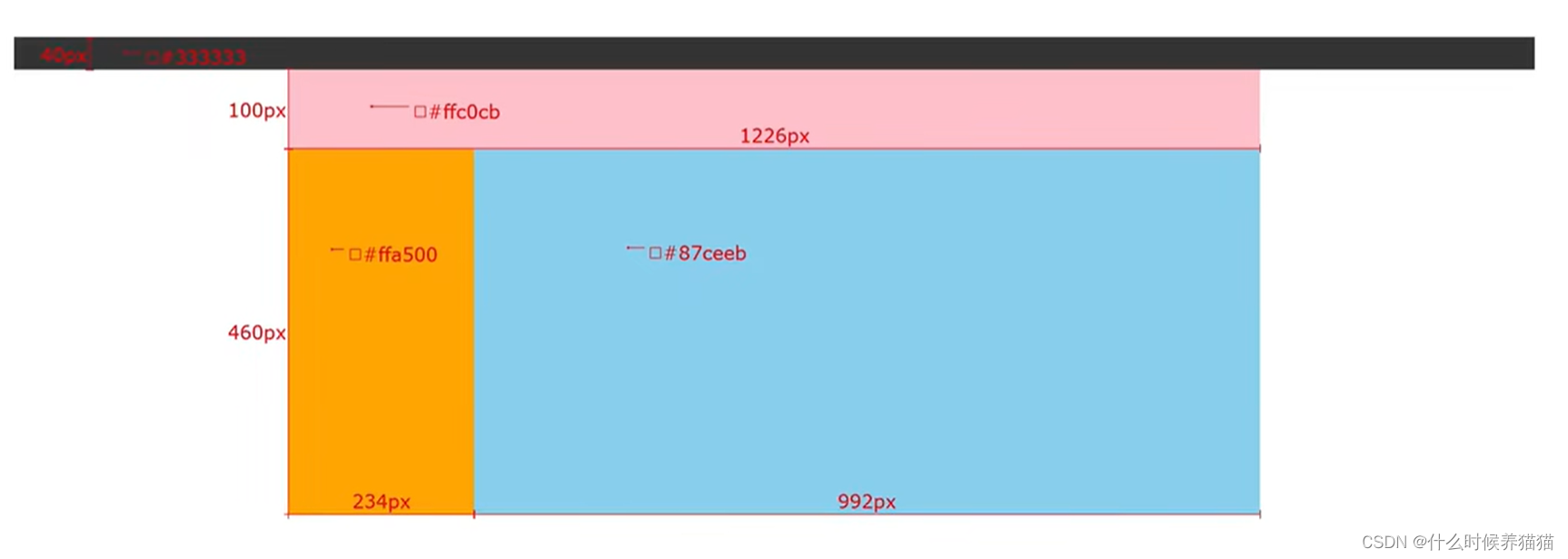
</body>(案例)网页布局案例
需求:使用浮动,完成设计图中布局效果
    <style>
        *{
            margin: 0;
            padding: 0;
        }

        .top{
            /* 宽高背景色 */
            height: 40px;
            background-color: #333;
        }
        .header{
            width: 1226px;
            height: 100px;
            background-color: pink;
            margin: 0 auto;
        }

        .content{
            width: 1226px;
            height: 460px;
            background-color: #fff;
            margin: 0 auto;
        }
        .left{
            float: left;
            width: 234px;
            height: 460px;
            background-color: #ffa500;
        }
        .right{
            float: left;
            width: 992px;
            height: 460px;
            background-color:#87ceeb ;
        }

        /* CSS书写顺序:浏览器执行效率更高
        1.浮动/display
        2.盒子模型: margin border padding 宽高背景色
        3.文字样式
        */
    </style>
</head>
<body>
    <!-- 通透的盒子:宽度和浏览器宽度一样大 -->
    <div class="top"></div>
    <div class="header">头部</div>
    <div class="content">
        <div class="left">left</div>
        <div class="right">right</div>
    </div>
</body>
CSS书写顺序:浏览器执行效率更高
1.浮动/display
2.盒子模型: margin border padding 宽高背景色
3.文字样式
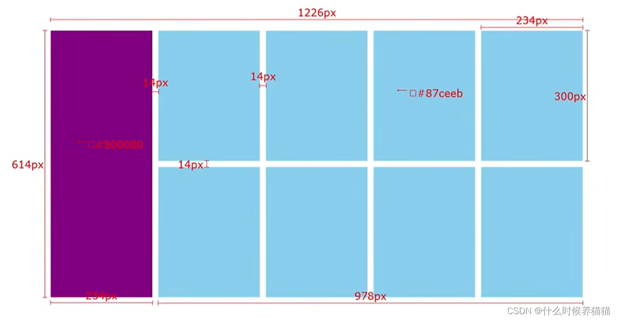
(案例)小米模板案例
需求:使用浮动,完成设计图中的布局效果
<style>
*{
margin: 0;
padding: 0;
}
.box{
margin: 0 auto;
width: 1226px;
height: 614px;
/* background-color: pink; */
}
.left{
float: left;
width: 234px;
height: 614px;
background-color: #800080;
}
.right{
float: right;
width: 978px;
height: 614px;
}
.right li{
float: left;
margin-right: 14px;
margin-bottom :14px;
width: 234px;
height: 300px;
background-color: #87ceeb;
}
/* 如果父级宽度不够,子级会自动换行 */
/* 第四个li和第八个li右间距清楚 */
.right li:nth-child(4n){
margin: 0;
}
ul{
/* 去掉列表的符号 */
list-style: none;
}
</style>
</head>
<body>
<div class="box">
<div class="left"></div>
<div class="right">
<ul>
<li></li>
<li></li>
<li></li>
<li></li>
<li></li>
<li></li>
<li></li>
<li></li>
</ul>
</div>
</div>
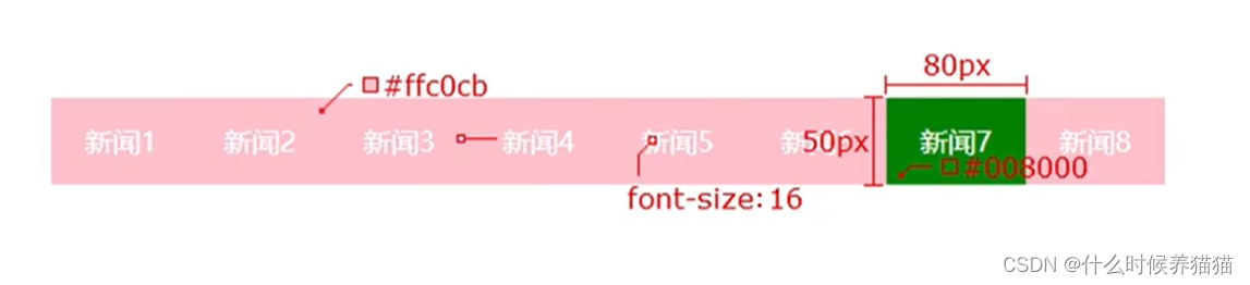
</body>(案例)网页导航案例
需求:使用浮动,完成设计图中布局效果
    <style>
        *{
            margin: 0;
            padding: 0;
        }

        .nav{
            margin: 50px auto;
            width: 640px;
            height: 50px;
            background-color: #ffc0cb;
        }
        ul{
            list-style: none;
        }
        .nav li{
            float: right;
        }
        .nav li a{
            /* 1.浮动 display */
            /* display: inline-block; */
            display: block;

            /* 2.盒子模型 */
            width: 80px;
            height: 50px;
            /* background-color: green; */

            /* 3.文字演示 */
            color:#fff;
            text-align: center;
            line-height: 50px;
            text-decoration: none;
        }

        .nav li a:hover{
            background-color: green;
        }
    </style>
</head>
<body>
    <div class="nav">
        <ul>
            <li><a href="">新闻</a></li>
            <li><a href="">新闻</a></li>
            <li><a href="">新闻</a></li>
            <li><a href="">新闻</a></li>
            <li><a href="">新闻</a></li>
            <li><a href="">新闻</a></li>
            <li><a href="">新闻</a></li>
            <li><a href="">新闻</a></li>
        </ul>
    </div>
</body>


 735
735


 被折叠的 条评论
为什么被折叠?
被折叠的 条评论
为什么被折叠?
 到【灌水乐园】发言


