import matplotlib. pyplot as plt
from IPython. display import HTML
import numpy as np
from html变量 import *
plt. style. available
['Solarize_Light2',
 '_classic_test_patch',
 'bmh',
 'classic',
 'dark_background',
 'fast',
 'fivethirtyeight',
 'ggplot',
 'grayscale',
 'seaborn',
 'seaborn-bright',
 'seaborn-colorblind',
 'seaborn-dark',
 'seaborn-dark-palette',
 'seaborn-darkgrid',
 'seaborn-deep',
 'seaborn-muted',
 'seaborn-notebook',
 'seaborn-paper',
 'seaborn-pastel',
 'seaborn-poster',
 'seaborn-talk',
 'seaborn-ticks',
 'seaborn-white',
 'seaborn-whitegrid',
 'tableau-colorblind10']
plt. style. use( "ggplot" )
note( 'num' , '图形的编号或名称。如果为 None,则自动编号。' )
num 图形的编号或名称。如果为 None,则自动编号。
note( 'figsize' , '图形的尺寸,以英寸为单位。(8, 6) 表示宽度为8英寸,高度为6英寸。' )
figsize 图形的尺寸,以英寸为单位。(8, 6) 表示宽度为8英寸,高度为6英寸。
note( 'dpi' , '整数。图形的分辨率,即每英寸的点数。例如,dpi=80。' )
dpi 整数。图形的分辨率,即每英寸的点数。例如,dpi=80。
note( 'facecolor' , "图形窗口的背景颜色。'w' 表示白色。" )
facecolor 图形窗口的背景颜色。'w' 表示白色。
note( 'edgecolor' , "图形窗口边框的颜色。'k' 表示黑色。" )
edgecolor 图形窗口边框的颜色。'k' 表示黑色。
note( 'xlabel or ylabel' , 'x or y轴的标签文本。' )
xlabel or ylabel x or y轴的标签文本。
plt. ylabel( ylabel= 'Rotated and Offset Y-axis Label' )
Text(0, 0.5, 'Rotated and Offset Y-axis Label')
note( 'fontdict' , '字典类型,用于设置标签字体的属性(如大小、颜色、样式等)。' )
fontdict 字典类型,用于设置标签字体的属性(如大小、颜色、样式等)。
fontdict = {
'family' : 'serif' ,
'color' : 'blue' ,
'weight' : 'normal' ,
'size' : 14
}
plt. ylabel( 'Rotated and Offset Y-axis Label' , fontdict= fontdict)
Text(0, 0.5, 'Rotated and Offset Y-axis Label')
note( 'loc' , "设置标签的位置(如'center', 'left' or 'top', 'right' or 'bottom')。" )
loc 设置标签的位置(如'center', 'left' or 'top', 'right' or 'bottom')。
plt. ylabel( 'Rotated and Offset Y-axis Label' , loc= 'top' )
Text(0, 1, 'Rotated and Offset Y-axis Label')
note( 'color' , '标签的颜色(如果fontdict未指定颜色)。' )
color 标签的颜色(如果fontdict未指定颜色)。
plt. ylabel(
'Rotated and Offset Y-axis Label' ,
color= 'green' )
Text(0, 0.5, 'Rotated and Offset Y-axis Label')
note( 'fontsize' , '标签的字体大小(如果fontdict未指定大小)。' )
fontsize 标签的字体大小(如果fontdict未指定大小)。
plt. ylabel( 'Rotated and Offset Y-axis Label' , fontsize= 16 )
Text(0, 0.5, 'Rotated and Offset Y-axis Label')
note( 'horizontalalignment 或 ha' , "调整标签的水平对齐方式(默认为'center')。" )
horizontalalignment 或 ha 调整标签的水平对齐方式(默认为'center')。
plt. ylabel( 'Rotated and Offset Y-axis Label' , horizontalalignment= 'left' )
plt. show( )
note( 'rotation' , "标签的旋转角度(默认为0度)。" )
plt. ylabel( 'Rotated and Offset Y-axis Label' , rotation= 10 )
plt. show( )
note( 'labelpad' , "标签与x or y轴之间的距离。" )
labelpad 标签与x or y轴之间的距离。
plt. ylabel( 'Rotated and Offset Y-axis Label' , labelpad= 100 )
plt. show( )
note( '**kwargs' , "其他关键字参数将传递给底层的文本对象。" )
**kwargs 其他关键字参数将传递给底层的文本对象。
plt. ylabel( 'Rotated and Offset Y-axis Label' ,
backgroundcolor= 'red' ,
bbox= dict ( facecolor= 'red' , edgecolor= 'black' , boxstyle= 'round' )
)
Text(0, 0.5, 'Rotated and Offset Y-axis Label')
note( 'label' , "标题文本。" )
plt. title( label= 'title' )
plt. show( )
note( 'fontsize' , "字体大小(整数)。" )
plt. title( label= 'title' ,
fontsize= 16 )
plt. show( )
note( 'color' , "字体颜色(名称、十六进制、RGB)。" )
plt. title( label= 'title' ,
color= 'blue' )
plt. show( )
note( 'loc' , "标题位置('center', 'left', 'right')。" )
loc 标题位置('center', 'left', 'right')。
plt. title( label= 'title' ,
loc= 'left' )
plt. show( )
note( 'pad' , "标题与图表顶部的间距。" )
plt. title( label= 'title' ,
pad= 40 )
plt. show( )
note( 'fontweight' , "字体粗细('normal', 'bold'等)。" )
fontweight 字体粗细('normal', 'bold'等)。
plt. title( label= 'title' ,
fontweight= 'bold' )
plt. show( )
note( '**kwargs' , "额外属性传递给文本对象。" )
plt. title( label= 'title' ,
fontstyle= 'italic' ,
family= 'serif' )
plt. show( )
note( 'handles' , "指定哪些元素出现在图例中。" )
line1, = plt. plot( [ 1 , 2 , 3 , 4 , 5 ] , [ 3 , 4 , 5 , 6 , 1 ] )
line2, = plt. plot( [ 1 , 2 , 3 , 4 , 5 ] , [ 5 , 2 , 1 , 2 , 4 ] )
plt. legend( handles= [ line1, line2] )
plt. show( )
/opt/conda/lib/python3.7/site-packages/ipykernel_launcher.py:3: UserWarning: The handle <matplotlib.lines.Line2D object at 0x7fe37bbe3210> has a label of '_line0' which cannot be automatically added to the legend.
  This is separate from the ipykernel package so we can avoid doing imports until
/opt/conda/lib/python3.7/site-packages/ipykernel_launcher.py:3: UserWarning: The handle <matplotlib.lines.Line2D object at 0x7fe37bbe3610> has a label of '_line1' which cannot be automatically added to the legend.
  This is separate from the ipykernel package so we can avoid doing imports until
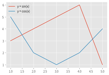
note( 'label' , "数据系列的标签列表,用于在图例中显示。" )
label 数据系列的标签列表,用于在图例中显示。
line1, = plt. plot( [ 1 , 2 , 3 , 4 , 5 ] , [ 3 , 4 , 5 , 6 , 1 ] )
line2, = plt. plot( [ 1 , 2 , 3 , 4 , 5 ] , [ 5 , 2 , 1 , 2 , 4 ] )
plt. legend( handles= [ line1, line2] , labels= [ 'y = sin(x)' , 'y = cos(x)' ] )
plt. show( )
note( 'loc' , "图例在图表中的位置,如 'upper left'。" )
loc 图例在图表中的位置,如 'upper left'。
line1, = plt. plot( [ 1 , 2 , 3 , 4 , 5 ] , [ 3 , 4 , 5 , 6 , 1 ] )
line2, = plt. plot( [ 1 , 2 , 3 , 4 , 5 ] , [ 5 , 2 , 1 , 2 , 4 ] )
plt. legend( handles= [ line1, line2] , labels= [ 'y = sin(x)' , 'y = cos(x)' ] , loc= 'upper right' )
plt. show( )
note( 'fontsize' , "图例字体大小。" )
line1, = plt. plot( [ 1 , 2 , 3 , 4 , 5 ] , [ 3 , 4 , 5 , 6 , 1 ] )
line2, = plt. plot( [ 1 , 2 , 3 , 4 , 5 ] , [ 5 , 2 , 1 , 2 , 4 ] )
plt. legend( handles= [ line1, line2] , labels= [ 'y = sin(x)' , 'y = cos(x)' ] , fontsize= 12 )
plt. show( )
note( 'ncol' , "图例的列数,用于控制标签的排列。" )
line1, = plt. plot( [ 1 , 2 , 3 , 4 , 5 ] , [ 3 , 4 , 5 , 6 , 1 ] )
line2, = plt. plot( [ 1 , 2 , 3 , 4 , 5 ] , [ 5 , 2 , 1 , 2 , 4 ] )
plt. legend( handles= [ line1, line2] , labels= [ 'y = sin(x)' , 'y = cos(x)' ] , ncol= 2 )
plt. show( )
note( 'borderpad' , "图例边框内边距。" )
line1, = plt. plot( [ 1 , 2 , 3 , 4 , 5 ] , [ 3 , 4 , 5 , 6 , 1 ] )
line2, = plt. plot( [ 1 , 2 , 3 , 4 , 5 ] , [ 5 , 2 , 1 , 2 , 4 ] )
plt. legend( handles= [ line1, line2] , labels= [ 'y = sin(x)' , 'y = cos(x)' ] , borderpad= 9 )
plt. show( )
note( 'labelspacing' , "标签间的垂直间距。" )
line1, = plt. plot( [ 1 , 2 , 3 , 4 , 5 ] , [ 3 , 4 , 5 , 6 , 1 ] )
line2, = plt. plot( [ 1 , 2 , 3 , 4 , 5 ] , [ 5 , 2 , 1 , 2 , 4 ] )
plt. legend( handles= [ line1, line2] , labels= [ 'y = sin(x)' , 'y = cos(x)' ] , labelspacing= 9 )
plt. show( )
note( 'handlelength' , "标识符(线、点等)的长度。" )
handlelength 标识符(线、点等)的长度。
line1, = plt. plot( [ 1 , 2 , 3 , 4 , 5 ] , [ 3 , 4 , 5 , 6 , 1 ] )
line2, = plt. plot( [ 1 , 2 , 3 , 4 , 5 ] , [ 5 , 2 , 1 , 2 , 4 ] )
plt. legend( handles= [ line1, line2] , labels= [ 'y = sin(x)' , 'y = cos(x)' ] , handlelength= 9 )
plt. show( )
note( 'handletextpad' , "标识符与标签的间距。" )
line1, = plt. plot( [ 1 , 2 , 3 , 4 , 5 ] , [ 3 , 4 , 5 , 6 , 1 ] )
line2, = plt. plot( [ 1 , 2 , 3 , 4 , 5 ] , [ 5 , 2 , 1 , 2 , 4 ] )
plt. legend( handles= [ line1, line2] , labels= [ 'y = sin(x)' , 'y = cos(x)' ] , handletextpad= 9 )
plt. show( )
note( 'borderaxespad' , "图例边框与坐标轴的间距。" )
borderaxespad 图例边框与坐标轴的间距。
line1, = plt. plot( [ 1 , 2 , 3 , 4 , 5 ] , [ 3 , 4 , 5 , 6 , 1 ] )
line2, = plt. plot( [ 1 , 2 , 3 , 4 , 5 ] , [ 5 , 2 , 1 , 2 , 4 ] )
plt. legend( handles= [ line1, line2] , labels= [ 'y = sin(x)' , 'y = cos(x)' ] , borderaxespad= 9 )
plt. show( )
note( 'title' , " 图例的标题。" )
line1, = plt. plot( [ 1 , 2 , 3 , 4 , 5 ] , [ 3 , 4 , 5 , 6 , 1 ] )
line2, = plt. plot( [ 1 , 2 , 3 , 4 , 5 ] , [ 5 , 2 , 1 , 2 , 4 ] )
plt. legend( handles= [ line1, line2] , labels= [ 'y = sin(x)' , 'y = cos(x)' ] , title= "legend" )
plt. show( )
note( 'frameon' , "是否显示图例外框。" )
line1, = plt. plot( [ 1 , 2 , 3 , 4 , 5 ] , [ 3 , 4 , 5 , 6 , 1 ] )
line2, = plt. plot( [ 1 , 2 , 3 , 4 , 5 ] , [ 5 , 2 , 1 , 2 , 4 ] )
plt. legend( handles= [ line1, line2] , labels= [ 'y = sin(x)' , 'y = cos(x)' ] , frameon= False )
plt. show( )
note( 'fancybox' , "是否使用圆角外框。" )
line1, = plt. plot( [ 1 , 2 , 3 , 4 , 5 ] , [ 3 , 4 , 5 , 6 , 1 ] )
line2, = plt. plot( [ 1 , 2 , 3 , 4 , 5 ] , [ 5 , 2 , 1 , 2 , 4 ] )
plt. legend( handles= [ line1, line2] , labels= [ 'y = sin(x)' , 'y = cos(x)' ] , fancybox= True )
plt. show( )
note( 'shadow' , "是否显示阴影。" )
line1, = plt. plot( [ 1 , 2 , 3 , 4 , 5 ] , [ 3 , 4 , 5 , 6 , 1 ] )
line2, = plt. plot( [ 1 , 2 , 3 , 4 , 5 ] , [ 5 , 2 , 1 , 2 , 4 ] )
plt. legend( handles= [ line1, line2] , labels= [ 'y = sin(x)' , 'y = cos(x)' ] , shadow= True )
plt. show( )
HTML( html_doughnut3)
<table style="width: 100%;">
<tr>
    <td style="width: 50%; vertical-align: top; word-break: break-all; text-align: left; background-color: rgb(115, 252, 214); padding: 10px;">
        <span style="font-size: 17px;">option</span>
    </td>
    <td style="width: 50%; vertical-align: top; background-color: rgb(255, 172, 213); padding: 10px;">
        <select style="width: 100%; font-size: 17px; background-color: rgb(255, 172, 213);">
             <option value="on">on: 打开坐标轴标签和刻度线(默认)</option>
            <option value="off">off: 关闭坐标轴标签和刻度线</option>
            <option value="tight">tight: 自动调整坐标轴范围以紧密地包围数据</option>
            <option value="equal">equal: 设置 x 轴和 y 轴具有相同的刻度间隔</option>
            <option value="scaled">scaled: 根据数据的比例自动调整范围</option>
        </select>
    </td>
</tr>
note1( '*args' , "据所选的 option,可以传递额外的参数来设置坐标轴范围。例如,如果选择了 'tight',则可以传递两个数值参数来手动指定数据范围的最小值和最大值。" , "**kwargs" , "额外属性传递给文本对象。" )
*args 据所选的 option,可以传递额外的参数来设置坐标轴范围。例如,如果选择了 'tight',则可以传递两个数值参数来手动指定数据范围的最小值和最大值。
x = np. linspace( 0 , 10 , 100 )
y = np. sin( x)
plt. figure( )
plt. plot( x, y, label= 'Sine Function' )
plt. axis( [ 2 , 8 , - 1.2 , 1.2 ] )
plt. xlabel( 'X Axis' )
plt. ylabel( 'Y Axis' )
plt. title( 'Custom Axis Range' )
plt. legend( loc= 'best' )
plt. show( )
note( 'ticks' , "指定x轴刻度的位置,可传入列表或数组。" )
ticks 指定x轴刻度的位置,可传入列表或数组。
plt. plot( [ 1 , 2 , 3 , 4 , 5 ] , [ 3 , 4 , 5 , 6 , 1 ] )
plt. xticks( [ 1 , 2 , 3 , 4 , 5 ] )
plt. show( )
note( 'labels' , "为每个刻度设置标签文本,可传入字符串列表。" )
labels 为每个刻度设置标签文本,可传入字符串列表。
plt. plot( [ 1 , 2 , 3 , 4 , 5 ] , [ 3 , 4 , 5 , 6 , 1 ] )
plt. xticks( [ 1 , 2 , 3 , 4 , 5 ] , [ 'Zero' , 'Two' , 'Four' , 'Six' , 'Eight' ] )
plt. show( )
note( 'rotation' , "设置刻度标签的旋转角度,传入数值。" )
rotation 设置刻度标签的旋转角度,传入数值。
plt. plot( [ 1 , 2 , 3 , 4 , 5 ] , [ 3 , 4 , 5 , 6 , 1 ] )
plt. xticks( [ 1 , 2 , 3 , 4 , 5 ] , rotation= 45 )
plt. show( )
note( 'fontsize' , "设置刻度标签的字体大小,传入数值。" )
fontsize 设置刻度标签的字体大小,传入数值。
plt. plot( [ 1 , 2 , 3 , 4 , 5 ] , [ 3 , 4 , 5 , 6 , 1 ] )
plt. xticks( [ 1 , 2 , 3 , 4 , 5 ] , fontsize= 20 )
plt. show( )
note( 'color' , "设置刻度标签的颜色,传入颜色字符串。" )
plt. plot( [ 1 , 2 , 3 , 4 , 5 ] , [ 3 , 4 , 5 , 6 , 1 ] )
plt. xticks( [ 1 , 2 , 3 , 4 , 5 ] , color= 'blue' )
plt. show( )
note( 'backgroundcolor' , "设置标签的背景颜色" )
backgroundcolor 设置标签的背景颜色
plt. plot( [ 1 , 2 , 3 , 4 , 5 ] , [ 3 , 4 , 5 , 6 , 1 ] )
plt. xticks( [ 1 , 2 , 3 , 4 , 5 ] ,
labels= [ 'Zero' , 'Two' , 'Four' , 'Six' , 'Eight' ] ,
backgroundcolor= 'red' ,
)
plt. show( )
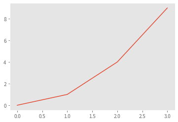
note1( 'bottom' , "设置 y 轴的下限。" , 'top' , "设置 y 轴的上限。" )
plt. plot( [ 0 , 1 , 2 , 3 ] , [ 0 , 1 , 4 , 9 ] )
plt. ylim( 0 , 1.5 )
plt. show( )
note1( 'x, y' , "文本在图表上的坐标位置。" , "s" , "要显示的文本内容,通常是字符串。" )
plt. plot( [ 0 , 1 , 2 , 3 ] , [ 0 , 1 , 4 , 9 ] )
plt. text( 1.5 , 2.5 , 'Hello world' )
plt. show( )
HTML( html_doughnut4)
<table style="width: 100%;">
<tr>
    <td style="width: 50%; vertical-align: top; word-break: break-all; text-align: left; background-color: rgb(115, 252, 214); padding: 10px;">
        <span style="font-size: 17px;">**kwargs</span>
    </td>
    <td style="width: 50%; vertical-align: top; background-color: rgb(255, 172, 213); padding: 10px;">
        <select style="width: 100%; font-size: 17px; background-color: rgb(255, 172, 213);">
            <option value="ha">ha: 水平对齐方式,可选值有 'center'、'left'、'right' 等。</option>
            <option value="va">va: 垂直对齐方式,可选值有 'center'、'top'、'bottom'、'baseline' 等。</option>
            <option value="rotation">rotation: 文本旋转的角度(以度为单位)。</option>
            <option value="color">color: 文本颜色。</option>
            <option value="alpha">alpha: 文本透明度(0 到 1 之间)。</option>
            <option value="bbox">bbox: 一个字典,用于设置文本边界框的属性,如颜色、线宽等。</option>
        </select>
    </td>
</tr>
plt. plot( [ 0 , 1 , 2 , 3 ] , [ 0 , 1 , 4 , 9 ] )
plt. text( 1.5 , 2.5 , 'Hello world' , ha= 'center' , va= 'center' , color= 'red' , rotation= 45 )
plt. show( )
note( 'which' , "字符串,指定显示哪种网格线。可选 'major'、'minor'、'both'。默认为 'major'。" )
which 字符串,指定显示哪种网格线。可选 'major'、'minor'、'both'。默认为 'major'。
plt. plot( [ 0 , 1 , 2 , 3 ] , [ 0 , 1 , 4 , 9 ] )
x_minor_locator = plt. MaxNLocator( nbins= 2 * len ( plt. xticks( ) [ 0 ] ) + 1 )
y_minor_locator = plt. MaxNLocator( nbins= 2 * len ( plt. yticks( ) [ 0 ] ) + 1 )
plt. gca( ) . xaxis. set_minor_locator( x_minor_locator)
plt. gca( ) . yaxis. set_minor_locator( y_minor_locator)
plt. grid( which= "minor" , linestyle= ':' , color= 'gray' )
plt. grid( which= "major" , linestyle= '-' , color= 'lightgray' , linewidth= 2 )
plt. show( )
note( 'axis' , "字符串,指定在哪个轴上显示网格线。可选 'both'、'x'、'y'。默认为 'both'。" )
axis 字符串,指定在哪个轴上显示网格线。可选 'both'、'x'、'y'。默认为 'both'。
plt. plot( [ 0 , 1 , 2 , 3 ] , [ 0 , 1 , 4 , 9 ] )
plt. grid( axis= 'y' )
note( 'alpha' , "网格线透明度,0 到 1 之间。" )
plt. plot( [ 0 , 1 , 2 , 3 ] , [ 0 , 1 , 4 , 9 ] )
plt. grid( alpha= 0.2 )
note( 'visible' , "布尔值,直接控制网格线是否可见。" )
plt. plot( [ 0 , 1 , 2 , 3 ] , [ 0 , 1 , 4 , 9 ] )
plt. grid( visible= False )
note( '**kwargs' , "其他用于控制网格线样式和属性的关键字参数。" )
**kwargs 其他用于控制网格线样式和属性的关键字参数。
plt. plot( [ 0 , 1 , 2 , 3 ] , [ 0 , 1 , 4 , 9 ] )
plt. grid( which= 'both' , axis= 'y' , color= 'lightgray' , linestyle= '--' , linewidth= 5 , alpha= 0.75 )


 被折叠的 条评论
为什么被折叠?
被折叠的 条评论
为什么被折叠?
 到【灌水乐园】发言


