


这个文字的 hover 出现效果,看似简单,其实想要完全实现它,仅仅依靠 CSS 是非常复杂的,其中一个比较难的地方在于 – 如何让一个效果,逐渐作用给整段文字中的部分,而不是一次将整个效果赋予整段文本。
利用 background 实现文字的下划线效果
到这里,我想起了之前在这篇文章中 – CSS 文字装饰 text-decoration & text-emphasis,我介绍的一种 使用 background 模拟下划线 的效果。
看个简单的 DEMO,使用 background 模拟文字的下划线效果:
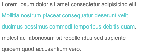
Lorem ipsum dolor sit amet consectetur adipisicing elit. Mollitia nostrum placeat consequatur deserunt ve
《一线大厂Java面试题解析+后端开发学习笔记+最新架构讲解视频+实战项目源码讲义》
【docs.qq.com/doc/DSmxTbFJ1cmN1R2dB】 完整内容开源分享
lit ducimus possimus commodi temporibus debitis quam, molestiae laboriosam sit repellendus sed sapiente quidem quod accusantium vero.
p {
width: 600px;
font-size: 24px;
color: #666;
}
a {
background: linear-gradient(90deg, #0cc, #0cc);
background-size: 100% 3px;
background-repeat: no-repeat;
background-position: 100% 100%;
color: #0cc;
}
使用 background 模拟文字的下划线效果,效果图如下:
又或者,使用 background 模拟虚线下划线:
a {
background: linear-gradient(90deg, #0cc 50%, transparent 50%, transparent 1px);
background-size: 10px 2px;
background-repeat: repeat-x;
background-position: 100% 100%;
}

CodePen Demo – 使用 background 模拟下划线与虚线下划线
当然这个是最基础的,巧妙的运用 background 的各种属性,我们实现各种有意思的效果。
 最低0.47元/天 解锁文章


 541
541


 被折叠的 条评论
为什么被折叠?
被折叠的 条评论
为什么被折叠?
 到【灌水乐园】发言


