


几款好玩的css动画效果图,

<!DOCTYPE html>
<html>
	<head>
		<meta charset="utf-8">
		<title></title>
		<style type="text/css">
        //所有元素margin,padding 都设置为0
			*{
				margin: 0;
				padding: 0;
				background-color: #000000;
			}
            //小球设置,

			.box{
				width: 50px;
				height: 50px;
				border-radius: 50%;
				background: radial-gradient(circle at center,white,grey);
				box-shadow: yellow 0px 0px 20px;
				position: absolute;
				animation:yqb 8s reverse infinite;
			}
			.box2{
				width: 50px;
				height: 50px;
				border-radius: 50%;
				background: radial-gradient(circle at center,pink,orange);
				box-shadow: red 0px 0px 20px;
				position: absolute;
				animation:yqb 8s infinite;
			}
            //关键帧设置
			@keyframes yqb{
				0%{
					left: 0px;top: 0px;
				}
				25%{
					left: 1300px;top: 0px;
				}
				50%{
					left: 1300px; top: 550px;
				}
				75%{
					left: 0px;top: 550px;
				}
				100%{
					left: 0;top: 0;
				}
			}
		</style>
	</head>
	<body>
		<div class="box"></div>
		<div class="box2"></div>
	</body>
</html>
下面还有一个好玩的僵尸运动
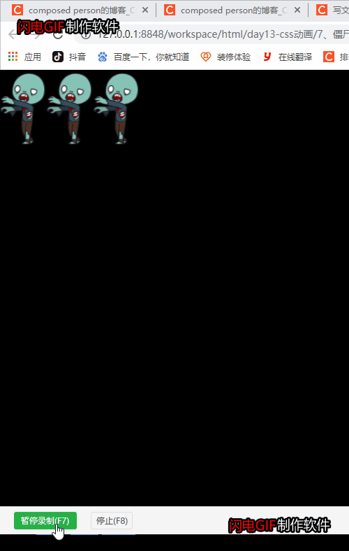
用纯css效果实现一直在动的小僵尸
<!DOCTYPE html>
<html>
	<head>
		<meta charset="utf-8">
		<title></title>
		<style type="text/css">

			.box {
				width: 200px;
				overflow: hidden;
				float: left;
			}

			body {
				background-color: #000000;
			}

			img {
				animation: name 0.1s steps(10) infinite;
			}

			@keyframes name {
				to {
					transform: translate(-2000px);
				}
			}
		</style>
	</head>
	<body>
		<div class="box">
			<img src="img/walkingdead.png">
		</div>
		<div class="box">
			<img src="img/walkingdead.png">
		</div>
		<div class="box">
			<img src="img/walkingdead.png">
		</div>

	</body>
</html>


 1282
1282


 被折叠的 条评论
为什么被折叠?
被折叠的 条评论
为什么被折叠?
 到【灌水乐园】发言


