


 本文介绍了Bootstrap框架,包括其响应式设计、下载方法、使用步骤、栅格系统和媒体查询的应用。通过实例展示了如何利用Bootstrap创建响应式网页,如栅格布局和轮播图,强调了按需引入组件以提高性能。
Bootstrap
Bootstrap 是由 Twitter 公司开发维护的前端 UI 框架,它提供了大量编写好的 CSS 样式,允许开发者结合一定 HTML 结构及JavaScript,快速编写功能完善的网页及常见交互效果。
Bootstrap 框架下载
建议直接百度去官网下载 Bootstrap3 ,最新的Bootstrap4 开发都放弃维护和更新了不建议使用,官网地址 (Bootstrap中文网)。
在实际的开发中,我们都是按需导入,简单理解,需要用到啥,我们复制那个文件,没有必要都放入,提高性能。
响应式
响应式的开发离不开一个核心原理:媒体查询 (media) ,媒体查询能检测游览器视口的宽度然后可以类似伪类一样修改一些属性或者值,演示代码如下:
body {
    background-color: gray;
}

/* 大于等于768px 为粉色 */
@media (min-width: 768px) {
    body {
        background-color: pink;
    }
}

/* 大于等于992px 为蓝色 */
@media (min-width: 992px) {
    body {
        background-color: skyblue;
    }
}

/* 大于等于992px 为绿色 */
@media (min-width: 1200px) {
    body {
        background-color: green;
    }
}
媒体查询的具体事用场景1:
body {
    max-width: 540px;
    margin: 0 auto;
}

/* 大于等于540px 则不允许  html文字大小再改动,强制定为 54px*/
@media (min-width: 540px) {
    html {
        font-size: 54px !important;
    }
}
媒体查询使用场景2 元素的显示和隐藏:
@media (max-width: 800px) {
    .box div:nth-child(2) {
        display: none;
    }

    .box div:last-child {
        width: 350px;
    }
}
媒体查询使用场景3:
响应式原理:通过@media媒体标签判断屏幕大小, 让盒子在不同宽度呈现不同的摆放顺序
<!DOCTYPE html>
<html lang="en">

<head>
  <meta charset="UTF-8">
  <meta http-equiv="X-UA-Compatible" content="IE=edge">
  <meta name="viewport" content="width=device-width, initial-scale=1.0">
  <title>Document</title>
  <style>
    .box {
      width: 1000px;
      height: 150px;
      /* background-color: pink; */
      margin: 0 auto;
      display: flex;
      flex-wrap: wrap;
    }

    .box div {
      width: 25%;
      background-color: skyblue;
      height: 150px;
      margin-bottom: 20px;
    }

    .box div:nth-child(even) {
      background-color: pink;
    }

    @media (max-width: 992px) {
      .box {
        width: 768px;
      }

      .box div {
        width: 50%;
      }
    }

    @media (max-width: 768px) {
      .box {
        width: 100%;
      }

      .box div {
        width: 100%;
      }
    }
  </style>
</head>

<body>
  <div class="box">
    <div>1</div>
    <div>2</div>
    <div>3</div>
    <div>4</div>
  </div>
</body>

</html>
Bootstrap 的使用步骤
1、解压好了后打开并复制 css文件

引用到需要框架的 html 文件中
<link rel="stylesheet" href="./css/bootstrap.min.css">2、如果需要 js ,则是一样,复制 js 文件并引入
<script src="./js/bootstrap.min.js"></script>3、官网有具体的文本与演示介绍,使用内部预定义好的类即可。
栅格系统
栅格系统(gridsystems),也叫“网格系统,它就是通过一系列的行(row)与列(column)的组合创建页面布局。简单说,栅格系统也是一种布局方式。 BootStrap 给咱们内置好了一套布局系统。
BootStrap3 默认将网页分成12等份
比如:超大屏幕 (超过1200px) 下我们想要一个通栏的大盒子里子盒子各占一半
<div class="container">
    <div class="col-lg-6">我占左边6个</div>
    <div class="col-lg-6">我站右边6个</div>
</div>
这些类名都是在引入的 css 文件里预设好了的,直接使用就会有效果。
如果实现不同屏幕下,不同的显示个数,可以通过使用不同类名。
 <div class="container">
    <div class="col-lg-3 col-md-3">盒子内容</div>
    <div class="col-lg-3 col-md-3">盒子内容</div>
    <div class="col-lg-3 col-md-3">盒子内容</div>
    <div class="col-lg-3 col-md-3">盒子内容</div>
  </div>
上面的代码在中等屏幕 (小于1200px但大于992px) 下子盒子只占4格
在小屏幕 (小于992px但是大于768px) 下只显示两个,代码如下:
<div class="container">
    <div class="col-lg-3 col-md-3 col-sm-6">盒子内容</div>
    <div class="col-lg-3 col-md-3 col-sm-6">盒子内容</div>
    <div class="col-lg-3 col-md-3 col-sm-6">盒子内容</div>
    <div class="col-lg-3 col-md-3 col-sm-6">盒子内容</div>
  </div>
超小屏幕 (小于768px) 也就是手机端下只放一个子盒子,代码如下:
 <div class="container">
    <div class="col-lg-3 col-md-3 col-sm-6 col-xs-12">盒子内容</div>
    <div class="col-lg-3 col-md-3 col-sm-6 col-xs-12">盒子内容</div>
    <div class="col-lg-3 col-md-3 col-sm-6 col-xs-12">盒子内容</div>
    <div class="col-lg-3 col-md-3 col-sm-6 col-xs-12">盒子内容</div>
  </div>
细心的小伙伴应该发现了预设类名的共同点:col- 固定开头、lg 代表大屏幕 (超过1200px,台式机大屏)、md 代表中等屏幕 (小于1200px但大于992px,笔记本中屏) 、sm 代表小屏幕 (小于992px但是大于768px,ipad小屏幕)、xs 代表超小屏幕 (小于 768px,手机屏幕) 后面跟着的数字代表占几份。
在 Bootsrtap 的预设样式里 container 有默认的内边距 (padding),使用 row 类可以取消掉即:
<div class="container">
<div class="row">
<div class="col-lg-3 col-md-3 col-sm-6 col-xs-12">盒子内容</div>
<div class="col-lg-3 col-md-3 col-sm-6 col-xs-12">盒子内容</div>
<div class="col-lg-3 col-md-3 col-sm-6 col-xs-12">盒子内容</div>
<div class="col-lg-3 col-md-3 col-sm-6 col-xs-12">盒子内容</div>
</div>
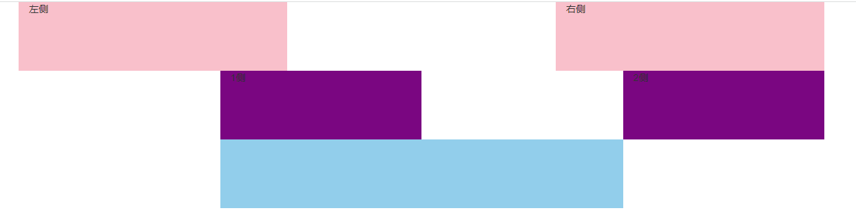
</div>Bootstrap 子盒子偏移 通过 col-lg-offset-*
* 代表数字,让盒子往右走 * 份 比如:
<!DOCTYPE html>
<html lang="en">

<head>
    <meta charset="UTF-8">
    <meta http-equiv="X-UA-Compatible" content="IE=edge">
    <meta name="viewport" content="width=device-width, initial-scale=1.0">
    <title>Document</title>
    <style>
       .first div {
      height: 100px;
      background-color: pink;
    }

    .second div {
      background-color: purple;
      height: 100px;
    }

    .third div {
      height: 100px;
      background-color: skyblue;
    }
    </style>
    <!-- 引入 Bootstrap css文件 -->
    <link rel="stylesheet" href="./素材准备/css/bootstrap.min.css">
</head>

<body>

<div class="container">
    <div class="row first">
      <div class="col-lg-4">左侧</div>
      <div class="col-lg-4 col-lg-offset-4">右侧</div>
    </div>
    <div class="row second">
      <div class="col-lg-3 col-lg-offset-3">1侧</div>
      <div class="col-lg-3 col-lg-offset-3">2侧</div>
    </div>
    <div class="row third">
      <div class="col-lg-6 col-lg-offset-3"></div>
    </div>
  </div>

</body>

</html>
效果如下:
媒体查询响应式 与 Bootstrap 框架实例
<!DOCTYPE html>
<html lang="en">
<head>
<meta charset="UTF-8">
<meta http-equiv="X-UA-Compatible" content="IE=edge">
<meta name="viewport" content="width=device-width, initial-scale=1.0">
<title>Document</title>
<style>
body {
background-color: gray;
}
div {
height: 100px;
}
/* 媒体查询 min-width 值的书写必须从小到大 顺序错误会被覆盖 */
/* 媒体查询 max-width 值的书写必须从大到小 顺序错误会被覆盖 */
/* 屏幕大于 768px 时为粉色 */
@media (min-width: 768px) {
div {
background-color: pink;
}
}
/* 屏幕大于 992px 时为粉色 */
@media (min-width: 992px) {
div {
background-color: skyblue;
}
}
/* 屏幕大于 1200px 时为绿色 */
@media (min-width: 1200px) {
div {
background-color: green;
}
}
/* @media (max-width: 992px) {
div {
background-color: skyblue;
}
} */
/* @media (max-width: 992px) {
div {
background-color: skyblue;
}
} */
/* @media (max-width: 768px) {
div {
background-color: pink;
}
} */
</style>
<!-- 引入 Bootstrap css文件 -->
<link rel="stylesheet" href="./素材准备/css/bootstrap.min.css">
</head>
<body>
<div class="container">
<div class="row">
<div class="col-lg-3 col-md-3 col-sm-6 col-xs-12">盒子内容</div>
<div class="col-lg-3 col-md-3 col-sm-6 col-xs-12">盒子内容</div>
<div class="col-lg-3 col-md-3 col-sm-6 col-xs-12">盒子内容</div>
<div class="col-lg-3 col-md-3 col-sm-6 col-xs-12">盒子内容</div>
</div>
</div>
</body>
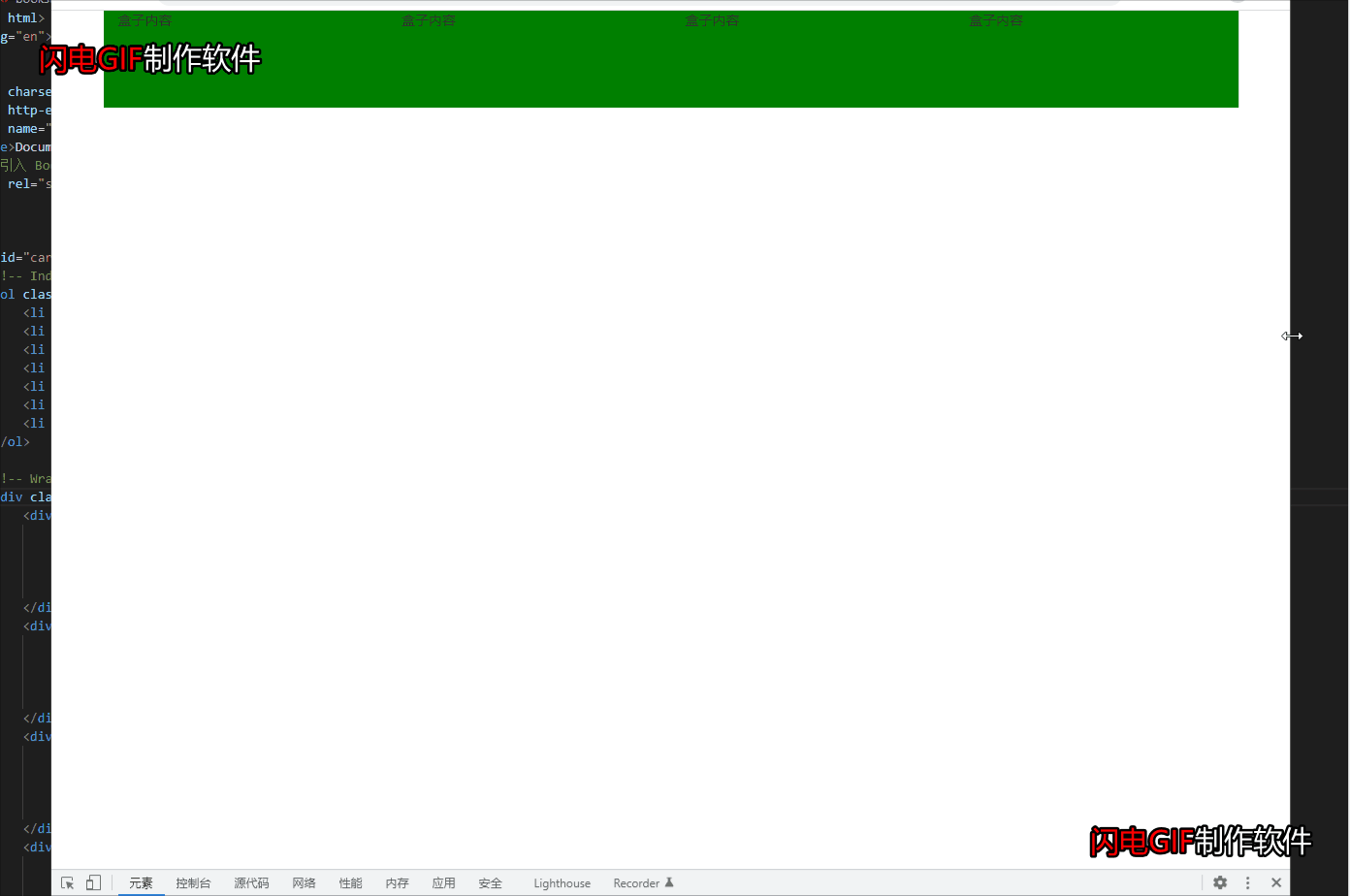
</html>效果如下:
Bootstrap 轮播图实例
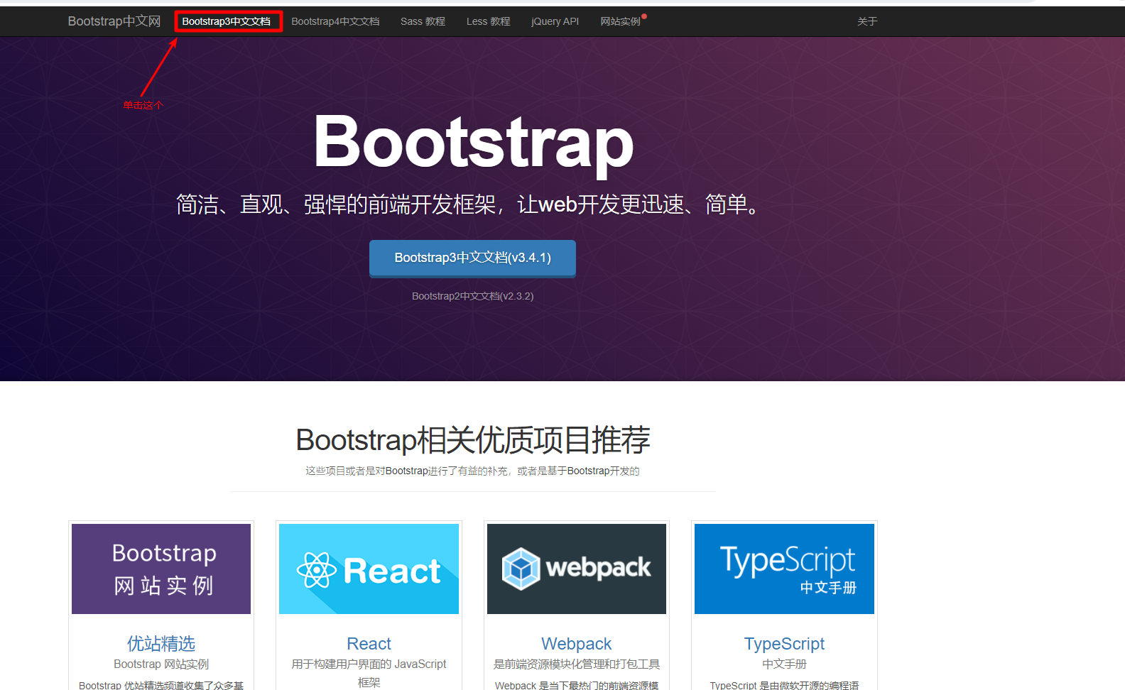
首先要找到轮播图的预设代码在哪,如下图:
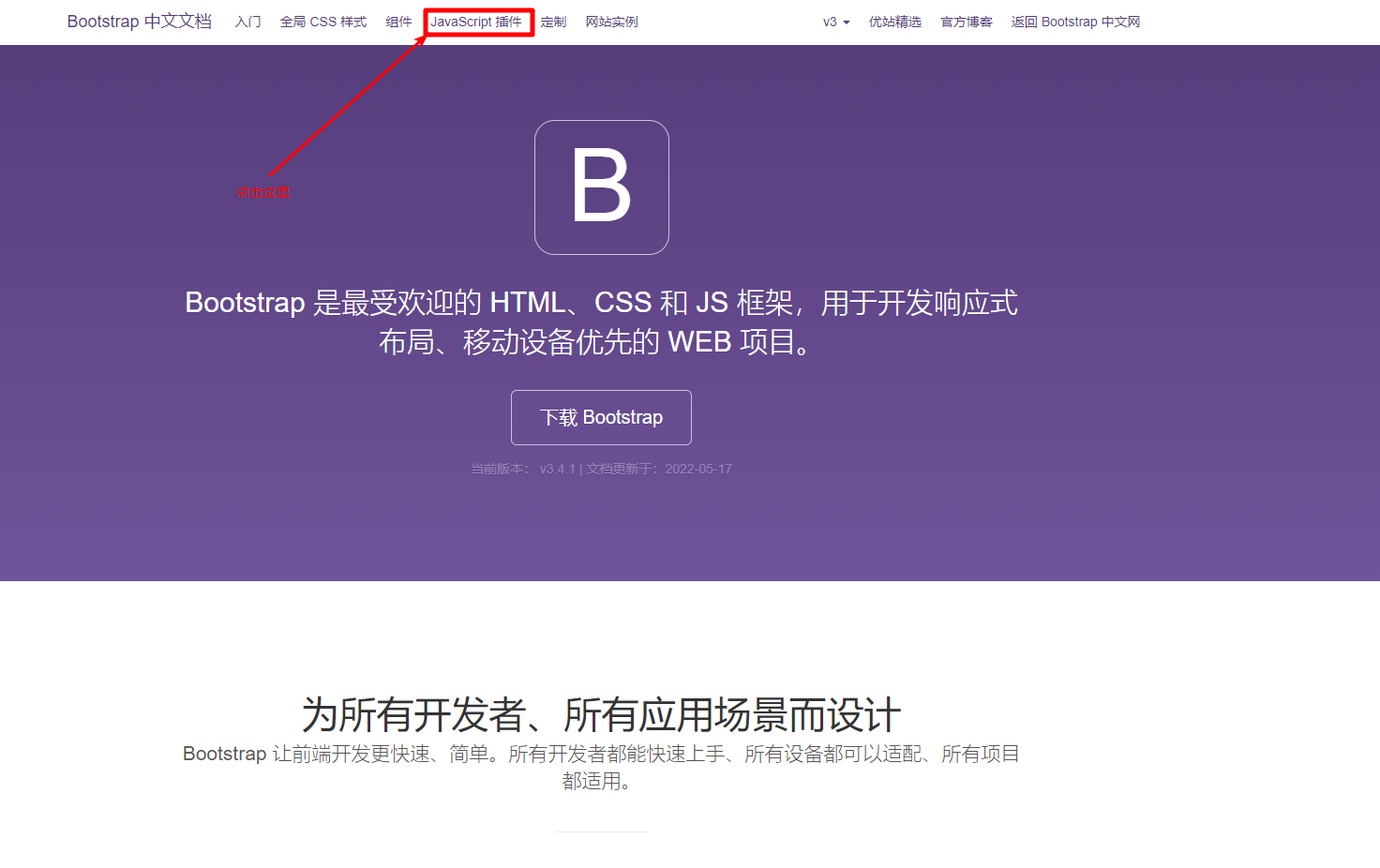
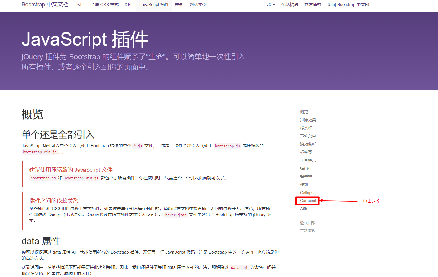
然后就能看到 Bootstrap 的轮播图的所有代码和演示了:
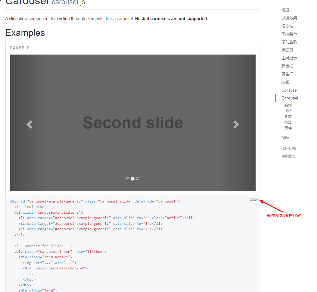
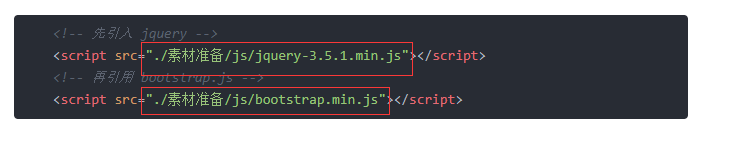
注意:会使用到 Bootstrap 的 js 代码,一定要引入下载包里的 jquery 文件和 js 文件并且是写在body 里的,代码如下:
    <!-- 先引入 jquery -->
    <script src="./素材准备/js/jquery-3.5.1.min.js"></script>
    <!-- 再引用 bootstrap.js -->
    <script src="./素材准备/js/bootstrap.min.js"></script>
修改好的整体代码如下:
<!DOCTYPE html>
<html lang="en">
<head>
<meta charset="UTF-8">
<meta http-equiv="X-UA-Compatible" content="IE=edge">
<meta name="viewport" content="width=device-width, initial-scale=1.0">
<title>Document</title>
<!-- 引入 Bootstrap css文件 -->
<link rel="stylesheet" href="./素材准备/css/bootstrap.min.css">
</head>
<body>
<div id="carousel-example-generic" class="carousel slide" data-ride="carousel">
<!-- Indicators 轮播图指示器-->
<ol class="carousel-indicators">
<li data-target="#carousel-example-generic" data-slide-to="0" class="active"></li>
<li data-target="#carousel-example-generic" data-slide-to="1"></li>
<li data-target="#carousel-example-generic" data-slide-to="2"></li>
<li data-target="#carousel-example-generic" data-slide-to="3"></li>
<li data-target="#carousel-example-generic" data-slide-to="4"></li>
<li data-target="#carousel-example-generic" data-slide-to="5"></li>
<li data-target="#carousel-example-geaneric" data-slide-to="6"></li>
</ol>
<!-- Wrapper for slides 轮播图的每一项-->
<div class="carousel-inner" role="listbox">
<div class="item active">
<img src="./素材准备/images/banner_1.jpg" alt="...">
<div class="carousel-caption">
第一张图片
</div>
</div>
<div class="item">
<img src="./素材准备/images/banner_4.jpg" alt="...">
<div class="carousel-caption">
第二张图片
</div>
</div>
<div class="item">
<img src="./素材准备/images/banner_3.jpg" alt="...">
<div class="carousel-caption">
第三张图片
</div>
</div>
<div class="item">
<img src="./素材准备/images/banner_4.jpg" alt="...">
<div class="carousel-caption">
第四张图片
</div>
</div>
<div class="item">
<img src="./素材准备/images/banner_1.jpg" alt="...">
<div class="carousel-caption">
第五张图片
</div>
</div>
<div class="item">
<img src="./素材准备/images/banner_4.jpg" alt="...">
<div class="carousel-caption">
第六张图片
</div>
</div>
<div class="item">
<img src="./素材准备/images/banner_3.jpg" alt="...">
<div class="carousel-caption">
第七张图片
</div>
</div>
</div>
<!-- Controls -->
<a class="left carousel-control" href="#carousel-example-generic" role="button" data-slide="prev">
<span class="glyphicon glyphicon-chevron-left" aria-hidden="true"></span>
<span class="sr-only">Previous</span>
</a>
<a class="right carousel-control" href="#carousel-example-generic" role="button" data-slide="next">
<span class="glyphicon glyphicon-chevron-right" aria-hidden="true"></span>
<span class="sr-only">Next</span>
</a>
</div>
<!-- 先引入 jquery -->
<script src="./素材准备/js/jquery-3.5.1.min.js"></script>
<!-- 再引用 bootstrap.js -->
<script src="./素材准备/js/bootstrap.min.js"></script>
</body>
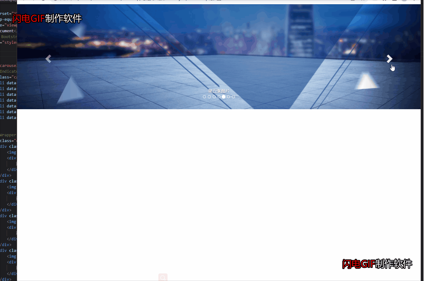
</html>效果如下:
完全复制我的代码而出不来的,要修改引入的文件路径,也就是前面引入文件里的 src 里的代码,
把下图里我的路径删掉,用的软件是 vscode 的话只需要打个英文的点加斜杠 ( ./ ) 后续有提示。


 扫一扫
扫一扫


 374
374

 被折叠的 条评论
为什么被折叠?
被折叠的 条评论
为什么被折叠?
 到【灌水乐园】发言


