


先看效果:
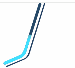
遇到不规则div应该怎么画出来呢?css提供了两个样式可以实现,clip裁剪跟mask遮罩,clip有点麻烦就略过,直接说mask。
mask类似background,遮罩可以理解成一块有洞的盖板,覆盖在最上一层,所以只能看到洞透过去的东西,一眼就会,直接上代码。
<template>
  <div class="mask-cpn">
    <div class="progress-wrap">
      <div class="progress-bar" ref="progressBarRef"></div>
      <div
        :style="{ paddingTop: `${progressBarHeight * ((100 - percent) / 100)}px` }"
        class="progress-bar progress-bar-active"
      ></div>
    </div>
  </div>
</template>

<script>
export default {
  components: {},

  data() {
    return {
      percent: 20,
      progressBarHeight: 0
    }
  },
  mounted() {
    this.init()

    setInterval(() => {
      this.test()
    }, 300)
  },
  methods: {
    test() {
      this.percent = parseInt(Math.random() * 100)
    },
    init() {
      this.progressBarHeight = this.$refs.progressBarRef.offsetHeight
    }
  }
}
</script>

<style>
.mask-cpn {
  height: 212px;
  width: 165px;
  position: relative;
}
.progress-wrap {
  height: 100%;
  background: url(图片地址)
    28px 0px no-repeat;
}

.progress-bar {
  width: 165px;
  height: 204px;
  transition: all ease 0.2s;
  position: absolute;
  background-color: #244867;
  mask-image: url(//图片地址);
  mask-repeat: no-repeat;
  mask-position: center;
}
.progress-bar-active {
  z-index: 2;
  background: linear-gradient(to top, #41e0fe 40%, #9a8a82 60%, #ce5a3e 80%, #ff451b);
  background-clip: content-box;
}

</style>


 扫一扫
扫一扫


 749
749

 被折叠的 条评论
为什么被折叠?
被折叠的 条评论
为什么被折叠?
 到【灌水乐园】发言


