


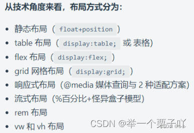
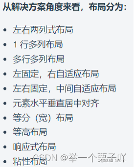
你了解哪些布局方式?
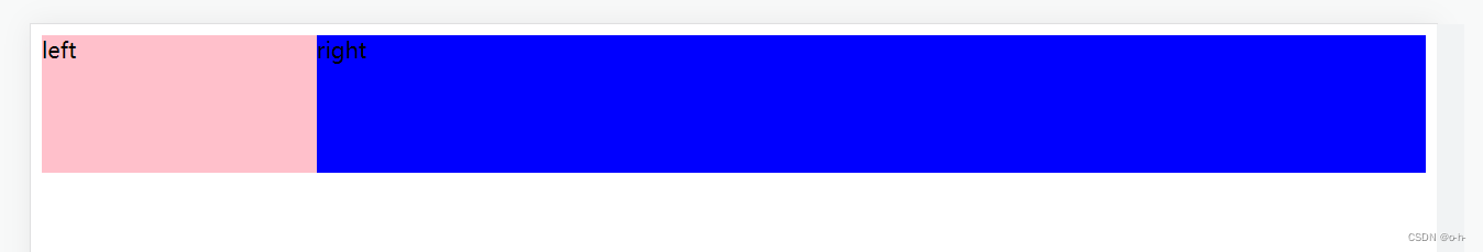
1、两栏布局的实现—左固定右自适应
1-1方式一:利用float 或 overflow: hidden;
<div class="wrap">
      <div class="left">left</div>
      <div class="right">right</div>
</div>
.left {
        width: 200px;
        height: 100px
        background-color: pink;
        float: left;
     }
.right {
        height: 100px;
        background-color: blue;
        margin-left: 200px;  // 也可以用 overflow: hidden;
     }
注意: 当overflow的取值不是默认值的时候,就会创建BFC(块级格式化上下文,让元素成为隔离独立的容器,且容器内的子元素不会影响到外面的布局),从而起到一些独特的作用。
BFC的作用:
- 消除浮动,自动高度会计算浮动元素。
- 它的边框盒不会与浮动元素重叠。=>上述例子正是说明此作用
- 不会和它的子元素进行外边距合并。
详细的请点击跳转至BFC(块级格式化上下文)及display相关知识
1-2方式二:利用弹性盒子display: flex;
<div class="wrap">
      <div class="left">left</div>
      <div class="right">right</div>
</div>
.wrap {display: flex;}

.left {
        width: 200px;
        height: 100px;
        background-color: pink;
      }

.right {
        height: 100px;
        background-color: blue;
        flex: 1;
       }

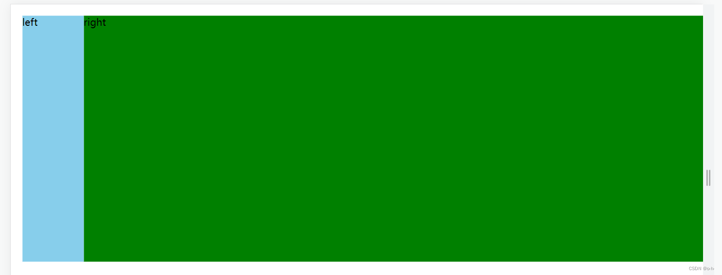
1-3方式三:利用 margin负值
<div class="wrap">
      <div class="left">left</div>
      <div class="right">right</div>
</div>
.wrap {
        width: 100%;
        padding: 10px
    }

.left {
        width: 100px;
        height: 400px;
        background-color: skyblue;
    }

.right {
        width: 100%;
        height: 400px;
        margin: -400px 0 0 100px;
        /* 上外边距是-400px,右外边距0px,下外边距0px,左外边距100px */
        background-color: green;
    }
注意: 当margin设置成负值时出现的情况如下:
- margin-top 元素自身会向上移动,同时会影响下方的元素会向上移动;
- margin-botom 元素自身不会位移,但是会减少自身供css读取的高度,从而影响下方的元素会向上移动;
- margin-left 元素自身会向左移动,同时会影响其它元素;
- margin-right 元素自身不会位移,但是会减少自身供css读取的宽度,从而影响右侧的元素会向左移动。
详细的请点击跳转至margin负值
1-4方式四:利用grid布局
<div class="wrap">
      <div class="left">left</div>
      <div class="right">right</div>
</div>
.wrap {
         display: grid;
         grid-template-columns: 100px auto;
      }
.left{
          background-color: aqua;
}
.right{
         background-color: cornflowerblue;
}

详细的请点击跳转至grid布局
1-5方式五:利用table布局
<div class="wrap">
      <div class="left">left</div>
      <div class="right">right</div>
</div>
.wrap {
        width: 100%;
        display: table;
    }
    .left {
        background-color: #0f0;
        width: 200px;
    }
    .right {
        width: 100%;
        display: table-cell;
        background-color: #f00;
    }

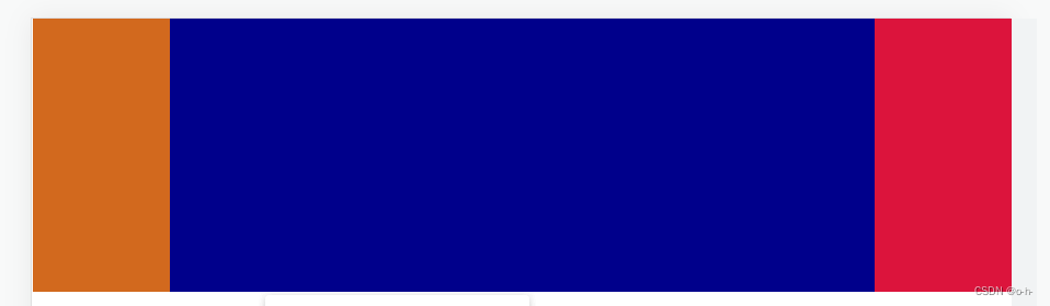
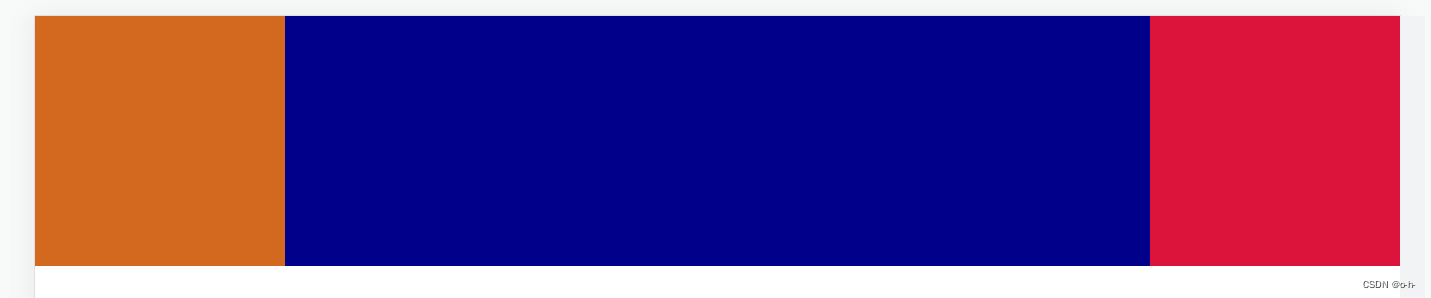
2、三栏布局的实现----左右固定中间自适应
2-1方式一: 浮动法:左栏左浮动,右栏右浮动,中间栏用margin。布局中main必须在最后,否则右侧布局会掉下来!
  <div class="left"></div>
  <div class="right"></div>
   <!-- 布局中main必须在最后 -->
  <div class="main"></div>
 body{
    margin: 0;
    padding: 0;
  }
  .left{
    height:200px;
    width: 200px;
    background: chocolate;
    /* 方法一浮动 */
    float: left;
  }

  .right{
    width: 200px;
    height:200px;
    background: crimson;
    /* 方法一浮动 */
    float: right;
  }
  .main{
    height:200px;
    background: darkblue;
    /* 方法一浮动
    水平居中 */
    margin: 0 200px;
  }

注意: 下面的顺序将会出现bug(谷歌浏览器问题)
  <div class="left"></div>
  <div class="main"></div>
  <div class="right"></div>
  <div class="main"></div>
  <div class="left"></div>
  <div class="right"></div>
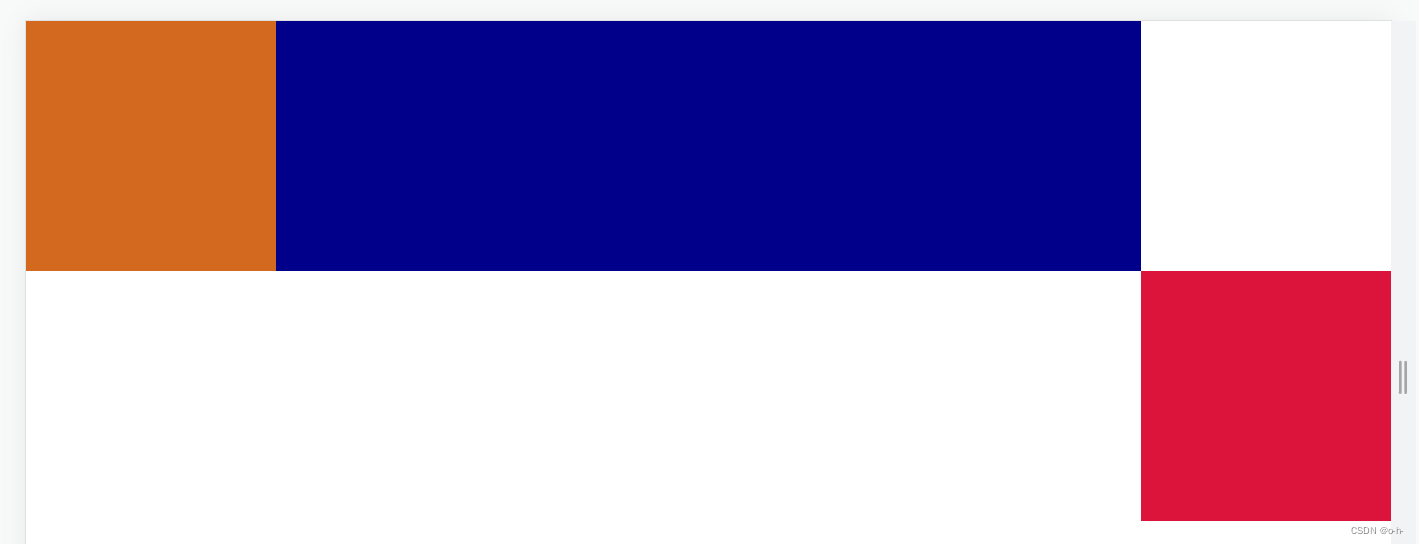
2-2方式二: 绝对定位法:左侧固定于左上,右侧固定于右上,中间用margin撑开。
 <div class="main"></div>
  <div class="left"></div>
  <div class="right"></div>
  body{
    margin: 0;
    padding: 0;
  }
  .left{
    height:200px;
    width: 100px;
    background: chocolate;
    /* 方法二绝对定位 */
    position:absolute;
    top:0;
    left:0;
  }
  .main{
    height:200px;
    background: darkblue;
    /* 方法二绝对定位 */
    margin: 0 100px;
  }
  .right{
    width: 100px;
    height:200px;
    background: crimson;
     /* 方法二绝对定位 */
    position:absolute;
    top:0;
    right:0;
  }
2-3方式三: flex布局:增加父级div,设置为display:flex, 中间main设置flex:1
   <!-- 父级div -->
 <div class="flexDiv">
    <div class="left"></div>
    <div class="main"></div>
    <div class="right"></div>
 </div>
  body{
    margin: 0;
    padding: 0;
  }
   /* 方法三 flex布局*/
  .flexDiv{
    display: flex;
  }
  .left{
    height:200px;
    width: 200px;
    background: chocolate;
  }
  .main{
    height:200px;
    background: darkblue;
     /* 方法三 flex布局*/
    flex: 1;
  }
  .right{
    width: 200px;
    height:200px;
    background: crimson;
  }
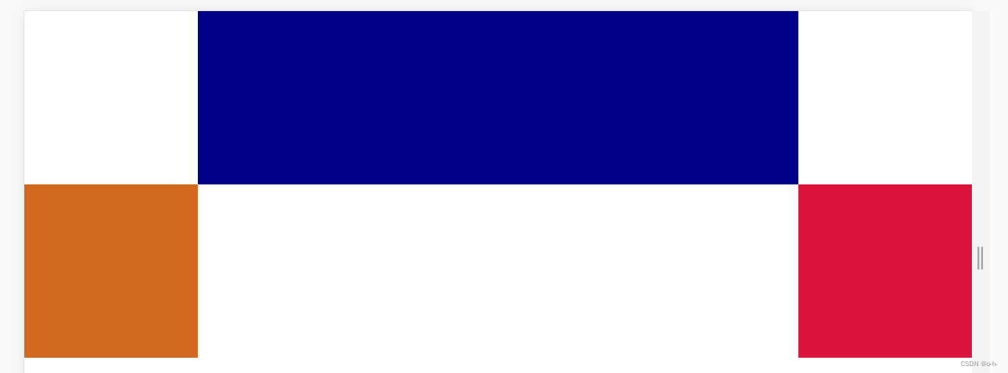
2-4方式四: margin负值法(圣杯布局):全部左浮动,中间栏宽度100%,并增加一个子元素,子元素设置margin:0 200px;空出左右两元素的宽度。左右两栏用负的margin值
  <div class="main">
     <!-- 增加一个子元素 -->
      <div class="content"></div>
  </div>
  <div class="left"></div>
  <div class="right"></div>
  body{
    margin: 0;
    padding: 0;
  }
  .left{
    height:200px;
    width: 200px;
    background: chocolate;
    /* 方法四margin赋值 */
    float: left;
    margin-left: -100%; /*注意*/
  }
  .main{
    /* 方法四margin赋值 */
    width: 100%;
    float: left;
  }
  /* 方法四margin赋值 */
  .content{
    margin:0 200px;
    height:200px;
    background: darkblue;
  }
  .right{
    width: 200px;
    height:200px;
    background: crimson;
    /* 方法四margin赋值 */
    float: left;
    margin-left: -200px; /*注意*/
  }


 595
595


 被折叠的 条评论
为什么被折叠?
被折叠的 条评论
为什么被折叠?
 到【灌水乐园】发言


