


前言
制作随时可以编辑的背景图,不需要向UI要背景图。【规则的】
ShapeDrawable 是绘制形状的 Drawable ,定义了基本的几何图形,如(矩形,圆形,线条等)
ShapeDrawable 根元素是 <shape/>
效果图
分别四种形状情况:ectangle(矩形)、oval(椭圆,包括圆)、line(线段)、ring(环形)
代码都在使用示例里,更多好看好玩的背景自行探索鸭
节点解析
1、形状: <shape>
| 属性 | 说明 |
|---|---|
| android:visible | 设置是否可见 |
| android:shape | 形状,可选: rectangle(矩形,包括正方形) oval(椭圆,包括圆) line(线段) ring(环形) |
| android:innerRadiusRatio | 当 shape 为 ring 才有效,表示环内半径所占半径的比率,如果设置了 innerRadius, 则会被忽略 |
| android:innerRadius | 当 shape 为 ring 才有效,表示环的内半径的尺寸 |
| android:thicknessRatio | 当 shape为 ring 才有效,表环厚度占半径的比率 |
| android:thickness | 当 shape 为 ring 才有效,表示环的厚度,即外半径与内半径的差 |
| android:useLevel | 当 shape 为 ring 才有效,表示是否允许根据level来显示环的一部分 |
2、尺寸: <size>
android:width 图形形状宽度、android:height 图形形状高度
3、渐变: <gradient>
| 属性 | 说明 |
|---|---|
| android:startColor | 渐变的起始颜色 |
| android:centerColor | 渐变的中间颜色 |
| android:endColor | 渐变的结束颜色 |
| android:type | 渐变类型,可选( linear , radial , sweep ), 线性渐变 (可设置渐变角度),发散渐变(中间向四周发散),平铺渐变 |
| android:centerX | 渐变中间颜色的x坐标,取值范围为:0~1 |
| android:centerY | 渐变中间颜色的Y坐标,取值范围为:0~1 |
| android:angle | 只有linear类型的渐变才有效,表示渐变角度,必须为45的倍数哦 |
| android:gradientRadius | 只有radial和sweep类型的渐变才有效,radial 必须设置,表示渐变效果的半径 |
| android:useLevel | 判断是否根据level绘制渐变效果 |
4、填充: <solid>
android:color 背景填充色,设置solid会覆盖gradient设置的效果
5、边框: <stroke>
| 属性 | 说明 |
|---|---|
| android:width | 边框的宽度 |
| android:color | 边框的颜色 |
| android:dashWidth | 边框虚线段的长度 |
| android:dashGap | 边框虚线段的间距 |
6、圆角: <corner>
android:radius 圆角半径,适用于上下左右四角
android:toLeftRadius 左上圆角,同理右上、左下、右下改变方向变量
7、内边距: <padding>
android:left 左边距、andorid:right 右边距、android:top 上边距、android:bottom 下边距
使用示例
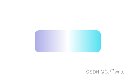
1、弧度、线性渐变、矩形
绘制一个有弧度渐变背景的矩形
<?xml version="1.0" encoding="utf-8"?>
<shape xmlns:android="http://schemas.android.com/apk/res/android"
android:shape="rectangle">
<corners android:radius="10dp"/>
<size android:width="150dp" android:height="50dp"/>
<gradient
android:startColor="#ABABE8"
android:centerColor="#FFFFFF"
android:endColor="#55E0F1"
android:type="linear"/>
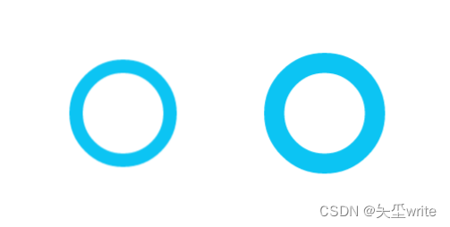
</shape>2、圆环
<?xml version="1.0" encoding="utf-8"?>
<shape xmlns:android="http://schemas.android.com/apk/res/android"
    android:shape="ring"
    android:innerRadius="30dp"
    android:thickness="10dp"
    android:useLevel="false">

    <size android:height="100dp" android:width="100dp"/>

    <solid android:color="#0CC4F3"/>

</shape>

<?xml version="1.0" encoding="utf-8"?>
<shape xmlns:android="http://schemas.android.com/apk/res/android"
    android:shape="ring"
    android:innerRadiusRatio="5"
    android:thicknessRatio="10"
    android:useLevel="false">

    <size android:height="100dp" android:width="100dp"/>

    <solid android:color="#0CC4F3"/>

</shape>
我这里写了两组,效果相同,制作填充蓝色的圆环,建议两组属性分开来使用
android:innerRadiusRatio、android:thicknessRatio 比率一组;
android:innerRadius、android:thickness 尺寸一组
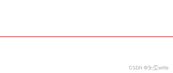
3、红线、线段
<?xml version="1.0" encoding="utf-8"?>
<shape xmlns:android="http://schemas.android.com/apk/res/android"
android:shape="rectangle">
<solid android:color="#CD1B1B" />
<size android:width="200dp" android:height="1dp" />
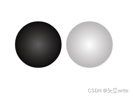
</shape>4、黑白棋、放射性渐变、圆形
<?xml version="1.0" encoding="utf-8"?>
<shape xmlns:android="http://schemas.android.com/apk/res/android"
    android:shape="oval">

    <size android:width="100dp" android:height="100dp"/>

    <gradient
        android:startColor="#605E5E"
        android:centerColor="#2C2929"
        android:endColor="#000000"
        android:type="radial"
        android:gradientRadius="60dp"/>
</shape>

<?xml version="1.0" encoding="utf-8"?>
<shape xmlns:android="http://schemas.android.com/apk/res/android"
    android:shape="oval">

    <size android:width="100dp" android:height="100dp"/>

    <gradient
        android:startColor="#FFFFFF"
        android:centerColor="#BCB9B9"
        android:endColor="#000000"
        android:type="radial"
        android:gradientRadius="60dp"/>
</shape>
总结
学会自定义Drawable资源,背景不再是单一的颜色color,能胜任更多场景,还能配合StateListDrawable实现组件背景点击效果。
1、StateListDrawable实现组件效果查看 StateListDrawable 状态控制


 扫一扫
扫一扫


 被折叠的 条评论
为什么被折叠?
被折叠的 条评论
为什么被折叠?
 到【灌水乐园】发言


