


步骤1:定义变量
<script>
export default {
  data() {
    return {
     backgroundColor: app.theme.getStyle().base.color, // 整个背景色也可以作为全局主题颜色(获取到的全局变量) this.global.getRandColor
     bgColor: "pink", //背景色
    };
  },
};
</script>
步骤2:在HTML中设置CSS使用的变量
<template>
    <input
      type="checkbox"
      class="inp"
      :style="{ '--backgroundColor': backgroundColor }"
    />主题色(随主题颜色变动) <br /><br />
    <input
      type="checkbox"
      class="inp"
      :style="{ '--backgroundColor': bgColor }"
    />自己可设置的颜色
</template>
步骤3:在style标签中使用变量
<style scoped>
.inp {
  width: 20px;
  height: 20px;
  /* 去除系统默认appearance的样式,常用于IOS下移除原生样式 */
  -webkit-appearance: none;
  border: 1px solid blue;
}

.inp:checked {
  /* 使用var()获取变量,参数就是变量名 */
  background-color: var(--backgroundColor);
}
</style>
效果展示
原图效果:
点击后效果: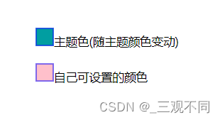
解读:
类型一
错误一:input(checkbox)型中想改变选中状态的颜色 如果只是这样写的话是不好使的
<style scoped>
.inp:checked {
  /* 使用var()获取变量,参数就是变量名 */
  background-color: var(--backgroundColor);
}
</style>
right:
<style scoped>
.inp {
  width: 20px;
  height: 20px;
  /* 去除系统默认appearance的样式,常用于IOS下移除原生样式 */
  -webkit-appearance: none;
  border: 1px solid blue;
}

.inp:checked {
  /* 使用var()获取变量,参数就是变量名 */
  background-color: var(--backgroundColor);
}
</style>
类型二
改变input(checkbox)类型默认方形为圆形或者其他图形
<style scoped>
.inp:checked {
  background: var(--backgroundColor);
}
.inp {
  width: 25px;
  height: 25px;
  background-color: #ffffff;
  border: solid 1px #dddddd;
  -webkit-border-radius: 50%;//外观的形状由我来决定哦!前缀为“-webkit-”的属性,能够在以
  webkit为内核的浏览器中正常使用,例如“safari”和“chrome”浏览器。
  border-radius: 50%;//外观的形状由我来决定哦!
  font-size: 0.8rem;
  margin: 0;
  padding: 0;
  position: relative;
  display: inline-block;
  vertical-align: top;
  cursor: default;
  -webkit-appearance: none;
  -webkit-user-select: none;
  user-select: none;
  -webkit-transition: background-color ease 0.1s;
  transition: background-color ease 0.1s;
}
.inp:checked::after {
  content: "";
  top: 5px;
  left: 5px;
  position: absolute;
  background: transparent;
  border: #fff solid 2px;
  border-top: none;
  border-right: none;
  height: 6px;
  width: 10px;
  -moz-transform: rotate(-45deg);
  -ms-transform: rotate(-45deg);
  -webkit-transform: rotate(-45deg);
  transform: rotate(-45deg);
}
</style>
效果展示
原图效果: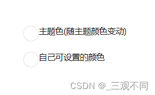
点击后效果: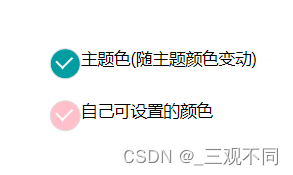
外观的改变样式中有注释。


 161
161


 被折叠的 条评论
为什么被折叠?
被折叠的 条评论
为什么被折叠?
 到【灌水乐园】发言


