


1. 盒模型(CSS中非常重要的一个问题)
CSS盒模型本质上是一个盒子,封装周围的HTML元素,它包括:边距,边框,填充,和实际内容。
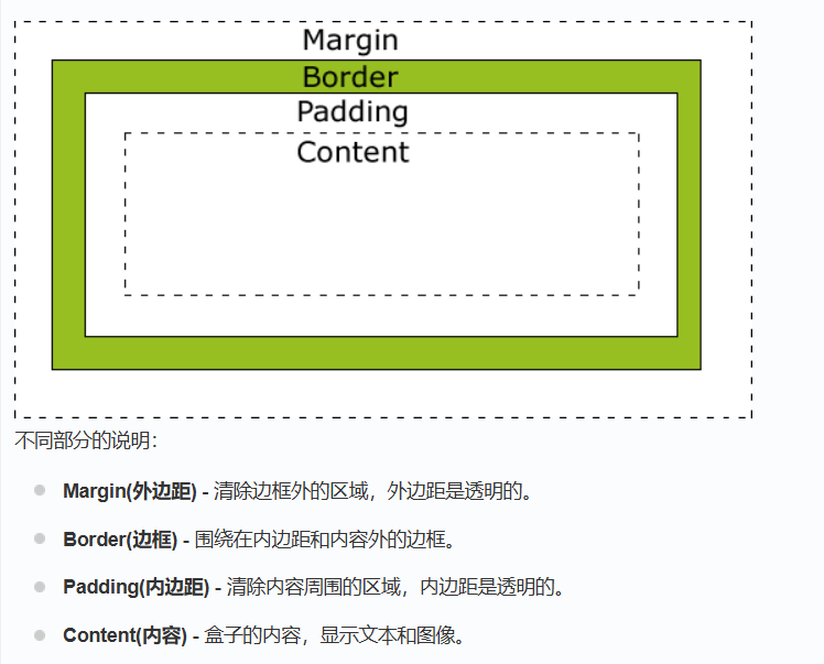
页面渲染时,dom 元素所采用的 布局模型。可通过box-sizing进行设置。根据计算宽高的区域可分为:
-
content-box (W3C 标准盒模型)
-
border-box (IE 盒模型)
W3C标准盒模型的宽高是指的 content 区宽高;IE怪异盒模型的宽高是指的content+padding+border 的宽高。
设置盒模型
(1)标准盒模型:box-sizing: content-box;
(2)怪异盒模型:box-sizing: border-box;
2.行内元素和块级元素
-
行内元素有:span、img、input、select、strong、a
-
块级元素有:div、ul、ol、 li、dl、dt、dd、h1、h2、h3、h4...、p
行内元素不可以设置宽高,不独占一行;块级元素可以设置宽高,独占一行
3. 选择器优先级
-
!important > 行内样式 > #id > .class > tag > * > 继承 > 默认
-
选择器 从右往左 解析
-
!important>内联>ID选择器>类选择器>标签选择器
4. BFC
块级格式化上下文,是一个独立的渲染区域,让处于 BFC 内部的元素与外部的元素相互隔离,使内外元素的定位不会相互影响。
IE下为 Layout,可通过 zoom:1 触发
-
触发条件:
-
根元素
-
position: absolute/fixed
-
display: inline-block / table
-
float 元素
-
ovevflow !== visible/hidden
-
-
规则:
-
属于同一个 BFC 的两个相邻 Box 垂直排列
-
属于同一个 BFC 的两个相邻 Box 的 margin 会发生重叠
-
BFC 中子元素的 margin box 的左边, 与包含块 (BFC) border box的左边相接触 (子元素 absolute 除外)
-
BFC 的区域不会与 float 的元素区域重叠
-
计算 BFC 的高度时,浮动子元素也参与计算
-
文字层不会被浮动层覆盖,环绕于周围
-
-
应用:
-
阻止margin重叠
<div class="container">
  <p>段落1</p>
  <p>段落2</p>
</div>
p { margin: 20px 0; } /* 创建BFC解决外边距折叠 */ .container { overflow: hidden; /* 触发BFC */ } -
可以包含浮动元素 —— 清除内部浮动(清除浮动的原理是两个div都位于同一个 BFC 区域之中)
<div class="parent">
  <div class="float-child">浮动元素</div>
</div>
.float-child { float: left; width: 100px; height: 100px; } /* 创建BFC包含浮动元素 */ .parent { overflow: hidden; /* 触发BFC */ border: 1px solid #000; } -
自适应两栏布局
<div class="container">
  <div class="left">左侧栏</div>
  <div class="right">右侧内容</div>
</div>
.left { float: left; width: 200px; } .right { overflow: hidden; /* 触发BFC */ } -
可以阻止元素被浮动元素覆盖
<div class="float-box"></div>
<div class="text-box">这里是文本内容...</div>
.float-box { float: left; width: 100px; height: 100px; } /* 创建BFC防止文字环绕 */ .text-box { overflow: hidden; /* 触发BFC */ }
-
5.层叠上下文
元素提升为一个比较特殊的图层,在三维空间中 (z轴) 高出普通元素一等。
-
触发条件
-
根层叠上下文(html)
-
position
-
css3属性
-
flex
-
transform
-
opacity
-
filter
-
will-change
-
-webkit-overflow-scrolling
-
-
-
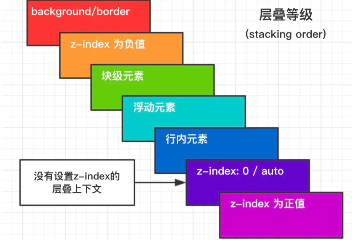
层叠等级:层叠上下文在z轴上的排序
- 在同一层叠上下文中,层叠等级才有意义
- z-index的优先级最高
6. 居中布局
-
水平居中
-
行内元素: text-align: center
.parent { text-align: center; /* 父元素设置文本居中 */ } .inline-element { display: inline; /* 行内元素默认属性 */ } -
块级元素: margin: 0 auto
.block-center { width: 50%; /* 定义宽度 */ margin: 0 auto; /* 上下外边距为0,左右外边距自动 */ } -
flex布局水平居中:flex + justify-content: center
.flex-container {
    display: flex;
    justify-content: center; /* 水平居中 */
}
-
-
垂直居中
-
绝对定位 + 负边距垂直居中:absolute + transform
.absolute-center { position: absolute; top: 50%; transform: translateY(-50%); } -
flex布局垂直居中:flex+ align-items: center
.flex-container {
    display: flex;
    align-items: center; /* 垂直居中 */
}
-
-
水平垂直居中
-
absolute + transform
.absolute-center { position: absolute; top: 50%; left: 50%; transform: translate(-50%, -50%); } -
Flexbox水平和垂直居中:flex + justify-content + align-items
.flex-container {
    display: flex;
    justify-content: center; /* 水平居中 */
    align-items: center; /* 垂直居中 */
}
-
- 单行文本水平和垂直居中
.text-center {
    width: 100px; /* 定义宽度 */
    height: 100px; /* 定义高度 */
    line-height: 100px; /* 行高与高度一致 */
    text-align: center; /* 水平居中 */
}- 多行文本水平和垂直居中
.text-center {
    display: flex;
    flex-direction: column; /* 多行文本需要设置为列方向 */
    justify-content: center; /* 水平居中 */
    align-items: center; /* 垂直居中 */
}
7.CSS动画
-
transition: 过渡动画
-
transition-property: 属性
-
transition-duration: 间隔
-
transition-timing-function: 曲线
-
transition-delay: 延迟
-
常用钩子: transitionend
-
-
animation / keyframes
-
animation-name: 动画名称,对应@keyframes
-
animation-duration: 间隔
-
animation-timing-function: 曲线
-
animation-delay: 延迟
-
animation-iteration-count: 次数
-
infinite: 循环动画
-
-
animation-direction: 方向
-
alternate: 反向播放
-
-
animation-fill-mode: 静止模式
-
forwards: 停止时,保留最后一帧
-
backwards: 停止时,回到第一帧
-
both: 同时运用 forwards / backwards
-
-
常用钩子: animationend
-
-
动画属性: 尽量使用动画属性进行动画,能拥有较好的性能表现
-
translate
-
scale
-
rotate
-
skew
-
opacity
-
color
-


 扫一扫
扫一扫


 被折叠的 条评论
为什么被折叠?
被折叠的 条评论
为什么被折叠?
 到【灌水乐园】发言


