


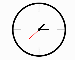
效果
html部分
    <div class="box">
        <!-- 圆心 -->
        <div class="dot"></div>

        <!-- 表盘刻度线 -->
        <div class="section">
            <ul>
                <li><span></span></li>
                <li><span></span></li>
                <li><span></span></li>
                <li><span></span></li>
            </ul>
        </div>
        <!-- 时针 分针 秒针-->
        <div class="hours"></div>
        <div class="mins"></div>
        <div class="seconds"></div>
    </div>
CSS部分
.box {
            position: relative;
            margin: 100px auto;
            width: 200px;
            height: 200px;
            border: 6px solid black;
            border-radius: 50%;
        }
        /* 表盘中心点 */

        .box::after {
            content: '';
            position: absolute;
            left: 50%;
            top: 50%;
            transform: translate(-50%, -50%);
            width: 10px;
            height: 10px;
            background-color: black;
            border-radius: 50%;
        }
        /* 表盘刻度线 */

        .section span {
            display: inline-block;
            position: absolute;
            left: 50%;
            top: 0;
            height: 30px;
            width: 3px;
            background-color: rgba(0, 0, 0, 0.2);
        }

        li {
            list-style: none;
        }
        /* 通过改变旋转原点的方式让刻度线绕着中心旋转 */

        .section ul li:nth-child(1) span {
            transform-origin: 50% 100px;
            /* 先位移再旋转 */
            transform: translate(-50%) rotate(90deg);
        }

        .section ul li:nth-child(2) span {
            transform-origin: 50% 100px;
            transform: translate(-50%) rotate(180deg);
        }

        .section ul li:nth-child(3) span {
            transform-origin: 50% 100px;
            transform: translate(-50%) rotate(270deg);
        }

        .section ul li:nth-child(4) span {
            transform-origin: 50% 100px;
            transform: translate(-50%) rotate(3600deg);
        }

        .hours {
            position: absolute;
            left: 50%;
            bottom: 50%;
            transform-origin: center bottom;
            transform: translate(-50%) rotate(45deg);
            height: 30px;
            width: 6px;
            background-color: black;
        }

        .mins {
            position: absolute;
            left: 50%;
            bottom: 50%;
            height: 40px;
            transform-origin: center bottom;
            transform: translate(-50%) rotate(90deg);
            width: 4px;
            background-color: black;
        }

        .seconds {
            position: absolute;
            left: 50%;
            bottom: 50%;
            width: 2px;
            height: 55px;
            background-color: red;
            transform-origin: center bottom;
            transform: translate(-50%);
            animation: rotate 60s steps(60) infinite;
        }
        /* 秒针旋转动画 */
        @keyframes rotate {
            from {
                transform: rotate(0deg);
            }
            to {
                transform: rotate(360deg);
            }
        }


 898
898


 被折叠的 条评论
为什么被折叠?
被折叠的 条评论
为什么被折叠?
 到【灌水乐园】发言


