可视化案例(今日作业)
条形图
import matplotlib.pyplot as plt
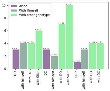
barWidth = 0.9
bars1 = [3, 3, 1]
bars2 = [4, 2, 3]
bars3 = [4, 6, 7, 10, 4, 4]
bars4 = bars1 + bars2 + bars3
r1 = [1,5,9]
r2 = [2,6,10]
r3 = [3,4,7,8,11,12]
r4 = r1 + r2 + r3
plt.bar(r1, bars1, width = barWidth, color = (0.3,0.1,0.4,0.6), label='Alone')
plt.bar(r2, bars2, width = barWidth, color = (0.3,0.5,0.4,0.6), label='With Himself')
plt.bar(r3, bars3, width = barWidth, color = (0.3,0.9,0.4,0.6), label='With other genotype')
注意:可以很容易地创建条形图。有关其他示例,请参见条形图部分。
plt.legend()
plt.xticks([r + barWidth for r in range(len(r4))], ['DD', 'with himself', 'with DC', 'with Silur', 'DC', 'with himself', 'with DD', 'with Silur', 'Silur', 'with himself', 'with DD', 'with DC'], rotation=90)
label = ['n = 6', 'n = 25', 'n = 13', 'n = 36', 'n = 30', 'n = 11', 'n = 16', 'n = 37', 'n = 14', 'n = 4', 'n = 31', 'n = 34']
for i in range(len(r4)):
plt.text(x = r4[i]-0.5 , y = bars4[i]+0.1, s = label[i], size = 6)
plt.subplots_adjust(bottom= 0.2, top = 0.98)
plt.show()
import numpy as np
import matplotlib.pyplot as plt
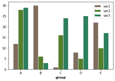
barWidth = 0.25
bars1 = [12, 30, 1, 8, 22]
bars2 = [28, 6, 16, 5, 10]
bars3 = [29, 3, 24, 25, 17]
r1 = np.arange(len(bars1))
r2 = [x + barWidth for x in r1]
r3 = [x + barWidth for x in r2]
plt.bar(r1, bars1, color='#7f6d5f', width=barWidth, edgecolor='white', label='var1')
plt.bar(r2, bars2, color='#557f2d', width=barWidth, edgecolor='white', label='var2')
plt.bar(r3, bars3, color='#2d7f5e', width=barWidth, edgecolor='white', label='var3')
plt.xlabel('group', fontweight='bold')
plt.xticks([r + barWidth for r in range(len(bars1))], ['A', 'B', 'C', 'D', 'E'])
plt.legend()
plt.show()
import numpy as np
import matplotlib.pyplot as plt
from matplotlib import rc
import pandas as pd
rc('font', weight='bold')
bars1 = [12, 28, 1, 8, 22]
bars2 = [28, 7, 16, 4, 10]
bars3 = [25, 3, 23, 25, 17]
bars = np.add(bars1, bars2).tolist()
r = [0,1,2,3,4]
names = ['A','B','C','D','E']
barWidth = 1
plt.bar(r, bars1, color='#7f6d5f', edgecolor='white', width


 这篇博客展示了学校的数学建模作业,重点介绍了如何使用Python和Matlab进行数据可视化,包括绘制条形图、散点图、二维直方图和正方形矩阵图。
 最低0.47元/天 解锁文章


 被折叠的 条评论
为什么被折叠?
被折叠的 条评论
为什么被折叠?
 到【灌水乐园】发言


