


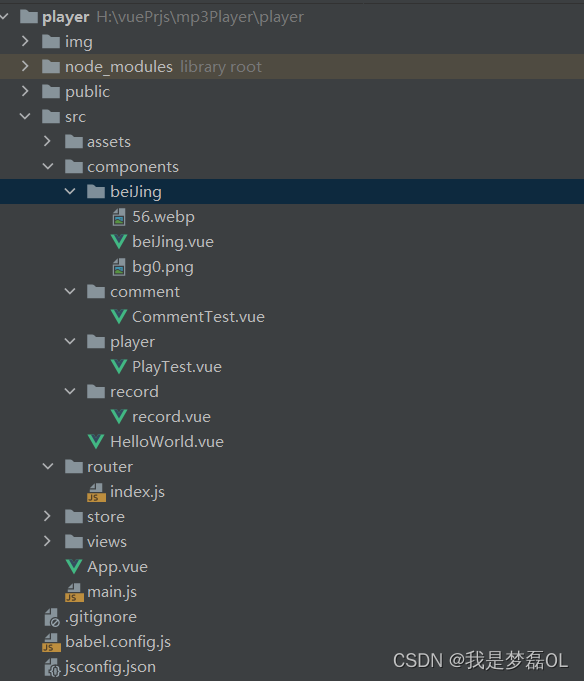
1,目录
2,beiJing.vue
<template>
<div>
  <div class="home">

  </div>
 <div class="item1">
   <record></record>
 </div>
  <div class="comment">
    <CommentTest></CommentTest>
  </div>
</div>
</template>

<script>
import Record from "@/components/record/record";
import CommentTest from "@/components/comment/CommentTest";
export default {
  name: "beiJing",
  components: {CommentTest, Record}
}
</script>

<style scoped>
.home{
  position: absolute;
  width: 70%;
  height: 80%;
  filter: blur(0);
  overflow: hidden;

  margin: 60px;
  box-sizing: border-box;
}
.item1{
  position: absolute;
  left: 200px;
  top: 150px;
}
.comment{
  color: #42b983;
  position: absolute;
  right: 500px;
  top: 150px;
}
</style>
2,record.vue
<template>
<div>

  <el-image
      class="slow-rotate"
      style="width: 500px; height: 500px"
      :src="url"
      fit="cover"
  ></el-image>

</div>
</template>

<script>
export default {
  // eslint-disable-next-line vue/multi-word-component-names
  name: "Record",
  data(){
    return{
      url:"https://p9-juejin.byteimg.com/tos-cn-i-k3u1fbpfcp/44d8451bb5ed4ce2867513276dab4ed4~tplv-k3u1fbpfcp-zoom-in-crop-mark:1512:0:0:0.awebp?"
    }
  }
}
</script>

<style scoped>
.slow-rotate {
  border-radius: 50%;
  transform-origin: center;

  animation: rotate 9s linear infinite;
}
.slow-rotate:hover{
  animation-play-state: paused;
}
@keyframes rotate {
  from {
    transform: rotate(0deg);
  }
  to {
    transform: rotate(360deg);
  }
}
</style>
3,CommentTest.vue
<template>
<div>
  <div class="">
    <div class="first">
      <div class="firstitem">
        <div class="one">
          <el-image
              style="width: 100px; height: 100px"
              :src="url"
              fit="cover"></el-image>
        </div>

        <div class="two">
          <br>
          是柚肉呀:故事不长也不短,当初给她唱丫头的那个男孩子结婚了
        </div>

        <div class="one">
          <el-image
              style="width: 100px; height: 100px"
              :src="url"
              fit="cover"></el-image>
        </div>

        <div class="two">
          <br>
          是柚肉呀:故事不长也不短,当初给她唱丫头的那个男孩子结婚了
        </div>
      </div>
    </div>
  </div>
</div>
</template>

<script>
export default {
  // eslint-disable-next-line vue/multi-word-component-names
  name: "CommentTest",
  data(){
    return{
      url:'https://p9-juejin.byteimg.com/tos-cn-i-k3u1fbpfcp/44d8451bb5ed4ce2867513276dab4ed4~tplv-k3u1fbpfcp-zoom-in-crop-mark:1512:0:0:0.awebp?'
    }
  }
}
</script>

<style scoped>
.one {

  width: 100px;
  height: 100px;

}
.two {

  width: 290px;
  height: 100px;
}

.first{


  position: relative;
  top: 100px;
  left: 100px;

  width: 400px;
  height:220px;
  overflow: hidden;

}
.firstitem{
  flex-wrap: wrap;
  gap: 10px;
  display: flex;
  width: 400px;
  height:220px;
  animation: scroll 10s cubic-bezier(.63,.37,.79,.75) infinite;

}
@keyframes scroll {


  0% {
    transform: translateY(0);
  }
  100% {
    transform: translateY(-100%);
  }
  0%{
    transform: translateY(100%);
  }

}
</style>
效果展示
【CSS制作图片旋转和歌词滚动】 https://www.bilibili.com/video/BV1NT411b7rX/?share_source=copy_web&vd_source=58607fc67d165b8caff1ed8bfcefd35b


 1979
1979


 被折叠的 条评论
为什么被折叠?
被折叠的 条评论
为什么被折叠?
 到【灌水乐园】发言


