


目录
1 过渡
### 过渡
```css
参考文档:https://www.cnblogs.com/afighter/p/5731293.html补间动画
/* 设置哪些属性要参与到过渡动画效果中: all */
transition-property: all;/* 设置过渡执行时间 */
transition-duration: 1s;/* 设置过渡延时执行时间 */
transition-delay: 1s;/* 设置过渡的速度类型 */
transition-timing-function: linear;
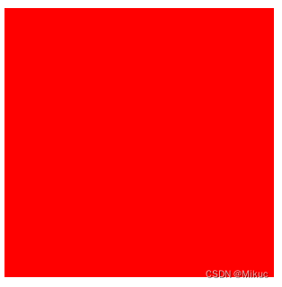
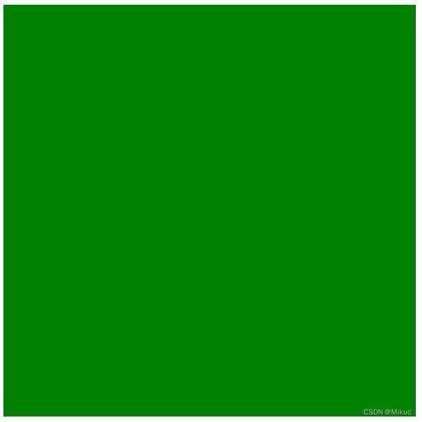
样例:实现红色盒子到绿色盒子的过渡过程设置
过渡:一个状态到另一个状态,即有一个开始状态和结束状态。在盒子开始样式里设置一系列的过渡属性。可以分开设置,也可以一条属性一起设置。结合hover实现开始状态到结束状态。
<head>
	<meta charset="UTF-8">
	<title>Document</title>
	<style type="text/css">
		/* 动画的开始状态 : 浏览中元素的默认显示效果*/
		.box1 {
			width: 200px;
			height: 200px;
			background-color: red;

			/* 设置哪些属性要参与到过渡动画效果中: all */
			/* transition-property: all; */

			/* 设置过渡执行时间 */

			/* transition-duration: 1s; */

			/* 设置过渡延时执行时间 */
			/* transition-delay: 1s; */

			/* 设置过渡的速度类型 */
			/* transition-timing-function: linear; */

			transition: all 1s linear 1s;

		}

		/* 动画的结束状态 */
		.box1:hover {
			width: 400px;
			height: 400px;
			background-color: green;
		}
	</style>
</head>

<body>

	<div class="box1"></div>
</body>
2 动画
### 动画
```css
/* 1定义动画集 */
@keyframes rotate {/* 定义开始状态 0%*/
from {
transform: rotateZ(0deg);
}/* 结束状态 100%*/
to {
transform: rotateZ(360deg);
}
}注意:
1. 如果设置动画集使用的是百分比,那么记住百分比是相对整个动画执行时间的。
```
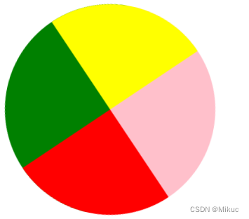
样例:首先定义1个动画集(包含开始状态,中间状态,结束状态),在盒子样式里设置动画的属性。用:hover设置暂停动画
<!DOCTYPE html>
<html lang="en">
<head>
	<meta charset="UTF-8">
	<title>Document</title>
	<style type="text/css">
		.box {
			width: 0px;
			height: 0px;
			border-left: 100px solid yellow;
			border-right: 100px solid red;
			border-bottom: 100px solid green;
			border-top: 100px solid pink;
			border-radius: 50%;


			/* 调用 */

			/* 动画名称 */
			animation-name: rotate;

			/* 设置动画时间 */
			animation-duration: 2s;

			/* 设置动画执行的次数:  infinite 无限执行; */
			animation-iteration-count: infinite;

			/* 动画执行的速度类型 */
			animation-timing-function: linear;

			/* 设置动画逆波 */
			animation-direction: alternate;

			/* 设置动画延时 */
			animation-delay: 1s;

			/* 设置动画结束时候的状态 */
			animation-fill-mode: forwards;

		}

		.box:hover {
			/* 动画暂停 */
			animation-play-state: paused;
		}


		/* 1定义动画集 */
		@keyframes  rotate {

			/* 定义开始状态  0%*/
			0% {
				/* transform: rotateZ(0deg); */
				transform: translateX(0px);
			}

			50% {

			}

			/* 结束状态 100%*/
			100% {
                /*z方向旋转360°,呈现的效果是图形,在原地一直旋转*/
			   /* transform: rotateZ(360deg); */

			   transform: translateX(200px);
			}
		}
	</style>
</head>
<body>

	 <div class="box"></div>

</body>
</html>


 被折叠的 条评论
为什么被折叠?
被折叠的 条评论
为什么被折叠?
 到【灌水乐园】发言


