


<template>
  <div class="switch" @click="openSwitch">
    <div class="switch-false" :class="{ on: switchStatus === true }"></div>
    <div class="switch-true" ref="switchTrue"></div>
    <div class="switch-btn" :class="{ on: switchStatus === true }"></div>
  </div>
</template>

<script>
export default {
  props: {
    status: {
      type: Boolean
    },
    width: {
      type: Number,
      default: 50
    },
    height: {
      type: Number,
      default: 20
    },
    activeColor: {
      type: String,
      default: '#13ce66'
    },
    inactiveColor: {
      type: String,
      default: '#ff4949'
    },
    activeBorderColor: {
      type: String,
      default: '#13ce66'
    },
    inactiveBorderColor: {
      type: String,
      default: '#ff4949'
    }
  },
  data() {
    return {
      switchStatus: false
    }
  },
  methods: {
    openSwitch() {
      this.switchStatus = !this.switchStatus
      if (this.switchStatus) {
        this.$refs.switchTrue.classList.value = 'switch-true on'
      } else {
        this.$refs.switchTrue.classList.value = 'switch-true off'
      }
      this.$emit('change', this.switchStatus)
    }
  },
  mounted() {
    this.$el.style.setProperty('--width', this.width + 'px')
    this.$el.style.setProperty('--width2', this.width / 2 + 'px')
    this.$el.style.setProperty('--height', this.height + 'px')
    this.$el.style.setProperty('--activeColor', this.activeColor)
    this.$el.style.setProperty('--inactiveColor', this.inactiveColor)
    this.$el.style.setProperty('--activeBorderColor', this.activeBorderColor)
    this.$el.style.setProperty('--inactiveBorderColor', this.inactiveBorderColor)
  },
  watch: {
    status: {
      handler(val) {
        this.switchStatus = val
      },
      deep: true,
      immediate: true
    }
  }
}
</script>

<style scoped>
.switch {
  width: var(--width);
  height: var(--height);
  position: relative;
  cursor: pointer;
}
@keyframes moveOn {
  0% {
    border: none;
    width: 0px;
  }
  1% {
    border: 1px solid var(--activeBorderColor);
  }
  100% {
    border: 1px solid var(--activeBorderColor);
    width: var(--width);
  }
}
@keyframes moveOff {
  0% {
    border: 1px solid var(--activeBorderColor);
    width: var(--width);
  }
  99% {
    border: 1px solid var(--activeBorderColor);
  }
  100% {
    border: none;
    width: 0px;
  }
}
.switch-false {
  width: 100%;
  height: 100%;
  background: var(--inactiveColor);
  border-radius: 3px;
  border: 1px solid var(--inactiveBorderColor);
  position: absolute;
  top: 0;
  right: 0;
  transition: width 0.5s;
}
.switch-true {
  width: 0px;
  height: 100%;
  background: var(--activeColor);
  border-radius: 3px;
  position: absolute;
  top: 0;
  left: 0;
  z-index: 2;
}
.switch-btn {
  width: var(--width2);
  height: var(--height);
  background: #ffffff;
  border-radius: 3px;
  position: absolute;
  top: 0px;
  left: 0px;
  transition: left .5s;
  z-index: 3;
}
.switch-false.on {
  width: 0px;
}
.switch-true.on {
  border: 1px solid var(--activeBorderColor);
  width: 100%;
  animation: moveOn .5s ease;
}

.switch-true.off {
  animation: moveOff .5s ease;
}

.switch-btn.on {
  /*background: var(--activeColor);*/
  left: var(--width2);
}
</style>
应用
<template>
	<switch :status="false" :width="50" :height="20" active-color="#13ce66" inactive-color="#ff4949" active-border-color="#13ce66" inactive-border-color="#ff4949" @change="changeSwitch"></switch>
</template>
<script>
import Switch from '@/components/switch'
export default {
  components: {
    Switch
  },
  methods: {
    changeSwitch(val) {
      console.log(val)
    }
  }
}
</script>
说明:
| 参数 | 说明 | 类型 | 默认值 |
|---|---|---|---|
| status | 开始状态 | Boolean | false |
| width | 宽度 | Number | 50 |
| hight | 高度 | Number | 20 |
| active-color | switch打开时的背景色 | String | #13ce66 |
| inactive-color | switch关闭时的背景色 | String | #ff4949 |
| active-border-color | switch打开时的边框色 | String | #13ce66 |
| inactive-border-color | switch关闭时的边框色 | String | #ff4949 |
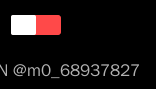
效果图:


 392
392


 被折叠的 条评论
为什么被折叠?
被折叠的 条评论
为什么被折叠?
 到【灌水乐园】发言


