


往期鸿蒙全套实战文章必看:
WithTheme
WithTheme组件用于设置应用局部页面自定义主题风格,可设置子组件深浅色模式和自定义配色。
说明:
该组件从API Version 12开始支持。后续版本如有新增内容,则采用上角标单独标记该内容的起始版本。
子组件
支持单个子组件。
接口
WithTheme(options: WithThemeOptions)
参数:
| 参数名 | 参数类型 | 必填 | 参数描述 |
|---|---|---|---|
| options | WithThemeOptions | 是 | 设置作用域内组件配色。 |
属性
不支持通用属性。
事件
不支持通用事件。
WithThemeOptions
设置WithTheme作用域内组件缺省样式及深浅色模式。
原子化服务API: 从API version 12开始,该接口支持在原子化服务中使用。
参数:
| 参数名 | 参数类型 | 必填 | 参数描述 |
|---|---|---|---|
| theme | CustomTheme | 否 | 用于自定义WithTheme作用域内组件缺省配色。 默认值:undefined,缺省样式跟随系统token默认样式。 |
| colorMode | ThemeColorMode | 否 | 用于指定WithTheme作用域内组件深浅色模式。 默认值:ThemeColorMode.System。 |
示例
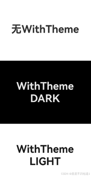
设置局部深浅色时,需要在resources文件夹下添加dark目录,dark目录添加dark.json资源文件,深浅色模式才会生效。
// 指定局部深浅色模式
@Entry
@Component
struct Index {
  build() {
    Column() {
    // 系统默认
      Column() {
        Text('无WithTheme')
          .fontSize(40)
          .fontWeight(FontWeight.Bold)
      }
      .justifyContent(FlexAlign.Center)
      .width('100%')
      .height('33%')
      .backgroundColor($r('sys.color.background_primary'))
      // 设置组件为深色模式
      WithTheme({ colorMode: ThemeColorMode.DARK }) {
        Column() {
          Text('WithTheme')
            .fontSize(40)
            .fontWeight(FontWeight.Bold)
          Text('DARK')
            .fontSize(40)
            .fontWeight(FontWeight.Bold)
        }
        .justifyContent(FlexAlign.Center)
        .width('100%')
        .height('33%')
        .backgroundColor($r('sys.color.background_primary'))
      }
      // 设置组件为浅色模式
      WithTheme({ colorMode: ThemeColorMode.LIGHT }) {
        Column() {
          Text('WithTheme')
            .fontSize(40)
            .fontWeight(FontWeight.Bold)
          Text('LIGHT')
            .fontSize(40)
            .fontWeight(FontWeight.Bold)
        }
        .justifyContent(FlexAlign.Center)
        .width('100%')
        .height('33%')
        .backgroundColor($r('sys.color.background_primary'))
      }
    }
    .height('100%')
    .expandSafeArea([SafeAreaType.SYSTEM], [SafeAreaEdge.TOP, SafeAreaEdge.END, SafeAreaEdge.BOTTOM, SafeAreaEdge.START])
  }
}
// 自定义WithTheme作用域内组件缺省配色
import { CustomTheme, CustomColors } from '@kit.ArkUI';
class GreenColors implements CustomColors {
fontPrimary = '#ff049404';
fontEmphasize = '#FF00541F';
fontOnPrimary = '#FFFFFFFF';
compBackgroundTertiary = '#1111FF11';
backgroundEmphasize = '#FF00541F';
compEmphasizeSecondary = '#3322FF22';
}
class RedColors implements CustomColors {
fontPrimary = '#fff32b3c';
fontEmphasize = '#FFD53032';
fontOnPrimary = '#FFFFFFFF';
compBackgroundTertiary = '#44FF2222';
backgroundEmphasize = '#FFD00000';
compEmphasizeSecondary = '#33FF1111';
}
class PageCustomTheme implements CustomTheme {
colors?: CustomColors
constructor(colors: CustomColors) {
this.colors = colors
}
}
@Entry
@Component
struct IndexPage {
static readonly themeCount = 3;
themeNames: string[] = ['System', 'Custom (green)', 'Custom (red)'];
themeArray: (CustomTheme | undefined)[] = [
undefined, // System
new PageCustomTheme(new GreenColors()),
new PageCustomTheme(new RedColors())
]
@State themeIndex: number = 0;
build() {
Column() {
Column({ space: '8vp' }) {
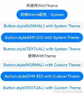
Text(`未使用WithTheme`)
// 点击按钮切换局部换肤
Button(`切换theme配色:${this.themeNames[this.themeIndex]}`)
.onClick(() => {
this.themeIndex = (this.themeIndex + 1) % IndexPage.themeCount;
})
// 系统默认按钮配色
Button('Button.style(NORMAL) with System Theme')
.buttonStyle(ButtonStyleMode.NORMAL)
Button('Button.style(EMP..ED) with System Theme')
.buttonStyle(ButtonStyleMode.EMPHASIZED)
Button('Button.style(TEXTUAL) with System Theme')
.buttonStyle(ButtonStyleMode.TEXTUAL)
}
.margin({
top: '50vp'
})
WithTheme({ theme: this.themeArray[this.themeIndex] }) {
// WithTheme作用域
Column({ space: '8vp' }) {
Text(`使用WithTheme`)
Button('Button.style(NORMAL) with Custom Theme')
.buttonStyle(ButtonStyleMode.NORMAL)
Button('Button.style(EMP..ED) with Custom Theme')
.buttonStyle(ButtonStyleMode.EMPHASIZED)
Button('Button.style(TEXTUAL) with Custom Theme')
.buttonStyle(ButtonStyleMode.TEXTUAL)
}
.width('100%')
}
}
}
}
看完三件事❤️
- 如果你觉得这篇内容对你还蛮有帮助,我想邀请你帮我三个小忙:
- 点赞,转发,有你们的 『点赞和评论』,才是我创造的动力。
- 关注作者,不定期分享原创知识。
- 同时可以期待后续文章ing🚀。


 扫一扫
扫一扫


 被折叠的 条评论
为什么被折叠?
被折叠的 条评论
为什么被折叠?
 到【灌水乐园】发言


