


最大的区别就是series中type类型的区别,bar,line,pie。
柱状图

        // 提取日期和各类数据的名称
          const dates = data.map((item) => item.date);
          const testValues = data.map((item) => item.test);
          const falseAlarmValues = data.map((item) => item.falseAlarm);
          const trueAlarmValues = data.map((item) => item.trueAlarm);
          const otherValues = data.map((item) => item.other);
          const unexpectedAlarmValues = data.map(
            (item) => item.unexpectedAlarm
          );
          // 创建 ECharts 实例
          const chartContainer = document.getElementById("chart1");
          const chart = echarts.init(chartContainer);
          // 配置图表选项
          const options = {
            xAxis: {
              type: "category",
              data: dates,
              axisLabel: {
                textStyle: {
                  fontSize: 12,
                },
              },
            },
            yAxis: {
              type: "value",
              axisLabel: {
                textStyle: {
                  fontSize: 12,
                },
              },
            },
            legend: {
              data: ["测试", "误报", "真实报警", "其他", "非预期报警"],
              textStyle: {
                fontSize: 12,
              },
            },
            //   dataZoom: [
            //     {
            //       type: "slider",
            //       start: 0,
            //       end: 20, // 设置滚动条的初始范围
            //     },
            //   ],
            tooltip: {
              trigger: "item", //坐标轴触发,主要在柱状图,折线图等会使用类目轴的图表中使用
              axisPointer: {
                // 坐标轴指示器,坐标轴触发有效
                type: "shadow", // 默认为直线,可选为:'line' | 'shadow'
              },
            },
            series: [
              {
                name: "测试",
                data: testValues,
                barMaxWidth: 30,
                type: "bar",
              },
              {
                name: "误报",
                barMaxWidth: 30,
                data: falseAlarmValues,
                type: "bar",
              },
              {
                name: "真实报警",
                barMaxWidth: 30,
                data: trueAlarmValues,
                type: "bar",
              },
              {
                name: "其他",
                barMaxWidth: 30,
                data: otherValues,
                type: "bar",
              },
              {
                name: "非预期报警",
                barMaxWidth: 30,
                data: unexpectedAlarmValues,
                type: "bar",
              },
            ],
          }; // 使用配置项显示图表
          chart.setOption(options);
线性图
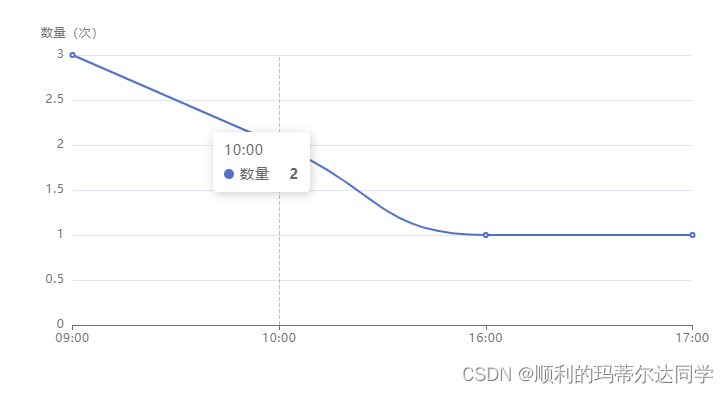
        const chart = echarts.init(document.getElementById("chart4"));
        const time = data.map((item) => item.time + ":00");
        const count = data.map((item) => item.count);
        const options = {
          xAxis: {
            data: time,//横轴显示的刻度
            boundaryGap: false,//默认true,两竖线中间间隙为刻度,false为竖线为刻度
            type: "category",
          },
          yAxis: {
            type: "value",
            name: "数量(次)",
          },
          tooltip: {
            trigger: "axis",//标记展示时显示垂直虚线
            show: true,
          },
          series: [
            {
              data: count,
              barMaxWidth: 50,
              name: "数量",
              type: "line",//线性表类型
              smooth: true,//光滑的曲线,默认false为折线
            },
          ],
        };

        chart.setOption(options);
饼图

     const options = {
          legend: {
            data: deviceTypeName,
            top: 10,
            textStyle: {
              fontSize: 12,
            },
          },
          tooltip: {
            trigger: "item",
            show: true,
          },
          series: [
            {
              type: "pie",
              data: data5,
              radius: ["40%", "55%"],//[内圆半径, 外圆半径]
              label: {
                show: true,
                formatter: "{b}\n{d}%",//标签格式
              },
            },
          ],
        };

        chart.setOption(options);


 480
480


 被折叠的 条评论
为什么被折叠?
被折叠的 条评论
为什么被折叠?
 到【灌水乐园】发言


