


但凡是块元素 都可以认为是盒子
/* 盒子身上有5大属性 */
/* 一个盒子中主要的属性就5个:width、height、padding、border、margin */
<style>
.box{
/* 内容的宽度 */
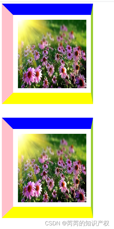
width: 300px;
/* 内容的高度 */
height: 300px;
/* 内边距 padding属性后面值的书写顺序:上内边距 右内边距 下内边距 左内边距 (上 右 下 左*/
padding: 20px 20px 20px 20px;
/* 边框
1opx 边框粗细
solid 实线
skyblue 边框颜色 */
/* border: 10px solid skyblue; */
border-top: 50px solid blue;
border-right: 10px solid yellowgreen;
border-bottom: 50px solid yellow;
border-left: 50px solid pink;
/* 外边距 (上右下左)*/
margin: 0 0 60px 0;
}
</style>
</head>
<body>
<!-- div是块元素 -->
<div class="box">
<img src="./img/1.webp" alt="" width="300" height="300">
</div>
<div class="box">
<img src="./img/1.webp" alt="" width="300" height="300">
</div>
</body>
效果图:
盒子的实际宽度:
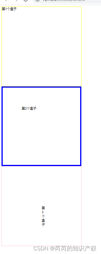
真实占有宽度= 左border + 左padding + width + 右padding + 右border
<style>
        .box1{
            width: 400px;
            height: 400px;
            border: 1px solid yellow;
        }
        .box2{
            width: 200px;
            height: 200px;
           padding: 95px;
           border: 6px solid blue;
        }
        .box3{
            width: 0;
            height: 0;
            padding: 200px;
            border: 1px solid pink;
        }
    </style>
</head>
<body>
    <!-- 三种不同的方式,创建3个一样大的盒子(这里说的一样大,是指盒子在浏览器中实际占有宽度) -->
    <div class="box1">第1个盒子</div>
    <div class="box2">第2个盒子</div>
    <div class="box3">第3个盒子</div>
</body>
效果图:


 4119
4119


 被折叠的 条评论
为什么被折叠?
被折叠的 条评论
为什么被折叠?
 到【灌水乐园】发言


