


哈喽啊小伙伴们!今天和大家分享我写的折扇开合代码。
折扇可以放在自己的网页里作为一个小部件,增加网页的美感和互动性
下面是代码,
首先我们建立一个表格:
     <ul>
        <li>1</li>
        <li>2</li>
        <li>3</li>
        <li>4</li>
        <li>5</li>
        <li>6</li>
        <li>7</li>
        <li>8</li>
        <li>9</li>
        <li>10</li>
        <li>11</li>
        <li>12</li>
        <li>13</li>
      </ul>
li的数量可根据需要修改
接下来是样式代码,同样有注释:
<style>
*{
padding: 0;
margin: 0;
}
ul{
list-style: none;
}
ul{
margin: 10px auto;
width: 600px;
height: 480px;
border: 5px solid gray;
position: relative;
/*鼠标悬浮在该区域内都会使折扇展开*/
}
li{
width: 60px;
height: 200px;
position: absolute;
left: 50%;
margin-left: -30px;
bottom: 30px;
text-align: center;
border-radius: 10px;/*圆角标签*/
transform-origin: bottom center;/*旋转中心*/
transition: all 1s;/*展开or合上的动作时间*/
/*单个标签的样式,数量较少可以增加宽度,这样更加美观*/
}
ul li:not(:nth-child(7)){ /*除了最中间的标签,其他的都默认不显示*/
opacity: 0;
}
ul:hover li{/*当鼠标悬浮在折扇上时,标签显示*/
opacity: 1;
}
/*根据喜好设置标签颜色*/
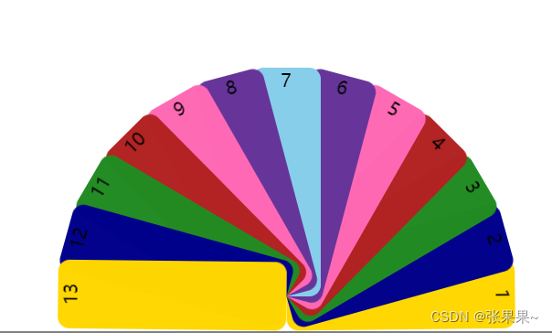
ul li:nth-child(1),ul li:nth-child(13){
background: gold;
}
ul li:nth-child(2),ul li:nth-child(12){
background: darkblue;
}
ul li:nth-child(3),ul li:nth-child(11){
background: forestgreen;
}
ul li:nth-child(4),ul li:nth-child(10){
background:firebrick;
}
ul li:nth-child(5),ul li:nth-child(9){
background: hotpink;
}
ul li:nth-child(6),ul li:nth-child(8){
background: rebeccapurple;
}
ul li:nth-child(7){
background:skyblue;
}
/*设置标签旋转角度,通常每个标签间的夹角deg=180/(n-1),依次递增即可;
注意正负,是以最中间的标签为准旋转的角度*/
/*例如:我有13个标签,应该设置每个夹角为15°*/
ul:hover li:nth-child(1){
transform: rotate(90deg);
}
ul:hover li:nth-child(13){
transform: rotate(-90deg);
}
ul:hover li:nth-child(2){
transform: rotate(75deg);
}
ul:hover li:nth-child(12){
transform: rotate(-75deg);
}
ul:hover li:nth-child(3){
transform: rotate(60deg);
}
ul:hover li:nth-child(11){
transform: rotate(-60deg);
}
ul:hover li:nth-child(4){
transform: rotate(45deg);
}
ul:hover li:nth-child(10){
transform: rotate(-45deg);
}
ul:hover li:nth-child(5){
transform: rotate(30deg);
}
ul:hover li:nth-child(9){
transform: rotate(-30deg);
}
ul:hover li:nth-child(6){
transform: rotate(15deg);
}
ul:hover li:nth-child(8){
transform: rotate(-15deg);
}
</style>最后的效果展示:
默认状态下

鼠标悬浮,折扇会很流畅地展开,注意标签顺序哦(可以修改角度的正负值改变标签顺序)

我的下一个练手项目,一定要加入这个折扇元素!这简直,泰裤辣!
过几天我会再升级一下,在标签中添加超链接,可以作为网页的导航。小伙伴们可以去我的主页
希望这篇文章对你有帮助,需要的时候直接复制粘贴,很节约时间哦~


 被折叠的 条评论
为什么被折叠?
被折叠的 条评论
为什么被折叠?
 到【灌水乐园】发言


