


目录
前言
前面我们已经了解了HTML,CSS,JS(前端三剑客),本篇博客我们通过对这知识的应用,来实现一个博客系统的前端页面。
1、页面组成
2、实现博客列表页
我们先拆成小部分,经行说明,最后展现完整的一个页面代码。
🍂设置背景图片
小编在这里创建了两个文件一个是blog_list.html,另一个是common.css。因为实现的多个博客页面的背景是一样的,所以这里创建的css文件是一个公共的样式,每个页面都可以使用,我们将背景图片设置在了这个公共样式中。
1️⃣blog_list.html文件
由于将背景图片设置在了公共样式中,所以这里只是在head标签中引用公共样式即可。
<link rel="stylesheet" href="css/common.css">2️⃣common.css文件
由于背景图片要填满整个浏览器窗口,所以要设置背景的大小background-size:cover,这里将背景大小的值设置为cover的好处是,它可以占满整个父元素,可以随着浏览器窗口大小的变化,自动调节占满浏览器窗口。但是设置为cover的缺点就是,有可能导致图片的某些部分无法显示。看到这里有的老铁会想到将背景图大小的值设为contain,虽然在使用contain时可以将背景图片完全展示,但是浏览器窗口可能出现空白。应为当背景图和容器的大小不同时,容器的空白区域会显示我们设置的背景颜色。
🌈使用cover
🌈使用contain
上面说到要让背景图片占满浏览器窗口,而背景图的父元素是body,body的父元素是html,html的父元素是浏览器窗口,所以我们首先要设置html的高度是其父元素的100%,然后同样设置body的高度是父元素(html)高度的100%,接下来设置背景图填满整个父元素。这里不需要设置块级元素的宽度,默认就是和父元素一样宽。相当于width:100%。
/* 公共的样式 */
/* 不论写什么样的页面,先写这个是没有错的 */
*{
    /* 设置盒子,不要让边框将它撑大 */
    box-sizing: border-box;
    /* 去除浏览器默认样式 */
    padding:0;
    margin:0;
}
/* html的父元素是浏览器的窗口 */
html {
    height:100%;
}
/* 图片的父元素是body,图片作为背景图,需要占满整个浏览器窗口,所以图片要填满整个父元素 */
body {
    /*  */
    background-image: url(../../image/scenery2.jpg);
    /* 设置背景不平铺 */
    background-repeat: no-repeat;
    /* 设置背景位置水平居中,垂直居中 */
    background-position: center center;
    /* 让背景图足够大,填满这个元素,有可能导致图片的某些部分无法显示完全 */
    background-size: cover;
    /* 设置body占满整个父元素 */
    height:100%;
}
🍂设置导航栏
在导航栏中设置一个logo,和多个连接。我们在设置导航栏的时候,将其设置为半透明的状态。这个时候就需要使用在设置导航栏的背景色的时候使用rgba,这里的a表示的就是透明度,它的取值是0~1,取值越接近1,越不透明,取值越接近0,取值越透明。
1️⃣blog_list.html文件
<body>
    <!-- 导航栏 nav 是导航整个次的缩写 -->
    <div class="nav">
        <!-- logo -->
        <img src="../image/logo.png" alt="">
        <div class="title">我的博客系统</div>
        <!-- 只是一个空白,用来把后面的链接挤过去 -->
        <!-- 这是一个简单粗暴的写法 -->
        <div class="spancer"></div>
        <a href="blog_list.html">主页</a>
        <a href="blog_edit.html">写博客</a>
        <!-- 这里的地址回头在说 -->
        <a href="#">注销</a>
    </div>
</body>
2️⃣common.css文件
/* 导航栏 */
.nav {
    height:50px;
    background-color:rgba(50, 50, 50,0.4);
    color:white;

    /* 使用弹性布局 */
    display: flex;
    /* 让导航栏中的内容垂直居中 */
    align-items: center;
}
.nav img{
    width:40px;
    height:40px;
    /* 通过给图片设置左右外边距,从而让图片与导航栏和文字隔开距离 */
    margin-left: 40px;
    margin-right: 30px;
    /* 设置圆角矩形,让logo编程圆形 */
    border-radius:20px
}
.nav a{
    color:white;
    /* 去掉a标签的下划线 */
    text-decoration: none;
    /* 此处使用内边距把多个连接分出距离 */
    /* 这里使用内边距和外边距都可以,但是使用内边距可以扩大点击的范围 */
    padding:0 10px;
}
/* 对导航栏中,空白位置设置宽度,用来将后面的连接挤到后面 */
.nav .spancer{
    width:70%;
}
🍂实现版心
在设置正文部分的时候,设置一个版心,将其分为左右两个部分。设置版心给定一个固定的宽度,将左右边距设置成水平居中,给版心设置高度,我们不能直接将版心的高度设置为100%,也就是不能设置为和父元素(body)一样的高度,因为body中还存在一个导航栏,所以我们设置版心的高度为父元素的高度减去导航栏的高度。这里我们设置height:calc(100% - 50px)。需要注意的是,我们在使用calc的时候,需要注意在"-"号两侧加空格。如果不加,浏览器就不会将其识别为减号。因为CSS中的命名风格中使用了"-"号。calc类似于一个函数,但是在CSS中没有函数的概念,这里的参数100%,在运算的时候会被自动替换成父元素的高度。
1️⃣blog_list.html文件
    <!-- 页面的主题部分 -->
    <div class="container">
        <!-- 左侧信息 -->
        <div class="container-left">

        </div>
        <!-- 右侧信息 -->
        <div class="container-right">

        </div>
    </div>
2️⃣common.css文件
/* 页面的主题部分,也称为"版心" */
.container{
    /* 设置成固定宽度,水平居中 */
    width: 1000px;
    /* 表示上下外边距是0,左右外边距是水平居中,设置成auto浏览器自动调节 */
    margin:0 auto;
    /* 设置高度,和浏览器高度一样高 */
    /* height:100%; */
    height:calc(100% - 50px);
    /* background-color:rgba(255, 255, 255, 0.6); */
    /* 对container中的元素设置弹性布局 */
    display:flex;
     /* 让container中的元素紧靠左右边界,中间等间距等间距铺开 */
    justify-content: space-between;
}
.container-left{
    height:100%;
    width:200px;

}
.container-right{
    height:100%;
    /* 留出5px的缝隙 在container中使用justify-content: space-between;让元素紧靠左右两边,中间等间距铺开,这样留出的缝隙就在中间了*/
    width:795px;

}
🍃实现个人信息
个人信息部分包括头像、用户名、github地址、文本信息。个人信息部分的容器宽度是由container-left设置的,高度是由容器中包含的元素、元素之间的间隔以及设置的内边距撑开的。
还需注意的是a标签是一个行内元素,针对行内元素的文字设置居中对齐时,是不会生效的,因为行内元素将文字紧紧的包裹这,这个时候行内元素中的文字就处于居中的状态,所以需要将行内元素转换成块级元素,在针对文字进行居中对齐。
1️⃣blog_list.html文件
        <!-- 左侧信息 -->
        <div class="container-left">
            <!-- 这个div表示整个用户信息的区域 -->
            <div class="card">
                <!-- 用户的头像 -->
                <img src="../image/head_portrait.jpg" alt="">
                <!-- 用户名 -->
                <h3>小张学编程</h3>
                <!-- GitHub地址 -->
                <a href="https://github.com">github 地址</a>
                <!-- 统计信息 -->
                <div class="counter">
                    <span>文章</span>
                    <span>分类</span>
                </div>
                <div class="counter">
                    <span>2</span>
                    <span>1</span>
                </div>
            </div>
2️⃣common.css文件
/* 设置用户信息区域 */
.card{
    /* container-left设置为白色半透明 */
    background-color: rgba(255, 255, 255, 0.8);
    /* 设置圆角矩形 */
    border-radius:10px;
    /* 设置内边距 */
    padding:30px;
}
/* 设置用户头像 */
.card img{
    /* 设置container-lett时宽度为200px,.card中设置内边距为30px,所以图片的位置只有140px */
    width:140px;
    height:140px;
    border-radius: 70px;
}
/* 设置用户名 */
.card h3{
    /* 设置文字水平居中 */
    text-align: center;
    /* 使用内边距把用户名和图片撑开一个距离 */
    padding :10px;
}
/* 设置github地址 */
.card a{
    text-align:center;
    /* 文字设置成灰色 */
    color:gray;
    /* 去掉下划线 */
    text-decoration: none;
    /* 需要把a标签转成块级元素,上述的a标签使用的文字水平居中才有意义 */
    display:block;
    /* 让a标签和下面的文字有间隔 */
    margin-bottom: 10px;
}
.card .counter{
    /* 使用弹性布局 */
    display: flex;
    padding:5px;
    /* 于左右边界由间隔,对水平的元素进行均匀排列 */
    justify-content: space-around;
}
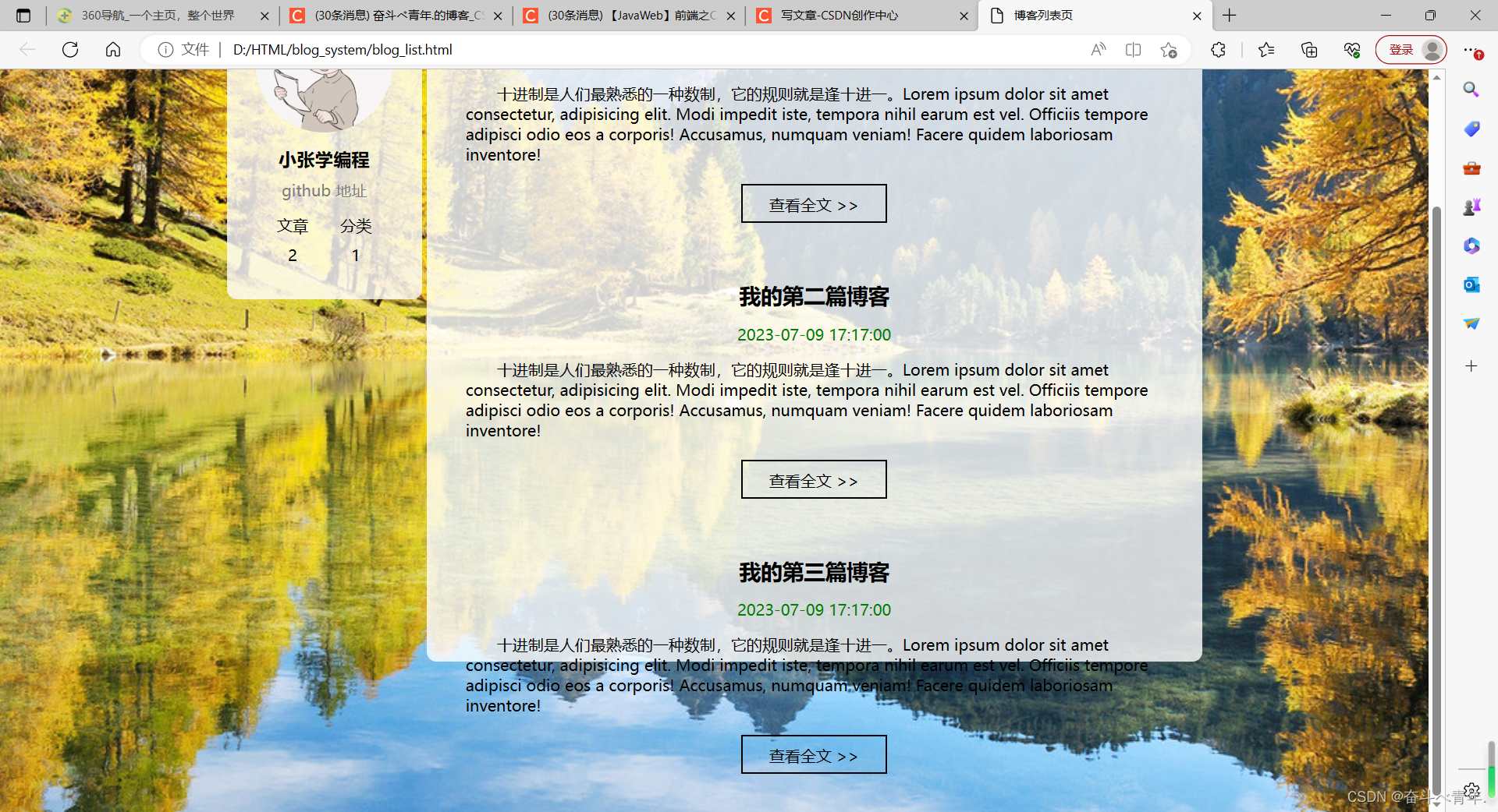
🍃实现博客列表
博客列表中存在的信息为每篇博客的标题,发布时间、摘要和查看全文的按钮,由于点击查看全文的按钮时,需要跳转页面,所以这个使用的a标签,但是a标签是一个行内元素,所以要使用display:block;将其转换位块级元素。a标签的href属性中写的blogId=1的作用就是区分博客列表页中的不同博客跳转的博客详情页。
还需注意的时,我们在html中想要使用大于号,小于号时,不能直接使用符号"<"、">",这两个符号会被浏览器识别位标签的一部分,我们需要使用转移字符,用>表示大于号,用<表示小于号。
还需了解的是,伪类选择器,他不是选中某个元素,而是选中某个元素的某种状态,具体来说,:hover就是选中了元素被鼠标悬停时的状态。
1️⃣blog_list.html文件
<!-- 右侧信息 -->
<div class="container-right">
<!-- 这个div表示一个博客 -->
<div class="blog">
<!-- 博客标题 -->
<div class="title">我的第一篇博客</div>
<!-- 博客发布时间 -->
<div class="data">2023-07-09 17:17:00</div>
<!-- 博客的摘要 -->
<div class="desc">
<!-- 使用Lorem 生成一段随机的字符串 -->
十进制是人们最熟悉的一种数制,它的规则就是逢十进一。Lorem ipsum dolor sit amet consectetur, adipisicing elit. Modi impedit iste, tempora nihil earum est vel. Officiis tempore adipisci odio eos a corporis! Accusamus, numquam veniam! Facere quidem laboriosam inventore!
</div>
<!-- html中不能直接写大于号、小于号可能会被当成标签的一部分,我们使用转移字符 用>表示大于号,<表示小于号-->
<a href="blog_detail.html?blogId=1">查看全文 >></a>
</div>
<div class="blog">
<!-- 博客标题 -->
<div class="title">我的第二篇博客</div>
<!-- 博客发布时间 -->
<div class="data">2023-07-09 17:17:00</div>
<!-- 博客的摘要 -->
<div class="desc">
<!-- 使用Lorem 生成一段随机的字符串 -->
十进制是人们最熟悉的一种数制,它的规则就是逢十进一。Lorem ipsum dolor sit amet consectetur, adipisicing elit. Modi impedit iste, tempora nihil earum est vel. Officiis tempore adipisci odio eos a corporis! Accusamus, numquam veniam! Facere quidem laboriosam inventore!
</div>
<!-- html中不能直接写大于号、小于号可能会被当成标签的一部分,我们使用转移字符 用>表示大于号,<表示小于号-->
<a href="blog_detail.html?blogId=2">查看全文 >></a>
</div>
<div class="blog">
<!-- 博客标题 -->
<div class="title">我的第三篇博客</div>
<!-- 博客发布时间 -->
<div class="data">2023-07-09 17:17:00</div>
<!-- 博客的摘要 -->
<div class="desc">
<!-- 使用Lorem 生成一段随机的字符串 -->
十进制是人们最熟悉的一种数制,它的规则就是逢十进一。Lorem ipsum dolor sit amet consectetur, adipisicing elit. Modi impedit iste, tempora nihil earum est vel. Officiis tempore adipisci odio eos a corporis! Accusamus, numquam veniam! Facere quidem laboriosam inventore!
</div>
<!-- 这里使用blogId=3用来区分跳转的是不同的博客内容 -->
<!-- 由于博客列表页中有很多博客,期望点击不同的博客,跳转的博客详情页是不同的内容 -->
<a href="blog_detail.html?blogId=3">查看全文 >></a>
</div>
</div>这里在设置博客列表样式时,分了两个文件,一个是在common.css文件中,在container-right中设置了博客列表页的背景颜色位白色半透明、将盒子设置为圆角矩形并且设置了内边距;另一部分在blog-list.css文件中,这个文件用来专门写博客列表页的专属样式。
2️⃣common.css文件
.container-right{
    height:100%;
    /* 留出5px的缝隙 在container中使用justify-content: space-between;让元素紧靠左右两边,中间等间距铺开,这样留出的缝隙就在中间了*/
    width:795px;
    /* 对博客列表设置为白色半透明的背景 */
    background-color: rgba(255, 255, 255, 0.8);
    /* 设置圆角矩形 */
    border-radius:10px;
    /* 设置内边距 让文字和边框产生距离*/
    padding:20px;


}
3️⃣blog_list.css文件
/* 专门写博客列表页的专属样式 */
/* 设置整个div的样式 */
.blog{
    /* 设置间距 */
    padding:20px;
}
/* 设置博客标题 */
.blog .title{
    /* 让文字字体变大 */
    font-size: 22px;
    /* 让文字居中显示 */
    text-align: center;
    /* 让文字字体加粗 */
    font-weight: 900;
}
/* 设置发布时间 */
.blog .data{
    /* 让时间文字居中 */
    text-align: center;
    color:rgb(0,128,0);
    /* 设置垂直方向间隔15px */
    padding:15px;
}
/* 设置摘要 */
.blog .desc{
    /* 设置段落缩进 使用em单位,一个em等于一个文字大小,是以相对大小的单位*/
    text-indent: 2em;
}
.blog a{
    /* 将行内元素改成块级标签 */
    display:block;
    width: 150px;
    height:40px;
    /* 设置边框 */
    border:2px solid black;

    /* 把文字的颜色和下划线修改一下 */
    color:black;
    /* 设置文字水平居中 */
    text-align: center;
    /* 去掉下划线 */
    text-decoration: none;
    /* 让文字居中显示 可以通过将文字的行高和元素的高度设置一样,这样文字就会在元素中垂直居中显示 */
    line-height: 40px;

    /* 水平居中 */
    margin:20px auto;

    /* 加上背景切换的过渡效果,all表示针对所有的变化都进行过度,2s意思是过度时间是2s */
    transition:all 0.3s;
}
/* :hover 是一个伪类选择器,它不是选中某个元素,而是选中元素的某种状态*/
/* 具体来说,:hover就是选中了元素被鼠标悬停的状态 */
.blog a:hover{
    /* 鼠标悬停的时候,a标签的背景颜色变为灰色 */
    background-color: gray;
    /* 字体颜色变成白色 */
    color:white;

}
但是写到这里还没有完,从下面的图中可以看到,当我们写的内容太多,超过了浏览器窗口一页所能显示的内容,浏览器窗口上就会出现滚动条,当container-right这个背景被填满之后,我们滑动浏览器窗口会看见文字出现在了背景container-right的外面。
解决的方法就是,在container-right的样式中添加overflow:auto即可,让内容超过container-right范围时,滚动条出现,没有超过时,滚动条消失。
这里添加的滚动条,属于是浏览器的默认样式的滚动条,每个浏览器设置滚动条的方式不同,这不能完全通过CSS来美化。
    /* 当内容超出范围是,自动添加滚动条 这里auto表示的意思就是当内容超出范围自动添加滚动条,当没有超出时,就不加*/
    overflow:auto;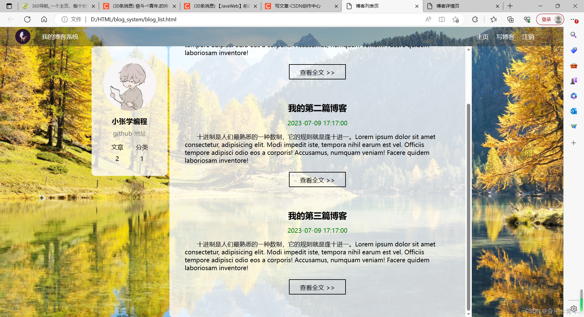
🌈 博客列表页完整代码
1️⃣blog-list.html文件
<!DOCTYPE html>
<html lang="en">
<head>
<meta charset="UTF-8">
<meta name="viewport" content="width=device-width, initial-scale=1.0">
<title>博客列表页</title>
<link rel="stylesheet" href="css/common.css">
<link rel="stylesheet" href="css/blog-list.css">
</head>
<body>
<!-- 导航栏 nav 是导航整个次的缩写 -->
<div class="nav">
<!-- logo -->
<img src="../image/logo.png" alt="">
<div class="title">我的博客系统</div>
<!-- 只是一个空白,用来把后面的链接挤过去 -->
<!-- 这是一个简单粗暴的写法 -->
<div class="spancer"></div>
<a href="blog_list.html">主页</a>
<a href="blog_edit.html">写博客</a>
<!-- 这里的地址回头在说 -->
<a href="#">注销</a>
</div>
<!-- 页面的主题部分 -->
<div class="container">
<!-- 左侧信息 -->
<div class="container-left">
<!-- 这个div表示整个用户信息的区域 -->
<div class="card">
<!-- 用户的头像 -->
<img src="../image/head_portrait.jpg" alt="">
<!-- 用户名 -->
<h3>小张学编程</h3>
<!-- GitHub地址 -->
<a href="https://github.com">github 地址</a>
<!-- 统计信息 -->
<div class="counter">
<span>文章</span>
<span>分类</span>
</div>
<div class="counter">
<span>2</span>
<span>1</span>
</div>
</div>
</div>
<!-- 右侧信息 -->
<div class="container-right">
<!-- 这个div表示一个博客 -->
<div class="blog">
<!-- 博客标题 -->
<div class="title">我的第一篇博客</div>
<!-- 博客发布时间 -->
<div class="data">2023-07-09 17:17:00</div>
<!-- 博客的摘要 -->
<div class="desc">
<!-- 使用Lorem 生成一段随机的字符串 -->
十进制是人们最熟悉的一种数制,它的规则就是逢十进一。Lorem ipsum dolor sit amet consectetur, adipisicing elit. Modi impedit iste, tempora nihil earum est vel. Officiis tempore adipisci odio eos a corporis! Accusamus, numquam veniam! Facere quidem laboriosam inventore!
</div>
<!-- html中不能直接写大于号、小于号可能会被当成标签的一部分,我们使用转移字符 用>表示大于号,<表示小于号-->
<a href="blog_detail.html?blogId=1">查看全文 >></a>
</div>
<div class="blog">
<!-- 博客标题 -->
<div class="title">我的第二篇博客</div>
<!-- 博客发布时间 -->
<div class="data">2023-07-09 17:17:00</div>
<!-- 博客的摘要 -->
<div class="desc">
<!-- 使用Lorem 生成一段随机的字符串 -->
十进制是人们最熟悉的一种数制,它的规则就是逢十进一。Lorem ipsum dolor sit amet consectetur, adipisicing elit. Modi impedit iste, tempora nihil earum est vel. Officiis tempore adipisci odio eos a corporis! Accusamus, numquam veniam! Facere quidem laboriosam inventore!
</div>
<!-- html中不能直接写大于号、小于号可能会被当成标签的一部分,我们使用转移字符 用>表示大于号,<表示小于号-->
<a href="blog_detail.html?blogId=2">查看全文 >></a>
</div>
<div class="blog">
<!-- 博客标题 -->
<div class="title">我的第三篇博客</div>
<!-- 博客发布时间 -->
<div class="data">2023-07-09 17:17:00</div>
<!-- 博客的摘要 -->
<div class="desc">
<!-- 使用Lorem 生成一段随机的字符串 -->
十进制是人们最熟悉的一种数制,它的规则就是逢十进一。Lorem ipsum dolor sit amet consectetur, adipisicing elit. Modi impedit iste, tempora nihil earum est vel. Officiis tempore adipisci odio eos a corporis! Accusamus, numquam veniam! Facere quidem laboriosam inventore!
</div>
<!-- 这里使用blogId=3用来区分跳转的是不同的博客内容 -->
<!-- 由于博客列表页中有很多博客,期望点击不同的博客,跳转的博客详情页是不同的内容 -->
<a href="blog_detail.html?blogId=3">查看全文 >></a>
</div>
</div>
</div>
</body>
</html>2️⃣common.css
/* 公共的样式 */
/* 不论写什么样的页面,先写这个是没有错的 */
*{
    /* 设置盒子,不要让边框将它撑大 */
    box-sizing: border-box;
    /* 去除浏览器默认样式 */
    padding:0;
    margin:0;
}
/* html的父元素是浏览器的窗口 */
html {
    height:100%;
}
/* 图片的父元素是body,图片作为背景图,需要占满整个浏览器窗口,所以图片要填满整个父元素 */
body {
    /*  */
    background-image: url(../../image/scenery2.jpg);
    /* 设置背景不平铺 */
    background-repeat: no-repeat;
    /* 设置背景位置水平居中,垂直居中 */
    background-position: center center;
    /* 让背景图足够大,填满这个元素,有可能导致图片的某些部分无法显示完全 */
    background-size: cover;
    /* 设置body占满整个父元素 */
    height:100%;
}
/* 导航栏 */
.nav {
    height:50px;
    background-color:rgba(50, 50, 50,0.4);
    color:white;

    /* 使用弹性布局 */
    display: flex;
    /* 让导航栏中的内容垂直居中 */
    align-items: center;
}
.nav img{
    width:40px;
    height:40px;
    /* 通过给图片设置左右外边距,从而让图片与导航栏和文字隔开距离 */
    margin-left: 40px;
    margin-right: 30px;
    /* 设置圆角矩形,让logo编程圆形 */
    border-radius:20px
}
.nav a{
    color:white;
    /* 去掉a标签的下划线 */
    text-decoration: none;
    /* 此处使用内边距把多个连接分出距离 */
    /* 这里使用内边距和外边距都可以,但是使用内边距可以扩大点击的范围 */
    padding:0 10px;
}
/* 对导航栏中,空白位置设置宽度,用来将后面的连接挤到后面 */
.nav .spancer{
    width:70%;
}

/* 页面的主题部分,也称为"版心" */
.container{
    /* 设置成固定宽度,水平居中 */
    width: 1000px;
    /* 表示上下外边距是0,左右外边距是水平居中,设置成auto浏览器自动调节 */
    margin:0 auto;
    /* 设置高度,和浏览器高度一样高 */
    /* height:100%; */
    height:calc(100% - 50px);
    /* background-color:rgba(255, 255, 255, 0.6); */
    /* 对container中的元素设置弹性布局 */
    display:flex;
    /* 让container中的元素紧靠左右边界,中间等间距等间距铺开 */
    justify-content: space-between;
}
.container-left{
    height:100%;
    width:200px;

}
.container-right{
    height:100%;
    /* 留出5px的缝隙 在container中使用justify-content: space-between;让元素紧靠左右两边,中间等间距铺开,这样留出的缝隙就在中间了*/
    width:795px;
    /* 对博客列表设置为白色半透明的背景 */
    background-color: rgba(255, 255, 255, 0.8);
    /* 设置圆角矩形 */
    border-radius:10px;
    /* 设置内边距 让文字和边框产生距离*/
    padding:20px;

    /* 当内容超出范围是,自动添加滚动条 */
    overflow:auto;


}
/* 设置用户信息区域 */
.card{
    /* container-left设置为白色半透明 */
    background-color: rgba(255, 255, 255, 0.8);
    /* 设置圆角矩形 */
    border-radius:10px;
    /* 设置内边距 */
    padding:30px;
}
/* 设置用户头像 */
.card img{
    /* 设置container-lett时宽度为200px,.card中设置内边距为30px,所以图片的位置只有140px */
    width:140px;
    height:140px;
    border-radius: 70px;
}
/* 设置用户名 */
.card h3{
    /* 设置文字水平居中 */
    text-align: center;
    /* 使用内边距把用户名和图片撑开一个距离 */
    padding :10px;
}
/* 设置github地址 */
.card a{
    text-align:center;
    /* 文字设置成灰色 */
    color:gray;
    /* 去掉下划线 */
    text-decoration: none;
    /* 需要把a标签转成块级元素,上述的a标签使用的文字水平居中才有意义 */
    display:block;
    /* 让a标签和下面的文字有间隔 */
    margin-bottom: 10px;
}
.card .counter{
    /* 使用弹性布局 */
    display: flex;
    padding:5px;
    /* 于左右边界由间隔,对水平的元素进行均匀排列 */
    justify-content: space-around;
}
3️⃣blog-list.css
/* 专门写博客列表页的专属样式 */
/* 设置整个div的样式 */
.blog{
/* 设置间距 */
padding:20px;
}
/* 设置博客标题 */
.blog .title{
/* 让文字字体变大 */
font-size: 22px;
/* 让文字居中显示 */
text-align: center;
/* 让文字字体加粗 */
font-weight: 900;
}
/* 设置发布时间 */
.blog .data{
/* 让时间文字居中 */
text-align: center;
color:rgb(0,128,0);
/* 设置垂直方向间隔15px */
padding:15px;
}
/* 设置摘要 */
.blog .desc{
/* 设置段落缩进 使用em单位,一个em等于一个文字大小,是以相对大小的单位*/
text-indent: 2em;
}
.blog a{
/* 将行内元素改成块级标签 */
display:block;
width: 150px;
height:40px;
/* 设置边框 */
border:2px solid black;
/* 把文字的颜色和下划线修改一下 */
color:black;
/* 设置文字水平居中 */
text-align: center;
/* 去掉下划线 */
text-decoration: none;
/* 让文字居中显示 可以通过将文字的行高和元素的高度设置一样,这样文字就会在元素中垂直居中显示 */
line-height: 40px;
/* 水平居中 */
margin:20px auto;
/* 加上背景切换的过渡效果,all表示针对所有的变化都进行过度,2s意思是过度时间是2s */
transition:all 0.3s;
}
/* :hover 是一个伪类选择器,它不是选中某个元素,而是选中元素的某种状态*/
/* 具体来说,:hover就是选中了元素被鼠标悬停的状态 */
.blog a:hover{
/* 鼠标悬停的时候,a标签的背景颜色变为灰色 */
background-color: gray;
/* 字体颜色变成白色 */
color:white;
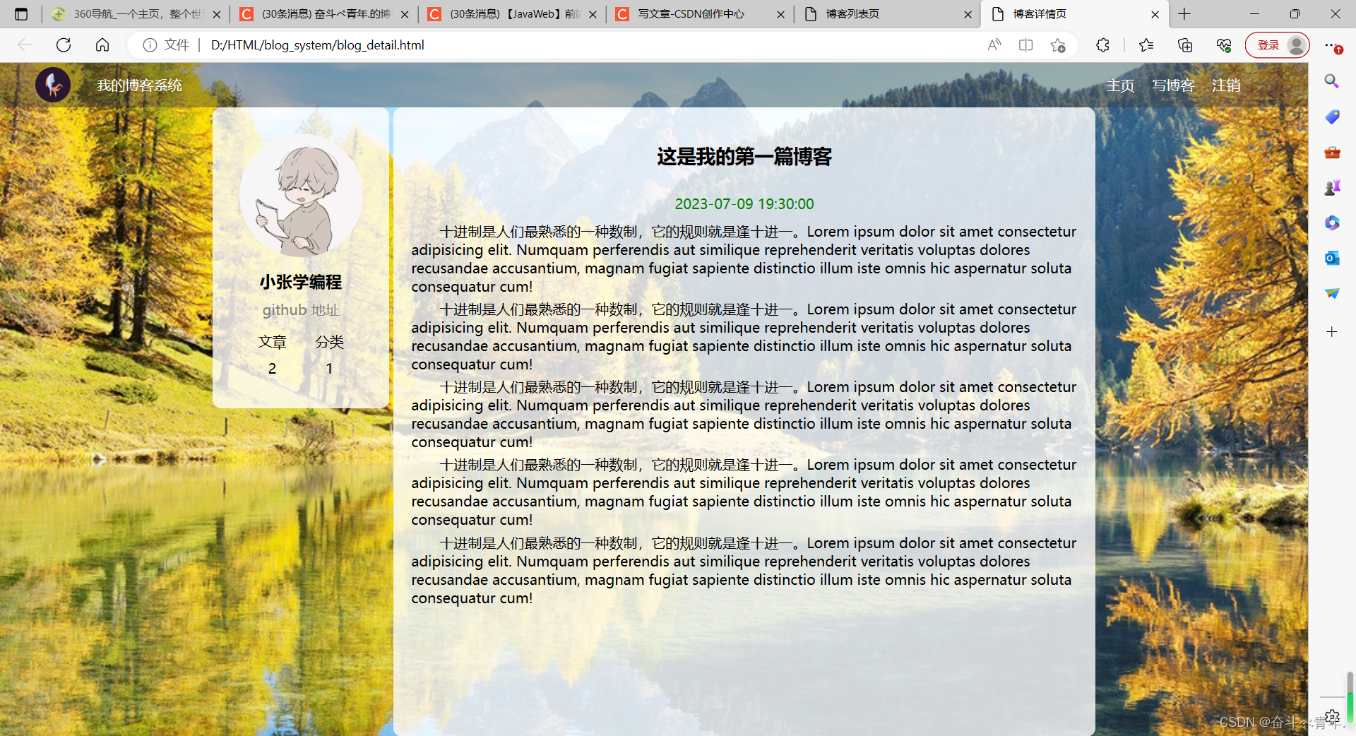
}3、实现博客详情页
我们将博客列表页写完之后,来写这个页面的时候,只有正文部分是不一样的所以这里我们就直接展示代码了。
1️⃣blog_detail.html文件
<!DOCTYPE html>
<html lang="en">
<head>
    <meta charset="UTF-8">
    <meta name="viewport" content="width=device-width, initial-scale=1.0">
    <title>博客详情页</title>
    <link rel="stylesheet" href="css/common.css">
    <link rel="stylesheet" href="css/blog-detail.css">
</head>
<body>
    <!-- 导航栏 nav 是导航整个次的缩写 -->
    <div class="nav">
        <!-- logo -->
        <img src="../image/logo.png" alt="">
        <div class="title">我的博客系统</div>
        <!-- 只是一个空白,用来把后面的链接挤过去 -->
        <!-- 这是一个简单粗暴的写法 -->
        <div class="spancer"></div>
        <a href="blog_list.html">主页</a>
        <a href="blog_edit.html">写博客</a>
        <!-- 这里的地址回头在说 -->
        <a href="#">注销</a>
    </div>
    <!-- 页面的主题部分 -->
    <div class="container">
        <!-- 左侧信息 -->
        <div class="container-left">
            <!-- 这个div表示整个用户信息的区域 -->
            <div class="card">
                <!-- 用户的头像 -->
                <img src="../image/head_portrait.jpg" alt="">
                <!-- 用户名 -->
                <h3>小张学编程</h3>
                <!-- GitHub地址 -->
                <a href="https://github.com">github 地址</a>
                <!-- 统计信息 -->
                <div class="counter">
                    <span>文章</span>
                    <span>分类</span>
                </div>
                <div class="counter">
                    <span>2</span>
                    <span>1</span>
                </div>
            </div>
        </div>

        <!-- 右侧信息 -->
        <div class="container-right">
            <h3>这是我的第一篇博客</h3>
            <div class="data">2023-07-09 19:30:00</div>
            <div class="content">
                <p>十进制是人们最熟悉的一种数制,它的规则就是逢十进一。Lorem ipsum dolor sit amet consectetur adipisicing elit. Numquam perferendis aut similique reprehenderit veritatis voluptas dolores recusandae accusantium, magnam fugiat sapiente distinctio illum iste omnis hic aspernatur soluta consequatur cum!</p>
                <p>十进制是人们最熟悉的一种数制,它的规则就是逢十进一。Lorem ipsum dolor sit amet consectetur adipisicing elit. Numquam perferendis aut similique reprehenderit veritatis voluptas dolores recusandae accusantium, magnam fugiat sapiente distinctio illum iste omnis hic aspernatur soluta consequatur cum!</p>
                <p>十进制是人们最熟悉的一种数制,它的规则就是逢十进一。Lorem ipsum dolor sit amet consectetur adipisicing elit. Numquam perferendis aut similique reprehenderit veritatis voluptas dolores recusandae accusantium, magnam fugiat sapiente distinctio illum iste omnis hic aspernatur soluta consequatur cum!</p>
                <p>十进制是人们最熟悉的一种数制,它的规则就是逢十进一。Lorem ipsum dolor sit amet consectetur adipisicing elit. Numquam perferendis aut similique reprehenderit veritatis voluptas dolores recusandae accusantium, magnam fugiat sapiente distinctio illum iste omnis hic aspernatur soluta consequatur cum!</p>
                <p>十进制是人们最熟悉的一种数制,它的规则就是逢十进一。Lorem ipsum dolor sit amet consectetur adipisicing elit. Numquam perferendis aut similique reprehenderit veritatis voluptas dolores recusandae accusantium, magnam fugiat sapiente distinctio illum iste omnis hic aspernatur soluta consequatur cum!</p>
            </div>


        </div>
    </div>
</body>
</html>
由于blog-detail.html文件中引入的common.css文件在之前已经写过了,这里就不写了。
2️⃣blog-detail.css文件
/* 设置标题 */
.container-right h3{
    /* 设置字体大小 */
    font-size: 22px;
    /* 设置文本居中 */
    text-align: center;
    /* 设置字体加粗 */
    font-weight: 900;
    /* 设置内边距 上下20px,左右为0 */
    padding:20px 0;
}
/* 设置发布时间 */
.container-right .data{
    /* 设置文字居中 */
    text-align: center;
    /* 设置字体颜色 */
    color: rgb(0,128,0);
    /* 设置div标签的内边距,上下位10px,左右为0 */
    padding:10px 0;
}
/* 设置段落 p标签为块级元素*/
.container-right .content p{
    /* 设置首行缩进两个字符 */
    text-indent:2em;
    /* 设置每个段落的外边距,底部外边距为5px */
    margin-bottom: 5px;
}
4、编写博客的登录页
由于这个页面的背景、导航栏和之前一样,所以这个博客登录页中也需要导入common.css文件,这个文件的版心就是一个登录的对话框(也就是一个盒子),盒子中有用户名、密码、输入框、和登录按钮。这里值得注意的是,对话框中写的这些内容,都要放在form标签中,便于后续给服务器提交数据。由于登录对话框是这个页面特有的,所以需要创建一个login.css文件,对这个对话框中的内容进行样式设计。
1️⃣login.html文件
<!DOCTYPE html>
<html lang="en">
<head>
    <meta charset="UTF-8">
    <meta name="viewport" content="width=device-width, initial-scale=1.0">
    <title>博客登录页</title>
    <link rel="stylesheet" href="css/common.css">
    <link rel="stylesheet" href="css/login.css">
</head>
<body>
    <!-- 导航栏 nav 是导航整个次的缩写 -->
    <div class="nav">
        <!-- logo -->
        <img src="../image/logo.png" alt="">
        <div class="title">我的博客系统</div>
        <!-- 只是一个空白,用来把后面的链接挤过去 -->
        <!-- 这是一个简单粗暴的写法 -->
        <div class="spancer"></div>
        <a href="blog_list.html">主页</a>
        <a href="blog_edit.html">写博客</a>
    </div>
    <!-- 登录页的版心 -->
    <div class="login-container">
        <!-- 登录对话框 -->
        <div class="login-dialog">
            <h3>登录</h3>
            <!-- 这里使用form包裹一下 下列内容,便于后续给服务器提交数据 -->
            <form action="">
                <div class="row">
                    <span>用户名</span>
                    <input type="text" id="username">
                </div>
                <div class="row">
                    <span>密码</span>
                    <input type="password" id="password">
                </div>
                <div class="row">
                    <input type="submit" id="submit" value="登录">
                </div>
            </form>

        </div>
    </div>

</body>
</html>
2️⃣login.css文件
/* 这个登录页的css */
.login-container{
    width:100%;
    height:calc(100% - 50px);

    /* 为了让login-dialog垂直水平居中,使用弹性布局 */
    display: flex;
    /* 设置水平居中 */
    justify-content: center;
    /* 设置垂直居中 */
    align-items: center;
}
/* 设置登录的对话框 */
.login-dialog{
    width:500px;
    height:400px;
    background-color: rgba(255,255,255, 0.8);
}

/* 登录标题 */
.login-dialog h3{
    /* 设置字体大小 */
    font-size: 24px;
    /* 设置字体加粗 */
    font-weight: 900;
    /* 设置文字居中显示 */
    text-align: center;
    /* 设置外边距,上下外边距为40px ,左右为0*/
    margin-top:60px;
    margin-bottom:40px;
}

/* 针对每一行的设置 */
.row{
    /* 设置每行的高度 */
    height:50px;
    /* 设置每行的宽度 */
    width:100%;
    /* 设置弹性布局 */
    display: flex;
    /* 水平方向元素之间的排列,与左右边界有间隔均匀排列 */
    justify-content: space-around;
    /* 垂直方向居中 */
    align-items: center;
}

/* 每一行的文字 */
.row span{
    font-size: 20px;
    width:80px;
    /* 将行内元素span标签转换为块级元素 */
    display: block;
    /* 设置左内边距为20px */
    padding-left: 20px;
}
.row #username{
    width:350px;
    height: 40px;
    /* 设置在输入框中输入的内容的字体大小为20px */
    font-size:20px;
    /* 设置输入的内容距离输入左边框10px */
    text-indent:10px;
    /* 设置圆角矩形 */
    border-radius:10px;

}
.row #password{
    width: 350px;
    height:40px;
    font-size: 20px;
    text-indent: 10px;
    border-radius: 10px;

}
.row #submit{
    width:150px;
    height:40px;
    color:white;
    background-color:skyblue;
    /* 设置文字大小 */
    font-size: 17px;
    /* 文字水平居中 */
    text-align:center;
    /* 文字垂直居中,当文字的行高和父元素的高度相同,文字就会垂直居中显示 */
    line-height: 40px;
    /* 取消按钮默认的边框 */
    border:none;
    /* 设置圆角矩形 */
    border-radius: 10px;
    /* 加上背景切换的过渡效果,all表示针对所有的变化都进行过度,2s意思是过度时间是2s */
    transition:all 0.3s;
    margin-top:70px;
}
.row #submit:hover{
    background: gray;
}
5、博客编辑页面
这个页面的实现,背景和导航栏还是套用之前页面中的代码。这个页面的版心存在两部分内容一个是标题的编辑区,一个是实现编辑区。
🍂实现标题的编辑区
这里包含的内容有输入框和提交按钮。
1️⃣blog_edit.html文件
<!DOCTYPE html>
<html lang="en">
<head>
    <meta charset="UTF-8">
    <meta name="viewport" content="width=device-width, initial-scale=1.0">
    <title>博客编辑页</title>
    <link rel="stylesheet" href="css/common.css">
    <link rel="stylesheet" href="css/blog-edit.css">
</head>
<body>
    <!-- 导航栏 nav 是导航整个次的缩写 -->
    <div class="nav">
        <!-- logo -->
        <img src="../image/logo.png" alt="">
        <div class="title">我的博客系统</div>
        <!-- 只是一个空白,用来把后面的链接挤过去 -->
        <!-- 这是一个简单粗暴的写法 -->
        <div class="spancer"></div>
        <a href="blog_list.html">主页</a>
        <a href="blog_edit.html">写博客</a>
        <!-- 这里的地址回头在说 -->
        <a href="#">注销</a>
    </div>
    <!-- 博客编辑页的版心 -->
    <div class="blog-edit-container">
        <form action="">
            <!-- 标题编辑区 -->
            <div class="title">
                <input type="text" id="title-input">
                <input type="submit" id="submit">
            </div>

        </form>

    </div>
</body>
</html>
2️⃣blog-edit.css文件
/* 博客编辑页的样式 */

/* 设置版心 */
.blog-edit-container{
    width:1000px;
    height:calc(100% - 50px);
    margin:0 auto;
}
/* 注意,使用后代选择器,防止和导航栏中的.title冲突 */
.blog-edit-container .title{
    height:50px;
    /* 设置弹性布局 */
    display: flex;
    /* 水平方向  紧靠左右边界有间隔的均匀排布 */
    justify-content: space-between;
    /* 垂直方向居中显示 */
    align-items: center;
}

/* 标题的输入框 */
#title-input{
    height:40px;
    width:896px;

    /* 添加圆角矩形 */
    border-radius: 10px;
    /* 去掉浏览器默认的边框 */
    border:none;
    /* 设置输入框中输入文字的大小 */
    font-size: 20px;
    /* 设置输入框左边和输入文字之间的距离 */
    text-indent:10px;
}

/* 提交按钮 */
#submit{
    height:40px;
    /* 提交按钮和标题的输入框宽度相加,是996px,中间留4px的缝隙 */
    width: 100px;

    /* 添加圆角矩形 */
    border-radius: 10px;
    /* 去掉浏览器默认的边框 */
    border:none;
    /* 设置提交按钮的字体的大小 */
    font-size: 17px;
    /* 设置提交按钮的文字颜色 */
    color:white;
    /* 设置提交按钮的颜色 */
    background-color: orange;
    /* 加上背景切换的过渡效果,all表示针对所有的变化都进行过度,2s意思是过度时间是2s */
    transition:all 0.3s;


}
/* 设置鼠标悬停在提交按钮上的背景颜色 */
#submit:hover{
    background-color: gray;
}
🍂实现博客编辑器(引入Makedown编辑器组件)
完成集成Makedown编辑器,并不是从0开始写一个,我们这里是使用现有的开源库editor.md。可以点击这个连接进行下载Editor.md - 开源在线 Markdown 编辑器 (pandao.github.io)
✨引入editor.md的步骤
1️⃣首先引入editor.md的依赖jQuery.js,这个文件可以直接使用网络地址,也可以将其下载下来,使用你电脑上的文件的地址,使用网络地址缺点就是,在网络不太好的时候,jQuery.js不能及时生效。
2️⃣下载editor.md的代码到项目目录中,在页面中点击github下载
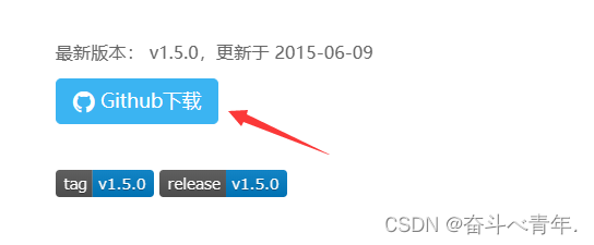
这里需要注意,解压的文件存放位置于小编的不同,那么后续在文件引入的时候地址也就不一样了,还有一点小编将解压后的目录名改了,在编写代码的时候都得注意。小编将解压后的目录和当前页面文件,存放在同一级目录下,所以在引入文件的时候,使用的是相对地址。
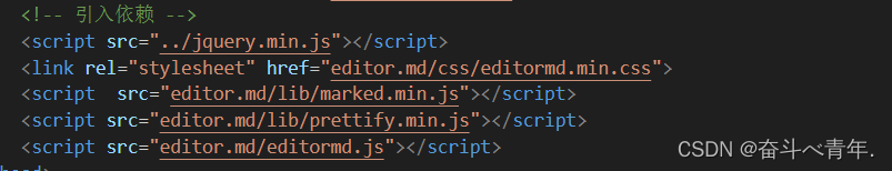
3️⃣引入依赖,这里引入一个css文件和三个js文件。
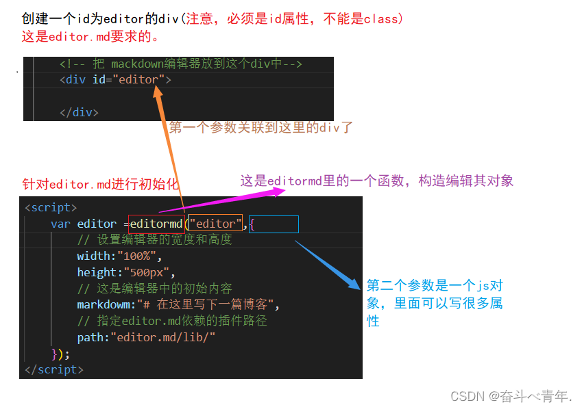
4️⃣针对editor.md进行初始化,主要是创建一个编辑器对象,并关联到页面的某个元素中。
最后这里的path中的路径要和目录结构是匹配的。
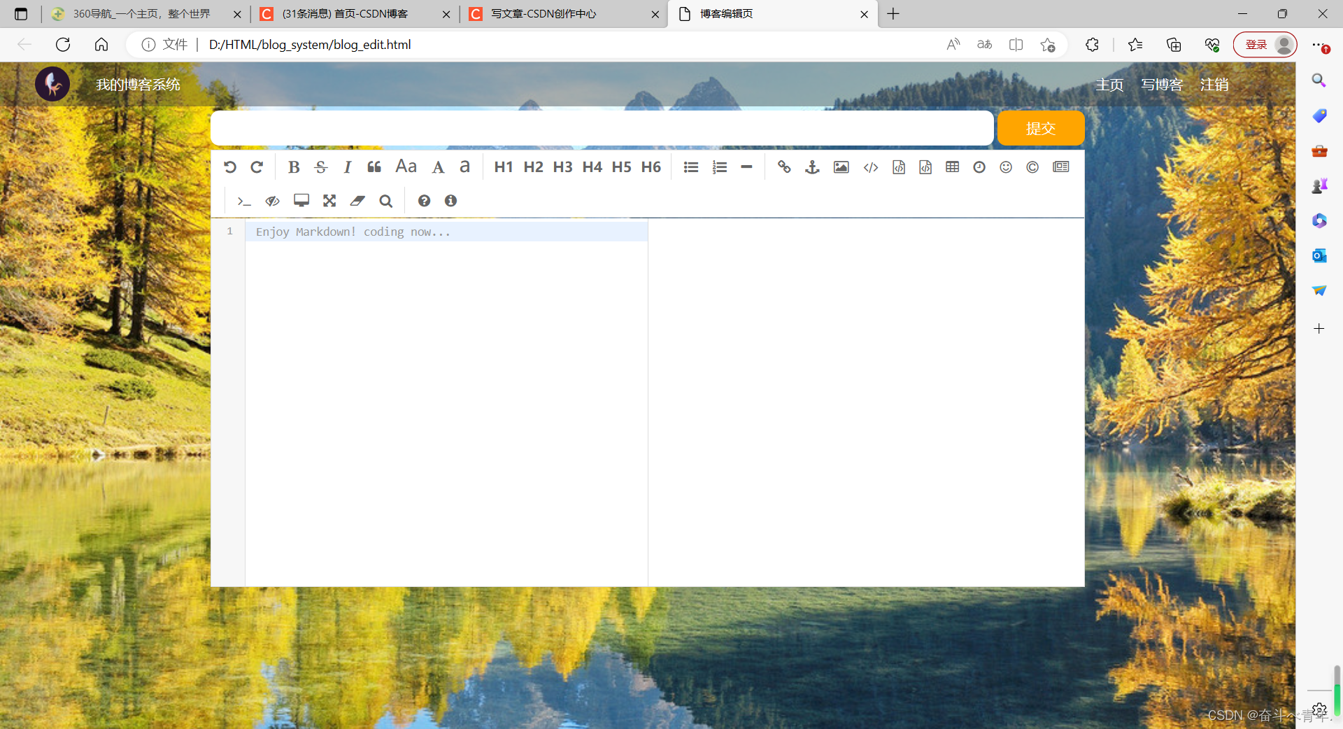
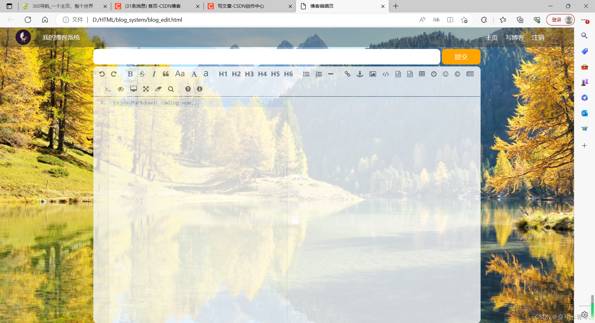
在将文件都引入成功之后,我们先不展示代码,先来看一下出现的结果。可以看见编辑器出现了,但是还有一些小瑕疵,就是这个编辑器并没有铺满它的父元素。还有就是这个编辑器不够透明,还需要调整的就是将编辑器设置为圆角矩形。
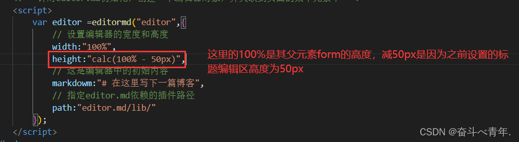
1️⃣让编辑器铺满父元素
这里设置编辑器的高度并不是,直接在editor.css文件中设置,而是在针对editor.md初始化的代码中设置,并在editor.css文件中设置编辑器的父元素高度。编辑器的父元素为form。

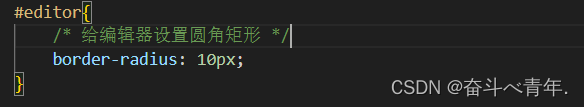
2️⃣ 设置圆角矩形
这个可以直接在editor.css文件中设置
3️⃣设置半透明效果
这里我们用之前的写法(background-color:rgba())设置半透明,最终的效果是展示不出来的,因为Makedowm编辑器的背景中又很多的其他的盒子,这些盒子并不透明,我们只是将Makedowm编辑器背景设置为透明的了,想要正真的生效,就得把里层和外层都设置成半透明才行,外层的div是我们自己写的,里层是editor.md自动生成的。所以这里我们使用opacity属性来设置,将所有的元素都设置成半透明。

🍃代码展示
1️⃣blog_edit.html文件
<!DOCTYPE html>
<html lang="en">
<head>
    <meta charset="UTF-8">
    <meta name="viewport" content="width=device-width, initial-scale=1.0">
    <title>博客编辑页</title>
    <link rel="stylesheet" href="css/common.css">
    <link rel="stylesheet" href="css/blog-edit.css">
    <!-- 引入依赖 -->
    <script src="../jquery.min.js"></script>
    <link rel="stylesheet" href="editor.md/css/editormd.min.css">
    <script  src="editor.md/lib/marked.min.js"></script>
    <script src="editor.md/lib/prettify.min.js"></script>
    <script src="editor.md/editormd.js"></script>
</head>
<body>
    <!-- 导航栏 nav 是导航整个次的缩写 -->
    <div class="nav">
        <!-- logo -->
        <img src="../image/logo.png" alt="">
        <div class="title">我的博客系统</div>
        <!-- 只是一个空白,用来把后面的链接挤过去 -->
        <!-- 这是一个简单粗暴的写法 -->
        <div class="spancer"></div>
        <a href="blog_list.html">主页</a>
        <a href="blog_edit.html">写博客</a>
        <!-- 这里的地址回头在说 -->
        <a href="#">注销</a>
    </div>
    <!-- 博客编辑页的版心 -->
    <div class="blog-edit-container">
        <form action="">
            <!-- 标题编辑区 -->
            <div class="title">
                <input type="text" id="title-input">
                <input type="submit" id="submit">
            </div>
            <!-- 博客编辑器 -->
            <!-- 把 mackdown编辑器放到这个div中-->
            <div id="editor">

            </div>
        </form>

    </div>
    <!-- 针对editor.md初始化,创建一个编辑器对象,并关联到页面的某个元素中 -->
    <script>
        var editor =editormd("editor",{
            // 设置编辑器的宽度和高度
            width:"100%",
            height:"calc(100% - 50px)",
            // 这是编辑器中的初始内容
            markdowm:"# 在这里写下一篇博客",
            // 指定editor.md依赖的插件路径
            path:"editor.md/lib/"
        });
    </script>
</body>
</html>
2️⃣blog-edit.css文件
/* 博客编辑页的样式 */

/* 设置版心 */
.blog-edit-container{
    width:1000px;
    height:calc(100% - 50px);
    margin:0 auto;
}
/* 注意,使用后代选择器,防止和导航栏中的.title冲突 */
.blog-edit-container .title{
    height:50px;
    /* 设置弹性布局 */
    display: flex;
    /* 水平方向  紧靠左右边界有间隔的均匀排布 */
    justify-content: space-between;
    /* 垂直方向居中显示 */
    align-items: center;
}

/* 标题的输入框 */
#title-input{
    height:40px;
    width:896px;

    /* 添加圆角矩形 */
    border-radius: 10px;
    /* 去掉浏览器默认的边框 */
    border:none;
    /* 设置输入框中输入文字的大小 */
    font-size: 20px;
    /* 设置输入框左边和输入文字之间的距离 */
    text-indent:10px;
}

/* 提交按钮 */
#submit{
    height:40px;
    /* 提交按钮和标题的输入框宽度相加,是996px,中间留4px的缝隙 */
    width: 100px;

    /* 添加圆角矩形 */
    border-radius: 10px;
    /* 去掉浏览器默认的边框 */
    border:none;
    /* 设置提交按钮的字体的大小 */
    font-size: 17px;
    /* 设置提交按钮的文字颜色 */
    color:white;
    /* 设置提交按钮的颜色 */
    background-color: orange;
    /* 加上背景切换的过渡效果,all表示针对所有的变化都进行过度,2s意思是过度时间是2s */
    transition:all 0.3s;


}
/* 设置鼠标悬停在提交按钮上的背景颜色 */
#submit:hover{
    background-color: gray;
}
.blog-edit-container form{
    height: 100%;
}
#editor{
    /* 给编辑器设置圆角矩形 */
    border-radius: 10px;
    /* 设置半透明 */
    /* background-color: rgba(255,255,255,0.8); */
    /* 会将我们设置的div和editor.md生成的子元素一起设置成半透明*/
    opacity:80%;
}


 951
951


 被折叠的 条评论
为什么被折叠?
被折叠的 条评论
为什么被折叠?
 到【灌水乐园】发言


