


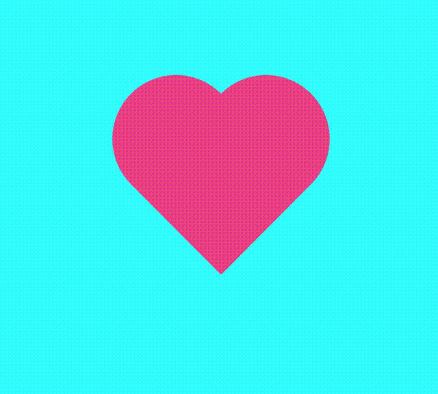
1. 效果展示
2. 实现代码
html:
<!DOCTYPE html>
<html>
<head>
<meta charset="utf-8">
<title></title>
<link rel="stylesheet" href="css/aixin.css">
</head>
<body>
<div class="heart"></div>
</body>
</html>
css:
.heart{
width:200px;
height:200px;
background-color: #eb3f84;
margin:200px auto;
position:relative;
transform:rotate(45deg);
animation:heart 4s ease infinite;
}
html{
animation:html 6s ease infinite;
}
.heart::before{
content: '';
width: 200px;
height: 200px;
background-color: #eb3f84;
border-radius:50%;
position:absolute;
top:100px;
left: 0;
animation:left 6s ease infinite;
transform:all 4s ease;
}
.heart::after{
content: '';
width: 200px;
height: 200px;
background-color: #eb3f84;
border-radius:50%;
position:absolute;
top:0px;
left: 100;
animation:right 6s ease infinite;
transform:all 4s ease;
}
@keyframes html{
0%{
background-color: #eb3f84;
}
50%{
background-color: #3ff;
}
100%{
background-color: #eb3f84;
}
}
@keyframes hearts{
0%{
teansform:rotate(0deg);
border-radius:200px;
background-color:#fff;
}
30%{
tranform:rotate(45deg);
border-radius:10px;
}
50%{
background-color: #eb3f84;
}
70%{
tranform:rotate(45deg);
border-radius:10px;
}
100%{
tranform:rotate(90deg);
border-radius:200px;
background-color: #fff;
}
}
@keyframes left{
0%{
top:0;
background-color: #fff;
}
30%{
top:-100px;
}
50%{
background-color:#eb3f84;
}
70%{
top:-100px;
}
100%{
top: 0;
background-color: #fff;
}
}
@keyframes right{
0%{
left:0;
background-color: #fff;
}
30%{
left:-100px;
}
50%{
background-color:#eb3f84;
}
70%{
left:-100px;
}
100%{
left: 0;
background-color: #fff;
}
}


 677
677


 被折叠的 条评论
为什么被折叠?
被折叠的 条评论
为什么被折叠?
 到【灌水乐园】发言


