


●新增的CSS3特性有兼容性问题, ie9+才支持
●移动端支持优于PC端
●不断改进中
●应用相对广泛编辑
●现阶段主要学习:新增选择器和盒子模型以及其他特性
一、属性选择器
权重10,伪类和类选择器也是10

<!-- 1.利用属性选择器就可以不用借助于类或者id选择器-->
<!-- 2.属性选择器还可以选择属性=值的某些元素-->
<!-- 3.属性选择器可以选择属性值开头的某些元素-->
<!-- 4.属性选择器可以选择属性值结尾的某些元素-->
    <style>
        input[value] {
            color: red;
        }
        input[type=text] {
            color: pink;
        }
        div[class^=icon] {
            color: green;
        }
        section[class$=data] {
            color: blue;
        }
    </style>
</head>
<body>
    <!-- 1.利用属性选择器就可以不用借助于类或者id选择器-->
    <!-- <input type="text" value="不吃饭">
    <input type="text"> -->
    <!-- 2.属性选择器还可以选择属性=值的某些元素,重点-->
    <input type="text" name="" id="" value="nnn">
    <input type="password" name="" id="">
    <!-- 3.属性选择器可以选择属性值开头的某些元素-->
    <div class="icon1">小图标1</div>
    <div class="icon2">小图标2</div>
    <div class="icon3">小图标3</div>
    <div class="icon4">小图标4</div>
    <div>我是打酱油的</div>
    <!-- 4.属性选择器可以选择属性值结尾的某些元素-->
    <section class="icon1-data">我是安其拉</section>
    <section class="icon2-data">我是哥斯拉</section>
    <section class="icon3- ico">哪我是谁</section>

</body>
二、结构伪类选择器

        /* 选择ul第一个孩子 */
        ul li:first-child {
            background-color: pink;
        }
        /* 选择ul里的最后一个孩子li */
        ul li:last-child {
            background-color: green;
        }
        /* 选择任意一个li */
        ul li:nth-child(3) {
            background-color: red;
        }
nth-child (n)选择某个父元素的一个或多个特定的子元素
●n 可以是数字,关键字和公式
●n 如果是数字.就是选择第n个子元素,里面数字从1开始...
n可以是关键字: even偶数, odd奇数
        /* 可以是偶数或者奇数 */
        ul li:nth-child(even) {
            background-color: blue;
        }
        ul li:nth-child(odd) {
            background-color: gray;
        }
        /* 可以是公式 */
        /* 使用公式选择全部 */
        ul li:nth-child(n) {
            background-color: #fff;
        }
        /* 选择偶数 */
        ul li:nth-child(2n) {
            background-color: #fff;
        }
        /* 第3个开始到最后,必须使用n+3,不能使用3+n */
        ul li:nth-child(n+3) {
            background-color: yellow;
        }
        /* 前五个,-n+5 */
        ul li:nth-child(-n+5) {
            background-color: yellow;
        }
区别:
1. nth-child对父元素里面所有孩子排序选择(序号是固定的)先找到第n个孩子,然后看看是否和E匹配
2. nth-of-type 对父元素里面指定子元素进行排序选择。先去匹配E , 然后再根据E找第n个孩子
        /* nth-child 会把所有的盒子都排列序号*/
        /* nth-of-type 会把指定元素的盒子排列序号*/
        /*执行的时候首先看 :nth-child(1) 之后回去看前面div */
        section div:nth-chi1d(1) {
        background-color:red;
        }
        section div:nth-of-type(1) {
        background-color:口blue;
        }
小结
●结构伪类选择器一 般用于选择父级里面的第几个孩子
●nth-child对父元素里面所有孩子排序选择(序号是固定的)先找到第n个孩子,然后看看是否和E匹配
●nth-of-type对父元素里面指定子元素进行排序选择。先去匹配E , 然后再根据E找第n个孩子
关于nth-child (n)我们要知道n是从0开始计算的,要记住常用的公式
●如果是无序列表 .我们肯定用nth-child更多
●类选择器、属性选择器、伪类选择器.权重为10.
三、伪元素选择器(\重点)
伪元素选择器可以帮助我们利用CSS创建新标签元素,而不需要HTML标签,从而简化HTML结构。

伪元素不能给宽高所以要转换为行内块元素
        div {
            width: 300px;
            height: 200px;
            background-color: pink;
        }
        div::before {
            /* content必须写 */
            content: "我";
        }
        div::after {
            /* 伪元素不能给宽高所以要转换为行内块元素 */
            display: inline-block;
            content: "好吃";
        }
1、字体图标
@font-face {
font-family: 'icomoon';
src: url('fonts/icomoon.eot?dbnkcf');
src: url('fonts/icomoon.eot?dbnkcf#iefix') format('embedded-opentype'),
url('fonts/icomoon.ttf?dbnkcf') format('truetype'),
url('fonts/icomoon.woff?dbnkcf') format('woff'),
url('fonts/icomoon.svg?dbnkcf#icomoon') format('svg');
font-weight: normal;
font-style: normal;
font-display: block;
}
div {
position: relative;
width: 200px;
height: 35px;
border: 1px solid red;
}
div::after {
font-family: 'icomoon';
/* content: ''; */
content: '\ea43';
position: absolute;
top: 10px;
right: 10px;
color: red;
font-size: 18px;
}

2、土豆案例遮罩层
写的时候,content千万不能丢。
        .tudou {
            position: relative;
            width: 444px;
            height: 300px;
            background-color: pink;
            margin: 0 auto;

        }

        .tudou img {
            width: 100%;
            height: 100%;
        }

        .tudou::before {
            content: '';
            /* 隐藏遮罩层 */
            display: none;
            position: absolute;
            top: 0;
            left: 0;
            width: 100%;
            height: 100%;
            background: rgba(0, 0, 0, .5) url(../img/start.png) no-repeat center;
        }

        /* 当鼠标经过tudou遮罩层显示出来 */
        .tudou:hover::before {
            display: block;

        }
    </style>
</head>

<body>
    <div class="tudou">
        <!-- <div class="mask"></div> -->
        <img src="../img/tudou.png" alt="">
    </div>
当鼠标经过时:

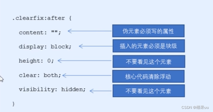
3、清除浮动
还记得之前讲的额外外标签法清除浮动吗。

后面两种伪元素清除浮动算是第一种额外标签法的一个升级和优化。

四、盒子模型,padding不在撑开盒子

所以可以这样写:
       * {
        margin: 0;
        padding: 0;
        box-sizing: border-box ;
       }
五、CSS3过渡

语法:

例如:
        div {
            width: 200px;
            height: 200px;
            background-color: pink;
            /* transition: 变化的属性 变化时间 变化曲线 延迟时间; */
            transition: width 1s ease 1s;
        }
        div:hover {
            width: 400px;
        }
效果就是放在div上,停留一时候,会逐渐过渡到400宽。
谁动给谁加,谁需要过渡就把transition加在谁里面 。
如果想要同时变幻多个属性:
transition: width .5s 1s,height .5s, background-color .5s; div:hover {
width: 400px;
height: 300px;
background-color: green;
}
效果图:
最常用的写法:
transition: all 1s;举例:进度条练习
        .bar {
            padding: 1px;
            margin-top: 10px;
            width: 300px;
            height: 14px;
            border: 1px solid red;
            border-radius: 7px;
        }
        .bar .bar1 {
            width: 60%;
            height: 100%;
            background-color: red;
            border-radius: 7px;
            transition: all .5s;
        }
        .bar:hover  .bar1 {
            width: 300px;
            height: 14px;
            background-color: red;
            border-radius: 7px;
        }
    </style>
</head>
<body>
    <div class="bar">
        <div class="bar1"></div>
    </div>

六、其他

CSS3 calc函数:
括号里面可以用+—— * /来计算。
width: calc(100%-80px);


 5331
5331


 被折叠的 条评论
为什么被折叠?
被折叠的 条评论
为什么被折叠?
 到【灌水乐园】发言


