


布局直接展示
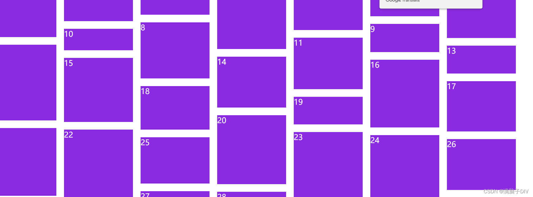
效果:
随着页面滚动条向下滚动,这种布局还会不断加载数据块并附加在当前底部,
排序顺序:
内容框的宽度固定内容框从左到右排列,一行排满后,其余内容可就会按顺序排在短短一列后面
实现的原理:
1.首先我们先计算一行能够容纳几列元素
2.然后通过计算比较找出这一列元素种高度之和的最小一列然后将下一行的第一个元素添加至高度之和最小的这一列下面
3.然后继续计算所有列中高度之和最小的那一列,
4.然后继续将新元素添加至高度之和最小的那一列后面直到所有元素添加完毕
代码片段如下: (HTML)
很多div组成,为了更好的演示给大家看, 因为后期是JS渲染上去的,所以在这部分只是看看就行
<div class="box">
        <!-- <div class="item item-1">1</div>
        <div class="item item-2">2</div>
        <div class="item item-3">3</div>
        <div class="item item-4">4</div>
        <div class="item item-5">5</div>
        <div class="item item-6">6</div>
        <div class="item item-7">7</div>
        <div class="item item-8">8</div>
        <div class="item item-9">9</div>
        <div class="item item-10">10</div>
        <div class="item item-11"></div>
        <div class="item item-12"></div>
        <div class="item item-13"></div>
        <div class="item item-14"></div>
        <div class="item item-15"></div>
        <div class="item item-16"></div>
        <div class="item item-17"></div>
        <div class="item item-18"></div>
        <div class="item item-19"></div>
        <div class="item item-20"></div>
        <div class="item item-21"></div>
        <div class="item item-22"></div> -->
    </div>
代码片段(CSS):
因为准备一行只放七个图片,所以只设置七个的样式,随意的宽度。
 <style>
        * {
            margin: 0;
            padding: 0;
        }
        body{
            position: relative;
        }
        .item {
            width: 180px;
            background-color: blueviolet;
            position: absolute;
            color: white;
            font-size: 20px;
            font-weight: 500;
        }
        .item-1 {
            height: 40px;
        }
        .item-2 {
            height: 50px;
        }
        .item-3 {
            height: 60px;
        }
        .item-4 {
            height: 70px;
        }
        .item-5 {
            height: 80px;
        }
        .item-6 {
            height: 90px;
        }
        .item-7 {
            height: 100px;
        }
    </style>
代码片段( JS ):
    <script>
        var body1 = document.getElementsByTagName("body")[0];
        // var step = 500;
        // var offsetx = 0;
        // body1.style.paddingBottom = 0;
        // body1.style.paddingBottom =offsetx;
        window.onscroll = function () {
            //网页全文高
            var pageHeight = document.documentElement.scrollHeight;
            //滚动条被卷去的距离
            var stop = document.documentElement.scrollTop;
            // console.log(stop);
            //可视窗口
            var seeHeight = document.documentElement.clientHeight;
            // console.log(seeHeight);
            //距离底部的距离
            var bottom1 = pageHeight - stop - seeHeight;
            //    console.log("距离底部的距离"+ bottom1)
            //    console.log("网页全文高"+pageHeight)
            //    console.log("滚动条被卷去的距离"+stop)
            //    console.log("可以看到的屏幕高度"+seeHeight)
            //    console.log("---------")
            //当滚动条距离距离底部小于200的时候就触发
            if (bottom1 <= 200) {
                // offsetx += step;
                // body1.style.paddingBottom = offsetx + "px";
                // console.log(body1.style.paddingBottom);
                for (var i = 0; i < 30; i++) {
                    // console.log(123);
                    var div = document.createElement('div')
                    var rodem = Math.floor(Math.random(0, 1) * 150 + 50)
                    div.style.height = rodem + 'px';
                    div.classList.add('item')
                    div.classList.add('item-' + (i + 1))
                    div.innerHTML = (i + 1)
                    document.body.appendChild(div)
                }
            }
            waterFall()
        }
        for (var i = 0; i < 130; i++) {
            var div = document.createElement('div')
            var rodem = Math.floor(Math.random(0, 1) * 150 + 50)
            div.style.height = rodem + 'px';
            div.classList.add('item')
            div.classList.add('item-' + (i + 1))
            div.innerHTML = (i + 1)
            document.body.appendChild(div)
        }
        var items = document.getElementsByClassName('item')
        // 定义间隙20
        var gap = 20
        window.onload = function () {
            waterFall()
        }

        function waterFall() {
            // 首先确定列数 页面的宽度/图片的宽度
            var wrapwidth = document.body.clientWidth
            // console.log(wrapwidth);
            var itemwidth = items[0].offsetWidth
            var columns = parseInt(wrapwidth / (itemwidth + gap))
            var arr = [];
            for (var i = 0; i < items.length; i++) {
                if (i < columns) {
                    // 满足这个条件则说明在第一行
                    items[i].style.top = 0;
                    items[i].style.left = (itemwidth + gap) * i + 'px';
                    arr.push(items[i].offsetHeight)

                } else {
                    // 不是第一行  先找出最小高度列,和索引
                    // 假设最小高度是第一个元素
                    var minHeight = arr[0]
                    var index = 0;
                    for (var j = 0; j < arr.length; j++) { //找出最小高度
                        if (minHeight > arr[j]) {
                            minHeight = arr[j]
                            index = j
                        }
                    }
                    // 设置下一行第一个盒子的位置
                    // top值就是最小的高度 + gap
                    items[i].style.top = arr[index] + gap + 'px'
                    items[i].style.left = items[index].offsetLeft + 'px'
                    // 修改最小列的高度
                    // 最小列的高度 = 当前自己的高度 + 拼接过来的高度 + 间隙高度
                    arr[index] = arr[index] + items[i].offsetHeight + gap
                }
            }
        }
        // 当前页面尺寸发生变化时,触发函数 实现响应式
        window.onresize = function () {
            waterFall()
        }
    </script>


 2万+
2万+


 被折叠的 条评论
为什么被折叠?
被折叠的 条评论
为什么被折叠?
 到【灌水乐园】发言


