


小白随机在互联网上乱丢一些赛博垃圾,还望拨冗批评斧正。
效果展示:
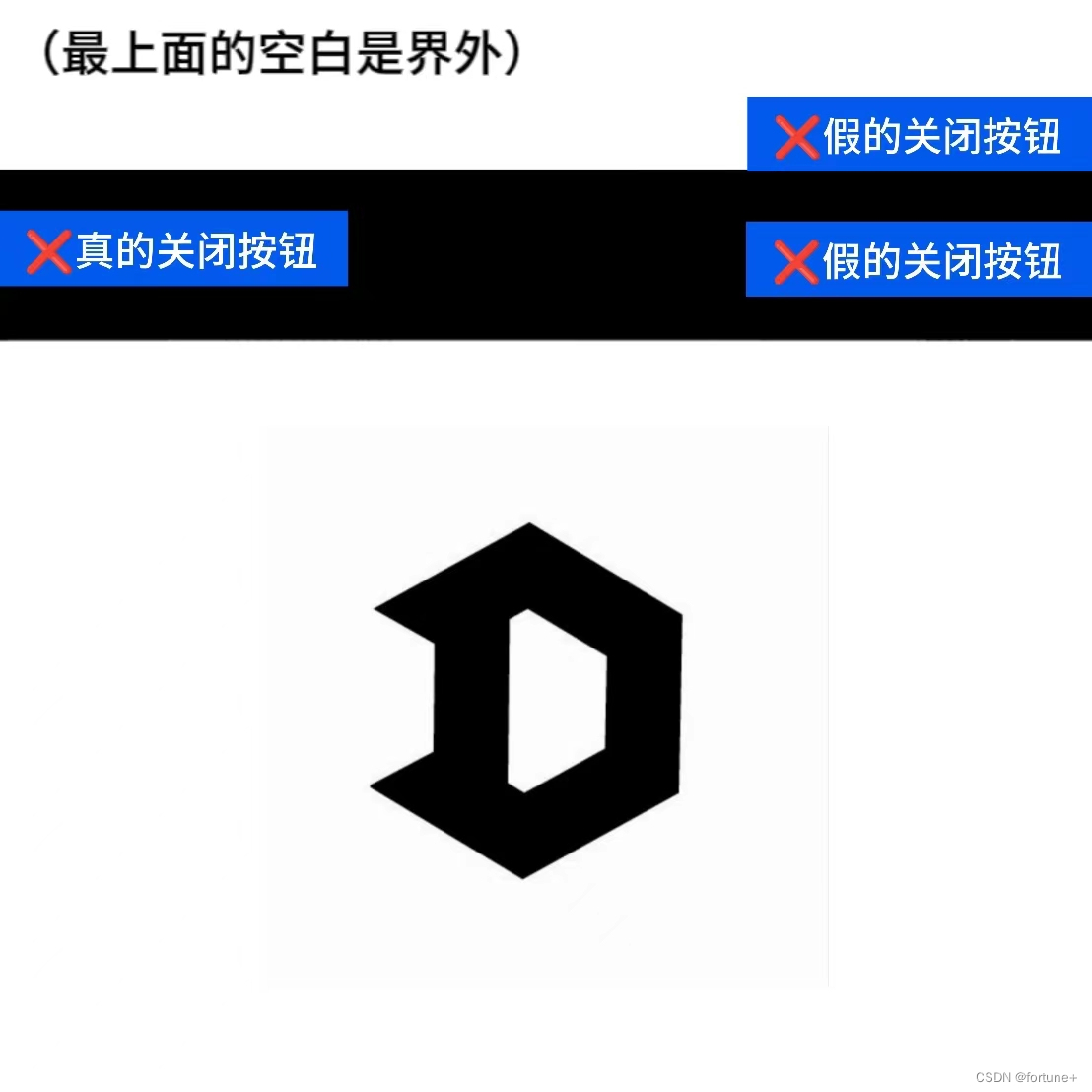
网页弹窗效果
一、图片素材准备
在做这个图片素材的时候我一直在发愁,究竟如何做出这样究极无敌爆炸土的印象派素材。
经反复尝试,我将目光锁定在了 word 文档上。
是的,只需要新疆 word 文档,通过新建文本框就可以做出下图效果。

具体来讲,拉出一个长条状的文本框后,复制几个竖着拼在一起,就能很轻易地把框架搭建好。
接下来我们要调整参数:
文本框:无边框,背景色通过吸取一些不良广告的素材来定下。部分背景需要设置渐变色。
文字:多数选择微软雅黑,第一行黄色边框是通过复制一层文字,将底层文字描边拉粗,再将正常文字覆盖在上面实现的。
形状拼接:右上角的三角,通过创建三角形拼在一起实现,下面两行多色效果只是新创建文本框然后覆盖在上面的效果。
做好之后截图保存,就得到印象派的广告素材啦!
下面是一些其他的抽象作品,供你取色和进行样式参考:


二、编写html文件
大体结构如下:
<body>
	<img src="CSDN上半.jpg" class="bgc">
	<img src="CSDN下半.jpg" class="bgc">
	<div class="main">
		<img src="广告示例.jpg" alt="nothing">
		<div class="header">
			<div class="left_top"></div>
			<a href="doc.html" class="right_down">关闭</a>
			<a href="doc.html" class="right_top"></a>
		</div>
	</div>
</body>
三、编写CSS样式
三个关闭按钮,按照位置不同,我们赋予他们 "left_top""right_top""right_down"的类名。
通过定位,将广告素材定位到.main盒子底部,再在其上方定位一个 header 盒子,把关闭按钮放到 header 中,用定位调整他们的位置。
此外,CSS还通过伪元素创建了关闭按钮,并实现了广告循环缩放动画以及鼠标悬浮到关闭上时的交互效果。
<style>
	* {
		margin: 0;
		padding: 0;
	}
	.main {
		position: relative;
		height: 325px;
		width : 336px;
		background-color: rgba(199,46,49,1.00);
		margin-top: -200px;
		z-index: 10;
		position:fixed;
		bottom:0;
		right:0;
	}
	.main img{
		height: 300px;
		margin-top: 25px;
		z-index: 30;
		animation-name: brightness;
		animation-duration: 0.5s;
		animation-iteration-count: infinite;
	}
	.bgc {
		width:100%;
	}
	.left_top {
		height: 30px;
		width: 35px;
		z-index: 100;
		position: absolute;
		left: 10px;
		line-height: 27px;
		text-decoration: none;
		align-items: center;
        cursor: pointer;
	}
	.header {
		position: absolute;
		display: flex;
		align-items: center;
		left: 0;
		top: 0;
		height:25px;
		width:336px;
		background-color: black;
		z-index: 30;
		align-items: center;
	}
	.right_down {
		height: 30px;
		width: 35px;
		z-index: 100;
		position: absolute;
		right: 10px;
		line-height: 30px;
		text-decoration: none;
	}
	.left_top::before{
            position: absolute;
            content: '';
            width: 0.25vw;
            height: 1.5vw;
            background: white;
            transform: rotate(45deg);
            top: calc(50% - 0.7vw);
            left: 10%;
			filter:blur(1px);
        }

    .left_top::after{
        content: '';
        position: absolute;
        width: 0.25vw;
        height: 1.5vw;
        background: white;
        transform: rotate(-45deg);
        top: calc(50% - 0.7vw);
        left: 10%;
		filter:blur(1px);
       }
   .right_top::before{
        position: absolute;
        content: '';
        width: 0.20vw;
        height: 1.2vw;
        background: black;
        transform: rotate(45deg);
        top: calc(50% - 0.5vw);
		left:44%;
		filter:blur(0.5px);
    }

    .right_top::after{
        content: '';
        position: absolute;
        width: 0.20vw;
        height: 1.2vw;
        background: black;
        transform: rotate(-45deg);
        top: calc(50% - 0.5vw);
		filter:blur(0.5px);
		left:44%;
       }
	.left_top:hover::after,
	.left_top:hover::before {
		background-color: red;
	}
	.right_top:hover::after {
		transform: scale(1.1) rotate(-45deg);
	}

	.right_top:hover::before {
		transform: scale(1.1) rotate(45deg);
	}
	.right_top {
		height: 23px;
		width: 23px;
		z-index: 100;
		position: absolute;
		right: 0;
		top: -23px;
		line-height:23px;
		text-decoration: none;
		background-color: white;
		color:black;
		text-align: center;
		border-width: 1px 1px 0px 1px;
		border-color: black;
		border-style: solid;
	}
	@keyframes brightness{
 		0% {
 		   transform: scale(0.99);
  		}
  		100% {
    		transform: scale(1.0);
  		}
	}
	.right_top:hover {
		text-decoration:underline;
	}
	.right_down:hover {
		text-decoration:underline;
	}
	div a {
		color:rgba(255,255,255,1.00);
	}
	.main img:hover {
		transform: scale(1);
		filter: brightness(110%);
		animation-name: none;
	}
</style>
三、编写js(少量js实现最后小部分功能)
由于我们img的插入并不是放在<a>标签里的,并且真的关闭按钮的关闭功能实现通过 js 更加便捷,所以添加最后几行 js 代码实现最后两个功能。
<script>
	var open = document.querySelector('.main').querySelector('img');
	open.addEventListener('click',function() {
		window.location.href="doc.html";
	})
	var main = document.querySelector('.main');
	var close = document.querySelector('.left_top');
	close.onclick = function(){
		main.style.display = 'none';
	}
</script>
以上就是全部内容,有疑问或者错误,期待大家在评论区交流讨论!


 扫一扫
扫一扫


 被折叠的 条评论
为什么被折叠?
被折叠的 条评论
为什么被折叠?
 到【灌水乐园】发言


