


目的:
设置动画使小水滴看起来是在动的。
其中,这里用到了:
Border-radius 最多可以使用8个数值,这就可以给设计师带来更多创意空间了,注意,需要作用斜杠「 / 」来分隔4个值,这是规范。
实现步骤:
首先,设计body布局:弹性盒子布局和背景。
接着,设计小水滴的大小,形状阴影。
然后是小水滴上的两个光点:大小,形状,阴影,相对位置等。
最后设计动画,让小水滴呈现变动。
<!DOCTYPE html>
<html lang="en">
<head>
    <meta charset="UTF-8">
    <meta name="viewport" content="width=device-width, initial-scale=1.0">
    <title>Document</title>
    <style>
        body{
            display: flex;
            justify-content: center;
            align-items: center;
            height: 100vh;
            background: #0984e3;
        }
        div{
            position: relative;
            width: 100px;
            height: 100px;
            box-shadow: 10px 10px 10px rgba(0, 0, 0, 0.4),-8px -6px 10px rgba(255, 255, 255, 0.6) inset,-8px -6px 10px rgba(255, 255, 255, -0.4) inset,5px -2px 10px rgba(0, 0, 0, 0.6) inset;
            border-radius: 60% 40% 48% 52% / 40% 50% 50% 60%  ;
            animation: aaa 2s linear infinite alternate;
        }
        div::before{
            position: absolute;
            left: 25px;
            top: 26px;
            content: "";
            display: block;
            height: 7px;
            width:7px ;
            background: #fff;
            box-shadow: 5px 1px 5px rgba(0, 0, 0, 0.4);
            border-radius: 24% 76% 48% 52% / 54% 36% 64% 46% ;
            animation: aaa 2s linear infinite alternate;
        }
        div::after{
            position: absolute;
            left: 30px;
            top: 38px;
            content: "";
            display: block;
            height: 7px;
            width:7px ;
            background: #fff;
            box-shadow: 1px 1px 5px rgba(0, 0, 0, 0.3);
            border-radius: 24% 76% 29% 71% / 56% 37% 63% 44%  ;
            animation: aaa 2s linear infinite alternate;
        }
        @keyframes aaa {
            20%{
                border-radius:24% 76% 54% 46% / 56% 43% 57% 44%  ;

            }
            60%{
                border-radius:36% 64% 45% 55% / 43% 43% 57% 57%  ;
            }
            100%{
                border-radius: 36% 64% 64% 36% / 48% 27% 73% 52% ;
            }
        }
    </style>
</head>
<body>
    <div></div>
</body>
</html> 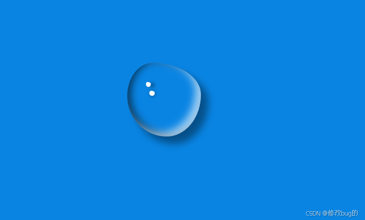


 扫一扫
扫一扫


 902
902

 被折叠的 条评论
为什么被折叠?
被折叠的 条评论
为什么被折叠?
 到【灌水乐园】发言


