


Matplotlib是Python最常使用的数据可视化库, 本文通过具体案例, 学会Python的Matplotlib库绘图使用.
希望通过不断迭代补充, 做到一文从入门到精通Matplotlib.
目录
1, 入门基本语法
语法点:
- 创建画布
figure() - 绘制图像
plot() - 显示图像
show()
示例1: 输出一周7天气温变化折线图
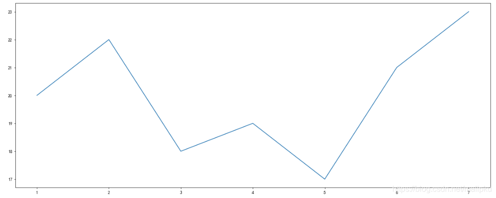
# 导入工具库
import matplotlib.pyplot as plt

# 1, 创建画布
plt.figure(figsize=(20,8),dpi=100)

# 2, 绘制图像
plt.plot([1, 2, 3, 4, 5, 6 ,7], [20,22,18,19,17,21,23])

# [3], 保存图像
plt.savefig("./result1.jpg")

# 3, 显示图像
plt.show()
2, 完善原始折线图
语法点:
- 设置坐标轴及标题文字
xlabel()/ylabel() - 自定义坐标轴刻度
xticks()/yticks() - 设置图片网格
grid()
示例2:画出11点到12点1小时内每分钟的温度变化折线图,温度范围在18度~20度之间
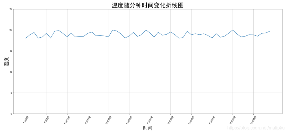
# 需求:画出11点到12点1小时内每分钟的温度变化折线图,温度范围在18度~20度之间

import random
import matplotlib.pyplot as plt
minute = range(60)
# help(random.uniform)
tempreture = [random.uniform(18,20) for i in x]

# 1,创建画布
plt.figure(figsize=(20,8))

# 2,绘制图像
plt.plo
最低0.47元/天 解锁文章


 1025
1025

 被折叠的 条评论
为什么被折叠?
被折叠的 条评论
为什么被折叠?
 到【灌水乐园】发言


