


1.matplotlib
1.绘制折线图
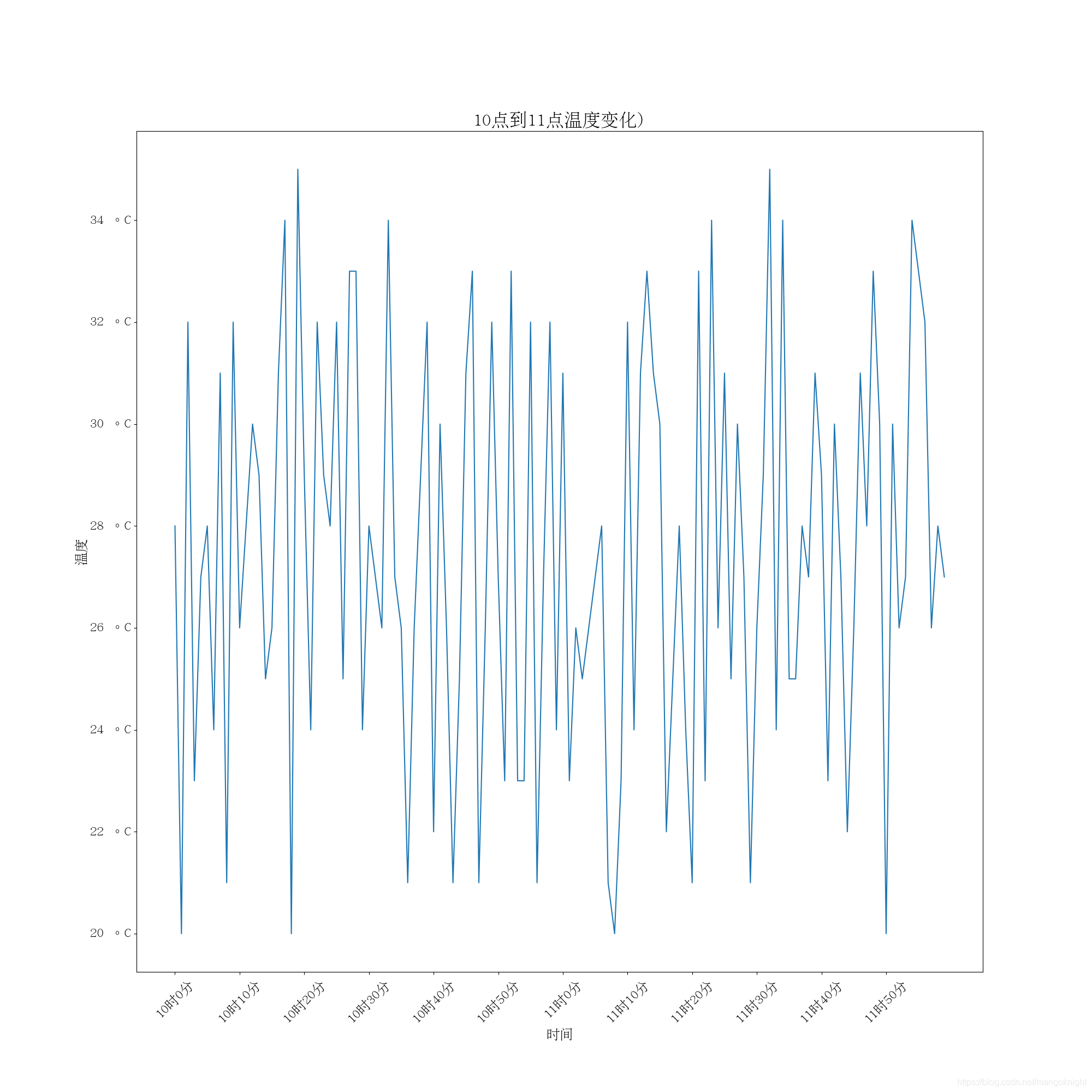
1.温度变化折线图
需求1:
绘制10点到12点每分钟的气温, 如何绘制折线图观察每分钟气温的变化情况?
temps = [random.randint(20, 35) for i in range(120)]
10时10分 10时20分
import random

from matplotlib import pyplot as plt
from matplotlib import font_manager
# 4). 中文显示乱码问题;
myfont = font_manager.FontProperties(fname="/usr/share/fonts/cjkuni-uming/uming.ttc", size=18)
titlefont = font_manager.FontProperties(fname="/usr/share/fonts/cjkuni-uming/uming.ttc", size=24)
# 图表的x轴的数据, 是一个可迭代的数据类型
x_times = range(0,120)
# 图表的y轴的数据, 是一个可迭代的数据类型
y_temp = [random.randint(20, 35) for i in range(120)]

# min(y_temp), max(y_temp)

#  1). 如何设置图片的大小;
plt.figure(figsize=(20, 20))

# 传入x和y轴的数据, 绘制图形;
plt.plot(x_times, y_temp)

# 3). x轴和y轴的描述信息;
plt.title("10点到11点温度变化)",fontproperties=titlefont )
plt.xlabel("时间", fontproperties=myfont)
plt.ylabel("温度", fontproperties=myfont)

# 5). 调整x轴和y轴的刻度;
# 6). x轴的刻度信息过长, 如何调整?

# 10时10分
# 11时10分
_x_labels = ["10时%s分" %(i) for i in range(0, 60, 10)]
_x_labels += ["11时%s分" %(i) for i in range(0, 60, 10)]
plt.xticks(x_times[::10], labels=_x_labels, fontproperties=myfont, rotation=45)
y_temp_range = range(min(y_temp), max(y_temp)+1, 2)
plt.yticks(y_temp_range, labels=["%s 。C"%(i) for i in y_temp_range], fontproperties=myfont)

# #
# plt.scatter(x_times[2], y_temp[2], color='b')
# plt.scatter(x_times[2], y_temp[2], color='', marker='o', edgecolors='r', s=300)

# 2). 如何保存到本地;
plt.savefig('doc/temp3.png')

# 在执行程序时显示图像
# plt.show()
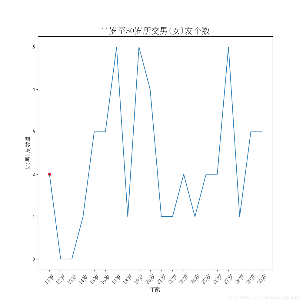
2.每年交男女朋友数量变化折线图
需求2:假设大家在30岁的时候,根据自己的实际情况统计出来从11岁到30岁每年交的女
(男)朋友的数量如a,请绘制出该数据的折线图,以便分析每年交女(男)朋友的数量走势;
import random
from matplotlib import pyplot as plt
from matplotlib import font_manager

x_age = range(11, 31)
y_count = [random.randint(0, 5) for i in range(20)]
myfont = font_manager.FontProperties(fname="/usr/share/fonts/cjkuni-uming/uming.ttc", size=14)
titlefont = font_manager.FontProperties(fname="/usr/share/fonts/cjkuni-uming/uming.ttc", size=20)

plt.figure(figsize=(10, 10))
plt.plot(x_age, y_count)
plt.title("11岁至30岁所交男(女)友个数", fontproperties=titlefont)
plt.xlabel("年龄", fontproperties=myfont)
plt.ylabel("女(男)友数量", fontproperties=myfont)


plt.xticks(x_age, labels=["%s岁" %(item) for item in x_age], fontproperties=myfont, rotation=45)
plt.scatter(x_age[0], y_count[0], c='r')

plt.savefig('doc/age.png')
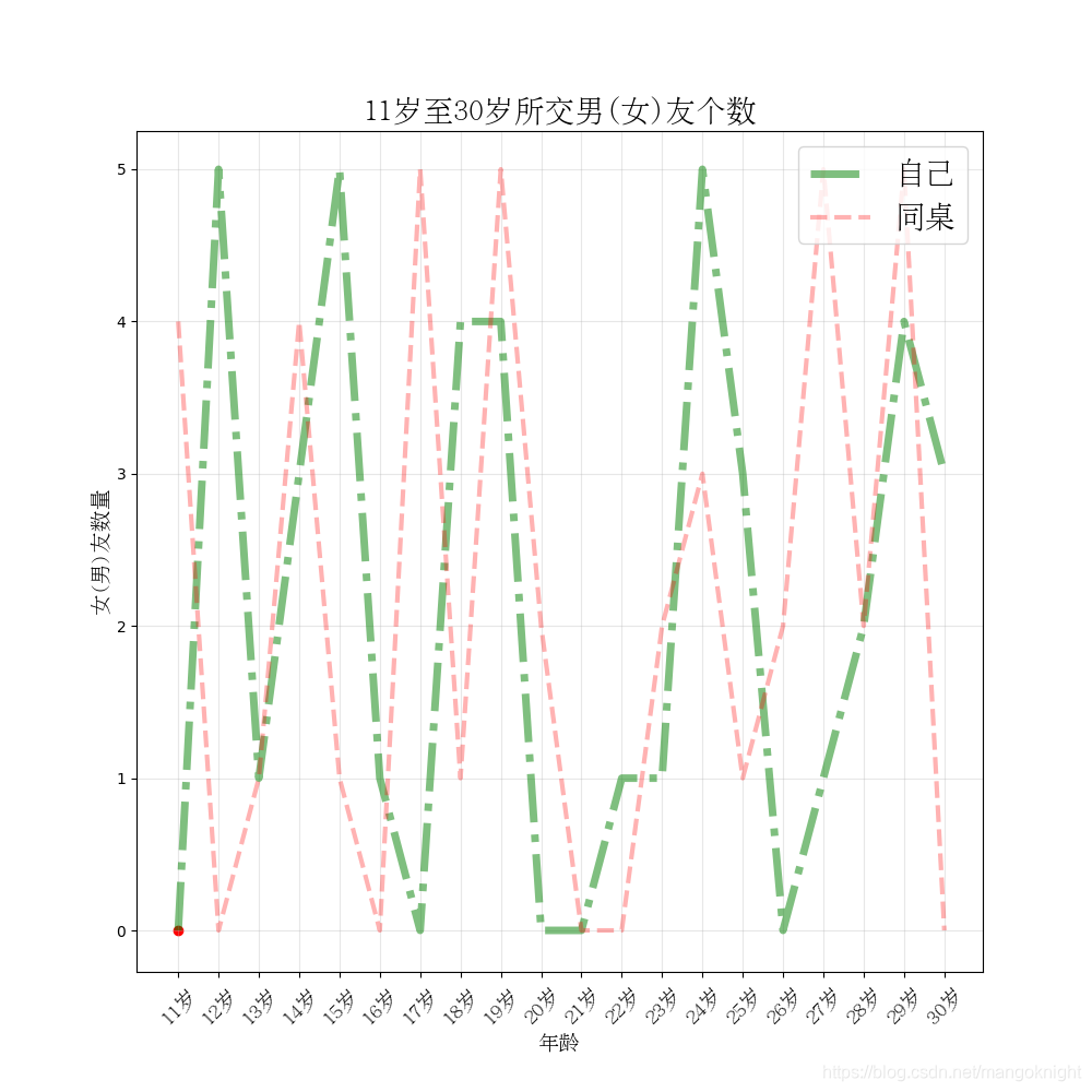
3.每年交男女朋友数量变化对比折线图
需求3:
假设大家30岁时统计出你和你同桌各自从11岁到30岁每年交女(男)朋友的数量如列表a和b,
请在一个图中展示数据折线图,以便比较两人20年之间每年交女(男)朋友的数量走势
import random
from matplotlib import pyplot as plt
from matplotlib import font_manager

x_age = range(11, 31)
y_count_1 = [random.randint(0, 5) for i in range(20)]
y_count_2 = [random.randint(0, 5) for j in range(20)]
myfont = font_manager.FontProperties(fname="/usr/share/fonts/cjkuni-uming/uming.ttc", size=14)
titlefont = font_manager.FontProperties(fname="/usr/share/fonts/cjkuni-uming/uming.ttc", size=20)

plt.figure(figsize=(10, 10))

# 在同一个图里面绘制多条折线,
#  color: 线条颜色
#  linestyle: 线条的风格
#  linewidth: 线条的粗细
#  alpha: 透明度
plt.plot(x_age, y_count_1, color='g', linestyle='-.', linewidth=5, alpha=0.5, label="自己")
plt.plot(x_age, y_count_2, color='r', linestyle='--', linewidth=3, alpha=0.3, label="同桌")

# 添加图例
plt.legend(loc="upper right", prop=titlefont)

# 添加网格
plt.grid(alpha=0.3)

plt.title("11岁至30岁所交男(女)友个数", fontproperties=titlefont)
plt.xlabel("年龄", fontproperties=myfont)
plt.ylabel("女(男)友数量", fontproperties=myfont)


plt.xticks(x_age, labels=["%s岁" %(item) for item in x_age], fontproperties=myfont, rotation=45)
plt.scatter(x_age[0], y_count_1[0], c='r')

plt.savefig('doc/age02.png')
2.绘制散点图
- 需求:
绘制北京3,10月份每天白天的最高气温随时间(天)变化的散点图,并找出规律
数据来源:天气网 http://lishi.tianqi.com/beijing/index.html
a = [11,17,16,11,12,11,12,6,6,7,8,9,12,15,14,17,18,21,16,17,20,14,15,15,15,19,21,22,22,22,23]
b = [26,26,28,19,21,17,16,19,18,20,20,19,22,23,17,20,21,20,22,15,11,15,5,13,17,10,11,13,12,13,6]
难点:
散点图语法
绘制两边分布式x轴坐标
目前难点: 10月的x轴坐标变化
fr 最低0.47元/天 解锁文章


 1万+
1万+


 被折叠的 条评论
为什么被折叠?
被折叠的 条评论
为什么被折叠?
 到【灌水乐园】发言


