


#必要头
import matplotlib.pyplot as plt
plt.rcParams['font.sans-serif']=['SimHei'] #用来正常显示中文标签
plt.rcParams['axes.unicode_minus']=False #用来正常显示负号
|
| # 绘制折线图 plt.figure(figsize=(8,4)) #必要 #创建画板 x=[1,2,3];y=[5,7,4];plt.plot(x,y) #必要 #点集1 plt.show() #必要 # 展示 |
|
| plt.figure(figsize=(8,4)) #必要 # 不创建画板,直接绘图使用默认的画板 x1 = [1,2,3];y1 = [5,7,4];plt.plot(x1,y1,label="第一季度") #必要 #点集1 x2 = [1,2,3];y2 = [10,14,12];plt.plot(x2,y2,label="第二季度") #必要 #点集2 plt.legend() ##美化 #展示以上点集的名称 plt.xlabel("x轴");plt.ylabel("y轴");plt.title("2020年第一季度销售趋势") ##美化 ##轴标签 ##上方标题 plt.show() #必要 |
|
| x = [1,2,3,4,5,6,7,8] y = [5,2,4,2,1,4,5,2]
# x,y轴数据 plt.plot(x,y,label="折线图") ########################3 # 显示x,y轴的轴标签 plt.xlabel("x轴") plt.ylabel("y轴") # 显示标题 plt.title("折线图图例") # 显示小图 plt.legend() # 展示图表 plt.show() |
|
| x1 = [1,3,5,7,9] y1 = [5,2,7,8,2]
x2 = [2,4,6,8,10] y2 = [8,6,2,5,6]
# 绘制柱状图 plt.bar(x1,y2,label="柱状图-01",color="g") ############## plt.bar(x2,y2,label="柱状图-02",color="#191970") ###############3
plt.xlabel("x轴") plt.ylabel("y轴")
plt.title("柱状图案例") plt.legend() plt.show() |
|
| x1 = [1,3,5,7,9] y1 = [5,2,7,8,2]
x2 = [2,4,6,8,10] y2 = [8,6,2,5,6]
# 绘制柱状图 plt.barh(x1,y2,label="条形图-01",color="g") ########### plt.barh(x2,y2,label="条形图-02",color="b") ############
plt.xlabel("x轴") plt.xlabel("y轴")
plt.title("条形图案例") plt.legend() plt.show() |
|
| # 抽取的年龄数据 population_ages = [22,55,62,45,21,22,34,42,42,4,99,102,110,120, 121,122,130,111,115,112,80,75,65,54,44,43,42,48]
bins = [0,18,30,45,60,80,130] # 分段的区间范围 plt.hist(population_ages,bins,histtype="bar") ############# plt.xlabel("年龄区间") plt.ylabel("频数") plt.title("年龄分布直方图") plt.show() |
|
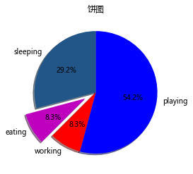
| data = [7.0,2.0,2.0,13.0] activities = ["sleeping","eating","working","playing"] cols = ["#225688","m","r","b"]
plt.pie(data, labels=activities, # 饼图的标签 colors=cols, # 每个扇形区域的颜色 startangle=90, # 开始绘制扇形区域的角度 explode=(0,0.2,0,0), # 扇形区域突出比例 shadow=True, autopct='%1.1f%%') # 以百分比的方式显示数据,保留一位小数 ####################### plt.title("饼图") plt.show() |
|
| x = [1,2,3,4,5,6,7,8] y = [5,2,4,2,1,4,5,2]
plt.scatter(x,y, label="skitscat", color="b", # 点的颜色 s=50, # 点的大小 marker="o") # 点的类型 ##########################
plt.xlabel("X") plt.ylabel("Y") plt.title("散点图案例") plt.legend() plt.show() |
|
| days = [1,2,3,4,5]
sleeping = [7,8,6,11,7] eating = [2,3,4,3,2] working = [7,8,7,2,2] playing = [8,5,7,8,13]
plt.stackplot(days, sleeping, eating, working, playing, colors=["c","m","r","k"]) ############
plt.xlabel("x") plt.ylabel("y") plt.title("堆叠图案例") plt.show() |
|
| fig = plt.figure(1) # 1行1列第一个绘图区域 ax1 = plt.subplot(111) #位置
# 柱状图数值 data = np.array([15,20,18,25])
# 柱状图宽度 width = 0.5 x_bar = np.arange(4)
# 绘制柱状图 ################ rect = ax1.bar(x=x_bar, height=data, width=width, color="lightblue")
# 通过rect对象,为每一个柱子添加顶部数值 for rec in rect: x = rec.get_x() height = rec.get_height() # print("x:{},height:{}".format(x,height)) ax1.text(x+0.15,height*1.02,str(height) + "w")
# 设置x轴标签 ax1.set_xticks(x_bar) ax1.set_xticklabels(["第一季度","第二季度","第三季度","第四季度"]) ax1.set_ylabel("销量(单位:万件)") ax1.set_title("2017年销量季度统计") ax1.grid(True) ax1.set_ylim(0,28) plt.show() |
|
| plt.figure(figsize=(6,6),dpi=80) plt.figure(1) # 创建第一个画板 plt.subplot(211) # 将第一个画板分割成两行一列共2个绘图区域,并同时选中第一个绘图区域 plt.plot([1,2,3]) # 在两行一列的第一个绘图区域上绘制折线图 plt.subplot(212) # 切换到两行一列的第二个绘图区域上 plt.plot([4,5,6])
# 创建第二个画板 plt.figure(2) plt.plot([4,5,6]) plt.title("第二个画板")
# 切换到画板1 plt.figure(1) plt.subplot(211) plt.title("第一个画板的第一个绘图区域") plt.subplot(212) plt.title("第一个画板的第二个绘图区域")
# 调整绘图区域之间的间隔 plt.tight_layout() plt.show() |
|
| # 抽取的年龄数据 df['Age'].hist(bins=50) plt.xlabel("年龄区间") plt.ylabel("频数") plt.title("年龄分布直方图") plt.show() |
|
| data=pd.crosstab(df.Survived,df.Pclass) data.plot(kind='bar',stacked=True) plt.title("Pclass VS Survived") plt.ylabel('Frequnce') plt.show()
|
|
| data = titanic_df.groupby("Survived").agg({"Age":"mean","Fare":"mean"}) plt.figure(figsize=(12,5)) plt.subplot(121) data.Age.plot(kind="bar") plt.title("Age VS Survived") plt.ylabel("Average") plt.subplot(122) data.Fare.plot(kind="bar") plt.title("Fare VS Survived") plt.ylabel("Average") plt.show() |


 1074
1074


 被折叠的 条评论
为什么被折叠?
被折叠的 条评论
为什么被折叠?
 到【灌水乐园】发言


