


折线图可以表现随时间变化的连续数据变化的趋势。
一、数据文件准备
因为实例文件繁琐,所以为了方便举例,就自己拿随机数生成啦ヾ(๑╹◡╹)ノ"。
二、导入模块包
可参考Windows下安装Python、matplotlib包 及相关
https://blog.csdn.net/mikasa3/article/details/78942650
1、numpy
2、matplotlib
三、完整代码
如下:
import random
import numpy as np
import matplotlib.pyplot as plt
def DrawLinechart():#画折线图
    xdata = np.arange(0,10)#生成0-10
    ydata = []
    for i in range(10):#随机生成5个数
        y = random.uniform(1,5)#随机生成1-5之间的浮点数
        ydata.append(y)
    fig = plt.figure()
    colors = "#AA00FF"#定义颜色
    label = "JS"#图例标签
    plt.plot(xdata, ydata, c = colors, label = label)
    plt.legend(loc = 'upper left')#图例的位置是左上
    plt.xlabel('Date')#X轴标签
    plt.ylabel('Price')#Y轴标签
    plt.title('Monthly Price Trends, 2018.04')#折线图标题
    plt.show()
if __name__=='__main__':
    DrawLinechart()#画折线图
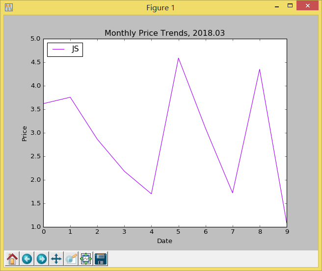
四、运行结果
1、折线图


 7635
7635


 被折叠的 条评论
为什么被折叠?
被折叠的 条评论
为什么被折叠?
 到【灌水乐园】发言


