


Alert用于启动一个提示对话框,包含对应的标题和信息。在Android上最多能指定三个按钮,这三个按钮分别具有“中间态”、“消极态”和“积极态”的概念。
Alert学习
Alert的API如下:
static alert(title: string, message?: string, button?: Buttons, type?: AlertType) Alert默认样式
render: function() {
return(
<TouchableHighlight style={styles.wrapper}
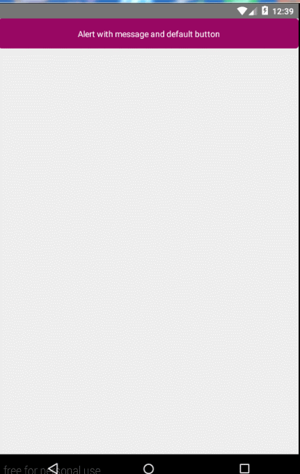
onPress={() => Alert.alert(
'Alert Title',
'Alert Content',
)}>
<View style={styles.button}>
<Text style={{color:'#ffffff'}}>Alert with message and default button</Text>
</View>
</TouchableHighlight>
);
}
var styles = StyleSheet.create({
wrapper: {
borderRadius: 5,
marginBottom: 15,
},
button: {
borderRadius: 5,
backgroundColor: '#980763',
alignItems: 'center',
justifyContent: 'center',
height: 50,
}
});上面为TouchableHighlight设置点击事件,并且在其onPress方法中创建一个Alert,没有指定任何按钮,则使用默认的样式。效果如下:
自定义按钮
我们可以自己通过为Alert指定一个数组,来指定其需要使用到的按钮,格式如下:
[
                {text:'OK', onPress: ()=> console.log('Ok button click')},
                {text:'Cancel',onPress: ()=> console.log('Cancel button click')},
              ]
关键代码如下:
<View>
        <TouchableHighlight style={styles.wrapper}
                onPress={() => Alert.alert(
                'Alert Title',
                'Alert Content',
                )}>
              <View style={styles.button}>
                  <Text style={{color:'#ffffff'}}>Alert with message and default button</Text>
              </View>
        </TouchableHighlight>

        <TouchableHighlight style={styles.wrapper}
                onPress={() => Alert.alert(
                'Alert Title',
                'Alert Content',
                [
                  {text:'OK', onPress: ()=> console.log('Ok button click')},
                  {text:'Cancel',onPress: ()=> console.log('Cancel button click')},
                ]
                )}>
              <View style={styles.button}>
                  <Text style={{color:'#ffffff'}}>Alert with two button</Text>
              </View>
        </TouchableHighlight>

        <TouchableHighlight style={styles.wrapper}
                onPress={() => Alert.alert(
                'Alert Title',
                null,
                [
                  {text: 'Foo', onPress: () => console.log('Foo Pressed!')},
                  {text: 'Bar', onPress: () => console.log('Bar Pressed!')},
                  {text: 'Baz', onPress: () => console.log('Baz Pressed!')},
                ]
              )}>
              <View style={styles.button}>
                <Text style={{color:'#ffffff'}}>Alert with three buttons</Text>
              </View>
        </TouchableHighlight>
</View>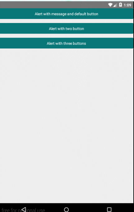
Clipboard学习
另外react native也为我们提供了一个Clipboard,顾名思义,该API是用来操作剪切板的,下面,我们使用该Clipboard来实现一个简单的demo,效果如下:
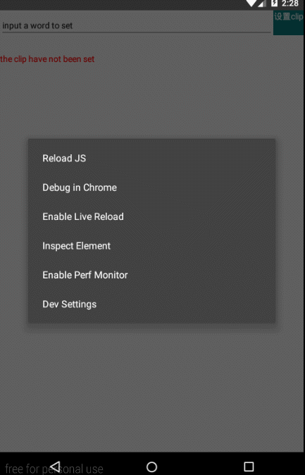
上面的效果使用到了两个核心的方法:
Clipboard.setString(string)
Clipboard.getString(string)
全部代码如下:
'use strict';

var React = require('react-native');

var {
  Image,
  StyleSheet,
  Text,
  TouchableWithoutFeedback,
  View,
  AppRegistry,
  Clipboard,
  TextInput,
} = React;


var secondProject = React.createClass({

    getInitialState: function() {
      return {
        content: 'the clip have not been set', //初始化了一个content的state
        text: 'input a word to set'  初始化了一个text的state
      };
    },

  _setContentToClipboard:function(){
    var newClip = this.state.text; //获取文本框中的值
    Clipboard.setString(newClip); //重新设置剪切板
    Clipboard.getString(content => {
      this.setState({content}); //重置content的内容
    });
  },

  render() {
    return (
        <View>
            <View style={{flexDirection: 'row'}}>
                <View style={styles.cell}>
                  <TextInput
                    style={{height: 40, borderColor: 'gray', borderWidth: 1}}
                    onChangeText={(text) => this.setState({text})}
                    defaultValue ={this.state.text}
                />
            </View>
            <TouchableWithoutFeedback style={styles.cell}
                onPress ={() => this._setContentToClipboard()}
                >
                <Text style={styles.button}>设置clip</Text>
            </TouchableWithoutFeedback>
            </View>
          <Text style={{color: 'red', marginTop: 20}}>
              {this.state.content}
           </Text>
      </View>
    );
  }
});

var styles = StyleSheet.create({
  button: {
    backgroundColor: '#097678',
    width: 50,
    padding: 3,
    textAlign: 'center',
    color: '#ffffff',
  },
  cell: {
      flex: 1,
      height: 50,
      justifyContent: 'center',
  },
});

AppRegistry.registerComponent('secondProject', () => secondProject);
在react native中会经常使用到state和prop,不懂得,可以先看下面的连接学习下:
react组件生命周期
react入门学习
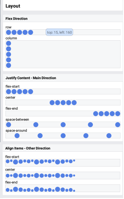
react-native 之布局篇
Flex效果简介
弹性盒(Flexbox),类似于css中的盒子模型,不过Flexbox支持响应式布局。官方提供的各个属性效果如下:
未完待续。


 1217
1217

 被折叠的 条评论
为什么被折叠?
被折叠的 条评论
为什么被折叠?
 到【灌水乐园】发言


