


视图容器组件
view
view是最常用的视图容器组件,相当于HTML页面的<div>标签,推荐使用flex布局。
示例代码
wxml:
<view class="section">
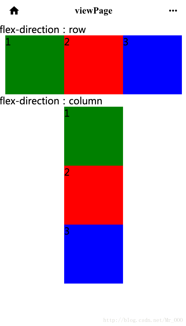
<view class="section_title">flex-direction:row</view>
<view class="flex-wrp" style="flex-direction:row;justify-content:center">
<view class="flex-item bc_green">1</view>
<view class="flex-item bc_red">2</view>
<view class="flex-item bc_blue">3</view>
</view>
</view>
<view class="section">
<view class="section_title">flex-direction:column</view>
<view class="flex-wrp" style="flex-direction:column;align-items:center;">
<view class="flex-item bc_green">1</view>
<view class="flex-item bc_red">2</view>
<view class="flex-item bc_blue">3</view>
</view>
</view>wxss:
.flex-wrp{
    display:flex;
    background-color: #FFFFFF;
}
.flex-item{
    width: 100px;
    height: 100px;
}
.bc_green{
    background-color: green;
}
.bc_red{
    background-color: red;
}
.bc_blue{
    background-color: blue;
}
.bc_yellow{
    background-color: yellow;
}
效果图:
scroll-view
属性表
可滚动视图区域的属性参见表1:
| 属性名 | 类型 | 默认值 | 说明 |
|---|---|---|---|
| scroll-x | Boolean | false | 允许横向滚动 |
| scroll-y | Boolean | false | 允许纵向滚动 |
| upper-threshold | Number | 50 | 距顶部/左边多远时(单位px),触发scrolltoupper事件 |
| lower-threshold | Number | 50 | 距底部/右边多远时(单位px),触发scrolltolower事件 |
| scroll-top | Number | 设置竖向滚动条位置 | |
| scroll-left | Number | 设置横向滚动条位置 | |
| scroll-into-view | String | 值应为某子元素id,则滚动到该元素,元素顶部对其滚动区域顶部 | |
| bindscrolltoupper | EventHandle | 滚动到顶部/左边,会触发scrolltoupper事件 | |
| bindscrolltolower | EventHandle | 滚动到底部/右边,会触发scrolltolower事件 | |
| bindscroll | EventHandle | 滚动时触发,event.detail={scrollLeft,scrollTop,scrollHeight,scrollWidth,deltaX,deltaY} |
使用竖向滚动是,需要给<scroll-view/>一个固定高度,通过WXSS设置height。
实例代码
wxss:
<view class="section">
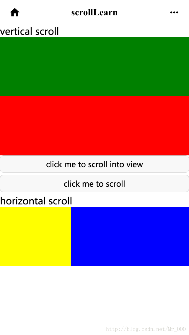
<view class="section_title">vertical scroll</view>
<scroll-view scroll-y="true" style="height: 200px" bindscrolltoupper="upper" bindscrolltolower="lower"
bindscroll="scroll" scroll-into-view="{{toView}}" scroll-top="{{scrollTop}}">
<view id="green" class="scroll-view-item bc_green"></view>
<view id="red" class="scroll-view-item bc_red"></view>
<view id="yellow" class="scroll-view-item bc_yellow"></view>
<view id="blue" class="scroll-view-item bc_blue"></view>
</scroll-view>
<view class="btn-area">
<button size="mini" bindtap="tap" style="width:100%">click me to scroll into view</button>
<button size="mini" bindtap="tapMove" style="width:100%">click me to scroll</button>
</view>
</view>
<view class="section section_gap">
<view class="section_title">horizontal scroll</view>
<scroll-view class="scroll-view_H" scroll-x="true"
style="width: 100%">
<view id="green" class="scroll-view-item_H bc_green"></view>
<view id="red" class="scroll-view-item_H bc_red"></view>
<view id="yellow" class="scroll-view-item_H bc_yellow"></view>
<view id="blue" class="scroll-view-item_H bc_blue"></view>
</scroll-view>
</view>
js:
var order = ['red', 'yellow', 'blue', 'green', 'red'];
Page({
  data: {
    toView: 'red',
    scrollTop: 100,
    text: "Page scrollLearn"
  },
  onLoad: function (options) {
    // 页面初始化 options为页面跳转所带来的参数
  },
  onReady: function () {
    // 页面渲染完成
  },
  onShow: function () {
    // 页面显示
  },
  onHide: function () {
    // 页面隐藏
  },
  onUnload: function () {
    // 页面关闭
  },


  upper: function (e) {
    console.log("up")
  },
  lower: function (e) {
    console.log('low')
  },
  scroll: function (e) {

  },
  tap: function (e) {
    for (var i = 0; i < order.length; ++i) {
      if (order[i] === this.data.toView) {
        this.setData({
          toView: order[i + 1]
        })
        break
      }
    }
  },
  tapMove: function (e) {
    this.setData({
      scrollTop: this.data.scrollTop + 10
    })
  }
})
wxss:
.flex-wrp {
  display: flex;
  background-color: #FFFFFF;
}

.flex-item {
  width: 100px;
  height: 100px;
}

.scroll-view_H {
  white-space: nowrap;
  background-color: #FFFFFF;
  height: 100px;
}

.bc_green {
  display: flex;
  background-color: green;
  align-items: center;
}

.bc_red {
  background-color: red;
}

.bc_blue {
  background-color: blue;
}

.scroll-view-item_H {
  display: inline-block;
  width: 200px;
  height: 100px;
}

.bc_yellow {
  background-color: yellow;
}

.scroll-view-item {
  height: 100px;
}

/*去掉滚动条*/
::-webkit-scrollbar {
  width: 0;
  height: 0;
  color: transparent;
}
效果图:
表单组件
button
属性表
| 属性名 | 类型 | 默认值 | 说明 |
|---|---|---|---|
| size | String | Default | 有效值包括:default、mini |
| type | String | default | 按钮的杨氏类型,有效值包括:primary、default、warn |
| plain | Boolean | false | 按钮是否镂空,背景色透明 |
| disabled | Boolean | false | 是否禁用 |
| loading | Boolean | false | 名称前是否带loading图标 |
| form-type | String | 无 | 有效值包括:submit、reset,用于<form/>组件,点击分别会触发submit/reset事件 |
| hover-class | String | button-hover | 制定按钮按下去的样式类。当hover-class=”none”时,表示没有点击态效果 |
示例代码
wxml:
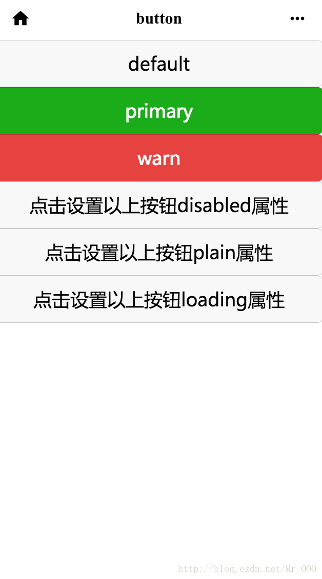
<button type="default" size="{{defaultSize}}" loading="{{loading}}" plain="{{plain}}"
disabled="{{disabled}}" bindtap="default" hover-class="other-button-hover">default</button>
<button type="primary" size="{{primarySize}}" loading="{{loading}}" plain="{{plain}}"
disabled="{{disabled}}" bindtap="primary">primary</button>
<button type="warn" size="{{warnSize}}" loading="{{loading}}" plain="{{plain}}"
disabled="{{disabled}}" bindtap="warn">warn</button>
<button bindtap="setDisabled">点击设置以上按钮disabled属性</button>
<button bindtap="setPlain">点击设置以上按钮plain属性</button>
<button bindtap="setLoading">点击设置以上按钮loading属性</button>
js:
var types = ['default','primary','warn']
var pageObject = {
  data:{
    text:"Page buttonLearn",
    defaultSize: 'default',
    warnSize: 'default',
    disabled: false,
    plain: false,
    loading: false
  },
  onLoad:function(options){
    // 页面初始化 options为页面跳转所带来的参数
  },
  onReady:function(){
    // 页面渲染完成
  },
  onShow:function(){
    // 页面显示
  },
  onHide:function(){
    // 页面隐藏
  },
  onUnload:function(){
    // 页面关闭
  },
  setDisabled: function(e) {
    this.setData({
      disabled: !this.data.disabled
    })
  },
  setPlain:function(e) {
    this.setData({
      plain: !this.data.plain
    })
  },
  setLoading: function(e) {
    this.setData({
      loading:!this.data.loading
    })
  }
}
Page(pageObject)
for(var i=0; i < types.length; ++i) {
  (function(type) {
    pageObject[type] = function(e) {
      var key = type + 'Size'
      var changedData = {}
      changedData[key] =
      this.data[key] === 'default' ? 'mini' : 'default'
      this.setData(changedData)
    }
  })(types[i])
}
wxss:
.container {
  height: 100%;
  display: flex;
  flex-direction: column;
  align-items: center;
  justify-content: space-between;
  padding: 200rpx 0;
  box-sizing: border-box;
}

.textStyle {
  display: flex;
  flex-direction: column;
  align-items: center;
}

.textContainer {
  margin-top: 200px;
}
.button-hover {
  background-color: red;
}
.other-button-hover {
  background-color: blue;
}
效果图:
input
属性表
| 属性名 | 类型 | 默认值 | 说明 |
|---|---|---|---|
| value | String | 输入框的内容 | |
| type | String | text | input的类型,有效值包括:text、number、idcard、digit、time、date |
| password | Boolean | false | 是否是密码类型 |
| placeholder | String | 输入框为空时占位符 | |
| placeholder-style | String | 指定placeholder的样式 | |
| placeholder-class | String | input-placeholder | 指定placeholder的样式类 |
| disabled | Boolean | false | 是否禁用 |
| maxlength | Number | 140 | 最大输入长度,设置为0时不限制最大长度 |
| auto-focus | Boolean | false | 自动聚焦,拉起键盘。页面中只能有一个<input/>设置auto-focus的属性 |
| focus | Boolean | false | 获取焦点(开发工具暂不支持,要看效果只能用手机预览模式) |
| bindchange | EventHandle | 输入框是去焦点时,触发bindchange事件,event.detail={value:value} | |
| bindinput | EventHandle | 除了date/time类型外的输入框,当键盘输入时,触发inptu事件,event.detal= {value:value},处理函数可以直接return一个字符串,将替换输入框中的内容 | |
| bindfocus | EventHandle | 输入框聚焦时触发,event.detail={value:value} | |
| bindblur | EVentHandl | 输入框失去焦点时触发,event.detal={value:value} |
实例代码
wxml:
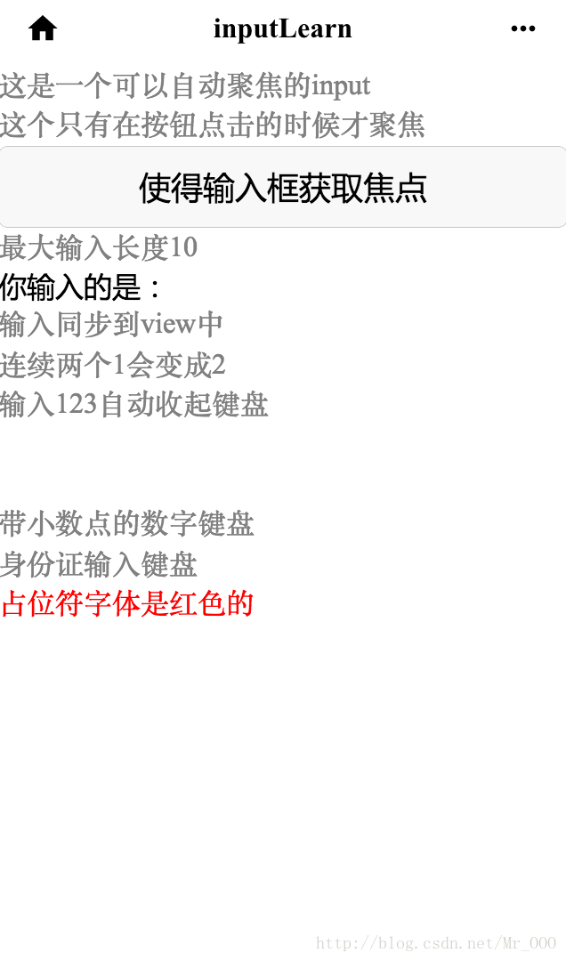
<view class="section">
  <input placeholder="这是一个可以自动聚焦的input" auto-focus />
</view>
<view class="section">
  <input placeholder="这个只有在按钮点击的时候才聚焦" focus="{{focus}}" />
  <view>
    <button bindtap="bindButtonTap">使得输入框获取焦点</button>
  </view>
</view>
<view class="section">
  <input maxlength="10" placeholder="最大输入长度10" />
</view>
<view class="section">
  <view class="section_title">你输入的是:{{inputValue}}</view>
  <input bindinput="bindKeyInput" placeholder="输入同步到view中" />
</view>
<view class="section">
  <input bindinput="bindReplaceInput" placeholder="连续两个1会变成2" />
</view>
<view class="section" >
  <input bindinput="bindHideKeyboard" placeholder="输入123自动收起键盘" />
</view>
<view class="section" >
  <input password type="number" />
</view>
<view class="section" >
  <input password type="text" />
</view>
<view class="section" >
  <input type="digit" placeholder="带小数点的数字键盘"/>
</view>
<view class="section" >
  <input type="idcard" placeholder="身份证输入键盘" />
</view>
<view class="section" >
  <input placeholder-style="color:red" placeholder="占位符字体是红色的"/>
</view>
js:
Page({
  data:{
    text:"Page inputLearn",
    focus: false,
    inputValue: ''
  },
  onLoad:function(options){
    // 页面初始化 options为页面跳转所带来的参数
  },
  onReady:function(){
    // 页面渲染完成
  },
  onShow:function(){
    // 页面显示
  },
  onHide:function(){
    // 页面隐藏
  },
  onUnload:function(){
    // 页面关闭
  },
  bindButtonTap: function() {
    this.setData({
      focus: Date.now()
    })
  },
  bindKeyInput: function (e) {
    this.setData({
      inputValue:e.detail.value
    })
  },
  bindReplaceInput: function(e) {
    var value = e.detail.value
    var pos = e.detail.curos
    if(pos != -1) {
      //光标在中间
      var left = e.detail.value.slice(0,pos)
      //计算光标的位置
      pos = left.replace(/11/g,'2').length
    }

    //直接返回对象,可以对输入进行过滤处理,同时可以控制光标的位置
    return {
      value: value.replace(/11/g,'2'),
      cursor: pos
    }

    //或者直接返回字符串,光标在最后
    //return value.replace(/11/g,'2'),
   },
   bindHideKeyboard: function (e) {
     if (e.detail.value === '123') {
       //收起键盘
       wx.hideKeyboard()
     }
   }
})
wxss:
.container {
  height: 100%;
  display: flex;
  flex-direction: column;
  align-items: center;
  justify-content: space-between;
  padding: 200rpx 0;
  box-sizing: border-box;
}

.textStyle {
  display: flex;
  flex-direction: column;
  align-items: center;
}

.textContainer {
  margin-top: 200px;
}
效果图:
其他组件
其他基本组件还有基础内容组件、互动操作组件、页面导航组件,高级组件还有媒体、地图、画布。因为太多了,这里就不一一举例了,用法大致上都差不多,大家可以查官方api,举一反三。
实例代码源码
github地址:https://github.com/a252937166/winxins2.git


 扫一扫
扫一扫
 520
520

 被折叠的 条评论
为什么被折叠?
被折叠的 条评论
为什么被折叠?
 到【灌水乐园】发言


