


前言
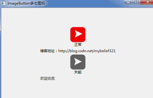
本节目的是设计WPF自定义控件ImageButton,这样就可以使用咱们的四态图标,方便在项目中直接使用,文章底部会将源码奉上,demo的演示效果如下:
WPF工程
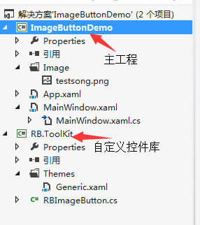
RBImageButton.cs
public class RBImageButton : Button
    {
        static RBImageButton()
        {
            DefaultStyleKeyProperty.OverrideMetadata(typeof(RBImageButton), new FrameworkPropertyMetadata(typeof(RBImageButton)));
        }

        #region 依赖属性

        public double ImageSize
        {
            get { return (double)GetValue(ImageSizeProperty); }
            set { SetValue(ImageSizeProperty, value); }
        }
        public static readonly DependencyProperty ImageSizeProperty = DependencyProperty.Register("ImageSize", typeof(double), typeof(RBImageButton),
            new FrameworkPropertyMetadata(30.0, FrameworkPropertyMetadataOptions.AffectsRender));


        public string ImagePath
        {
            get { return (string)GetValue(ImagePathProperty); }
            set { SetValue(ImagePathProperty, value); }
        }
        public static readonly DependencyProperty ImagePathProperty = DependencyProperty.Register("ImagePath", typeof(string), typeof(RBImageButton),
            new FrameworkPropertyMetadata("", FrameworkPropertyMetadataOptions.AffectsRender, ImageSourceChanged));


        public Visibility BorderVisibility
        {
            get { return (Visibility)GetValue(BorderVisibilityProperty); }
            set { SetValue(BorderVisibilityProperty, value); }
        }
        public static readonly DependencyProperty BorderVisibilityProperty =
            DependencyProperty.Register("BorderVisibility", typeof(Visibility), typeof(RBImageButton),
            new FrameworkPropertyMetadata(Visibility.Hidden, FrameworkPropertyMetadataOptions.AffectsRender));

        #endregion 依赖属性


        #region 事件
        //依赖属性发生改变时候触发
        private static void ImageSourceChanged(DependencyObject sender, DependencyPropertyChangedEventArgs e)
        {

            try
            {
                Application.GetResourceStream(new Uri("pack://application:,,," + (string)e.NewValue));
            }
            catch (Exception ex)
            {
                Console.WriteLine(ex.Message + ex.StackTrace);
            }

        }
        #endregion 事件
    }
Themes\Generic.xaml
<ResourceDictionary
    xmlns="http://schemas.microsoft.com/winfx/2006/xaml/presentation"
    xmlns:x="http://schemas.microsoft.com/winfx/2006/xaml"
    xmlns:local="clr-namespace:RB.ToolKit">
    <Style TargetType="{x:Type local:RBImageButton}">
        <Setter Property="Template">
            <Setter.Value>
                <ControlTemplate TargetType="{x:Type local:RBImageButton}">
                    <Grid>

                        <StackPanel
                            Orientation="Vertical" VerticalAlignment="{TemplateBinding VerticalAlignment}"
                            HorizontalAlignment="{TemplateBinding HorizontalAlignment}">
                            <Rectangle x:Name="bgrect"
                                Height="{Binding ImageSize, RelativeSource={RelativeSource TemplatedParent}}"
                                Width="{Binding ImageSize, RelativeSource={RelativeSource TemplatedParent}}"
                                VerticalAlignment="Center" HorizontalAlignment="Center"
                                ToolTip="{TemplateBinding ToolTip}">
                                <Rectangle.Fill>
                                    <ImageBrush ImageSource="{Binding ImagePath,RelativeSource={RelativeSource TemplatedParent}}" Stretch="Uniform" Viewbox="0,0,0.25,1" />
                                </Rectangle.Fill>
                            </Rectangle>
                            <ContentPresenter HorizontalAlignment="Center" Margin="{TemplateBinding Padding}"
                                    VerticalAlignment="Center" RecognizesAccessKey="True" />
                        </StackPanel>

                    </Grid>
                    <ControlTemplate.Triggers>
                        <Trigger Property="IsMouseOver" Value="True">
                            <Setter TargetName="bgrect" Property="Fill">
                                <Setter.Value>
                                    <ImageBrush ImageSource="{Binding ImagePath,RelativeSource={RelativeSource TemplatedParent}}" Stretch="Uniform" Viewbox="0.25,0,0.25,1" />
                                </Setter.Value>
                            </Setter>
                        </Trigger>
                        <Trigger Property="IsPressed" Value="True">
                            <Setter TargetName="bgrect" Property="Fill">
                                <Setter.Value>
                                    <ImageBrush ImageSource="{Binding ImagePath,RelativeSource={RelativeSource TemplatedParent}}" Stretch="Uniform" Viewbox="0.5,0,0.25,1" />
                                </Setter.Value>
                            </Setter>
                        </Trigger>
                        <Trigger Property="IsEnabled" Value="False">
                            <Setter TargetName="bgrect" Property="Fill">
                                <Setter.Value>
                                    <ImageBrush ImageSource="{Binding ImagePath,RelativeSource={RelativeSource TemplatedParent}}" Stretch="Uniform" Viewbox="0.75,0,0.25,1" />
                                </Setter.Value>
                            </Setter>
                        </Trigger>
                    </ControlTemplate.Triggers>
                </ControlTemplate>
            </Setter.Value>
        </Setter>
    </Style>
</ResourceDictionary>
引用代码
<Window x:Class="ImageButtonDemo.MainWindow"
        xmlns="http://schemas.microsoft.com/winfx/2006/xaml/presentation"
        xmlns:x="http://schemas.microsoft.com/winfx/2006/xaml"
        xmlns:toolkit="clr-namespace:RB.ToolKit;assembly=RB.ToolKit"
        Title="ImageButton多态图标" Height="350" Width="525">
    <Grid>
        <StackPanel VerticalAlignment="Center" HorizontalAlignment="Center">
            <toolkit:RBImageButton ImagePath="/ImageButtonDemo;component/Image/testsong.png" ImageSize="50" Content="正常"  VerticalAlignment="Top" HorizontalAlignment="Center"/>
            <Label Content="博客地址:http://blog.csdn.net/mybelief321"/>
            <toolkit:RBImageButton ImagePath="/ImageButtonDemo;component/Image/testsong.png" ImageSize="50" Content="失能"  VerticalAlignment="Top" HorizontalAlignment="Center" IsEnabled="False"/>
            <Label Content="欢迎交流"/>
        </StackPanel>

    </Grid>
</Window>
完
/*********************************************************************************************************
如需转载请注明出处:http://blog.csdn.net/mybelief321/article/details/49999147
*********************************************************************************************************/


 537
537


 被折叠的 条评论
为什么被折叠?
被折叠的 条评论
为什么被折叠?
 到【灌水乐园】发言


