


前言
本系列实现的是带有滑动条的导航栏,效果图如下

我看其它的网站,对比之下还是喜欢这种简洁大方的感觉,于是乎扒拉下来了。
布局层
首先,我新建了一个navigator1.html,先用div布局,如下
<!DOCTYPE html>
<html>
	<head>
		<meta charset="utf-8">
		<title>滑动条导航栏</title>
		<style type="text/css">
			body{margin: 0; }
			ul, li{margin: 0; padding: 0;}
			a{text-decoration: none;}
			.banner{
				width: 100%;
				height: 70px;
				background-color: yellow;
				}
			.nav-box{
				width: 50%;
				float: right;
				position: relative;
				top: 40px;
				background-color: darkgray;
			}
			.nav-box ul{
				list-style: none;
			}
			.nav-box ul li{
				float: left;
				font-size: 14px;
				font-family: "微软雅黑";
				height: 30px;
				line-height: 30px;
				padding: 0 12px;
				background-color: #F5F5F5;
			}
		</style>
	</head>
	<body>
		<div class="banner" >
			<div class="nav-box">
				<ul>
					<li class="cur"><a href="#">首页</a></li>
					<li><a href="#">论坛</a></li>
					<li><a href="#">商务合作</a></li>
					<li><a href="#">下载专区</a></li>
					<li><a href="#">关于我们</a></li>
				</ul>
			</div>
		</div>
	</body>
</html>
编写完上述代码,效果如下
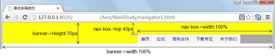
上图已经将高度标明,已看便知。其中的position前几节已经讲过。
添加导航条
下面为navigator1.html全部内容
<!DOCTYPE html>
<html>
	<head>
		<meta charset="utf-8">
		<title>滑动条导航栏</title>
		<style type="text/css">
			body{margin: 0; }
			ul, li{margin: 0; padding: 0;}
			a{text-decoration: none;}
			.banner{
				width: 100%;
				height: 70px;
			/*	background-color: yellow;*/
				}
			.nav-box{
				width: 50%;
				float: right;
				position: relative;
				top: 40px;
				/*background-color: darkgray;*/
			}
			.nav-box ul{
				list-style: none;
			}
			.nav-box ul li{
				float: left;
				font-size: 14px;
				font-family: "微软雅黑";
				height: 30px;
				line-height: 30px;
				padding: 0 12px;
				/*background-color: #F5F5F5;*/
			}
			.nav-box .nav-line {
			    background: none repeat scroll 0 0 #35C4FD;
			    bottom: 0;
			    font-size: 0;
			    height: 2px;
			    left: 0;
			    line-height: 2px;
			    position: absolute;
			    width: 52px;
			}
		</style>
	</head>
	<body>
		<div class="banner" >
			<div class="nav-box">
				<ul>
					<li class="cur"><a href="#">首页</a></li>
					<li><a href="#">论坛</a></li>
					<li><a href="#">商务合作</a></li>
					<li><a href="#">下载专区</a></li>
					<li><a href="#">关于我们</a></li>
				</ul>
				<div class="nav-line" ></div>
			</div>
		</div>
	</body>
</html>
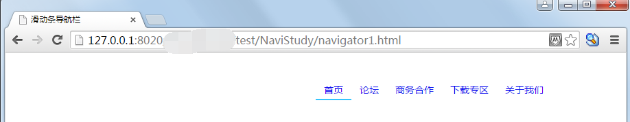
上面添加了导航条,并且去掉了层的颜色,效果图如下
结语
本节实现样式的代码不多,但是会者不难,难者不会,下一节利用jQuery实现跟随鼠标滑动


 2323
2323


 被折叠的 条评论
为什么被折叠?
被折叠的 条评论
为什么被折叠?
 到【灌水乐园】发言


