


目录
为什么他们这么丑?
为什么菜单项看起来这么难看?我看看。首先,让我们创建没有任何图标的菜单:
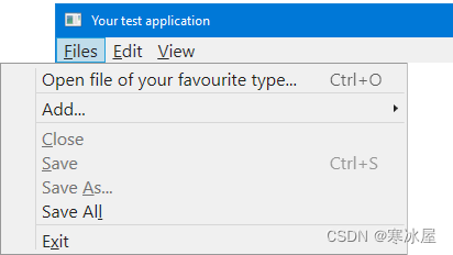
这就是大多数人抱怨的:左边有一个视觉上空的单元格。它被设计成一个图标,但没有一个图标,这一切看起来都令人不安,就像无头骑士一样。首先,人们要求删除这个区域并放弃图标。有很多解决方案,我发现它们不令人满意。更重要的是,为什么要放弃图标?至少可以选择拥有它们会更好,但要有适当的渲染。
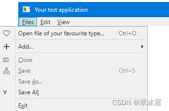
如果父菜单项的弹出区域中的所有或大多数菜单项都具有图标,则看起来会更好:
够好吗?一点也不!要查看问题,让我们放大菜单字体:
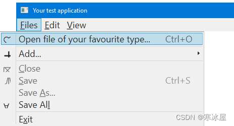
现在,图标无法正确呈现。在这里,我使用字符作为图标,为了简单起见,以及其他一些很好的理由,它确实有效。请注意,使用非默认字体大小时,表示字形的字符与菜单标题的字符不一致。如果我使用大小正好为16x16的位图字形,它总是适合的,但看起来与文本不一致。使用不同的图像大小时,会出现一些其他渲染问题,但通常,渲染任何具有较大尺寸的内容都永远不会准确。毋庸置疑,尝试匹配每个所需字体的大小将是一个非常糟糕的主意。这不仅完全不可靠,而且意味着要扼杀维护。
WPF Menu处理由任意类型的数据表示的MenuItem类型的文本菜单项和图标。
改进的外观
不是更好吗?
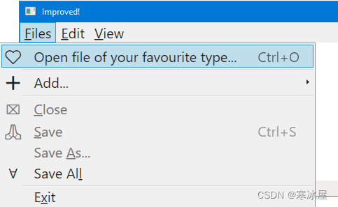
上图显示了我的最终结果。我故意把字体做得很大,以显示所有细节。在讨论问题和解决方案之前,让我们先看一下。完美吗?不,不是。首先,我不得不牺牲图标和标题区域之间的垂直分隔符。可以接受吗?由您决定。我想说,这种外观并不完全好,但仍然比没有修复要好。
对于那些选择不使用那些水平菜单分隔符的人来说,没有垂直分隔符从各方面来看都更好。此外,不同菜单项的图标以同一条垂直线为中心。
我测试了许多字体大小,甚至走到极端,以及不同的内容——一切正常。
现在,让我们讨论解决方案。
分析
当我查看Microsoft的默认WPF MenuItem模板时,我发现许多硬编码值会影响项目的大小和布局。很明显,该Menu控件被设计为与默认的固定字体和只有一个固定大小(16x16)的图标一起使用。换句话说,从我的角度来看,这是一个典型的临时布局示例——一个很大的设计错误。
但是,结构有点太复杂了,很容易被打破。我试图尽可能保守地修改它。首先,我发现在几个地方发现的16号是多余的,可以去掉。我还发现物品的高度是有限制的,限制等于22。我决定不删除它,而只是从Grid行大小中删除它。
最困难的问题是图标和标题区域之间的垂直分隔符。我决定放弃它并删除它,因为它的正确放置需要对一切进行彻底的重组。在默认的XAML代码中,三个Grid元素在同一个Grid.Raw中重叠,因此表示分隔符的Rectangle布局由硬编码Margins属性定义。我知道这是一个技巧,用于对齐几个堆叠菜单项的所有分隔符,但这是一种不好的做法。请注意,其他WPF控件(ListView,DataGrid)没有此问题。
解决方案
此代码可用作单独的ResourceDictionary文件:
<ResourceDictionary xmlns="http://schemas.microsoft.com/winfx/2006/xaml/presentation"
xmlns:x="http://schemas.microsoft.com/winfx/2006/xaml">
<SolidColorBrush x:Key="Menu.Static.Background" Color="#FFF0F0F0"/>
<SolidColorBrush x:Key="Menu.Static.Border" Color="#FF999999"/>
<SolidColorBrush x:Key="Menu.Static.Foreground" Color="#FF212121"/>
<!-- SA!!! removed because it is unused: the element using it cannot be positioned correctly as menu font size increases
<SolidColorBrush x:Key="Menu.Static.Separator" Color="#FFD7D7D7"/>
-->
<SolidColorBrush x:Key="Menu.Disabled.Foreground" Color="#FF707070"/>
<SolidColorBrush x:Key="MenuItem.Selected.Background" Color="#3D26A0DA"/>
<SolidColorBrush x:Key="MenuItem.Selected.Border" Color="#FF26A0DA"/>
<SolidColorBrush x:Key="MenuItem.Highlight.Background" Color="#3D26A0DA"/>
<SolidColorBrush x:Key="MenuItem.Highlight.Border" Color="#FF26A0DA"/>
<SolidColorBrush x:Key="MenuItem.Highlight.Disabled.Background" Color="#0A000000"/>
<SolidColorBrush x:Key="MenuItem.Highlight.Disabled.Border" Color="#21000000"/>
<MenuScrollingVisibilityConverter x:Key="MenuScrollingVisibilityConverter"/>
<Geometry x:Key="DownArrow">M 0,0 L 3.5,4 L 7,0 Z</Geometry>
<Geometry x:Key="UpArrow">M 0,4 L 3.5,0 L 7,4 Z</Geometry>
<Geometry x:Key="RightArrow">M 0,0 L 4,3.5 L 0,7 Z</Geometry>
<Geometry x:Key="Checkmark">F1 M 10.0,1.2 L 4.7,9.1 L 4.5,9.1 L 0,5.2 L 1.3,3.5 L 4.3,6.1L 8.3,0 L 10.0,1.2 Z</Geometry>
<Style x:Key="MenuScrollButton" BasedOn="{x:Null}" TargetType="{x:Type RepeatButton}">
<Setter Property="ClickMode" Value="Hover"/>
<Setter Property="Template">
<Setter.Value>
<ControlTemplate TargetType="{x:Type RepeatButton}">
<Border x:Name="templateRoot" Background="Transparent" BorderBrush="Transparent" BorderThickness="1" SnapsToDevicePixels="true">
<ContentPresenter HorizontalAlignment="Center" Margin="6" VerticalAlignment="Center"/>
</Border>
</ControlTemplate>
</Setter.Value>
</Setter>
</Style>
<Style x:Key="{ComponentResourceKey ResourceId=MenuScrollViewer, TypeInTargetAssembly={x:Type FrameworkElement}}" BasedOn="{x:Null}" TargetType="{x:Type ScrollViewer}">
<Setter Property="HorizontalScrollBarVisibility" Value="Hidden"/>
<Setter Property="VerticalScrollBarVisibility" Value="Auto"/>
<Setter Property="Template">
<Setter.Value>
<ControlTemplate TargetType="{x:Type ScrollViewer}">
<Grid SnapsToDevicePixels="true">
<Grid.ColumnDefinitions>
<ColumnDefinition Width="*"/>
</Grid.ColumnDefinitions>
<Grid.RowDefinitions>
<RowDefinition Height="Auto"/>
<RowDefinition Height="*"/>
<RowDefinition Height="Auto"/>
</Grid.RowDefinitions>
<Border Grid.Column="0" Grid.Row="1">
<ScrollContentPresenter CanContentScroll="{TemplateBinding CanContentScroll}" Margin="{TemplateBinding Padding}"/>
</Border>
<RepeatButton Command="{x:Static ScrollBar.LineUpCommand}" CommandTarget="{Binding RelativeSource={RelativeSource TemplatedParent}}" Grid.Column="0" Focusable="false" Grid.Row="0" Style="{StaticResource MenuScrollButton}">
<RepeatButton.Visibility>
<MultiBinding ConverterParameter="0" Converter="{StaticResource MenuScrollingVisibilityConverter}" FallbackValue="Visibility.Collapsed">
<Binding Path="ComputedVerticalScrollBarVisibility" RelativeSource="{RelativeSource TemplatedParent}"/>
<Binding Path="VerticalOffset" RelativeSource="{RelativeSource TemplatedParent}"/>
<Binding Path="ExtentHeight" RelativeSource="{RelativeSource TemplatedParent}"/>
<Binding Path="ViewportHeight" RelativeSource="{RelativeSource TemplatedParent}"/>
</MultiBinding>
</RepeatButton.Visibility>
<Path Data="{StaticResource UpArrow}" Fill="{StaticResource Menu.Static.Foreground}"/>
</RepeatButton>
<RepeatButton Command="{x:Static ScrollBar.LineDownCommand}" CommandTarget="{Binding RelativeSource={RelativeSource TemplatedParent}}" Grid.Column="0" Focusable="false" Grid.Row="2" Style="{StaticResource MenuScrollButton}">
<RepeatButton.Visibility>
<MultiBinding ConverterParameter="100" Converter="{StaticResource MenuScrollingVisibilityConverter}" FallbackValue="Visibility.Collapsed">
<Binding Path="ComputedVerticalScrollBarVisibility" RelativeSource="{RelativeSource TemplatedParent}"/>
<Binding Path="VerticalOffset" RelativeSource="{RelativeSource TemplatedParent}"/>
<Binding Path="ExtentHeight" RelativeSource="{RelativeSource TemplatedParent}"/>
<Binding Path="ViewportHeight" RelativeSource="{RelativeSource TemplatedParent}"/>
</MultiBinding>
</RepeatButton.Visibility>
<Path Data="{StaticResource DownArrow}" Fill="{StaticResource Menu.Static.Foreground}"/>
</RepeatButton>
</Grid>
</ControlTemplate>
</Setter.Value>
</Setter>
</Style>
<ControlTemplate x:Key="{ComponentResourceKey ResourceId=TopLevelItemTemplateKey, TypeInTargetAssembly={x:Type MenuItem}}" TargetType="{x:Type MenuItem}">
<Border x:Name="templateRoot" Background="{TemplateBinding Background}" BorderBrush="{TemplateBinding BorderBrush}" BorderThickness="{TemplateBinding BorderThickness}" SnapsToDevicePixels="true">
<Grid VerticalAlignment="Center">
<Grid.ColumnDefinitions>
<ColumnDefinition Width="Auto"/>
<ColumnDefinition Width="Auto"/>
</Grid.ColumnDefinitions>
<ContentPresenter x:Name="Icon" ContentSource="Icon" HorizontalAlignment="Center" Margin="3" SnapsToDevicePixels="{TemplateBinding SnapsToDevicePixels}" VerticalAlignment="Center" />
<Path x:Name="GlyphPanel" Data="{StaticResource Checkmark}" FlowDirection="LeftToRight" Fill="{StaticResource Menu.Static.Foreground}" Margin="3" VerticalAlignment="Center" Visibility="Collapsed"/>
<ContentPresenter ContentSource="Header" Grid.Column="1" Margin="{TemplateBinding Padding}" RecognizesAccessKey="True" SnapsToDevicePixels="{TemplateBinding SnapsToDevicePixels}"/>
</Grid>
</Border>
<ControlTemplate.Triggers>
<Trigger Property="Icon" Value="{x:Null}">
<Setter Property="Visibility" TargetName="Icon" Value="Collapsed"/>
</Trigger>
<Trigger Property="IsChecked" Value="true">
<Setter Property="Visibility" TargetName="GlyphPanel" Value="Visible"/>
<Setter Property="Visibility" TargetName="Icon" Value="Collapsed"/>
</Trigger>
<Trigger Property="IsHighlighted" Value="True">
<Setter Property="Background" TargetName="templateRoot" Value="{StaticResource MenuItem.Highlight.Background}"/>
<Setter Property="BorderBrush" TargetName="templateRoot" Value="{StaticResource MenuItem.Highlight.Border}"/>
</Trigger>
<Trigger Property="IsEnabled" Value="False">
<Setter Property="TextElement.Foreground" TargetName="templateRoot" Value="{StaticResource Menu.Disabled.Foreground}"/>
<Setter Property="Fill" TargetName="GlyphPanel" Value="{StaticResource Menu.Disabled.Foreground}"/>
</Trigger>
<MultiTrigger>
<MultiTrigger.Conditions>
<Condition Property="IsHighlighted" Value="True"/>
<Condition Property="IsEnabled" Value="False"/>
</MultiTrigger.Conditions>
<Setter Property="Background" TargetName="templateRoot" Value="{StaticResource MenuItem.Highlight.Disabled.Background}"/>
<Setter Property="BorderBrush" TargetName="templateRoot" Value="{StaticResource MenuItem.Highlight.Disabled.Border}"/>
</MultiTrigger>
</ControlTemplate.Triggers>
</ControlTemplate>
<ControlTemplate x:Key="{ComponentResourceKey ResourceId=TopLevelHeaderTemplateKey, TypeInTargetAssembly={x:Type MenuItem}}" TargetType="{x:Type MenuItem}">
<Border x:Name="templateRoot" Background="{TemplateBinding Background}" BorderBrush="{TemplateBinding BorderBrush}" BorderThickness="{TemplateBinding BorderThickness}" SnapsToDevicePixels="true">
<Grid VerticalAlignment="Center">
<Grid.ColumnDefinitions>
<ColumnDefinition Width="Auto"/>
<ColumnDefinition Width="Auto"/>
</Grid.ColumnDefinitions>
<ContentPresenter x:Name="Icon" ContentSource="Icon" HorizontalAlignment="Center" Margin="3" SnapsToDevicePixels="{TemplateBinding SnapsToDevicePixels}" VerticalAlignment="Center" />
<Path x:Name="GlyphPanel" Data="{StaticResource Checkmark}" FlowDirection="LeftToRight" Fill="{TemplateBinding Foreground}" Margin="3" VerticalAlignment="Center" Visibility="Collapsed"/>
<ContentPresenter ContentSource="Header" Grid.Column="1" Margin="{TemplateBinding Padding}" RecognizesAccessKey="True" SnapsToDevicePixels="{TemplateBinding SnapsToDevicePixels}"/>
<Popup x:Name="PART_Popup" AllowsTransparency="true" Focusable="false" IsOpen="{Binding IsSubmenuOpen, RelativeSource={RelativeSource TemplatedParent}}" Placement="Bottom" PopupAnimation="{DynamicResource {x:Static SystemParameters.MenuPopupAnimationKey}}" PlacementTarget="{Binding ElementName=templateRoot}">
<Border x:Name="SubMenuBorder" Background="{StaticResource Menu.Static.Background}" BorderBrush="{StaticResource Menu.Static.Border}" BorderThickness="1" Padding="2">
<ScrollViewer x:Name="SubMenuScrollViewer" Style="{DynamicResource {ComponentResourceKey ResourceId=MenuScrollViewer, TypeInTargetAssembly={x:Type FrameworkElement}}}">
<Grid RenderOptions.ClearTypeHint="Enabled">
<Canvas HorizontalAlignment="Left" Height="0" VerticalAlignment="Top" Width="0">
<Rectangle x:Name="OpaqueRect" Fill="{Binding Background, ElementName=SubMenuBorder}" Height="{Binding ActualHeight, ElementName=SubMenuBorder}" Width="{Binding ActualWidth, ElementName=SubMenuBorder}"/>
</Canvas>
<!-- SA!!! removed because it cannot be positioned correctly as menu font size increases
<Rectangle Fill="{StaticResource Menu.Static.Separator}" HorizontalAlignment="Left" Margin="29,2,0,2" Width="1"/>
-->
<ItemsPresenter x:Name="ItemsPresenter" KeyboardNavigation.DirectionalNavigation="Cycle" Grid.IsSharedSizeScope="true" SnapsToDevicePixels="{TemplateBinding SnapsToDevicePixels}" KeyboardNavigation.TabNavigation="Cycle"/>
</Grid>
</ScrollViewer>
</Border>
</Popup>
</Grid>
</Border>
<ControlTemplate.Triggers>
<Trigger Property="IsSuspendingPopupAnimation" Value="true">
<Setter Property="PopupAnimation" TargetName="PART_Popup" Value="None"/>
</Trigger>
<Trigger Property="Icon" Value="{x:Null}">
<Setter Property="Visibility" TargetName="Icon" Value="Collapsed"/>
</Trigger>
<Trigger Property="IsChecked" Value="true">
<Setter Property="Visibility" TargetName="GlyphPanel" Value="Visible"/>
<Setter Property="Visibility" TargetName="Icon" Value="Collapsed"/>
</Trigger>
<Trigger Property="IsHighlighted" Value="True">
<Setter Property="Background" TargetName="templateRoot" Value="{StaticResource MenuItem.Highlight.Background}"/>
<Setter Property="BorderBrush" TargetName="templateRoot" Value="{StaticResource MenuItem.Highlight.Border}"/>
</Trigger>
<Trigger Property="IsEnabled" Value="False">
<Setter Property="TextElement.Foreground" TargetName="templateRoot" Value="{StaticResource Menu.Disabled.Foreground}"/>
<Setter Property="Fill" TargetName="GlyphPanel" Value="{StaticResource Menu.Disabled.Foreground}"/>
</Trigger>
<Trigger Property="ScrollViewer.CanContentScroll" SourceName="SubMenuScrollViewer" Value="false">
<Setter Property="Canvas.Top" TargetName="OpaqueRect" Value="{Binding VerticalOffset, ElementName=SubMenuScrollViewer}"/>
<Setter Property="Canvas.Left" TargetName="OpaqueRect" Value="{Binding HorizontalOffset, ElementName=SubMenuScrollViewer}"/>
</Trigger>
</ControlTemplate.Triggers>
</ControlTemplate>
<ControlTemplate x:Key="{ComponentResourceKey ResourceId=SubmenuItemTemplateKey, TypeInTargetAssembly={x:Type MenuItem}}" TargetType="{x:Type MenuItem}">
<Border x:Name="templateRoot" Background="{TemplateBinding Background}" BorderBrush="{TemplateBinding BorderBrush}" BorderThickness="{TemplateBinding BorderThickness}" SnapsToDevicePixels="true">
<Grid Margin="-1">
<Grid.ColumnDefinitions>
<ColumnDefinition MinWidth="22" SharedSizeGroup="MenuItemIconColumnGroup" Width="Auto"/>
<ColumnDefinition Width="13"/>
<ColumnDefinition Width="*"/>
<ColumnDefinition Width="30"/>
<ColumnDefinition SharedSizeGroup="MenuItemIGTColumnGroup" Width="Auto"/>
<ColumnDefinition Width="20"/>
</Grid.ColumnDefinitions>
<ContentPresenter x:Name="Icon" ContentSource="Icon" HorizontalAlignment="Center" Margin="3" SnapsToDevicePixels="{TemplateBinding SnapsToDevicePixels}" VerticalAlignment="Center" />
<Border x:Name="GlyphPanel" Background="{StaticResource MenuItem.Selected.Background}" BorderBrush="{StaticResource MenuItem.Selected.Border}" BorderThickness="1" ClipToBounds="False" HorizontalAlignment="Center" Height="22" Margin="-1,0,0,0" VerticalAlignment="Center" Visibility="Hidden" Width="22">
<Path x:Name="Glyph" Data="{StaticResource Checkmark}" FlowDirection="LeftToRight" Fill="{StaticResource Menu.Static.Foreground}" Height="11" Width="10"/>
</Border>
<ContentPresenter x:Name="menuHeaderContainer" ContentSource="Header" Grid.Column="2" HorizontalAlignment="Left" Margin="{TemplateBinding Padding}" RecognizesAccessKey="True" SnapsToDevicePixels="{TemplateBinding SnapsToDevicePixels}" VerticalAlignment="Center"/>
<TextBlock x:Name="menuGestureText" Grid.Column="4" Margin="{TemplateBinding Padding}" Opacity="0.7" Text="{TemplateBinding InputGestureText}" VerticalAlignment="Center"/>
</Grid>
</Border>
<ControlTemplate.Triggers>
<Trigger Property="Icon" Value="{x:Null}">
<Setter Property="Visibility" TargetName="Icon" Value="Collapsed"/>
</Trigger>
<Trigger Property="IsChecked" Value="True">
<Setter Property="Visibility" TargetName="GlyphPanel" Value="Visible"/>
<Setter Property="Visibility" TargetName="Icon" Value="Collapsed"/>
</Trigger>
<Trigger Property="IsHighlighted" Value="True">
<Setter Property="Background" TargetName="templateRoot" Value="{StaticResource MenuItem.Highlight.Background}"/>
<Setter Property="BorderBrush" TargetName="templateRoot" Value="{StaticResource MenuItem.Highlight.Border}"/>
</Trigger>
<Trigger Property="IsEnabled" Value="False">
<Setter Property="TextElement.Foreground" TargetName="templateRoot" Value="{StaticResource Menu.Disabled.Foreground}"/>
<Setter Property="Fill" TargetName="Glyph" Value="{StaticResource Menu.Disabled.Foreground}"/>
</Trigger>
<MultiTrigger>
<MultiTrigger.Conditions>
<Condition Property="IsHighlighted" Value="True"/>
<Condition Property="IsEnabled" Value="False"/>
</MultiTrigger.Conditions>
<Setter Property="Background" TargetName="templateRoot" Value="{StaticResource MenuItem.Highlight.Disabled.Background}"/>
<Setter Property="BorderBrush" TargetName="templateRoot" Value="{StaticResource MenuItem.Highlight.Disabled.Border}"/>
</MultiTrigger>
</ControlTemplate.Triggers>
</ControlTemplate>
<ControlTemplate x:Key="{ComponentResourceKey ResourceId=SubmenuHeaderTemplateKey, TypeInTargetAssembly={x:Type MenuItem}}" TargetType="{x:Type MenuItem}">
<Border x:Name="templateRoot" Background="{TemplateBinding Background}" BorderBrush="{TemplateBinding BorderBrush}" BorderThickness="{TemplateBinding BorderThickness}" SnapsToDevicePixels="true">
<Grid Margin="-1">
<Grid.ColumnDefinitions>
<ColumnDefinition MinWidth="22" SharedSizeGroup="MenuItemIconColumnGroup" Width="Auto"/>
<ColumnDefinition Width="13"/>
<ColumnDefinition Width="*"/>
<ColumnDefinition Width="30"/>
<ColumnDefinition SharedSizeGroup="MenuItemIGTColumnGroup" Width="Auto"/>
<ColumnDefinition Width="20"/>
</Grid.ColumnDefinitions>
<ContentPresenter x:Name="Icon" ContentSource="Icon" HorizontalAlignment="Center" Margin="3" SnapsToDevicePixels="{TemplateBinding SnapsToDevicePixels}" VerticalAlignment="Center" />
<Border x:Name="GlyphPanel" Background="{StaticResource MenuItem.Highlight.Background}" BorderBrush="{StaticResource MenuItem.Highlight.Border}" BorderThickness="1" Height="22" Margin="-1,0,0,0" VerticalAlignment="Center" Visibility="Hidden" Width="22">
<Path x:Name="Glyph" Data="{DynamicResource Checkmark}" FlowDirection="LeftToRight" Fill="{StaticResource Menu.Static.Foreground}" Height="11" Width="9"/>
</Border>
<ContentPresenter ContentSource="Header" Grid.Column="2" HorizontalAlignment="Left" Margin="{TemplateBinding Padding}" RecognizesAccessKey="True" SnapsToDevicePixels="{TemplateBinding SnapsToDevicePixels}" VerticalAlignment="Center"/>
<TextBlock Grid.Column="4" Margin="{TemplateBinding Padding}" Opacity="0.7" Text="{TemplateBinding InputGestureText}" VerticalAlignment="Center"/>
<Path x:Name="RightArrow" Grid.Column="5" Data="{StaticResource RightArrow}" Fill="{StaticResource Menu.Static.Foreground}" HorizontalAlignment="Left" Margin="10,0,0,0" VerticalAlignment="Center"/>
<Popup x:Name="PART_Popup" AllowsTransparency="true" Focusable="false" HorizontalOffset="-2" IsOpen="{Binding IsSubmenuOpen, RelativeSource={RelativeSource TemplatedParent}}" Placement="Right" PopupAnimation="{DynamicResource {x:Static SystemParameters.MenuPopupAnimationKey}}" VerticalOffset="-3">
<Border x:Name="SubMenuBorder" Background="{StaticResource Menu.Static.Background}" BorderBrush="{StaticResource Menu.Static.Border}" BorderThickness="1" Padding="2">
<ScrollViewer x:Name="SubMenuScrollViewer" Style="{DynamicResource {ComponentResourceKey ResourceId=MenuScrollViewer, TypeInTargetAssembly={x:Type FrameworkElement}}}">
<Grid RenderOptions.ClearTypeHint="Enabled">
<Canvas HorizontalAlignment="Left" Height="0" VerticalAlignment="Top" Width="0">
<Rectangle x:Name="OpaqueRect" Fill="{Binding Background, ElementName=SubMenuBorder}" Height="{Binding ActualHeight, ElementName=SubMenuBorder}" Width="{Binding ActualWidth, ElementName=SubMenuBorder}"/>
</Canvas>
<Rectangle Fill="{DynamicResource {x:Static SystemColors.ControlDarkBrushKey}}" HorizontalAlignment="Left" Margin="29,2,0,2" Width="1"/>
<ItemsPresenter x:Name="ItemsPresenter" KeyboardNavigation.DirectionalNavigation="Cycle" Grid.IsSharedSizeScope="true" SnapsToDevicePixels="{TemplateBinding SnapsToDevicePixels}" KeyboardNavigation.TabNavigation="Cycle"/>
</Grid>
</ScrollViewer>
</Border>
</Popup>
</Grid>
</Border>
<ControlTemplate.Triggers>
<Trigger Property="IsSuspendingPopupAnimation" Value="true">
<Setter Property="PopupAnimation" TargetName="PART_Popup" Value="None"/>
</Trigger>
<Trigger Property="Icon" Value="{x:Null}">
<Setter Property="Visibility" TargetName="Icon" Value="Collapsed"/>
</Trigger>
<Trigger Property="IsChecked" Value="True">
<Setter Property="Visibility" TargetName="GlyphPanel" Value="Visible"/>
<Setter Property="Visibility" TargetName="Icon" Value="Collapsed"/>
</Trigger>
<Trigger Property="IsHighlighted" Value="True">
<Setter Property="Background" TargetName="templateRoot" Value="Transparent"/>
<Setter Property="BorderBrush" TargetName="templateRoot" Value="{StaticResource MenuItem.Highlight.Border}"/>
</Trigger>
<Trigger Property="IsEnabled" Value="False">
<Setter Property="TextElement.Foreground" TargetName="templateRoot" Value="{StaticResource Menu.Disabled.Foreground}"/>
<Setter Property="Fill" TargetName="Glyph" Value="{StaticResource Menu.Disabled.Foreground}"/>
<Setter Property="Fill" TargetName="RightArrow" Value="{StaticResource Menu.Disabled.Foreground}"/>
</Trigger>
<Trigger Property="ScrollViewer.CanContentScroll" SourceName="SubMenuScrollViewer" Value="false">
<Setter Property="Canvas.Top" TargetName="OpaqueRect" Value="{Binding VerticalOffset, ElementName=SubMenuScrollViewer}"/>
<Setter Property="Canvas.Left" TargetName="OpaqueRect" Value="{Binding HorizontalOffset, ElementName=SubMenuScrollViewer}"/>
</Trigger>
</ControlTemplate.Triggers>
</ControlTemplate>
<Style x:Key="MenuItemStyle1" TargetType="{x:Type MenuItem}">
<Setter Property="HorizontalContentAlignment" Value="{Binding HorizontalContentAlignment, RelativeSource={RelativeSource AncestorType={x:Type ItemsControl}}}"/>
<Setter Property="VerticalContentAlignment" Value="{Binding VerticalContentAlignment, RelativeSource={RelativeSource AncestorType={x:Type ItemsControl}}}"/>
<Setter Property="Background" Value="Transparent"/>
<Setter Property="BorderBrush" Value="Transparent"/>
<Setter Property="BorderThickness" Value="1"/>
<Setter Property="ScrollViewer.PanningMode" Value="Both"/>
<Setter Property="Stylus.IsFlicksEnabled" Value="False"/>
<Setter Property="Template" Value="{DynamicResource {ComponentResourceKey ResourceId=SubmenuItemTemplateKey, TypeInTargetAssembly={x:Type MenuItem}}}"/>
<Style.Triggers>
<Trigger Property="Role" Value="TopLevelHeader">
<Setter Property="Background" Value="Transparent"/>
<Setter Property="BorderBrush" Value="Transparent"/>
<Setter Property="Foreground" Value="{StaticResource Menu.Static.Foreground}"/>
<Setter Property="Template" Value="{DynamicResource {ComponentResourceKey ResourceId=TopLevelHeaderTemplateKey, TypeInTargetAssembly={x:Type MenuItem}}}"/>
<Setter Property="Padding" Value="6,0"/>
</Trigger>
<Trigger Property="Role" Value="TopLevelItem">
<Setter Property="Background" Value="{StaticResource Menu.Static.Background}"/>
<Setter Property="BorderBrush" Value="{StaticResource Menu.Static.Border}"/>
<Setter Property="Foreground" Value="{StaticResource Menu.Static.Foreground}"/>
<Setter Property="Template" Value="{DynamicResource {ComponentResourceKey ResourceId=TopLevelItemTemplateKey, TypeInTargetAssembly={x:Type MenuItem}}}"/>
<Setter Property="Padding" Value="6,0"/>
</Trigger>
<Trigger Property="Role" Value="SubmenuHeader">
<Setter Property="Template" Value="{DynamicResource {ComponentResourceKey ResourceId=SubmenuHeaderTemplateKey, TypeInTargetAssembly={x:Type MenuItem}}}"/>
</Trigger>
</Style.Triggers>
</Style>
</ResourceDictionary>无需引用在此资源字典中创建的样式。使用菜单将其包含在XAML中就足够了。然后,此资源字典将影响应用程序的所有项目。
请注意,可以使用以下ResourceDictionary.MergedDictionaries将资源字典包含在XAML中,请参阅文档文章合并的资源字典(WPF .NET)。
源资源字典不仅可以作为文件合并到XAML中,还可以作为资源或单独生成的程序集,使用对引用的程序集项目的程序集资源的引用。这可以通过使用包URI方案来实现,请参阅文档文章 WPF中的包URI。
测试
此解决方案在具有不同内容和字体大小的.NET 5到.NET 7上进行了测试。
结论
该解决方案确实有效。但是,它的目标是最小的修复,而没有尝试引入从根本上改进的结构。我对其进行了彻底的测试,该解决方案提供了比MenuItem默认模板更好的结果。
https://www.codeproject.com/Tips/5367587/Improved-WPF-MenuItem-Template


 2101
2101

 被折叠的 条评论
为什么被折叠?
被折叠的 条评论
为什么被折叠?
 到【灌水乐园】发言


