


要实现行内元素(<span>、<a>等)的水平居中,只需把行内元素包裹在块级父层元素(<div>、<li>、<p>等)中,并且在父层元素CSS设置如下:
<!DOCTYPE html>
<html>
<head>
<meta http-equiv="Content-Type" content="text/html; charset=UTF-8">
<title>垂直居中Demo</title>
<style type="text/css">
#container {
	text-align: center;
	background-color: #666;
}
#center {
	color: #fff;
	font-size: 20px;
}
</style>
</head>
<body>
<div id='container'> <span id = 'center'>#center</span> </div>
</body>
</html>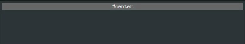
块状元素的水平居中
要实现块状元素(display:block)的水平居中,我们只需要将它的左右外边距margin-left和margin-right设置为auto,即可实现块状元素的居中,要水平居中的块状元素CSS设置如下:
<!DOCTYPE html>
<html>
<head>
<meta http-equiv="Content-Type" content="text/html; charset=UTF-8">
<title>垂直居中Demo</title>
<style type="text/css">
#container {
	height: 100px;
	background: #d6d6d6;
}
#center {
	margin: auto;
	width: 100px;
	height: 100px;
	background-color: #666;
	color: #fff;
	display: flex;
	align-items: center;
	justify-content: center;
	font-weight: bold;
	font-size: 18px;
}
</style>
</head>
<body>
<div id='container'>
  <div id = 'center'>#center</div>
</div>
</body>
</html>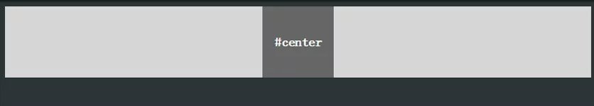
多个块状元素的水平居中
要实现多个水平排列的块状元素的水平居中,传统的方法是将要水平排列的块状元素设为display:inline-block,然后在父级元素上设置text-align:center,达到与上面的行内元素的水平居中一样的效果。
<!DOCTYPE html>
<html>
<head>
<meta http-equiv="Content-Type" content="text/html; charset=UTF-8">
<title>垂直居中Demo</title>
<style type="text/css">
#container {
	height: 100px;
	background: #d6d6d6;
}
#center {
	margin: auto;
	width: 100px;
	height: 100px;
	background-color: #666;
	color: #fff;
	display: flex;
	align-items: center;
	justify-content: center;
	font-weight: bold;
	font-size: 18px;
}
</style>
</head>

<body>
<div id='container'>
  <div id = 'center'>#center</div>
  <div id = 'center'>#center</div>
  <div id = 'center'>#center</div>
</div>
</body>
</html> 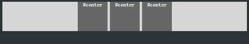
已知高度宽度元素的水平垂直居中
法一.
绝对定位与负边距实现。
利用绝对定位,将元素的top和left属性都设为50%,再利用margin边距,将元素回拉它本身高宽的一半,实现垂直居中。
<!DOCTYPE html>
<html>
<head>
<meta http-equiv="Content-Type" content="text/html; charset=UTF-8">
<title>垂直居中Demo</title>
<style type="text/css">
#container {
	background: #d6d6d6;
	height: 300px;
	position: relative;
}
#center {
	position: absolute;
	top: 50%;
	left: 50%;
	margin: -50px 0 0 -50px;
	width: 100px;
	height: 100px;
	background-color: #666;
	color: #fff;
	font-weight: bold;
	font-size: 18px;
}
</style>
</head>

<body>
<div id='container'>
  <div id = 'center'>#center</div>
</div>
</body>
</html> 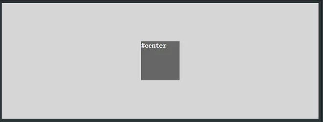
法二.
绝对定位与margin。
这种方法也是利用绝对定位与margin,但是无需知道被垂直居中元素的高和宽。
<!DOCTYPE html>
<html>
<head>
<meta http-equiv="Content-Type" content="text/html; charset=UTF-8">
<title>垂直居中Demo</title>
<style type="text/css">
#container {
	position: relative;
	height: 300px;
	background: #d6d6d6;
}
#center {
	position: absolute;
	margin: auto;
	top: 0;
	bottom: 0;
	left: 0;
	right: 0;
	width: 100px;
	height: 100px;
	background-color: #666;
	color: #fff;
	font-weight: bold;
	font-size: 18px;
}
</style>
</head>

<body>
<div id='container'>
  <div id = 'center'>#center #center #center #center</div>
</div>
</body>
</html>
未知高度和宽度元素的水平垂直居中
法一. 当要被居中的元素是inline或者inline-block元素
当要被居中的元素是inline或者inline-block的时候,可以巧妙的将父级容器设置为display:table-cell,配合text-align:center和vertical-align:middle即可以实现水平垂直居中。
<!DOCTYPE html>
<html>
<head>
<meta http-equiv="Content-Type" content="text/html; charset=UTF-8">
<title>垂直居中Demo</title>
<style type="text/css">
#container {
	width: 600px;
	height: 300px;
	background: #d6d6d6;
	display: table-cell;
	text-align: center;
	vertical-align: middle;
}
#center {
	background-color: #666;
	color: #fff;
	font-weight: bold;
	font-size: 18px;
}
</style>
</head>

<body>
<div id='container'> <span id='center'>#center</span> </div>
</body>
</html> 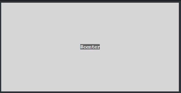
法二. Css3显威力
利用Css3的transform,可以轻松的在未知元素的高宽的情况下实现元素的垂直居中。
<!DOCTYPE html>
<html>
<head>
<meta http-equiv="Content-Type" content="text/html; charset=UTF-8">
<title>垂直居中Demo</title>
<style type="text/css">
#container {
	height: 300px;
	background: #d6d6d6;
	position: relative;
}
#center {
	position: absolute;
	top: 50%;
	left: 50%;
	transform: translate(-50%, -50%);
	width: 100px;
	height: 100px;
	background-color: #666;
	color: #fff;
	font-weight: bold;
	font-size: 18px;
}
</style>
</head>

<body>
<div id='container'>
  <div id = 'center'>#center</div>
</div>
</body>
</html> 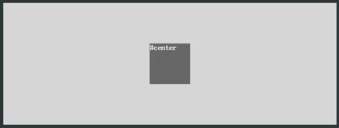
法三. flex布局轻松解决
使用flex布局,无需绝对定位等改变布局的操作,可以轻松实现元素的水平垂直居中。
核心代码如下:
<!DOCTYPE html>
<html>
<head>
<meta http-equiv="Content-Type" content="text/html; charset=UTF-8">
<title>垂直居中Demo</title>
<style type="text/css">
#container {
	height: 300px;
	background: #d6d6d6;
	display: flex;
	justify-content: center;
	align-items: center;
}
#center {
	width: 100px;
	height: 100px;
	background-color: #666;
	color: #fff;
	font-weight: bold;
	font-size: 18px;
	display: flex;/*这个写在这只是为了#center这几个字的垂直居中*/
	justify-content: center;
	align-items: center;
}
</style>
</head>

<body>
<div id='container'>
  <div id = 'center'>#center</div>
</div>
</body>
</html>

CSS3的transform和flex固然好用,但在项目的实际运用中必须考虑兼容问题,大量的hack代码可能会导致得不偿失。
某些浏览器仍需使用前缀写法:
.flexboxtest{
display: flex;
display: -webkit-flex; //Safari仍旧需要使用特定的浏览器前缀
}


 扫一扫
扫一扫
 457
457

 被折叠的 条评论
为什么被折叠?
被折叠的 条评论
为什么被折叠?
 到【灌水乐园】发言


