


Bootstrap按钮组是将一组按钮放在一个拥有class="btn-group"的div中,这些button给他加上.btn或者.btn-success样式,让这些按钮形成一个组,效果如下:
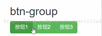
从图片中可以看出,使用按钮组包裹起来的按钮,当点击其中一个按钮时,此按钮呈现点击的状态,并当你点击非此按钮的区域时,这个点击的状态才会消失。
代码如下:
<!DOCTYPE html>
<html lang="en">
<head>
    <meta charset="UTF-8">
    <title>按钮组</title>
    <link rel="stylesheet" href="../libs/bootstrap-3.3.7/css/bootstrap.css">
</head>
<body>
<div class="container" style="margin-top: 20px;">
    <h1 class="text-center">按钮组</h1>
    <h2>btn-group</h2>
    <div class="btn-group">
        <button class="btn btn-success">按钮1</button>
        <button class="btn btn-success">按钮2</button>
        <button class="btn btn-success">按钮3</button>
    </div>
</div>
</body>
</html>
关于按钮组的几个class样式:
.btn-group——基础按钮组,用于放置带有class.btn的一系列按钮。
.btn-toolbar——用于放置按钮组。
 <div class="btn-toolbar">
        <div class="btn-group">
            <button class="btn btn-primary">按钮1</button>
            <button class="btn btn-primary">按钮2</button>
            <button class="btn btn-primary">按钮3</button>
        </div>
        <div class="btn-group">
            <button class="btn btn-primary">按钮1</button>
            <button class="btn btn-primary">按钮2</button>
            <button class="btn btn-primary">按钮3</button>
        </div>
        <div class="btn-group">
            <button class="btn btn-primary">按钮1</button>
            <button class="btn btn-primary">按钮2</button>
            <button class="btn btn-primary">按钮3</button>
        </div>
    </div>
.btn-group-lg, .btn-group-sm, .btn-group-xs——指定按钮组中按钮的大小。
 <h2> btn-group-xs</h2>
    <div class="btn-group-xs">
        <button class="btn btn-primary">按钮1</button>
        <button class="btn btn-primary">按钮2</button>
        <button class="btn btn-primary">按钮3</button>
    </div>

    <h2> btn-group-sm</h2>
    <div class="btn-group-sm">
        <button class="btn btn-primary">按钮1</button>
        <button class="btn btn-primary">按钮2</button>
        <button class="btn btn-primary">按钮3</button>
    </div>

    <h2>btn-group-lg</h2>
    <div class="btn-group-lg">
        <button class="btn btn-primary">按钮1</button>
        <button class="btn btn-primary">按钮2</button>
        <button class="btn btn-primary">按钮3</button>
    </div>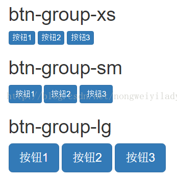
.btn-group-vertical——让这一组按钮垂直显示。
<h2>btn-group-vertical</h2>
    <div class="btn-group-vertical">
        <button class="btn btn-primary">按钮1</button>
        <button class="btn btn-primary">按钮2</button>
        <button class="btn btn-primary">按钮3</button>
    </div>
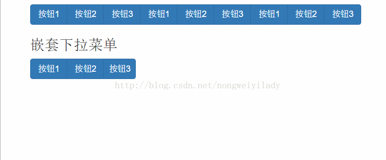
在按钮组中可以嵌套使用,比如btn-group嵌套btn-group,也可以使用btn-group中放入用下拉菜单的按钮,形成如下效果:
因为引用了下拉菜单组件,需要引入js脚本文件,代码如下:
<!DOCTYPE html>
<html lang="en">
<head>
    <meta charset="UTF-8">
    <title>按钮组</title>
    <link rel="stylesheet" href="../libs/bootstrap-3.3.7/css/bootstrap.css">
    <script src="../libs/jquery-3.1.1.js"></script>
    <script src="../libs/bootstrap-3.3.7/js/bootstrap.js"></script>
</head>
<body>
<div class="container" style="margin-top: 20px;">
    <h2>按钮嵌套</h2>
    <div class="btn-group">
        <div class="btn-group">
            <button class="btn btn-primary">按钮1</button>
            <button class="btn btn-primary">按钮2</button>
            <button class="btn btn-primary">按钮3</button>
        </div>
        <div class="btn-group">
            <button class="btn btn-primary">按钮1</button>
            <button class="btn btn-primary">按钮2</button>
            <button class="btn btn-primary">按钮3</button>
        </div>
        <div class="btn-group">
            <button class="btn btn-primary">按钮1</button>
            <button class="btn btn-primary">按钮2</button>
            <button class="btn btn-primary">按钮3</button>
        </div>
    </div>
    <h3>嵌套下拉菜单</h3>
    <div class="btn-group">
        <button class="btn btn-primary">按钮1</button>
        <button class="btn btn-primary">按钮2</button>
        <button class="btn btn-primary dropdown-toggle" data-toggle="dropdown">按钮3</button>
        <ul class="dropdown-menu">
            <li><a href="#">菜单1</a></li>
            <li><a href="#">菜单2</a></li>
            <li><a href="#">菜单3</a></li>
            <li><a href="#">菜单4</a></li>
        </ul>
    </div>
</div>
</body>
</html>
本文参考资料来自:http://www.runoob.com/bootstrap/bootstrap-button-groups.html


 扫一扫
扫一扫
 245
245

 被折叠的 条评论
为什么被折叠?
被折叠的 条评论
为什么被折叠?
 到【灌水乐园】发言


